

Artists use the term ‘greeking’ to describe writing that isn’t writing, text that isn’t text, in a painting. The term comes from typography. There’s a famous passage that starts, Lorem ipsum dolor sit amet… It gets subbed in anywhere where the words aren’t already available to the designer.
This text comes from an essay by Cicero, and has been used by typesetters for this purpose almost since the start of moveable type. I don’t know which surprises me more-that typesetters in the 15th century knew Latin, or that so many of us today can recite a fragment of Cicero without having a clue about its meaning.
Medieval scribes were schooled in Latin, but not Greek. When they encountered Greek in a passage, they would note, graecum est; non potest legi (It’s Greek, so it can’t be read). Today we say, “it’s all Greek to me,” meaning it’s in a foreign language. Thus, a Latin placeholder ends up being called greeking. Makes perfect sense.
When is greeking appropriate?
Actual words are powerfully potent in visual imagery, as advertising attests. For a more high-brow example, think of Robert Indiana‘s famous LOVE icon and how it immediately changes the landscape when in sculptural form.
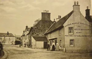
There are times when words can stand alone. For example, you might paint nocturne of a bar and put the single word ‘bar’ over the transom, to convey something about the destination to your viewers. That would read differently than if you carefully scribed Poosie Nansies, etc. on the wall of a painting of that Scottish inn. In the photo above, we’re instantly drawn to the text at the expense of the people, road, and fabulous chimney pots. The photographer couldn’t help it, but we painters have the option to deemphasize the writing in favor of the longer view.
We greek words to avoid overemphasizing their meaning at the expense of your overall design.
How do I do it?
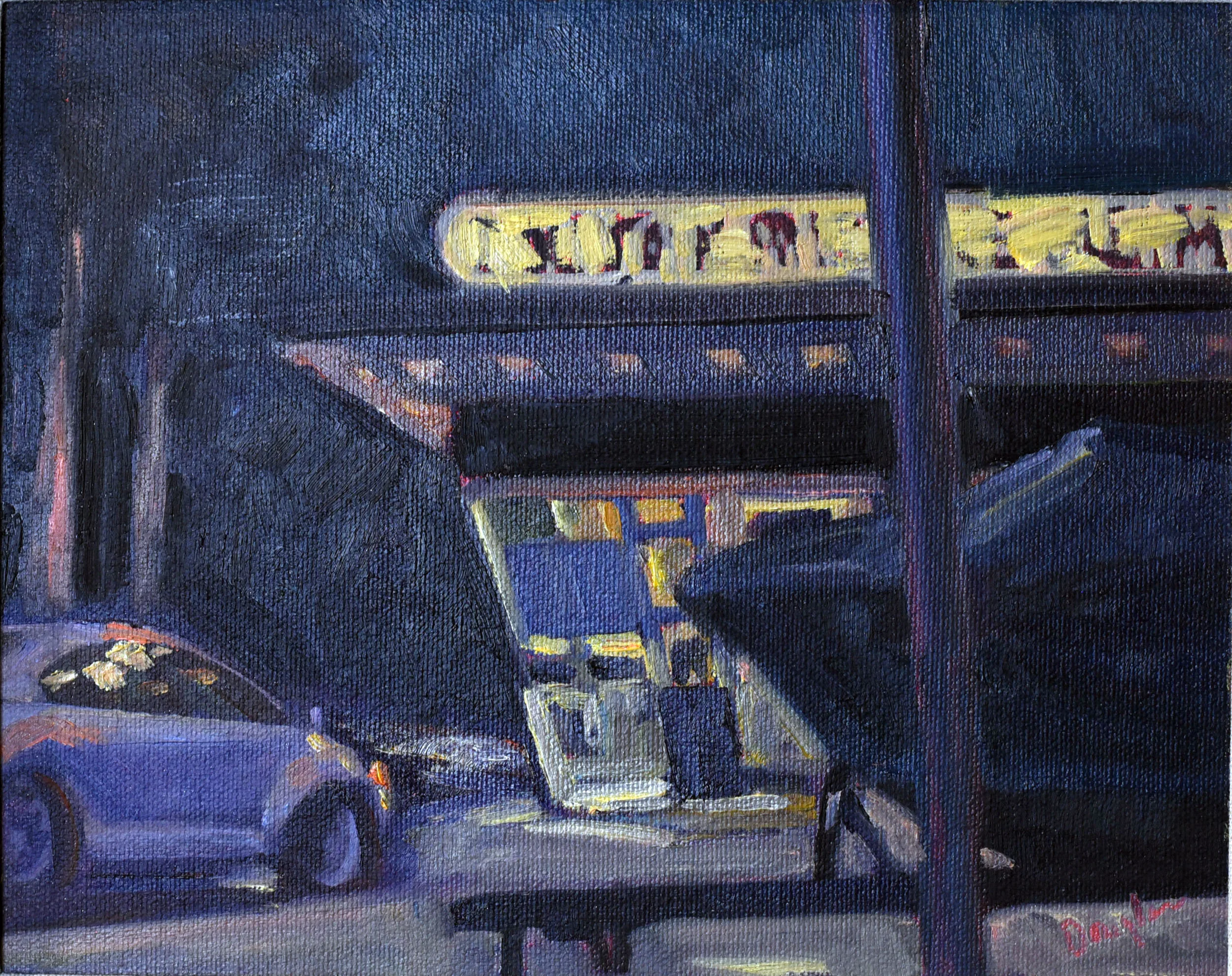
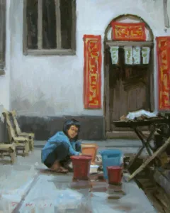
In oils, greeking is very simple. You simply scribe in some approximation of text and then push the background colors against it. You can do that neatly, as in Ken DeWaard‘s example above, or mushily, as in mine, at top.
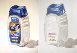
In watercolor it is a little more difficult, since you can’t push the paint around in quite the same way. If the text you’re greeking is darker than the background, just scribble it in. If you have to reverse it, I find it’s easiest to write it in with your light color, let it dry, and then push the background in around it.
Try it; it’s fun!
My 30 Watercolors in 45 Days Challenge is an excellent opportunity to try greeking. Anything packaged in your home is bound to have words on it. Or, paint a sign in a landscape and experiment with how muddled or clear you want it to be. How does the painting read differently with different levels of clarity in the text?
Registration is now open for workshops in 2026! Reserve your spot:
- Advanced Plein Air Painting | Rockport, ME, July 13-17, 2026
- Sea & Sky | Acadia National Park, ME, August 2–7, 2026
- Find your Authentic Voice in Plein Air | Berkshires, MA, August 10-14, 2026
- New! Color Clinic 2026 | Rockport, ME, October 3-4, 2026
- New! Composition Week 2026 | Rockport, ME, October 5-9, 2026
Can’t commit to a full workshop? Work online at your own pace: