A game-changer for watercolor?

It's a danger when you come to visit; I probably will make you work.

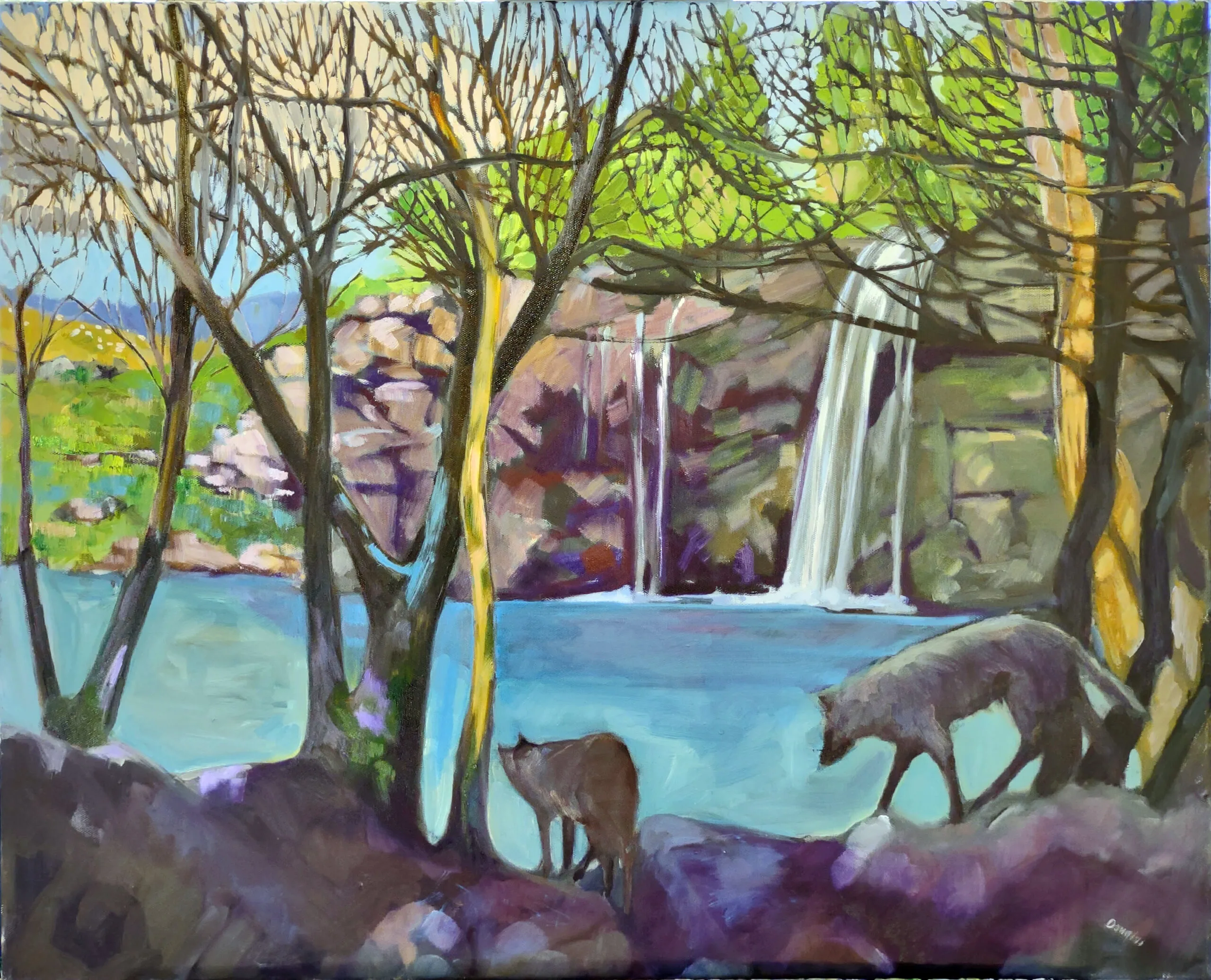
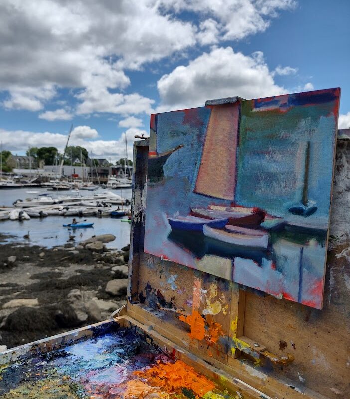
It’s a danger when you come to visit; I probably will make you work.

Watercolor painters have several options for transferring their sketch to paper. They can hope they get it right without guidelines at all. That has never worked for me; I’m far too impulsive.

Or, they can sketch in light pencil lines. Pencil can be very charming under watercolor, but make the marks too dark or numerous, and they’re jarring. Excess erasing will damage the surface of the paper. As soon as you’ve painted over pencil marks, they’re fixed in place forever.

Underdrawing done with Pilot FriXion pen.

Another solution is to paint in guidelines with a very dilute solution of Neutral Tint and a tiny brush. This is a technique I learned from the late painter James Asher, and it works very well with his meticulous, carefully-realized style of painting. I’ve found it works better in controlled studio work than in loose plein air work, however.

My daughter Mary recently bought herself a Cricut machine and in the process of fiddling with it, learned about the Pilot FriXion pen. It comes in .7mm or .5mm and a variety of colors, and it erases with the heat given off by friction. For a watercolor artist, this has tremendous potential, if it means we can erase drawing lines using a hair dryer.

Diane’s watercolor before erasing the line drawing.

As I live in the deep woods, I was able to buy only a .7mm point; it was fine for my test, but I’d probably buy the finer point if given a choice. According to the package, the usable temperature range is 14-140° F.

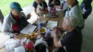
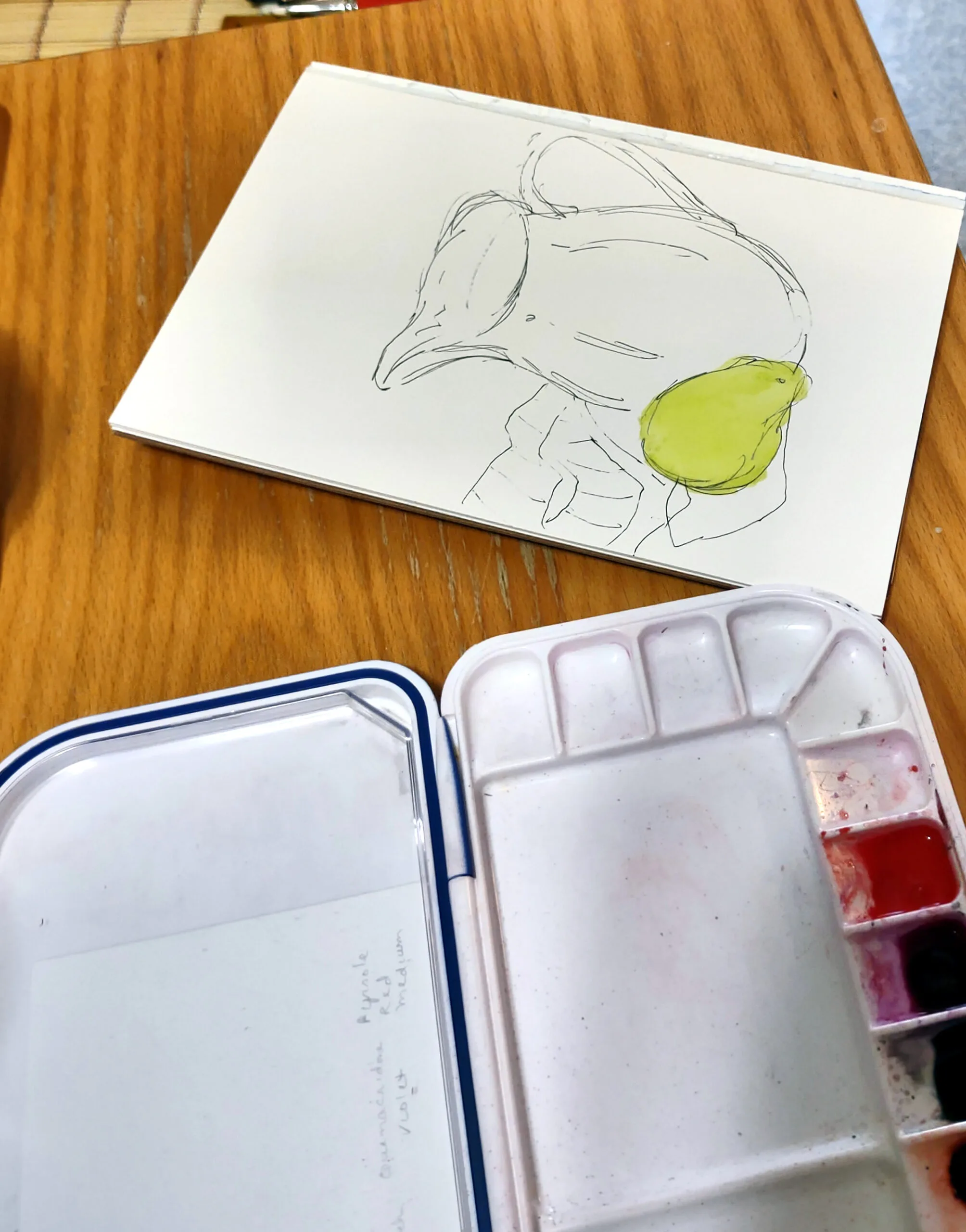
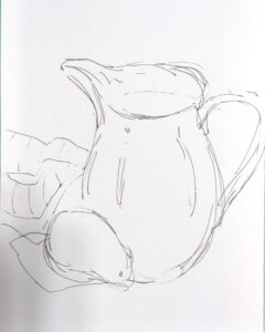
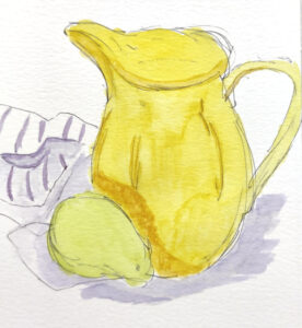
My student Diane Fulkerson is visiting, so I asked her to test it for me. (I’m telling you the specific materials she used so that you, too, can do your own scientific tests). I gave her a sheet of Strathmore 400 watercolor paper. Starting with a quick drawing of a pitcher, a pear and a towel, she limned in the colors with QoR paints.

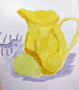
At this point the painting looked like a basic pen-and-wash exercise, and therein lies the danger of forgetting that these marks will completely disappear. When we hit it with the hairdryer, the marks really did vanish, leaving some lack of definition. “After the lines disappeared, I was left with just basic shapes,” said Diane. She then went back in and added shadows and a few details.

Diane’s watercolor looks a little barren without the pencil lines. Nothing a bit of painting won’t fix.

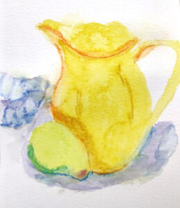
Will the lines reappear over time? I can’t say, but as an experiment, we tossed it in the freezer (around 0° F) for about two hours to see if the lines reappeared; they did, ever so slightly. Don’t store your finished artwork in your unheated north-woods cabin over winter and you should probably be okay.

After she erased the lines, she added more marks.

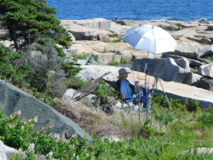
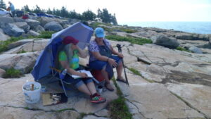
I bought a few more and I’m taking them and my hair dryer to Acadia to see how my Sea & Sky workshop students like working with them. If you try this, let me know what materials you used and how it worked.

“I thought it was cool,” said Diane, and I can’t disagree with her.

From the archives: Extreme painting

My guest expert (my daughter) wrote this post in 2018, because I was indisposed due to medical tests. I’m having tests again today (one of life’s eternal verities) and was reminded of this classic.
The Road to Seward, Alaska, by Carol L. Douglas

Dear Carol,

Last week, you mentioned the wild turkeys near your residency. I am, unfortunately, afflicted with both hoplophobia and meleagrisphobia – fears of guns and those creatures most fowl. When is it appropriate to pepper spray a turkey?
 
Yours, Allie N., New Mexico
 
Allie,
I have good news and I have bad news. As of 1992, the EPA was still looking for data on the effectiveness of capsaicin (the active spicy spice that makes spices spicy) against birds.1They accepted that it was probably effective against birds, in addition to other animals. Obviously, it has been several years since then. Two scientists at the University of California, San Francisco, discovered in 2002 that, while birds have the vanilloid receptors that taste capsaicin for us, theirs are immune to capsaicin.2 In conclusion, you could probably pepper spray a turkey and it would irritate and startle him. However, you’d get the same effect by shrieking and flapping your arms wildly. In my opinion, the perfect time to pepper spray a turkey is directly before he goes into the oven.
Mary Helen
The Alaska Range, by Carol L. Douglas
Greetings Carol,
 
It’s my favorite time of year here in Success, Saskatchewan – the air is crisp and clear, the leaves are changing, and it’s finally moose season. I can’t wait to make all my favorite moose recipes once my wife comes back from hunting. Moose chili, moose enchiladas, moose tartare, coleslaw with moose meatballs, moose bulgogi – you name it, I’ll eat it! I love going with my wife on her hunting trips all around the wilderness of Saskatchewan. You’ve been there. You know how it is! It’s a great time to do some plein airpainting while enjoying some quality time with the missus. How can I best keep myself from getting mistaken for a moose? You know, we share so many of the same features.
 
Bill Winkleman, Saskatchewan
 
Bill,
Moose season in Saskatchewan this year is from October to December. Soon it will be too cold to do much painting en plein air. However, here’s good advice on how to avoid being mistaken for a large ungulate:
  • Wear brightly-colored clothing when out in the woods. I recommend a large, heavily starched tie-dye wizard’s hat.
  • Try to sing as loudly as possible at all times. It’s common knowledge that moose are fans of jazz and Scandinavian black metal, so stick to old pop standards and famous Canadian sea shanties.
You may find that when you’re painting en plein air, you may find moose walking around en trails. Worse than that, you may find that some enterprising hunter has left moose entrails en trails and you have to walk gingerly. I recommend wellies.
Mary Helen
Confluence, by Carol L. Douglas
Carol –
 
My Oma and I are planning a cycling trip up the Alaska Highway next summer. We’ve already begun shopping for a truly inspiring collection of very tight, padded shorts and we’ve got our cameras ready to see all the wildlife. How do you get your best photos of bears?
 
Hildegard
Hildy,
It’s GREAT to hear from you again! My advice for taking photos of bears from your bicycle from the shoulder of the Alaska highway is, uh, DON’T!
Black bears can run between 25 and 30 miles an hour and brown bears can run even faster. A ridiculously lost polar bear can run even faster than that! For comparison, your 97-year old grandmother can probably only manage about ten miles an hour. Just put something to make noise in the spokes of your bike and leave the bears alone. Instead of stopping to photograph them as they forage on the roadside, why not take a quick snapshot of the other tourists taking their picture as you zoom by to safety?
Laird Hot Springs, by Carol L. Douglas. This was the site of a fatal bear attack in 1997.
In July 2018, conservation officers in British Columbia responded to 25 calls about grizzlies and 179 calls about black bears.3,4The Yukon Government reported that at least 63 bears were killed in Yukon,5a five-year high. Human interaction with bears is not only dangerous for the humans, but dangerous for the bear. Remember – a fed bear is a dead bear.
Mary Helen
  1. R.E.D. Facts – Capsaicin. (1992, June). Environmental Protection Agency.
  2. Jordt, S., & Julius, D. (2002, February 8). Molecular basis for species-specific sensitivity to “hot” peppers. Cell, 108(3), 421-430.
  3. Predator statistics: black bear. (2018, September). Conservation Officer Service of British Columbia.
  4. Predator statistics: grizzly bear. (2018, September). Conservation Officer Service of British Columbia.
  5. 63 bears destroyed in Yukon this year because of human conflict. (2017, November 29). CBC News.

Monday Morning Art School: start with value

Lobster pound, 14X18, oil on canvas,  $1594 framed includes shipping and handling within the continental US.
Lobster pound, 14X18, oil on canvas, $1594 framed includes shipping and handling within the continental US.

There’s an old saw that goes, “value does all the work and color gets all the credit.” I tend to not repeat it because value is just one aspect of color. It’s like saying ‘my arm hit that ball and my body gets all the credit.’ Nevertheless, it points out an essential truth.

A review, for those of you who are new to color science:

Value – How light or dark is the pigment?

Hue – Where does the color sit on the color wheel? All colors fall into one of the following hue families: red, orange, yellow, green, blue and violet. Within those families, however, are many subdivisions.

Chroma – How much intensity, or “punch” does the color have?

Spring Greens, 9X12, available.

Value is the key player in our first reading of a painting. It drives our perception and guides us through the painting. When we understand this, we can substitute any hue in a painting—even unreal, high-intensity colors—as long as they’re the proper value.

The inverse is also sadly true. “I substitute off-value color and chroma for accurate value. Then, except for a couple spots of high-chroma yellow, I wonder why my paintings are flat,” a student told me. He took that observation and ran with it, painting only in greyscale for months.

That might be a little extreme, but preparatory work in value is important. If you've never tried value sketching before, start with this set of grey markers and a simple Strathmore Visual Journal (in Bristol finish). Practice simplifying complex scenes into simple value structures.

There are various ways to sharpen our focus on value: notans, value sketches, and grisaille underpaintings being the most popular. However we get there, the first step of a good painting is to see each composition in terms of its value structure.

The same is true in watercolor, of course. Untitled class demo.

Alla prima painting requires great skill in color mixing, because the goal is to nail it on the first strike. That goes not just the for darks, but every color in the picture. Even a painting with wonderful shadows and lights will have many middle tones, often closely related in value. These are actually the most difficult colors to mix accurately. If you have a painting that isn’t working, ask yourself if it has a full tonal range, or is it simply hitting the highs and lows. For example, when people get in trouble painting texture, it’s usually because they’re overstating the contrast.

All color is relative, meaning it depends on its neighbors. That’s particularly true when it comes to value. Below see a plate from Joseph Albers’ groundbreaking Interaction of Color. The inner violets are the exact same value. But the framing color influences how we see those values, so one looks much lighter than the other.

Plate IV-4 from Joseph Albers' Interaction of Color, demonstrating how all color is relative. The inner violet colors are the same exact value, but what surrounds them influences how we perceive them

There are three things to remember:

Value judgments are subjective. There’s no reliable way to measure the value of a color. The camera is as subjective as the human eye.

You can’t get a color to go darker than its ‘natural’ value without distorting the hue or chroma. Thus, there is no natural dark version of cadmium yellow, so the shadows in a yellow object require a workaround.

All pigments can make about the same number of discrete steps. While the yellows have a shorter range, the steps are more noticeable. Blues can mix from almost-white to almost-black, but the middle points are very similar.

This page contains affiliate links for some but not all products. If you choose to make a purchase after clicking a link, I may receive a commission at no additional cost to you. Thank you for your support!

The limitations of style

Ravenous Wolves, oil on canvas, 24X30, $3,478.00 framed includes shipping and handling in continental US.

I’ll be painting next weekend in Camden on Canvas. I’m a little rusty because my time right now is being taken up by things that have nothing to do with painting. While I can’t go out and do a full plein air painting, I’m taking an hour a day to practice. These little ditties have no higher-level thinking and the subject is unimportant. For example, yesterday I painted a basket of beach toys.

I don’t worry about finishing these sketches. To paint like that occasionally is a relief, for style can be a trap and a delusion.

The Late Bus, 8X6, oil on canvasboard, $435 framed, available.

A reader told me yesterday, “My goal this summer is to get closer to a point of view and/or style.” I’m all for understanding point of view; it’s the deepest discipline in painting (and life). But style is something that should develop naturally. Forcing it stymies development.

Style is the mark-making, composition, color palette and other attributes in a finished work. Style ties an artist’s work together in one body, and it ties that artist to a specific time and place. It’s the art historian’s best tool for classifying artwork.

I can never be a Scottish colourist, any more than I can be Wayne Thiebaud. We’re each tied to our own specific moment. Imitating the style of Dead Masters is a sure path to irrelevance (while copying them is a great learning technique).

Great painters choose beauty over stylishness, even to the point of seeming awkward to their contemporaries. The difference is depth and staying power. It takes some scratching to get down to fundamental truth.

Beautiful Dream (Rockport Harbor), oil on canvasboard, 12X16 $1,449.00 framed.

A good artist investigates thorny questions, not just about the world, but about painting itself. When they are answered, he moves on, just like Omar Khayyam’s moving finger. Often, by the time we get through the cycle of making and mounting a body of work, we’re no longer that interested in it. We’ve moved on to another struggle.

Each time we pick up the brush, there’s variation in how we approach painting problems. I might use a palette knife for a sky, even though palette knife painting is not part of my regular repertoire. I’ll occasionally revert to painting the way I first learned, with lots of detail and modeling. I refuse to box myself in by saying that a technique is inappropriate because it isn’t my style. ‘Embracing your style’ is a trap that painters may not be able to escape.

There’s a difference between style and being stylish. I enjoy Olena Babak’s ability to describe reflections in a single, fluid brush line. That’s not styling; it’s self-confident skill that results in stylish brush work.

Sometimes, what people call style is just technical deficiency. For example, some painters separate their color fields with narrow lines—white paper in watercolor, dark outlines in oils. I’d like to know that they embraced this voluntarily, not because they never learned how to marry edges.

Wreck of the SS Ethie, oil on canvas, 18X24, available

I do not admire painters who use the same scribing or pattern-making on the surface of every painting. It’s style for its own sake, and it often is just a ruse to cover up badly-conceived paintings.

Mature artists don’t generally think about style. At that point, style is the gap between what they perceive and what comes off their brush. That’s deeply revelatory, and it can be disturbing when we see it in our own work.

Some of us try to cover that up with stylings, not realizing that those moments of revelation are what viewers hunger for. They—not the nominal subject of the piece—are the real connection between the artist and his audience.

Common sense isn’t that common

The Schoodic Peninsula has some wild and wooly scenery.

Jennifer Johnson has been my monitor for Sea & Sky at Acadia National Park for six years. In all matters other than painting, she knows more about the workshop than I do. I’m not impractical, but my focus is on the instruction. Plus, to be perfectly honest, I’ve never really learned how to keep a sensible calendar.

Every year, I send students a supply list and a copy of my own personal packing list. Every year, I get the same question back: “Do I really need dress clothes?”

Jennifer takes the photos while I get to paint, which is why I don't have any pictures of her.

In Maine, dress clothes can mean your best flannel shirt, not to be confused with the everyday flannel shirt in which you go fishing or change the oil. That’s not mere reverse-snobbery; a good flannel shirt can be an investment. Also, there’s no telling when it might suddenly be necessary—the most clement summer wedding can suddenly be swept by a cold wind from the north that will set your bunions aching. That, by the way, is one reason mass transit will never really catch on here—we need cars to stash our spare gear in the event of a sudden turn in the weather.

At any rate, this packing list has taken me around the world. I modify it for the places I’m heading and the situations I expect. No, I don’t wear jewelry in Yukon Territory. I’m unlikely to need my Grundens waterproofs in Delaware. Unlikely, but not impossible. I once painted an event in the dregs of a hurricane in Rye, NY with my buddy Brad Marshall, and I’ve never been wetter.

I spend a lot of time traversing rough terrain to get from painter to painter. It's a good thing I'm so dang young and fit!

Things have changed over time. For example, there’s no call now for reading material when we all carry the universe on our phones. When I first wrote this list, nobody wore watches that needed charging; you either replaced a battery or wound them up.

This is a universal list, from which the painter can pick or choose as appropriate. However, it would never have occurred to me to do something as simple as add a heading to explain that. This year, Jennifer, in exasperation, wrote her own, revised copy of the list. From now on, I’m sending both to my students.

Over the years, my monitors have had to deal with some odd problems, like broken easels, interpersonal conflict (it happens occasionally), and lost students. Jennifer is pretty unflappable, so I haven’t yet met the circumstances where she’ll lose her cool. A bear might do it, but that hasn’t happened yet.

But I like nothing more than sitting at Schoodic Point discussing watercolor with my old pal Becky, who has come back year after year for more of my malarkey.

This is an unusual workshop in that residents are supplied their meals. That’s sensible, because Schoodic is isolated; you can buy a sandwich at the local gas station, and there’s a small grocery store in Winter Harbor. However, the macadamia pancakes and freeze-dried fruit smoothie crowd is SOL, as they say. That’s the price we pay for a real wilderness experience.

But it does put food service in some ways into our hands. Left to my own devices, I’d eat Slim Jims for a week. It’s really helpful to have someone working with me who remembers to handle the lunches.

Yesterday, Jennifer pointed out to me that I have an impossible scheduling conflict at the beginning of the workshop. I’m supposed to be at the auction for Camden on Canvas on Sunday from 4-6, and welcoming students to Schoodic at the same time. They’re two hours apart.

Oops. Such is my faith in her that I can just plan to get there as soon as I can. I could never do that if I didn’t trust her absolutely. A good monitor is worth her weight in gold.

By the way, this week a humpback whale was visiting the Rockland breakwater and Camden harbor. Here’s a video off the deck of schooner American Eagle, and one from Curtis Island Light. Between that and a seal kill by a Great White Shark off Owls Head last week, it’s been an awfully exciting week for marine spotters.

Monday Morning Art School: is this painting finished?

Best Buds, 11X14, oil on canvasboard, $1087 framed includes shipping and handling in continental US.

On Friday I wrote about a painting I’d been carrying around in the hope of finishing, only to realize that it was already done. That provoked an outpouring of emails. Most of us have had the opposite experience, where we painfully noodle a good painting to death.

Sometimes, paintings are finished but are just plain bad. No amount of reworking can fix a fundamental design flaw. The classic Hail Mary pass in this situation is to add a tchotchke—for example, a seagull in flight. These last-minute additions merely complicate bad design, they don’t resolve it. Sometimes fundamental design flaws can be resolved by recropping the canvas with a knife or saw, but most are destined for the burn pile. This is why painting teachers harp on sketching and planning.

Bracken Fern, 9x12, oil on canvas, available.

Apply formal standards of criticism to your own painting

Assuming the fundamental composition is solid, the painter can analyze his own work against the formal elements of design, which include:

  • Focal point—is there a focal point and series of focal points, and is the viewer’s eye directed to them with contrast, detail and line?
  • Line—is line used effectively and reinforced in the painting?
  • Value—does the painting have a solid value structure? Does it need to be restated or is it clear?
  • Color—is there a cogent color scheme? Is it expansive enough to be interesting?
  • Balance—does the painting hit that sweet spot between static and riotous?
  • Shape and form—are there interesting shapes in the painting?
  • Texture—is there enough paint on the canvas to make the brushwork compelling?
  • Rhythm and movement—is there energy driving you through the canvas?

If any of these elements are unfinished or poorly realized, the painting is not done.

Tom Sawyer's Fence, oil on canvasboard, 14X18, $1275 unframed.

Listen to your gut.

I don’t like the imperious “Not another brush-stroke!” approach to telling people to not overwork a painting. After all, we can’t know where the finish line is unless we occasionally overshoot it. But our own gut often tells us the same thing. I generally work on paintings until I’m tired of them. That’s my intuition speaking.

Be careful whom you ask for critique

“I painfully witnessed someone undo a beautiful painting yesterday in the figure studio,” a student told me. “I stepped into a continuation of a pose from Monday. The painting was a striking likeness of the model and quite charming. It improved with a background and some tweaks during the first 25-minute sitting. Then the artist asked the studio for suggestions. From there, it was a snowball downhill.

“There were more questions and tweaks at every break during the three-hour session. The portrait ended up muddy, the face too fat, the likeness and charm gone.”

With very few exceptions I don't solicit criticism from my peers. When it’s offered, I carefully consider the source. In most instances, I’m better off setting the work aside and reviewing it when I’ve disengaged emotionally from the work.

Furthermore, that painter was doing a small (9x12) head over a six-hour session. That’s simply too long to fuss over such a tiny canvas. He or she would have learned more doing three two-hour studies in the same time-frame.

Mountain Fog, 12X9, $869 framed, $696 unframed.

Stop when you’re tired.

One of my students has a quilting rule of putting her work away immediately when she hears herself saying, “I’m going to sew just one more seam today.”

I push past that limit every time I sew, and it always results in a long, irritating session with a seam-ripper.

Are you hungry, thirsty or tired? Are you rushing because you only have a few more minutes left to work? If you’re starting to lose focus, stop and put the work away, because whatever you do next won’t be pretty.

Is that painting finished?

Drying Sails, oil on canvas, 9x12, available on my website later this morning.

When I’m wondering, “is this painting finished?” the answer is usually yes.

Camden Harbor before the day begins, 8x10, oil on canvasboard, available on my website later this morning.

I’ve been carrying a small 8x10 around in my backpack for a few weeks, hoping to run into Ken DeWaard so I could ask him if he had a reference photo from that day. It’s of the ketch Angelique, on the left, and Lazy Jack II. I’ve got a good visual memory, but that was last summer or perhaps the summer before. Not only has the detail faded in my mind, any sense of what I wanted to ‘finish’ has disappeared as well.

I caught up with him Tuesday, when our respective painting classes ended up on the same beach. (If you haven’t seen this story from Owl’s Head, it’ll encourage you to keep your footsies out of deep water this summer.) Ken shook his head and said, “I got nothin’,” and laughed. “If it was earlier this summer, maybe.” Such a day is indistinguishable from a thousand other painting days, unless it results in a painting one loves enough to keep. (We paint a lot of dreck along the way.)

I propped it up on a bench and pondered. Is it really not finished? There’s detail I’d love to add, and the masts look chunky. But they so often do on windjammers, which were originally built not as yachts but as working boats. The color is coherent and evocative, and the brushwork is unified and expressive. What’s really left to add?

Owl's Head, Early Morning, 8X16, available.

The painting of Owl’s Head lobster boats, above, is another example of one I toted around until I realized it was done. I recently popped it into a frame and now I love it just as it is.

I’m in a boat-painting tear, and it’s not always going well. “I’m channeling George Bellows,” I told Bobbi Heath as I hacked farther and farther into the weeds on a canvas that probably ought to go in the woodstove. As always, the problem started out compositionally, but the students in my Zoom critique class suggested that I get rid of a big green dumpster on the dock. That helped, but it’s still way too busy and way too bright—without Bellows’ incisive wit and commentary. No reference photo will save this canvas. It’s overbaked and underthought.

Meanwhile, I met Björn Runquist to practice our chip shots in advance of Camden on Canvas. “There’s a nice angle of Lazy Jack from that bench over there,” I told him. Had either of us been smarter, we might have asked why I wasn’t painting that schooner myself. The answer, riding in my subconscious, is that she’s a daytripper. You can’t trust her. You get her limned in, all beautiful, and she up and leaves you. Sure enough, that’s what happened to Björn. Oops.

Coming Around Owl's Head, 6x8, is available through Cape Ann Plein Air's online sale.

It had rained, so Lazy Jack was running her sails up and down to dry them off. This is a subject that fascinates Ken DeWaard, so I try to avoid it. Occasionally, however, it’s irresistible, because it adds another compositional dimension to boats in harbor. Having learned my lesson, I finished the painting, at top, quickly, before I forgot what I was doing.

I’m absolutely horrible at taking reference photos. I get caught up in the moment and the light. By the time I remember, it’s too late. Still, it’s something I’ve resolved to do better. But taking the painting back into the studio and adding details has the potential to stomp on its beauty. When I’m wondering, “is this painting finished?” the answer is usually yes.

First world problems are real problems

Black House, 18X24, oil on canvas, Carol L. Douglas

I’ve got a student who’s been waiting for a chip for his GM pickup truck for several months. “First world problem,” he says good-humoredly when I ask him about it. I get that he means it as an expression of gratitude that his problems aren’t bigger, but it’s an expression that bugs me. It rests on a logical fallacy. First-world problems are not inherently less-important than those of the developing world.

Yes, food poverty is an extreme and crushing problem, but so too are fatal drug overdoses. Affluence increases longevity, but it’s not a strictly linear relationship; otherwise, Bangladeshis (averaging 72.1 years) would not outlive Indians (averaging 69.7 years).

Manhattan bridge approach, 9X12, oil on canvasboard, Carol L. Douglas

Obviously, I can’t speak for the developing world, but I doubt their lives are characterized by endless misery and suffering. We all have our joys and sorrows, big problems and trivial ones.

A vehicle, a reader chastised me recently, is not a necessity. “High gas prices are a good thing. We should walk more and use public transportation,” she wrote. I don’t know where she lives, but that’s not practical for most of us. Even those who live in large cities rely on internal-combustion engines. Everything they consume is delivered by truck; their trash is invisibly whisked away in trucks. Subway trains and busses are, overwhelmingly, diesel. Food is grown on farms, using tractors, powered by diesel.

A truck sitting at a dealership, undriveable, represents something more than inconvenience. It’s a major financial asset that’s depreciating without being usable. It represents trips that can’t be taken and work that cannot be done. For the dealership, not finishing the job means lost productivity.

Beach toys, oil on canvasboard, Carol L. Douglas. Four out of five travelers are experiencing disruptions this year. It hurts.

Multiply that by 95,000 GM vehicles sitting on lots without chips, and we’re talking about billions of dollars of lost revenue. That will inevitably translate to laid-off workers. And that’s just one car manufacturer.

“First world problem” is sometimes used as a comical apology about trivial concerns. In this sense, it’s a humblebrag, since it points out that you can afford $5 for a cup of coffee in the first place, or to lose another set of AirPods. It’s checking your privilege before someone else has the chance to check it for you, and that’s where it gets really ugly.

Tomatoes, oil on canvasboard, Carol L. Douglas. Not being able to grow your own food is definitely a first-world problem.

If you complain that you spent two hours in a security line at an airport and missed your connection, and someone responds “first world problem,” they’re really just saying “STFU; I don’t care about your troubles.” Travel problems are very real; 4 out of 5 travelers this year are reporting some kind of disruption.

Artists are the canaries in the coal-mine of the economy, as aesthetics are pretty high on the hierarchy of human need. I’ve worked through six recessions, and they’re no fun. We’re not in one yet, but we’re in a period of economic turmoil. We’re seeing all kinds of fallout in the art business this summer. Dismiss this as a first world problem if you want, but please don’t say it within my earshot.

Monday Morning Art School: most rules of painting are written in sand, not stone

The Logging Truck, oil on archival canvasboard, 16X20, $2029.00 framed includes shipping and handling in continental US.

Rules are meant to be learned—and then, after mastery, some can be broken.

A few weeks ago, my plein air class was working on Knox Street in Thomaston. Eric Jacobsen was painting in his own yard nearby. A student asked me the secret to painting bigger canvases. “Bigger brushes,” I told him. “Walk over there and see how Eric’s doing it.” I know Eric’s a generous soul and wouldn’t begrudge him the peek over his shoulder.

It turns out that Eric was limning in big, fat, audacious peonies with a delicate #8 brush. “It thinks like a big brush,” he explained. Even as I smiled at his infectious humor, I understood his point. He wasn’t making sweet little marks with it, but sweeping gestures.

Spring Allee, 14X18, oil on canvas, available.

Most plein air painters create a plan before they start. Depending on the complexity of the painting, this sketch can be either simple or quite detailed; however, it lays out the composition as a series of values. Ken DeWaard, on the other hand, starts with a series of charcoal hash marks across his canvas. Natalia Andreeva is another painter who omits the sketch stage. She believes it makes for fresher work.

Everyone ‘knows’ that watercolor is painted light-to-dark, but I’ve watched Poppy Balser paint in a wall of black spruces and then wash the sky right over it, giving the whole composition a trembling northern glow.

Dark-to-light is one of the principle rules for oil painting, and for good reason; it is very difficult to make corrections over tints in alla prima painting, even when you’ve carefully wiped out your mistake. It’s a rule I often break. Having laid in my darks, I sometimes place the mosaic of lightest lights against it to see how the composition reads. I can do this because I work from a careful sketch. Ken DeWaard has jokingly called my technique ‘paint-by-numbers’.

My set-up for a large plein air painting. Note my sketchbook at my feet, and that I jumped from the darkest darks to capture the clouds before they left.

I teach a protocol that takes students through design, preparation, and execution. I tell my students that what I’m teaching are the most accepted practices in painting, but they’re not the only way to do things—people have broken painting rules since the beginning of time.

Sometimes that ends very badly, as with the canvases of Albert Pinkham Ryder. He was an inveterate tinkerer, working canvases for a decade or longer, applying sequential layers of paint, resin and varnish. He paid no attention to the drying speeds of his materials, and tossed in things like candle wax, asphalt, and non-siccative oils. These weird techniques gave his paintings unparalleled luminosity that dazzled his contemporaries. Sadly, the results were unstable. His paintings darkened, cracked, and sometimes completely disintegrated.

Ryder ignored two fundamental rules of painting: fat over lean, and don’t add weird stuff to your paints. (The latter isn’t really a painting rule but plain common sense.) But, aside from the fundamentals, other rules can be broken, or at least modified. They’re meant to give the artist a good working method and a way of seeing quickly. If, as an artist develops, a particular step becomes a hindrance, it makes sense to get rid of it. But that’s only appropriate after mastering the process in the first place.

Perfect is the enemy of good

Mudflats. It's a start.

This blog was on Google’s Blogger from 2007 until the present (with a short hiatus during which it was hosted by the Bangor Daily News). Blogger is a simple platform, but in 2021, it suspended support of its RSS web feed. That meant that people could no longer subscribe.

After consulting with the usual experts, I determined that it was sensible to bring it in-house, onto my own website. I have a tenuous relationship with my website—it’s a large beast that I placate by throwing content over the fence and then quickly running away.

Importing 15 years of blog posts was way above my skillset. In May, I wrote about hiring an expert. Unfortunately, she finished just as I started my hike across England. It was easier to just keep writing on Blogger. The posts piled up. I didn’t dare ask Deepika to do another import, so yesterday I finally sat down and moved the remaining mess on my own.

Drying sails in Camden harbor. We're taking practice shots before Camden on Canvas.

It’s not elegant. I’ve had 15 years to make Blogger look exactly as I want—font, header, nested links, advertising. But it’s done, and as of today, you should be getting this feed in your mailbox if you’re subscribed. And if you’re not, you can subscribe 
 oh, darn, the subscription box has migrated away again. Another task for Deepika, until I can master this interface.

When my father was 63, he was secure in his expertise, partially because there was a secretary who did all the technical stuff for him. When my grandfather was 63, he was dead. In contrast, my husband and I spend inordinate amounts of time and effort mastering new technology. In almost every field, we’re barraged by new information and equipment.

Apple Blossom Time, 9x12, oil on canvasboard, $696 unframed. I painted this with Eric Jacobsen last summer.

There are two lessons here, both of which I think are hopeful. The first is that, at 63, I see no sign of mental exhaustion or slippage. All this struggle is keeping me mentally agile.

The second is
 oh, shoot, I forgot the second.

It’s summer, so I go out in the morning and painting for a few hours. Then I head home and open my gallery. It’s exactly the right amount of time for a good start. Last week I painted with Ken DeWaard. I painted an absolute stinker. This week, Björn Runquist and I have been practicing our chip shots together and mine have gotten better.

Spring Greens, 8X10, oil on canvasboard, $522 unframed.

“How can you be rusty?” my husband, who’s a bass player, asked me. “Isn’t painting a mental skill?” Painting and music are both combinations of the mental and the physical, and the two are closely intertwined.

Are my painting starts perfect? Heck, no. Do they show promise? Yes.

Oh, yeah, that was my second point: it doesn’t matter if my blog or paintings are good or bad. They won’t get better unless I actually work on them.