Chromophobia

Until you start playing and experimenting, you won’t really own your own color pathway.

Bobbi Heath once posited to me that painters learn to manage color in three phases:

  • They make everything grey;
  • They vastly overshoot the chroma;
  • They finally learn a pleasing color sensibility.

 â€œIs it even possible to overshoot the chroma?” I riposted, because I’m apparently stuck in the second phase. I was joking, of course. In being a high-chroma painter, I’m operating within my own time and place in history. High chroma is part of our current landscape painting style.

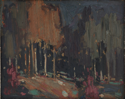
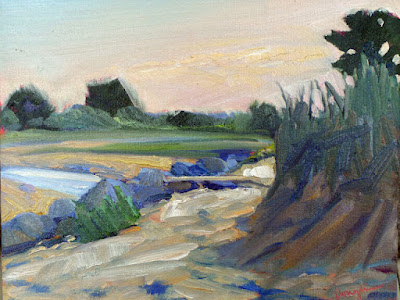
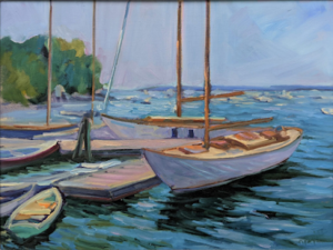
Beautiful Dream, 12X16, oil on archival canvasboard, available.

(For those of you new to the discussion, chroma is one of three aspects of color, which you can read about here. It means how intense the color is. Grey is low-chroma; fuchsia is high-chroma.)

Bobbi had it right, of course. Painters start in a world of soft greys because grey is safe. They need to blow through that safety net to master all aspects of color.

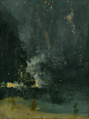
The problem is exacerbated when the painter lives in an area with grey skies. I spent 21 years in Rochester, NY, where the weather is controlled by tempestuous Lake Ontario. Those damp, overcast skies were great for gardening and my skin, but they mean indirect light. That, in turn, can lead to gloomier color and less separation between lights and darks. Beautiful, but dull in a painting—unless you take a page from the Luministplaybook and straight-up lie. Before you can do that, you have to be able to see it.

Giving birth to a brighter color palette can be painful. Brilliant color looks garish at first, often because our first experiments at high-chroma painting are garish. The question of color harmony is more important when our painting isn’t subdued by a leavening wash of grey. With chroma elevated, we can no longer ignore when color combinations don’t work.

Bracken Fern, 9×12, oil on archival canvasboard, available.

You can’t get to that phase of development until you let go of the crutch of neutrality. This is one area where a teacher or mentor can be a great help. “Leave it,” we say. “Set it aside and look at it again in two weeks.” Actually, it would be more helpful to set it aside and paint twenty or thirty paintings in this new high-chroma space until you start to see how it hangs together.

Yes, you’ll make some awful paintings. It’s a necessary phase of growth. “No mistakes, no success. Know mistakes, know success,” my buddy Ivan Ramostold me yesterday. That’s never truer than with color. I can lecture all year about color interaction but there are millions of ways to lay colors down next to each other. Until you start playing and experimenting, you won’t really own your own color pathway.

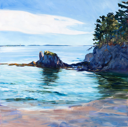
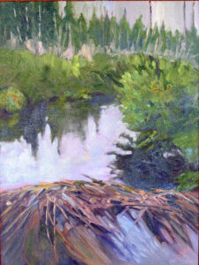
Quebec Brook, 12X16, oil on archival canvasboard, available.

I encourage my students to have tintson their palette because they help keep color clean. These premixes can save a lot of time and prevent a whole lot of dullness.

None of this is to say there isn’t room for neutrals in painting. Of course, there is, and the third phase of color management is to add those neutrals back in. (I’m still waiting.) But let’s not jump the gun here; neutrals are in some ways the apotheosis of color, a counterpoint to chroma. They come last in our color-sensibility development.

Monday Morning Art School: the nocturne

Forget the fairy-lights; a good nocturne follows the same rules as any good painting.

Hunter’s Supper, c. 1909, Frederic Remington, courtesy National Cowboy and Western Heritage Museum
Nocturne is a term appropriated by James Abbott McNeill Whistler from music. Whistler used it to title works that evoked the sensation of nighttime or twilight. It didn’t mean just any painting done at night. The difference was whether the absence of light plays a role in the painting’s construction and meaning.

Prior to the Industrial Revolution, the night was a more powerful force than it is today. It’s no surprise that nocturnes have always had a place in art. Giotto’s The Kiss of Judas (c. 1304) is an early example. By the 15thcentury it was a tradition to set the Nativity and Annunciation to the Shepherds as night scenes, pitting the Light of the World against darkness for dramatic effect.

Nocturne in Black and Gold – The Falling Rocket, 1874, James Abbott McNeill Whistler, courtesy Detroit Institute of Art

The 17th century brought us chiaroscuro, tenebrism and three great interpreters of darkness: Rembrandt van Rijn, Georges de La Tour, and Caravaggio. In modern terms, most of their paintings aren’t considered nocturnes, because they’re set indoors. But they are nocturnes in spirit. Darkness is palpable and part of the message; it sits in counterpoint to the main theme.

It wasn’t until landscape painting came into its own that we started to see the development of true nocturnes under Whistler’s definition. Ironically, artificial light played a big part in this; it made it possible to paint at night.

Nocturnes are particularly associated with Tonalism, which eschewed the bright colors of Impressionism and Post-Impressionismin favor of neutral colors, diffused light, and soft outlines, all of which naturally suggest low-light situations.

Frederic Remington did about 70 paintings which we might properly call nocturnes before his premature death at age 48. He was very scientific and technical in his approach, which is no surprise for an artist who started as an illustrator.

Nocturne, c. 1914, Tom Thomson, courtesy Art Gallery of Windsor

Remington’s nocturnes are filled with color and light. Their composition is complex, often involving a foreground figure in silhouette, setting off the light source. He experimented with electric lighting and flash photography to make his paintings. That’s ironic in that they’re an elegy for the rapidly-disappearing pre-technological way of life. If you’re interested in the nocturne, the National Gallery’s The Color of Night is an excellent reference book.

Study Remington’s compositions; they’re energetic and well-realized. Too many nocturnes rest on the time-worn device of reflected light. These can be part of a great painting but they won’t carry the whole construction. A good nocturne follows the same rules as any good painting: it rests on a solid composition, it has an integrated color scheme, and its brushwork engages the viewer. If you don’t have those three things, go back to the drawing board.

Painting nocturnes en plein air requires a light. I have a cheap battery-operated book light; other artists use head lamps. The level of illumination should be kept as low as possible so that you don’t blind yourself to what you’re seeing.

Nocturne, c. 1885, watercolor, John La Farge, courtesy Metropolitan Museum of Art

Plein air nocturnes are especially difficult in watercolor. Night air is damp, so paper doesn’t dry well (or at all). Watercolor is simply not designed for large masses of opaque darkness. Sometimes artists use ink instead of watercolor in the darkest passages; I’ve tried it and find it deadens the painting. In general, I’d suggest the watercolor artist start by drawing and move over to paint in the studio.

However, the above painting by John LaFarge suggests a workaround. He uses a medium blue in the place of black, and the viewer’s mind makes the substitution. It’s transparent enough that it would dry in the night air. A nocturne need not always be about the dead of night; it can be of twilight and dawn, too.

Regular readers know that I’m no longer taking beginning students, except in my boat workshops. Bobbi Heath is offering classes to new students in oils, and Cassie Sano has started her first session with watercolor (to rave reviews, I might add)

Bobbi’s classes are pre-recorded so students can go at their own pace. I am intimately familiar with her teaching style and material and know that you will be ready to paint with me when you’ve finished her program.

You can learn more here.

Granite State Gallery: New Hampshire Art and Artists through the Years will look at the history of New Hampshire’s native painters and visitors. It’s tonight at 6 PM, which means I can’t watch it live, so I sure hope they record it.

All the plein air events, at your fingertips

Thinking about competitive plein air painting? Here’s a useful tool.

Beach Erosion, 8X10, oil on canvasboard, $652 framed, available through Ocean Park Association.

I met Chrissy Pahucki at a plein air event. She was standing in line with one of her children waiting to have her canvases stamped. Chrissy’s branding came naturally—she always had a kid trailing along. I once asked a show organizer how many years we’d been doing his event. “You can tell how long it’s been by how much Ben has shot up in height,” he answered.

All three Pahucki kids are grown now and Chrissy’s still doing the plein air circuit. In her spare time, she’s a full-time, award-winning middle school art teacher in Goshen, NY. About a decade ago, she created a website to direct-sell paintings called the Plein Air Store, and she still maintains it.

Quebec Brook, 12X16, oil on canvasboard, $1449 framed.

She also made this spreadsheet for applying to events. It’s a useful tool because it lays out application, notification and event dates in tabular form. That means a busy person doesn’t have to hunt through reams of material looking for a show. Unlike a magazine, it’s searchable. And it’s free. Thank you, Chrissy.

The plein air circuit is where I first met Mary Byrom, Bobbi Heath, Poppy Balser, and many other talented, hard-working and like-minded women. Like Chrissy, they’ve become valued friends. These events are much like the rodeo circuit; the same artists show up at them over and over. Artists compete with each other for prizes and sales, but at the same time, they’re supportive and friendly. That’s a good life lesson right there.

Plein air events teach you to search out beauty. There is something otherworldly about grey, soaking weather that you don’t realize if you only go out when it’s fine. The painting Sometimes It Rains, below, was painted during a complete washout at Ocean Park, ME. I tucked myself into the vestibule at the Temple and painted down Royal Street. Ed Buonvecchio set up right behind me and painted me with my little red wagon. Sometimes It Rains turned out to be one of my favorite paintings. Ed’s painting sold, although why anyone would want me on their wall remains a mystery to me.

Fog Bank off Partridge Island, 14X18, oil on canvasboard, $1594 framed.

Sometimes there’s very little to work with. I once did an event in a coastal resort comprised of boxy modern houses shoved cheek-by-jowl along a strand. We were forced to find something beautiful, and the only way forward was to search shapes for a transformative angle or trick of the light. “You can make a good painting out of anything” is a good painting lesson and an even better life lesson.

Plein air events teach us to finish work. That last bit used to be my undoing. I once perseverated for years over a commission, to the point where it became a standing joke among my students. “Is that thing still there?” they’d ask as they trooped into my studio week after week.

Sometimes It Rains, 9X12, oil on archival canvasboard, $869 framed.

But plein air events allow for no such noodling. There’s an immutable deadline. You hand in work whether you think its done or not. A buyer or judge loves it for its unrefined energy. The adage that we spend 90% of our time doing 10% of the work is true in painting. It’s also true that we sometimes spend 90% of our time overworking that 10%.

Plein air painting is, simply, the most important art movement of our time. If you’re interested in it, I encourage you to dip your toe into the competitive process. Start with a regional show near you and see how it goes. Chrissy’s table is a good way to start.

What constitutes a beginner painter?

I don’t want painting students to pass a test before they start with me; I just want them to be able to thread their metaphorical sewing machine on their own.

 Midsummer, 24×36, $3985 framed. In honor of Canadian Thanksgiving, which is Monday, let’s feature paintings I’ve done in Canada.

As soon as I announced that I wasn’t taking beginners anymore, a number of my students expressed trepidation about continuing with me. “But I’m a beginner!” they said. In some cases, they’re right, but they’re already on the path to understanding painting. In other cases, they don’t have a clue how well they’re painting, and how much they’ve learned.

When I said ‘beginning painters,’ I meant people on their first date with a brush. They’re unclear on the materials and what they’re used for. They’ve never mixed paint or handled a brush. They’ve never heard or considered basic terms like hue, saturation or value.

Anyone who’s taken one of my classes is past this newbie-phase, by definition. And anyone who’s studied with another teacher or taught themselves with the aid of books or videos is unlikely to be a beginner, either.

Ottawa House, 16X20, oil on canvas, $2029 framed. All these paintings were done en plein air.

My friend and student Jennifer Johnson—who taught quilting for many years—says that she would have students in her classes with advanced design skills, and others who’d never threaded a sewing machine before. “Neither of these things are more important than the other,” she said. “But I spent 90% of my time rethreading the machine for the beginner.”

I’m trying to describe something analogous in paint. I don’t want painting students to pass a test before they start with me; I just want them to be able to thread their metaphorical sewing machine on their own.

In fact, I think it’s important to have a class of different levels. Hearing the steps justified and explained to a less-experienced painter is often helpful to the more-experienced painter. Sometimes, an essential principle hasn’t really clicked. Or, our willful brains just forget something important.

Clouds over Teslin Lake, Yukon Territory, 8×10, oil on canvasboard, $522 unframed.

As with every discipline, painters improve at different rates. How fast they learn depends on their natural quickness, how much time they can practice outside of class, distractions, anxieties, and other factors. I could start twelve painters at exactly the same level, teach them the same lessons for a year, and there’d still be a wide range of achievement at the end. That’s natural, and if you’re someone who learns more slowly, it’s nothing to worry about.

The greatest painting classes are marked by camaraderie and good will. The best way to learn something is to explain it to someone else. Those painters generous with their own knowledge are helping themselves as much as they’re helping their friend.

Cobequid Bay farm, oil on canvasboard, 6X8, $348 unframed.

Having said all that, Bobbi Heath tells me she has run up against a problem and will not be offering her introductory oil-painting class this fall. That means that for the short term, new oil painters will still be coming to me (subject to space limits in my classes, of course). Cassie Sano will still be offering introductory watercolor classes, concurrent with my own fall classes.

A new system of training new painters

I’m confident this approach will prepare confident, competent painting students ready to tackle higher-level observational painting, composition, color theory and mark-making.

Breaking storm, 48X30, oil on canvas, Carol L. Douglas, available through Folly Cove Gallery, Rockport, MA

After this session of painting classes, which ends on November 2, I will no longer take beginning painters. I’m simply stretched too thin. Instead, I’m going to send brand-new painters to two excellent teachers. That’s a simple, six-week process in which they will learn the rudiments of paint application, brush-work and color mixing. When they’ve completed this preparatory work, I’ll welcome them back into my classes.

That doesn’t mean every new student must start this way. If you already know the fundamentals of applying paint, I’m happy to work with you, whether you are self-taught or you started in another class. And en plein air, I’m happy to welcome painters of all levels.

Michelle Reading, oil on linen, Carol L. Douglas available through Rye Arts Center.

I’ll be sending oil and acrylic painters to my old friend, Bobbi Heath. I’ve taught students prepared by her and they’ve come to me knowing the order of operations in solid-media painting. Bobbi painted on the side during a long and successful business career. That shows in the workmanlike way she trains new painters. You won’t get a lot of rhetoric from her, just a good step-by-step introduction in how alla prima painting is supposed to be done.

I’ll be sending new watercolor painters to one of my own students, Cassie Sano. Cassie has experience teaching, but she developed a syllabus specifically to train new painters for me. She too is a very logical thinker, and a person of great compassion and kindness. She’s a crackerjack watercolorist, and, more importantly, she can explain how each step works. She’ll demystify watercolor for the beginner.

Main Street, Owls Head, 16X20, Carol L. Douglas, oil on gessoboard, $1,623 unframed.

Where does this leave me? Relieved. My students have been galloping forward for the past few years, working on higher-level observational painting, composition, color theory, and mark-making. It’s unfair to the new painter to be thrown into this melee without the basics under his or her belt.

Alla prima painting comes under many names, including wet-on-wet, direct painting or au premier coup. That French version means ‘at the first strike’, and it’s a perfect description of what has to happen to get the freshness that alla prima painting promises.

Wreck of the SS Ethie, oil on canvas, Carol L. Douglas, 18X24, $2318 framed.

To hit it right on the first strike means a lot of things have to have become second nature—drawing, color mixing, and brushwork. The whole point is to keep do-overs to a minimum. That requires preparation and confidence. I’m confident that this new system of training will enhance both.

Monday Morning Art School: Precision

A good painting requires a good plan. What does that mean? 

This last weekend I was painting in the 14thannual Paint for Preservation for the Cape Elizabeth Land Trust. This always involves a big canvas, and this year was no exception: I painted 30×40.

I always start with a drawing in my sketchbook; when I’m working this large, the drawing becomes paramount. To look at my canvas from a distance meant climbing down into a small ravine and back up the next finger of rock, so I didn’t do it often. Accuracy in that situation requires planning. I transfer the drawing faithfully to my canvas, gridding if necessary. Then the sketchbook lies at my feet so I can consult it for values if necessary.

Foghorn Symphony, 36×40, by Carol L. Douglas, will be available through the Cape Elizabeth Land Trust in late August.

“You write numbers on it?” said Ken DeWaard, who’d stopped by with his morning coffee.

“Numbers and colors,” I said. That’s not my idea; it’s one I stole from an old guy named Vincent van Gogh, who often wrote the colors alongside his sketches. The sun at dawn on Saturday was a lemony yellow, and it would have been easy to remember it as richer and deeper. That would have overridden the sense of a transient sea-fog in the distance, which was causing the five lighthouses of greater Portland to play a fog-horn symphony.

Plein air events like Paint for Preservation have no do-overs. We’re required to put out a good painting. There are two options. You can paint more than one, and choose the best. That seldom works for me, since I’m no judge of my own work in the thrust-and-flow of an event. It’s also a lot of work.

Zeb Cove, 40×40, was my 2020 painting for CELT’s Paint for Preservation.

.
I go with the second, which is to paint one good one from the start, using all the tools at my disposal. Since a painting always goes wrong in the planning stages, I make sure my plan is solid, and then I stick with it.

What makes a good plan?

Precision of drawing

This means proper perspective and measurement. You might think this is irrelevant when the subject is rocks and the sea, but it’s as important there as with architecture. Drawing is the only clue about the distances involved. There’s a contemporary Maine style, which involves fast, loose brushwork, but it rests on a foundation of perfect drafting. In fact, bad initial drawing is a great way to end up with a tight painting, since you’ll constantly have to redraw with your brush.

Four Ducks, 30×40, was my 2019 painting for CELT’s Paint for Preservation.

Precision of composition

This means understanding the motive line, energy, and value structure of your painting from the beginning. A 30×40 painting will take from 8-12 hours to finish. The tide will have gone through one full cycle, and the sun will beat its way across the sky as you’re painting. In order to retain the light structure you started with, you must lay it out in advance—and then you must stick with it.

Precision of color

Nothing makes for a muddier painting than constantly restating colors because you didn’t get them right on the first try. Make a grisaille, and check your mixed colors against it.

Rocky, 36×36, was my 2018 painting for CELT’s Paint for Preservation. I’m detecting a theme here.

To mix color properly, you must be absolutely conversant with the pigments on your own palette. This requires practice. The goal is au premier coup, or to nail it on the first strike. That goes not just the for darks, but every color in the picture. Even a painting with wonderful shadows and lights will have many middle tones, often closely related in value. These are actually the most difficult colors to mix accurately. If you have a painting that isn’t working, ask yourself if it has a full tonal range, or is it simply hitting the highs and lows. 

Time management for artists

The temptation to say yes to every opportunity that comes your way is strong, but it will wreck your focus.

Skylarking 2, 18X24, oil on linen, $1855 unframed.

This week, I cancelled my Cody, WY, workshop. There was nothing wrong with it in concept; it generated a lot of interest. The trouble started when students looked for rental cars. There weren’t any available, and in the nearby larger markets, rental rates were extortionate.

This is nobody’s ‘fault’; it’s an unforeseen result of COVID. However, that doesn’t give me a free pass to ignore the consequences. I still had a lot of clerical work to do to make the cancellation. That—along with the lost work and expense of setting up the workshop up in the first place—is part of the cost of doing business.

This is the time of year when I suddenly notice that I’m making lots of mistakes. That’s because I’m working myself too hard. That’s partly because of summer visitors, but it’s also because of my business model. I live and work in a tourist town, where we make hay while the sun shines.

Skylarking, 24X36, oil on canvas, $3985.

Every year at this time I reach a point where I can’t manage the clerical stuff on my own. There are only two solutions:

  • Scale back, or
  • Hire some of it out.

There are good arguments against either. Scaling back would reduce my income. Hiring is difficult in this market, and it would require raising prices.

To be self-employed without a secretary has only possible because of the remarkable improvement in business efficiency in the last few decades. Take paying bills, for example. It used to be a half-day affair that involved writing checks, addressing and mailing envelopes, and a quaint bookkeeping activity called “balancing the checkbook.” Now I can do it—including checking all accounts for fraudulent activity—in an hour every other week.

Belfast harbor, oil on canvasboard, $1594, framed.

Unfortunately, that has been replaced by other activities that are equally time-consuming. The biggest of these is social media, but it’s the best advertising at our disposal. When artists tell me, “I don’t have time for that,” they’re ignoring the first requirement of business, which is marketing.

Still, the reality for all self-employed people is that there are only 2000 working hours in the year. You have to be able to do all your tasks in that allotted time, or you’ll fail. Years ago, my friend and fellow painter Bobbi Heath taught me a simple time-managementsystem. The take-away lesson is that not everything will get done. Your job as a manager is to figure out which needs to be done most urgently, and to let the chaff fall.

Owls Head, 8X10, $652 framed.

Like most of us, I have a hard time saying no, but saying no doesn’t make me a failure or a bad person. It means I’ve prioritized other activities.

The temptation to say yes to every opportunity that comes your way is strong, especially when you’re just setting out. People will ask you to paint all kinds of things, in all kinds of places. “Your dog, at your wedding reception? What time should I be there?”

But many of these ‘opportunities’ are really just cul de sacs that will spread you too thin, and cost you your focus. If they can’t be done well, don’t do them at all.

Some days I hate learning experiences

Painting boats is a great metaphor for life. The wind in your sails is the easy part. It’s the rigging that’s ticklish.

Breaking storm, 48X30, oil on canvas, available through Folly Cove Fine Art.

There are 47,000 photos on this laptop, another 41,000 on our server, and thousands more on my phone. (There is, of course, significant overlap). They’re in folders titled by seasons or events—except for images of paintings, which I store by the year they were completed. The problem is that I’m more likely to remember the curve of a taffrail than where or when I saw it.

Last autumn I did a watercolor sketch for a boat painting. I got as far as laying it out on canvas and then got derailed. I just got back to it this week and I had no recollection of what reference photo (if any) I’d used. There’s a low-res collage called Boats on my thumb drive. That’s a terrible name, since I have almost 400 other pictures with similar names. I looked at them all. No luck.

Sunset Sail, oil on canvas, available through Folly Cove Fine Art.

The shore in my sketch looks like the Camden Hills. Did I use a photo from the Camden Classics Cup regatta? Howard Gallagherand the late Lee Boynton and I once watched the start from Howard’s boat, but if I have any photos I no longer know where they are.

Let this be a lesson to me and everyone else—when you decide to paint from a photo, put it somewhere you can find it later.

I searched online and found a delightful Cornish sloop and a couple of beautiful Camden Class daysailors. I roughed them in and sat back to look. I’d just realized the scale was all wrong when Ann Trainor Domingue stopped by.

“Does it matter?” she asked. If you know Annie’s work (which is terrific) you’ll understand why she questioned that. But to me it mattered.

I can paint the sails of most fore-and-aft rigged vessels in my sleep. They feel as natural as the wind to me. But when it comes to attaching them to a hull, I must be careful. Placing the cabins, the masts, and the sheets properly is ticklish.

It’s a great metaphor for life. The wind is the easy part.

The trouble with combining reference photos of boats is that the wind, the light, the angle and the scale all must be roughly the same. For my painting to work, the different boats’ sails can’t exactly mimic each other. However, boats running in the same wind tend to be trimmed the same way. I debated how much license I wanted to take.

I ran this past my pal Bobbi Heath, who not only paints boats, but also sails. She, in turn, ran it past her husband. He thought my gaff-rigged cutter might plausibly be jibing at the same time as the sloop was running downwind.

“We may be overthinking this,” Bobbi added. I wasn’t worried; Bobbi and I do some of our best work while overthinking things. Still, I was unhappy. My painting had developed a patina of historical drama, and that wasn’t what I wanted at all. I was trying to paint sheer larkiness.

Rising Tide at Wadsworth Cove, 12×16, oil on canvasboard by Carol L. Douglas. Stimulus sale price, $675 (regularly $895 unframed)

Last February, Ann Domingue and I planned a workshop called Uncovering Your Mark, which was a guided exercise to help artists get to the heart of their own work. She planned to teach it in my studio here in Maine in June. With the pandemic, she offered it online as a Zoom class.

I had expected to learn something about how I might change my work. Instead, I realized I was painting exactly what I’m supposed to be painting right now. She couldn’t have given me a greater gift.

Stormy Weather, 16X20, oil on canvas by Carol L. Douglas. Stimulus sale price $1000 (regularly $1400 unframed)

The brilliant thing about art is that neither Ann’s approach nor mine is ‘right’. We’re each saying different things in our paintings, speaking to different audiences. I wouldn’t have it any other way.

Thinking about that, something clicked and I remembered where the photo that inspired my sketch was filed—under Eggemoggin Reach Regatta. The human mind is inscrutable, isn’t it?

If I don’t have the exact boats, I certainly have the right wind. Today I can scrape out my flailings and paint it properly. At times, art can be a cruel taskmaster, but if you’re patient you will get there.

Monday Morning Art School: when you lose your drawing

You do a lovely underpainting and you lose it in the top layers. Why does that happen?

Fog Bank, by Carol L. Douglas. This will be on display at Maine Farmland Trust Gallery later this month.

The human mind loves complex, irrational space divisions. The same mind perversely regularizes what it paints and draws. A split-rail fence, where the gaps between posts diminish haphazardly into infinity, attracts us when we see it. However, unless we’re mindful, when we paint it, we regularize the spacing. The same thing happens with trees, flowers and clouds. In nature, they’re artfully erratic. We too often space them in neat lines. Bobbi Heath calls this anti-entropy. It’s a good description of the brain’s powerful impulse to push ideas, images and tones into patterns.

We’re best at drawing when we’re fresh. The challenge is to keep that freshness throughout the finished layers of a painting.

Visan Vineyard underpainting, by Bobbi Heath.

Bobbi graciously allowed me to share an example for this post. She painted the underpainting above last year in France and finished the work this month in her own studio. That in itself is a challenge. No matter how good your visual memory is, it diminishes over time. You’ll always be most accurate if you finish work quickly.

Bobbi made significant changes between the drawing and the final work. The far hill doesn’t rear up as energetically. The ends of the rows are lower on the canvas, and thus less important. More critically, she reduced the contrast, softened the perspective lines, and the ends are less incisive. She also changed the value of the midfield. In my opinion, the painting was weakened by these changes (although it’s still beautiful).

Visan Vineyard, by Bobbi Heath.

I stress drawing on paper before painting, instead of going straight to the canvas. It’s important to work out the compositional questions before you pick up a brush. It’s just as important to have reference to consult when the light changes or your painting gets distorted. A photo on your phone will just tell you what was there, not how you drew it.

Avoid too much solvent in the bottom layers. In alla prima painting, the bottom layer should have enough OMS in it to move fluidly, but not enough to run. You cannot keep a tight drawing if you’re painting over mush, nor can you keep the colors separated and bright. If you have laid down too much pigment (and it should be thin) lighten it up with a rag, not an OMS-soaked brush. If you can see reflections in your underpainting, it’s too goopy for clean alla prima painting.

It’s a fallacy to think that you draw first and paint second. Painting is continuous drawing, and the initial drawing must be restated constantly. I leave important lines showing until I’m certain I have finished the passage, and sometimes I don’t obliterate them at all. You can’t cover up your drawing and expect to reiterate the freshness of the original line. That early drawing will always be your most delightful.

Home Farm, by Carol L. Douglas. This will be on display at Maine Farmland Trust Gallery later this month.

I prefer to work large in general. It’s easier to be accurate and poetic with a large sweeping line. The smaller the canvas, the more jarring small errors of measurement become. For most brushwork, I recommend holding the brush at a point more than halfway back from the ferrule. That gives your brushwork bounce and grace. But for accurate fine drawing, hold it like a pencil.

Kudos to Bobbi for offering to let me critique her painting publicly. “I wish I’d showed it to you earlier so you could have told me to restate the drawing,” she said. That’s a pal.

A version of this post first appeared in October, 2019.

Are you bored?

I can’t tell you the last time I was bored.

Sometimes it rains, by Carol L. Douglas, oil on canvasboard, available through Ocean Park Association.

Bobbi Heathblogged about boredomearlier this week. I didn’t read it until this morning because I’ve been so busy. Apparently, boredom is a big problem for people stuck at home during the pandemic. I have certainly noticed a lassitude among some of my friends that could be a symptom of either boredom or depression from the long isolation.

Personally, I don’t understand boredom. In part, this is protective. As kids, if we whined “I’m bored!” our mother would just give us more chores. That’s a parenting technique I grew to admire, and I’ve passed it on to my children.

Channel Marker, oil on canvasboard, by Carol L. Douglas, available.

Mainers have perfected the art of making hay while the sun shines—working like banshees for 120 days a year so that the larder is full for the winter. Plein air painters do a variation on the same dance, of course. This year has set that on its head, as I’m reminded when I see our beautiful old wooden schooners in their winter coverings in August.

However, I’m working harder than ever. I believe in the Sabbath—rest is a gift, after all. But it gets harder and harder to find the time as I dive deeper into this busy season.

I’m writing this in Yarmouth, where I’m staying for Cape Elizabeth Land Trust’s Paint for Preservation. This ought to be the easiest of events, because we have three days to do one painting, but they want us to paint big.

Fog Bank, oil on linen, by Carol L. Douglas. This is one of those paintings that I didn’t know what to make of when I did it, but that’s growing on me.

On Wednesday I wrotethat I was debating whether to bring the oil-primed 48X48 canvas I built for this event. The winds only got worse, and when I attempted to lift the canvas onto my roof rack, it slammed back down to earth. On the way down, it put a nasty scratch in the rear panel of the car, reminding me of Jane Chapin mangling the side of her pickup and insisting “that’ll buff out.”

It did buff out, more or less, but it was a sign that I shouldn’t try to paint that large in unsettled weather. Bobbi ran to Artist & Craftsman in Portland and got me a 40X40. I’m now carrying that, a 40X30, and three ‘smaller’ canvases.

They wrest their living from the sea, oil on canvasboard, by Carol L. Douglas. Available.

I told this to Ken DeWaard, who’s also in this event. He called me crazy, and then told me he’s packed a 30X40 and several smaller canvases in his car. He drives a Honda Fit—and he’s 6’5”.

Why do we bring so many canvases? We can guess, but we can’t predict what the best size and shape will be for the scene that presents itself. Even when we know the location (and I don’t, this year), the light and atmospherics are constantly changing.

I’d intended to take Wednesday off, but all that packing and planning ran right through my day of rest. That doesn’t include the work I never got to, like writing my Zoom lessons for next week. Listening to someone else’s to-do list is boring, I know, but I’m just demonstrating why I’m never bored.

Bobbi’s husband took exception to the idea that one could go through life never getting bored. “What about boring tasks?” he asked. We all have them, of course, but these days we just listen to music or a podcast. And I have a secret weapon: a sketchbook I deploy in meetings or anywhere else I’m expected to sit quietly for long periods.