Monday Morning Art School: what we can learn from Wolf Kahn

Color is the dominant theme of our age.

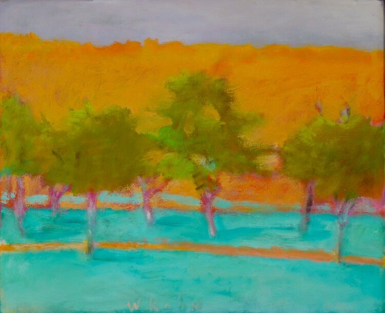
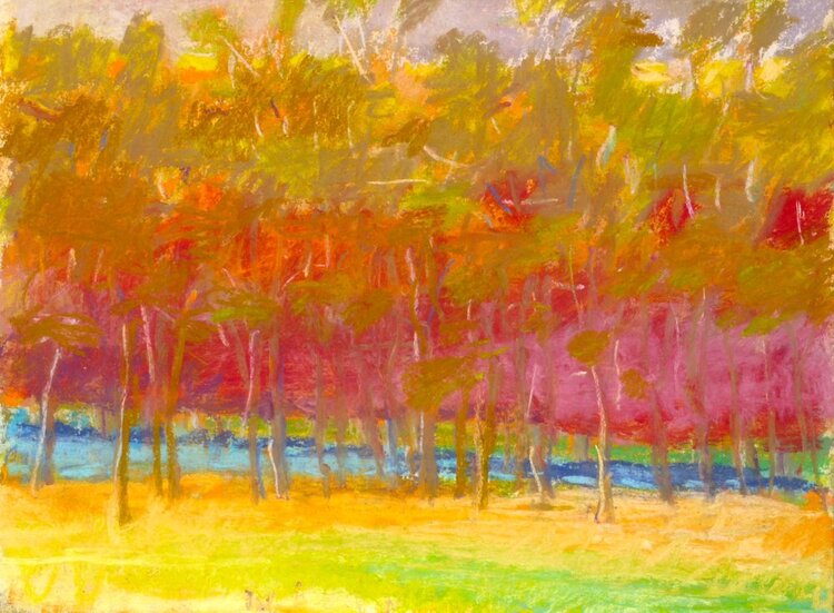
Autumn trees, undated, Wolf Kahn, from a commercial lithograph

Wolf Kahnwas a mid-century American landscape painter who was influenced significantly by Abstract-Expressionismand Color Fieldpainting. The fog on Deer Isle, Maine led to an epiphany about color: “I began to let the color come through on my canvases,” he wrote. “My pastels were always intense, and finally my painting caught up with them.”

Brilliant Green Trees, 1997, Wolf Kahn, courtesy Walter Wickiser Gallery

Kahn’s canvases are deceptively simple. What can we learn from them?

Color is the dominant theme of our age

That was beginning to be true in the 1960s when Kahn was coming into his own, but we now live in the full maturity of color. We are surrounded by a surfeit of chromatic intensity. Imagery has always been influenced by what’s around us, and today that’s our cell phones, monitors, and televisions. Printing technology is far better than it was even thirty years ago, so the photos in our books are clearer and brighter than ever. Paint and pigment technology have undergone similar improvement, which is why we’re seeing houses with navy blue vinyl siding—they’ve managed to make a dark blue that doesn’t fade.

Will this trend last forever? For all I know, there will be an equal and opposite reaction into monochrome. But for the moment, we’re living in an age of intense color, and if you are painting in our times, you’d best know how to use color.

That includes understanding and using modern organic pigments.

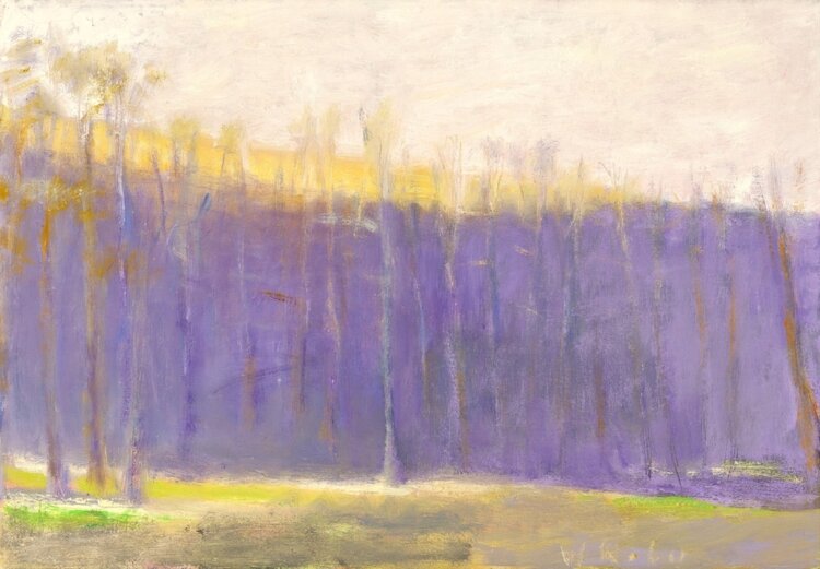
Midsummer, 1993, Pastel, Wolf Kahn, courtesy Walter Wickiser Gallery

The ‘real’ hue is irrelevant if the value is right

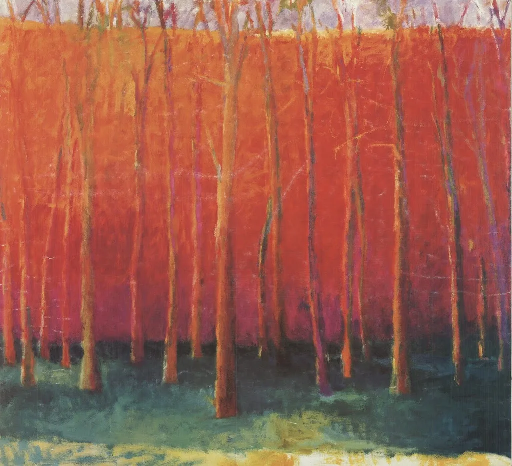
Kahn is famous for substituting impossible colors into the landscape: orange scrub, fuchsia woods and purple hills. One of his favorite techniques is to make the trunks of saplings the exact same value as the background, but the complementary color. The brain reads this as the screen of trees.

Stripped down to their essential form, objects are still recognizable to the human brain

Our minds are programmed to read images from the faintest stimuli, which is why we see faces in the steam on our shower door. This tendency to perceive meaningful images in ambiguous visual patterns is called pareidolia

This is not a purely human response, either. Occasionally, one of my hiking trails will be blocked off with a sawhorse festooned with signs. Until he’s close enough to investigate them, my dog finds these shapes very threatening. He’s seeing a vaguely-animal shape.

Our human pareidolia is the same response. We’re programmed to investigate visual stimulus that looks sort of familiar. Kahn and other abstract artists are exploiting this.

That’s an aspect of modern art that is likely to stay with us, as it’s built on our fundamental brain architecture. If we want to paint within our times, we need to stop spelling everything out.

Reluctant Green, 2001, Wolf Kahn, courtesy Walter Wickiser Gallery

It’s all an interplay of warm and cool

While Kahn’s selection of substitutionary colors might seem random, he is careful about color temperature. Where he wants objects to recede, they’re cool. Where he wants them to pull, they’re warm. Again, he’s playing with our brains and eyes and how they’re designed to perceive color.

Bright Center, 2015, Wolf Kahn, courtesy Addison-Ripley Fine Art

Chromatic intensity matters

In most instances in Kahn’s work, one hue leads. That color is given the greatest chromatic intensity. In others, two colors are balanced in chromatic intensity, but one leads by virtue of being warmer. None of this is accidental. Kahn was acutely aware of chroma and its importance.

We painting teachers bang on and on about value, and it’s certainly fundamental. However, color temperature and chromaare also important.

Why grisaille?

Your painting should be a carefully judged pas de deuxbetween reality and your own vision. That’s best worked out before you start adding a million different color variables.

There are days when I just want to think compositionally, without any reality or detail cluttering up my mind. Monochrome is the best way I know to do this.

I have a student who has started painting in monochrome as he learns to master color. It’s a great idea; I might insist on it, except it would result in revolution. People love ‘color’ but fail to see that value is color’s anchor. However one expresses darks, their pattern is what drives a painting. It’s best seen in monochrome, before you add in hues.

By removing the hue question, Mark is doing the equivalent of practicing one hand of his difficult piano sonata at a time. It’s a time-honored technique because it works.

Christ and the Woman Taken in Adultery, 1565, Pieter Bruegel the Elder, courtesy the Courtauld Gallery

A grisaille (pronounced ‘griz-EYE’) is a painting done entirely in shades of grey or another neutral. It can take the form of an underpainting or can be a finished painting in itself. It’s not generally done in lieu of a pencil sketch or notan, but rather as a discrete step in the process of planning a painting.

It is possible to start a painting with just hash-marks on the canvas. Some excellent painters do this; however, for the beginner, that’s the circus trapeze without a net.

Historically, grisaille has been used for finished works of art. This was particularly true in decorative painting, where grisaille might serve as a sort of trompe l’oeilfor sculptural relief. Paint, even in the hands of a master, is cheaper than marble.

Christ and the Woman Taken in Adultery, above, was a personal painting owned by Pieter Bruegel the Elder and his descendants. It’s tiny, roughly 9X12. Its character and intimacy are enhanced by being in monochrome. In that way, it has the feel of a fine drawing.

Odalisque in Grisaille, Jean-Auguste-Dominique Ingres and his workshop, 1823-24, courtesy Metropolitan Museum of Art

Sometimes popular paintings were copied in monochrome to simplify life for engravers. Jean-Auguste-Dominique Ingres’ copy of his La Grande Odalisque, above, is one such example. There lies a lesson for students: if engravers, who are skilled artisans in their own right, find it difficult to track value, how much harder is it for new painters?

Mostly, grisaille has been done as underpainting. Until the Impressionists, with a few exceptions, painting was done in what is called ‘indirect painting.’ Paint was applied in thin layers, or glazes. The underpainting was laid down in a thinned form, usually (but not always) in monochrome. This layer also served to tone the canvas. After it dried, subsequent thin washes of color were worked over the top. The underpainting was allowed to mingle with the glaze colors. It’s a powerful technique, but not as lyrical or free as alla prima painting.

A small underpainting grisaille example I made for my students.

Alla prima doesn’t really require any underpainting, but it’s an act of incredible courage to just start daubing on a blank canvas. Few artists are that brave—or foolhardy, depending on how you look at it. So, we tend to do exactly the same thing as our predecessors—a thin wash of paint, usually in grisaille, that tells us where stuff is supposed to go. Of course, we must learn to judge that first wash to a nicety. Too stiff, and the underpainting is too thick. Too goopy, and everything above it turns to soup.

If the composition reads well at this value-study phase, the painting is almost always going to work, providing you stick with your plan. If it doesn’t, you’re unlikely to salvage it.

All value judgments are subjective. There’s no reliable way to measure the value of a color. The camera is as subjective as the human eye. Your painting should be a carefully judged pas de deux between reality and your own vision. That’s best worked out before you start adding a million different variables in the form of hues.

Chromophobia

Until you start playing and experimenting, you won’t really own your own color pathway.

Bobbi Heath once posited to me that painters learn to manage color in three phases:

  • They make everything grey;
  • They vastly overshoot the chroma;
  • They finally learn a pleasing color sensibility.

 â€œIs it even possible to overshoot the chroma?” I riposted, because I’m apparently stuck in the second phase. I was joking, of course. In being a high-chroma painter, I’m operating within my own time and place in history. High chroma is part of our current landscape painting style.

Beautiful Dream, 12X16, oil on archival canvasboard, available.

(For those of you new to the discussion, chroma is one of three aspects of color, which you can read about here. It means how intense the color is. Grey is low-chroma; fuchsia is high-chroma.)

Bobbi had it right, of course. Painters start in a world of soft greys because grey is safe. They need to blow through that safety net to master all aspects of color.

The problem is exacerbated when the painter lives in an area with grey skies. I spent 21 years in Rochester, NY, where the weather is controlled by tempestuous Lake Ontario. Those damp, overcast skies were great for gardening and my skin, but they mean indirect light. That, in turn, can lead to gloomier color and less separation between lights and darks. Beautiful, but dull in a painting—unless you take a page from the Luministplaybook and straight-up lie. Before you can do that, you have to be able to see it.

Giving birth to a brighter color palette can be painful. Brilliant color looks garish at first, often because our first experiments at high-chroma painting are garish. The question of color harmony is more important when our painting isn’t subdued by a leavening wash of grey. With chroma elevated, we can no longer ignore when color combinations don’t work.

Bracken Fern, 9×12, oil on archival canvasboard, available.

You can’t get to that phase of development until you let go of the crutch of neutrality. This is one area where a teacher or mentor can be a great help. “Leave it,” we say. “Set it aside and look at it again in two weeks.” Actually, it would be more helpful to set it aside and paint twenty or thirty paintings in this new high-chroma space until you start to see how it hangs together.

Yes, you’ll make some awful paintings. It’s a necessary phase of growth. “No mistakes, no success. Know mistakes, know success,” my buddy Ivan Ramostold me yesterday. That’s never truer than with color. I can lecture all year about color interaction but there are millions of ways to lay colors down next to each other. Until you start playing and experimenting, you won’t really own your own color pathway.

Quebec Brook, 12X16, oil on archival canvasboard, available.

I encourage my students to have tintson their palette because they help keep color clean. These premixes can save a lot of time and prevent a whole lot of dullness.

None of this is to say there isn’t room for neutrals in painting. Of course, there is, and the third phase of color management is to add those neutrals back in. (I’m still waiting.) But let’s not jump the gun here; neutrals are in some ways the apotheosis of color, a counterpoint to chroma. They come last in our color-sensibility development.

Monday Morning Art School: the color of darkness

Painters spend lots of time thinking about the subtractive color system. We spend very little time thinking about the additive system. That’s a mistake, because this is the color of light.

A deer I painted years ago as a demonstration for my class. Shadows are the complement of the morning light.

Every artist is familiar with the three primary colors: red, blue and yellow, and their complements, the secondary colors green, orange and violet. This is the fundamental color wheel for the subtractive color system, or what’s used for paint and ink.

There’s another set that became more important in the 20thcentury, with the rise of electric lights and then electronics. These are the so-called additive color primaries, which are red, green and blue. This color system doesn’t have a color wheel, but it does have complements, which are shown below.

Additive complements (left) and subtractive complements (right). Courtesy Wikipedia.

Painters spend lots of time thinking about the subtractive color system. We spend very little time thinking about the additive system. That’s a mistake, because this is the color of light.

For painters, color theory is a balance between natural light (additive color) and their paints (subtractive color). That’s mind-blowing but they’re not alone in this challenge. Despite working in an additive-color medium, many web designers still think in terms of subtractive color. This system has influenced our aesthetics since the 18th century, and we don’t let go of what ‘looks right’ easily.

But in practical terms, shadows are the absence of light. If light is full-spectrum, then its shadows will be full-spectrum too. That means a white light will cast a grey shadow.

However, natural light is far more complex than that. It seldom shows up with all wavelengths being equal.

Sunrise, or the so-called ‘golden hour’ on Beech Hill. The shadows are definitely blue.

For this reason, artists have a useful rule: shadows are the complement of the color of the light. In the north on a snowy morning, golden light casts blue-violet shadows on the snow. In overcast light, the shadows are vaguer and full-spectrum, meaning they appear greyer. That’s easy to see, and demonstrates an idea that you can then generalize to all subjects. Although you should never trust your camera for color, I have included two photographs that show this.

Midday at the same location, the light is diffuse and so are the shadows.

It’s a mistake to get too attached to theory, however. For one thing, light is tricky. And for another thing, ‘primary color’ is another one of those constructs that we use because it’s useful, not because it’s absolute or provable. Our understanding and technologies are imperfect. CRT televisions of the 20th century were dull compared to modern LED screens. As technology got better, so did the color gamut, and what was considered ‘primary’ changed accordingly.

Most importantly, all these color systems are a dim mirror of the interaction of natural light and the human brain. Both are complex and imperfectly understood.

Light and shadows exist in the additive system, so your understanding of primaries is wrong if it’s based on what you learned in kindergarten. The complement of yellow in subtractive color is violet. The complement of yellow in additive color is blue. So, if the light is golden, the complement is more likely to be blue than violet.

At sunset, shadows appear black. There’s color in those darks, but our eyes can’t process it.

On the other hand, at sunset, the light is often red. The complement of red in additive color is cyan, but we almost never see any colors in the shadows at sunset. Instead, they’re just black, because we’ve hit the limit of what our poor rods and cones can process.

There’s a lot of latitude in what colors you can make your shadows, as long as you maintain the warm-cool balance. And—as always—all the theory in the world is no substitute for observation.


Monday Morning Art School: more interesting greens

We take a snapshot of a dancing, glowing landscape and what we end up with is a wall of dull green. We need to insinuate that original energy back into our picture.

Bracken Fern, 9X12, oil on canvasboard, available, Carol L. Douglas

Michael Wilcox published a watercolor pigment guide called Blue and Yellow Don’t Make Green. (Don’t buy it unless you can get it for a few dollars; its information is widely available on the internet, including here.)

Of course blue and yellow make green, but there are many routes to the same destination. I ask my students to avoid greens out of the tube, because they’re a sure-fired way of ending up with a monochromatic ‘wall of green’.

Apple Tree with Swing, 16X20, oil on canvasboard, Carol L. Douglas

Instead, I ask them to mix their greens using a matrix. I’ve written about this many times, so I’m not going to repeat the concept, except to say that it’s critically important to avoid the soul-sucking deadness of greens out of a tube.

Impressionism changed the way we look at and mix color. From the beginning of painting, artists understood that to warm a color up, you add a warmer tone, and to cool a color down, you add a cooler tone. If that neutralizes the color, so be it. That’s in fact what happens in real life with real light.

The Impressionists started to treat color as a wheel. If you wanted a warmer, lighter green, you mixed it not with Naples yellow* but with its cadmium yellow neighbor. If you wanted a cooler, darker green, you mixed it with it not with black but with its Prussian blue neighbor.

Better yet, you didn’t mix them at all, but laid gold next to green to warm it up, and laid blue next to green to cool it down. These tiny, discrete spots of color are averaged by the human eye into a coherent image. A blizzard of brushstrokes and color resolves into a discernable truth.

Spring Greens, 8X10, oil on canvasboard, Carol L. Douglas

If you look carefully at human skin, you realize it’s not ‘skin-tone’ but is quite varied. There are areas tinged with blue, yellow, purple, and red. Without that, a person would look dead. The same is true of foliage. There are moments in which the color leans toward khaki, yellow, teal, violet and orange. They are what give life to greens.

Unfortunately, these color shifts are subtle and almost never caught in the snapshots we use as reference photos. We talk about ‘photographic proof’ as if it is an absolute, although by now we all know that photos are terrible liars.

For guiding a painting, photos have their limits. They distort distance and spatial relationships. Modern point-and-shoot cameras (especially cell phones) blow contrast and chroma up, because that’s what buyers like. In exchange, subtle value and hue shifts disappear.

We take a snapshot of a dancing, glowing landscape and what we end up with is a wall of dull green. Does that mean we can’t ever paint from photos? Of course not (although you’ll never really master the intricacies of natural color if you don’t go outside). It means we have to insinuate that energy back into the picture, and the tool we have to do that with is color.

The Impressionists taught us that we can do that by extending the range of color in an object. I can give you many examples of artists who did that, starting with Claude Monet and Vincent van Gogh. Spend a few hours analyzing their paintings in terms of color range.

I made a series of four photoshopped trees, above, to illustrate the concept. The first one is the normal way we might paint trees. With each step, I’ve added color range to the tree, until the final version has every position in the color wheel.

The guiding principle is the color of light. I’ve kept (for the most part) cool colors in the shadows and warm colors in the highlights. When you first try this, it will seem artificial and possibly absurd, but persevere. It’s the key to dynamic greens.

*Today’s Naples yellow is a mix and almost as deadening to a painting as sap green.

You can’t abstract if you can’t draw

Try reducing one of these paintings to a notan, and you’ll realize just how much drawing underpins this seeming simplicity.

Plein air painting by Tara Will, courtesy of the artist.

“Why are you teaching us self-portrait?” a student recently asked me. The human face is the most demanding subject to draw, because very slight errors make a huge difference. It teaches the artist to use angles and distance to measure. And we might as well start with our own faces, since they’re the ones we know best.

“But I’m interested composition and color, not drawing!” my student responded. That’s like saying you’re interested in literature without first learning to sound out your letters. Drawing is the foundation of everything that follows.

Tara Wills’ lily pond painting from this week, courtesy of the artist.

Yesterday, I came across the above plein air painting by Tara Will, a pastel painter from Maryland. I don’t know Tara well, but what I do know, I like—both personally and professionally. We met doing plein air events, where she created work that seemed fast, effortless, and stylish. That’s deceptive; her work is underpinned with strong fundamentals, and she works hella hard at it.

Like all great literature, Tara’s lily pond painting is a complex story told with great economy. Count the shapes; they’re limited. She’s abstracted her subject to its absolute essentials. That’s where uninformed critics of modern art sometimes go off the rails; they think simplified drawing should be easier than working out the details. In fact, it’s the culmination of years of thinking and winnowing.

Tara started with a perfectly-executed perspective drawing of the surface of the water. Note how she draws you back along that plane before crashing headlong into the far shore. Without that draftsmanship, the painting would have collapsed into an unintelligible mess. Lesser painters sometimes conceal their lack of drawing skills with a muddle of details. These ‘marsh paintings’ are drearily similar and uninspiring.

Plein air painting by Tara Will, courtesy of the artist.

It would be nice to be able to buy a box of pastels and immediately tap into this sort of vibrancy, but color is more complicated than that. Resting under Tara’s effortless explosions of color is a complex and well-reasoned value structure.

It’s been said that “value does all the work; color gets the credit.” That’s an absurdity, because value is just one aspect of color, along with hue and saturation.

However, it is true that value is the first thing the human eye and mind read when they see a color pattern. Our brains are strongly programmed to interpret value patterns, and great artists have always taken advantage of that. Think first of value, and you can substitute a range of hues and saturation for what’s really there. The viewer’s mind will interpret the pattern, and have fun doing it.

Plein air painting with strong contre-jour, by Tara Will, courtesy of the artist.

But, again, that rests on a solid foundation of drawing and pattern making. The more Tara deviates from what’s there in terms of hue and saturation, the more she needs a solid value anchor. That’s especially true of contre-jourpainting, where the light comes from behind the subject, as in the painting above.

I picked out four of Tara’s recent plein air works to share with you. Her studio work is here. Try reducing one of these paintings to a notan, and you’ll realize just how much study underpins this seeming simplicity.

Monday Morning Art School: Precision

A good painting requires a good plan. What does that mean? 

This last weekend I was painting in the 14thannual Paint for Preservation for the Cape Elizabeth Land Trust. This always involves a big canvas, and this year was no exception: I painted 30×40.

I always start with a drawing in my sketchbook; when I’m working this large, the drawing becomes paramount. To look at my canvas from a distance meant climbing down into a small ravine and back up the next finger of rock, so I didn’t do it often. Accuracy in that situation requires planning. I transfer the drawing faithfully to my canvas, gridding if necessary. Then the sketchbook lies at my feet so I can consult it for values if necessary.

Foghorn Symphony, 36×40, by Carol L. Douglas, will be available through the Cape Elizabeth Land Trust in late August.

“You write numbers on it?” said Ken DeWaard, who’d stopped by with his morning coffee.

“Numbers and colors,” I said. That’s not my idea; it’s one I stole from an old guy named Vincent van Gogh, who often wrote the colors alongside his sketches. The sun at dawn on Saturday was a lemony yellow, and it would have been easy to remember it as richer and deeper. That would have overridden the sense of a transient sea-fog in the distance, which was causing the five lighthouses of greater Portland to play a fog-horn symphony.

Plein air events like Paint for Preservation have no do-overs. We’re required to put out a good painting. There are two options. You can paint more than one, and choose the best. That seldom works for me, since I’m no judge of my own work in the thrust-and-flow of an event. It’s also a lot of work.

Zeb Cove, 40×40, was my 2020 painting for CELT’s Paint for Preservation.

.
I go with the second, which is to paint one good one from the start, using all the tools at my disposal. Since a painting always goes wrong in the planning stages, I make sure my plan is solid, and then I stick with it.

What makes a good plan?

Precision of drawing

This means proper perspective and measurement. You might think this is irrelevant when the subject is rocks and the sea, but it’s as important there as with architecture. Drawing is the only clue about the distances involved. There’s a contemporary Maine style, which involves fast, loose brushwork, but it rests on a foundation of perfect drafting. In fact, bad initial drawing is a great way to end up with a tight painting, since you’ll constantly have to redraw with your brush.

Four Ducks, 30×40, was my 2019 painting for CELT’s Paint for Preservation.

Precision of composition

This means understanding the motive line, energy, and value structure of your painting from the beginning. A 30×40 painting will take from 8-12 hours to finish. The tide will have gone through one full cycle, and the sun will beat its way across the sky as you’re painting. In order to retain the light structure you started with, you must lay it out in advance—and then you must stick with it.

Precision of color

Nothing makes for a muddier painting than constantly restating colors because you didn’t get them right on the first try. Make a grisaille, and check your mixed colors against it.

Rocky, 36×36, was my 2018 painting for CELT’s Paint for Preservation. I’m detecting a theme here.

To mix color properly, you must be absolutely conversant with the pigments on your own palette. This requires practice. The goal is au premier coup, or to nail it on the first strike. That goes not just the for darks, but every color in the picture. Even a painting with wonderful shadows and lights will have many middle tones, often closely related in value. These are actually the most difficult colors to mix accurately. If you have a painting that isn’t working, ask yourself if it has a full tonal range, or is it simply hitting the highs and lows. 

Monday Morning Art School: Basic elements of design

The artist’s job is to invite the viewer into his world. That doesn’t happen by accident.

I and the Village, 1911, Marc Chagall, courtesy MOMA. In this painting, line is a dominant design element, articulating the relationship between man, beast and place. However, proportion (relative size of the objects) is playing a part as well.

Line

In math, a line is straight, has no thickness and extends in both directions through space. Sometimes that’s what we mean by a line in art—for example, a horizon line.

More typically in art, a line is just a path through space. Wherever you have an edge, you also have a line. However, lines also refer to mark-making, so in that sense they can be fat, thin, punctuated, tapering, diffident, bold or whispering.

Diagonals and curves seem to keep us more engaged than unbroken verticals, as they’re more difficult for the eye to ‘solve.’

Interior of the Laurenskerk in Rotterdam, 1664-66, Cornelis de Man, courtesy Mauritshuis. The illusion of three-dimensional form is created with perspective and value.

Shape and form

Shape and form define objects in space. Shapes have two dimensions–height and width–and are bounded by lines. Forms are three-dimensional. The artist’s dilemma is to give the illusion of three-dimensional form in a two-dimensional painting.

Ploughing in the Nivernais, 1849, Rosa Bonheur, courtesy MusĂ©e d’Orsay. The vast sky and field create as much narrative as do the team of oxen.

Space

Space in the real world is three-dimensional. In art, the term refers to a sense of depth, or the artist’s use of the area within the picture plane. The illusion of three-dimensional space is created with perspective drawing, atmospherics, relative proportion (size), positioning, and defining volume through modeling.

Sometimes we refer to negative and positive space, which means the division between the primary object(s) and what we perceive as the background. Positive and negative space were a very big deal in much twentieth-century design, which often used the vast emptiness of the page as a counterweight to the primary object.

The Crucifixion of Saint Peter, 1601, Caravaggio, courtesy Cerasi Chapel. Chiaroscuro relies primarily on value to drive the eye.

Color

Color has three essential characteristics:

  • Hue—where it falls on the color wheel (red, blue, etc.),
  • Chroma—how brilliant or dull it is,
  • Value—how light or dark it is.

Color is also described as ‘warm’ or ‘cool,’ but these are useful artistic conventions and not measurable as fact.

Historically, value did much of the heavy lifting in painting, and it remains the most important characteristic in your painting. The Impressionists began using hue and chroma to define volume, and that is essentially how most alla prima painters work today.

Portrait of the Baronness James de Rothschild, 1848, by Jean-Auguste-Dominique Ingres, private collection. We see satin, lace, tulle, feathers and jewels primarily due to Ingres’ exquisite control of reflected light.

Texture

Texture refers to the surface quality of an object. Paintings have implied texture, conveyed by color, line and brushwork. They also have real texture in the form of smooth or impasto surfaces.

Ejiri in Suruga Province, 1830, Katsushika Hokusai, courtesy Metropolitan Museum of Art. Great winds have blown away the clouds on Mount Fuji, and they’re also blowing the travelers and their packs around. This movement is echoed and amplified by the brushstrokes.

Movement

Movement can be either suggested or depicted—as in the wind in the painting above—or implied by brushwork. Most paintings have a major thrust of energy, which I call its motive line.

Your assignment is to take one of your own paintings and subject it to formal analysis. Consider each of these elements of design in turn. How are you using them? How could you use them better?

(This post originally appeared in July, 2020.)

The color of the sky

Is the sky blue? That’s in the eye of the beholder.

Midsummer, by Carol L. Douglas
The sky, by convention, is blue, but it’s not an even sheet of blue like a recently-painted wall. On a clear day, it’s more turquoise at the horizon, more violet at the zenith. Except when a line of gold or pink sits offshore, or it’s full of moisture and a solid blue-grey. The sky, like the ocean, is big enough to do anything it wants.
Anyone who hangs around with kids has learned the scientific explanation of why the sky is blue. Our sun produces yellow light because its surface temperature is 5,500°C. Still, we don’t have a yellow sky, for the most part. Sunlight reaches Earth’s atmosphere and is scattered in all directions by the gases and particles in the air. Blue light is scattered more than the other colors because it travels as shorter, smaller waves. There’s a lot of that going on, which is a good thing, because it means our planet home is protecting us from deadly high-energy radiation. That’s a nice, pat explanation and it certainly satisfied me when I was little.
A prism refracting and reflecting an incoming beam of uniform white light, after Newton, courtesy Wikipedia. It’s violet, not blue, that’s at the bottom.
It wasn’t until recently that I noticed that this doesn’t match what Isaac Newton discovered about the visible light spectrum back in 1665. Blue is not the shortest wavelength in the visible spectrum; indigo and violet are shorter. So why isn’t our sky violet? For that matter, how do I know that it isn’t violet? Do I believe it is blue because people tell me that?
In reality, the spectrum of skylight, when analyzed, is about equal parts violet and blue. While daylight is actually a complex spectrum, it’s dominated by the color range that falls between 400 nanometers (violet) and 450 nanometers (blue). That falls neatly into the human eye’s response range, which is about 380 to 740 nanometers. So why have we all decided the sky is blue?
Off Ogunquit, by Carol L. Douglas
We have cones in our eyes for detecting color. There are three kinds. Long cones detect yellow at 570 nanometers, medium detect green at 543 nanometers, and short cones detect blue-violet at 570 nanometers. But we perceive up to 10 million colors, because these cones fire off in combination to distinguish the subtleties of color. (This is all happening in our eyeballs, not our brains, by the way.) Blue-plus-violet is perceived by the eye as blue plus an admixture of all colors, or pure white light.
Other animals must see the sky very differently from humans. Most of them only have two types of eye cones. Some birds and honeybees have receptors for ultraviolet light.
Sea Fog, by Carol L. Douglas
More importantly, humans do not always see colors the same. Beyond the obvious issues of colorblindness, some tend to see less blue altogether. But mostly, it’s a question of paying attention.
Next time you go out on a beautiful day, pay attention to how many different shades of blue there are in the sky, depending on where you look. If you don’t feel that violet thrum deep down in your soul, I’ll be surprised.

Monday Morning Art School: the basic elements of design

Design elements are there whether you’re conscious of them or not. Learn to use them.

I and the Village, 1911, Marc Chagall, courtesy MOMA. In this painting, line is a dominant design element, articulating the relationship between man, beast and place.

Line

In math, a line is straight, has no thickness and extends in both directions through space. Sometimes that’s what we mean by a line in art—for example, a horizon line.
More typically in art, a line is just a path through space. Wherever you have an edge, you also have a line. However, lines also refer to mark-making, so in that sense they can be fat, thin, punctuated, tapering, diffident, bold or whispering.
Diagonals and curves tend to keep us more engaged than unbroken verticals, as they’re more difficult for the eye to ‘solve.’
Interior of the Laurenskerk in Rotterdam, 1664-66, Cornelis de Man, courtesy Mauritshuis. The illusion of three-dimensional form is created with drawing and value.
Shape and form
Shape and form define objects in space. Shapes have two dimensions–height and width–and are usually bounded by lines. Forms are three-dimensional. The artist’s dilemma is to give the illusion of three-dimensional form in a two-dimensional painting.
Ploughing in the Nivernais, 1849, Rosa Bonheur, courtesy MusĂ©e d’Orsay. The vast sky and field create as much narrative as do the team of oxen.
Space
Space is, in the real world, three-dimensional. In art, the term refers to a sense of depth, or the artist’s use of the area within the picture plane. The illusion of three-dimensional space is created with perspective drawing, atmospherics, positioning, size, and defining volume through modeling.
Sometimes we refer to negative and positive space, which means the division between the primary object(s) and what we perceive as the background. Positive and negative space were a very big deal in much twentieth-century design, which often used the vast emptiness of the page as a counterweight to the primary object.
The Crucifixion of Saint Peter, 1601, Caravaggio, courtesy Cerasi Chapel. Chiaroscuro relies primarily on value to drive the eye.
Color has three essential characteristics:
  • Hue—where it falls on the color wheel (red, blue, etc.),
  • Chroma—how brilliant or dull it is,
  • Value—how light or dark it is.
Color is also described as ‘warm’ or ‘cool,’ but these are useful artistic conventions and not measurable as fact.
Historically, value did much of the heavy lifting in painting. The Impressionists began using hue and chroma to define volume, and that is essentially how most alla primapainters work today.
Portrait of the Baronness James de Rothschild, 1848, by Jean-Auguste-Dominique Ingres, private collection. We see satin, lace, tulle, feathers and jewels primarily due to Ingres’ exquisite control of reflected light.
Texture refers to the surface quality of an object. Paintings have implied texture, conveyed by color, line and brushwork. They also have real texture in the form of smooth or impasto surfaces.
Your assignment is to take one of your own paintings and subject it to formal analysis. Consider each of these elements of design in turn. How are you using them? How could you use them better?