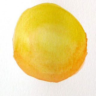
A color exercise that can be done with anything from a dime-store watercolor kit to a professional palette.
 |
| The Servant, by Carol L. Douglas |
Back before black was banned from the palette, we had shades and tints. Shades are made by adding black to a pure color. Tints are an admixture of white to a pure color. Shades aren’t an effective way to make something darker, but they often make nice new hues.
What we consider acceptable in color-mixing is style-driven, just like everything else. For example, see the Permanent Pigments Practical Color Mixing Guide of 1954, below. It’s all about making shades and tints. That’s a hint about why mid-century paintings looked so grey. A little shading goes a long way.
 |
| A mid-century guide to mixing colors. |
Today’s exercise is to make a paint chart playing the warm tones on your palette against the cool tones. Both of these examples were done in class by students. My definition of warm vs. cool has shifted over time. Ten years ago, I included quinacridone violet among the cools; last month I had my student stick it in among the warms. That’s because warm-vs.-cool is an arbitrary designation.
| The chart in watercolors. |
The instructions are a little different for solid-media students than for watercolorists. In either case, start by marking off your paper or canvas with 1” squares, allowing enough room for the cool colors on the left and the warm colors across the top.
Watercolorists (and users of fluid acrylics) just need to mix the colors. Oil painters need to tint their colors with a little bit of white. I’ll get to that below.
In watercolor, the column on the far left should be pure pigments straight from the tube: blues, greens, black, and violets if you want to call them cool. The row across the very top should also be pure pigments, but in the warm tones: reds, oranges and yellows.
The boxes in the middle of the chart are all mixtures. For example, the second-row-second-column box on Sheryl’s chart is black+raw umber. The third-row-second-column box is ultramarine blue+raw umber. The bottom right box is sap green+quinacridone violet, and so on.
The greatest difficulty for watercolor painters is to try and keep the color balance equal. Pigments differ in density, and it’s hard to control dilution. Still, try to use the same amount of each in your mixtures.
Sheryl was doing something my friend Poppy Balser calls “licking the paper.” (That’s partly because she was using a very cheap paper.) That means she was fussing after she put the first brushstroke down. That gave her final chart a mottled appearance. Try to get the mixture down in one brushstroke and leave it.
| The chart in oils. |
Solid media (oil, gouache, and acrylic) painters have a slightly different assignment. They need to add white to their mixtures. I always add it on the cool side of the chart, by mixing a large clump of the cool-plus-white colors and using that to work across, modulating the warm colors. Working this way, your second-row-second-column box will be (black+white)+raw umber. The third-row-second-column box will be (ultramarine blue+white)+raw umber, and so on.
Note that there is one three-way mixture on the left column. I do not typically paint with a tubed violet, so row five started with a mixed violet to which I added white. If you use a dioxazine purple, it belongs here.
Your last task for this week is to use color temperature, rather than value (lightness or darkness) to define the volume of a sphere, as in Sheryl’s example, below. Her shadows are warm, and her light is cool. Experiment with reversing that as well.
|
The shape of this sphere isn’t defined with value (lightness or darkness) but with a shift in color temperature. Try it!
|
This blog post was originally published on November 13, 2017. I’m traveling today.

