

“Never use black!” is a mantra that many artists have heard and probably repeated. There’s some truth behind it. We see dark things and perceive black, just as we see light things and perceive white. Shadows, for example, aren’t black, or even particularly grey. If you want to understand that spend time looking at the shadows in Wayne Thiebaud’s work.
The trouble is, the no-black rule is throwing the baby out with the bathwater. Back before black was banned from the palette, we had tints, shades and tones.
- A tint is a color plus white.
- A shade is a color plus black.
- A tone is a color plus black and white.
Obviously, you should never make grey by mixing black and white. It’s lifeless. But there are many subtle colors available only through black admixture.
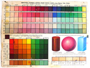
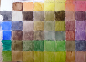
What we consider acceptable in color-mixing is style-driven, just like everything else. The Permanent Pigments Practical Color Mixing Guide of 1954, above, tells you how to make tints, shades, and tones. That they emphasized this is a hint as to why many mid-century paintings looked so grey.
Today, many painters use straight-out-of-the-tube high-chroma colors. There’s nothing inherently wrong with that, but it won’t serve you well when you need to mix flesh tones or the subtlety of a reptile’s skin.
Masstone and undertone
A masstone is the color a pigment is straight out of the tube, dense and unmixed with another color. While two pigments may look the same to the naked eye, their behavior when mixed can be radically different.
Undertone is the color revealed when a paint is spread thin enough that light bounces back up from the substrate. Some pigments are consistent when moving from mass tone to undertone. Others have significant color shifts.
One of the most important things in learning to mix tints, tones and shades is what they reveal to you about the undertones on your palette.
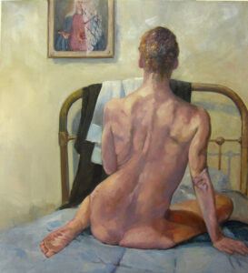
Beautiful flesh tones
When I was teaching figure, I had students do the flesh tone mix above. What they were doing, essentially, was making tones of the warm colors on their palettes. This would in turn net them all the midtones in human flesh. The cool thing about this exercise is that it’s true for people of all races; it’s just a question of how much white you add.
Put a burnt sienna tempered with ultramarine (or ivory black, if you want to do it like Rembrandt) in the darks, and you’re well on the way to having all the colors of human flesh.
Greens
David Wilcox’ Blue and Yellow Don’t Make Green had a profound influence on my understanding of color. It’s obsolete today, because the information on pigments can be found online (applicable to both watercolors and oils, in almost every case).
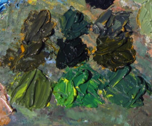
Wilcox taught me to make a beautiful green with black and yellow, as well as to avoid convenience mixes and hues. His point was that there are many routes to the same destination, and that to really mix colors, you need to understand what pigments you’re using, not work from trade names for colors.
That’s why today I don’t use any tubed greens, but rather mix my own. And black plays a big part in this.
Exercises
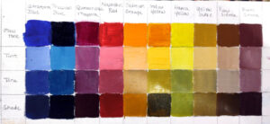
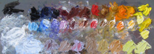
You can make either a tint, tone, shade chart of the colors on your palette, as above, or a warm-cool chart, as done in watercolor immediately above. Either will help you develop facility in mixing the colors you’re using, on your palette.
Registration is now open for workshops in 2026! Reserve your spot:
- Advanced Plein Air Painting | Rockport, ME, July 13-17, 2026
- Sea & Sky | Acadia National Park, ME, August 2–7, 2026
- Find your Authentic Voice in Plein Air | Berkshires, MA, August 10-14, 2026
- New! Color Clinic 2026 | Rockport, ME, October 3-4, 2026
- New! Composition Week 2026 | Rockport, ME, October 5-9, 2026
Can’t commit to a full workshop? Work online at your own pace: