My friend Clif Travers and I did a residency together at the Joseph A. Fiore Art Center. That was an opportunity to meet artist Lois Dodd, who came by one night for supper, along with painter David Dewey. I was rather starstruck, since I’m an unabashed fan of Dodd (and Dewey, for that matter).
Dodd proceeded to give a short, pithy and entirely constructive critique of one of my paintings. She made her point without in any way making me feel bad, and I walked away having new ideas and even more respect for her talent.
Compare that to a critique I’d had fifteen years earlier, by a pastelist and faculty member at a distinguished American university. “It looks like an immature Chagall,” she said. I went home and destroyed the painting by trying to make it more abstract.
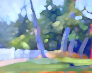
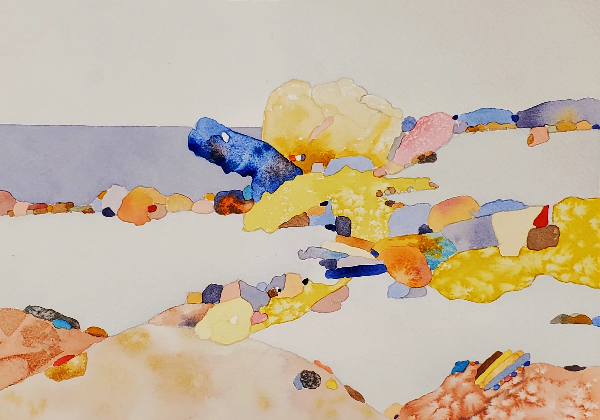
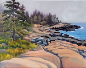
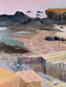
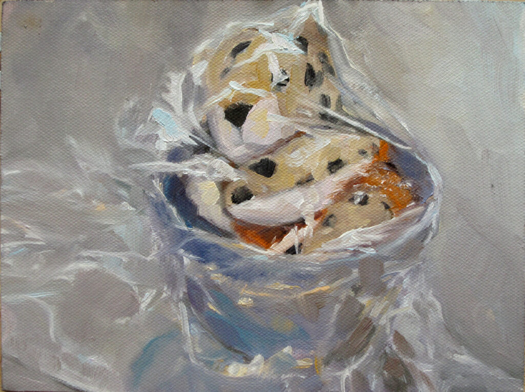
(Sadly, I can’t find images of either work, although the corpses might be lying around here somewhere.)
When words matter most
I’ve regretted wrecking that painting ever since. As a much more experienced painter, I think her criticism was simply wrong. She was simply saying, with her New York fin de siècle myopia, that while dreams and memory were fine, she had no time for highly-representational painting. (I no longer love that smoothly-rendered realism myself, but she had nothing to do with that development; plein air did.)
The part of that story that embarrasses me is not what she said, but my response to it. I should have set it aside and tried again on a different canvas. But I rushed into revisions while not even realizing how angry I was.
I was an experienced painter at the time; what made me flare up so badly?
Most artists are sensitive about their work; it’s deeply personal. Making it exposes our most private thoughts and feelings, which are in turn wrapped up in our identity and worldview.
Furthermore, we put a significant amount of time, energy, and dedication into our work. We can laugh when the uninformed say, “my kid could do that,” but when a respected practitioner dismisses it without care, that’s another issue entirely.
Art is also a means of communication, so negative feedback can strike at a deeply personal level. That’s especially true if the work is part of a creative leap forward, when we’re already feeling a sense of risk. Or, in the case of my painting, when the subject is deeply important.
Watch what you say
Artists are, believe it or not, human. Harsh or careless criticism is demoralizing.
There’s often a power imbalance between the critic and the subject, which shouldn’t be taken lightly.
I was once panned in a newspaper review, and it made me cry. There’s a difference between helpful feedback and tearing something down. Good criticism helps artists grow; careless or mean-spirited commentary stifles creativity.
Registration is now open for workshops in 2026! Reserve your spot:
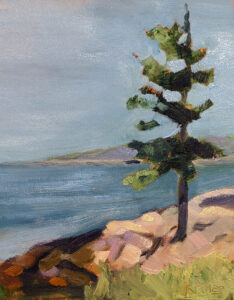
- Sea & Sky | Acadia National Park, ME, August 2–7, 2026
- Find your Authentic Voice in Plein Air | Berkshires, MA, August 10-14, 2026
- New! Color Clinic 2026 | Rockport, ME, October 3-4, 2026
- New! Composition Week 2026 | Rockport, ME, October 5-9, 2026
Can’t commit to a full workshop? Work online at your own pace: