
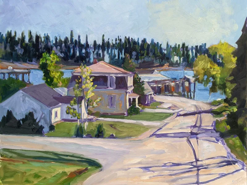
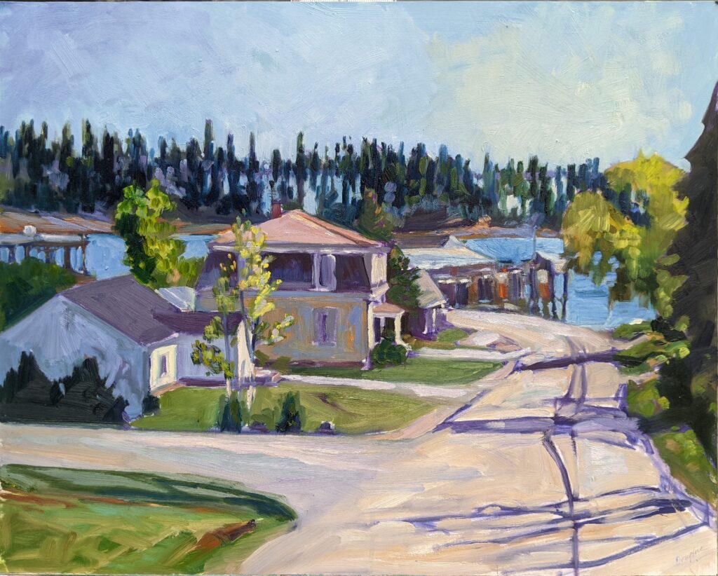
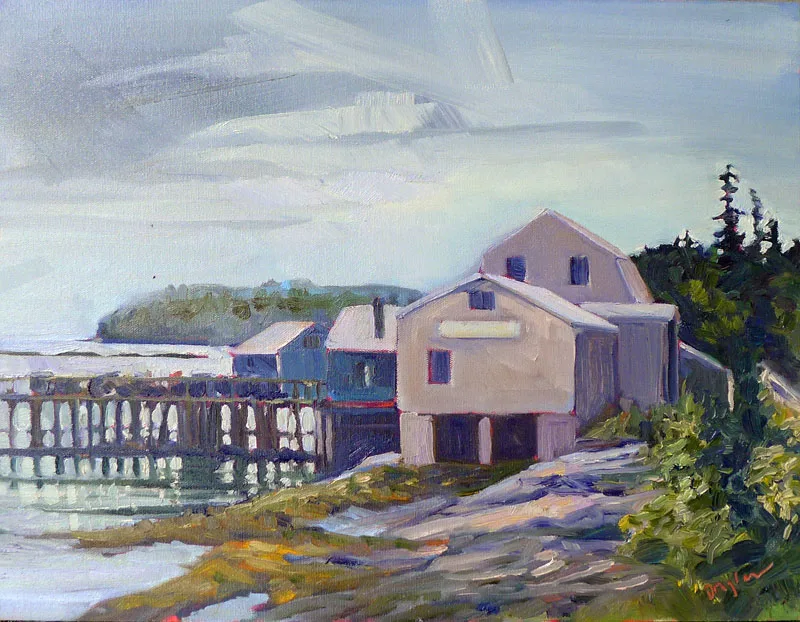
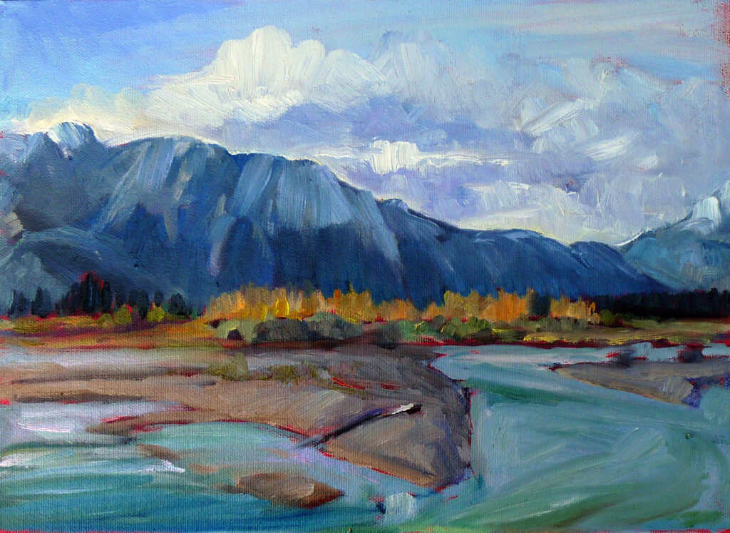
Some days, I’m in the mood to leave modern life out of my paintings. Some days, I want to include all the pollutants, potholes and power lines. This isn’t so much an aesthetic decision as one based on mood. (Although the older I get, the more inclined I am to leave caustic commentary to others. What the world needs now is love, not division.)
It’s easy to see what to put in a painting. It’s harder to figure out what to leave out.
A quick note on classes before we get into it
My upcoming session of evening Zoom classes is selling fast; Painting water is already sold out. Claim your spot in Painting clouds or From field sketch to final studio work before they sell out too.
Compositional hierarchy in painting
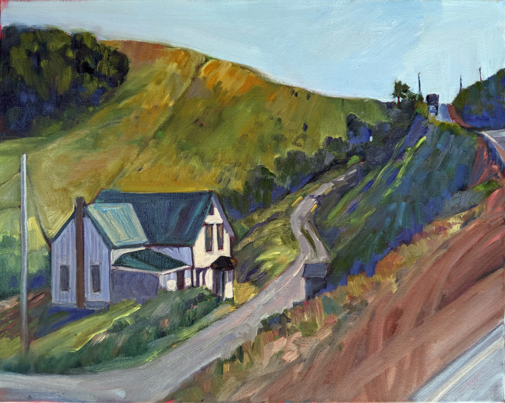
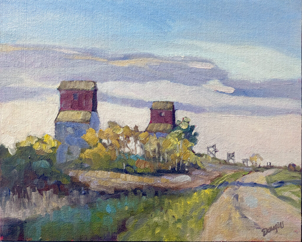
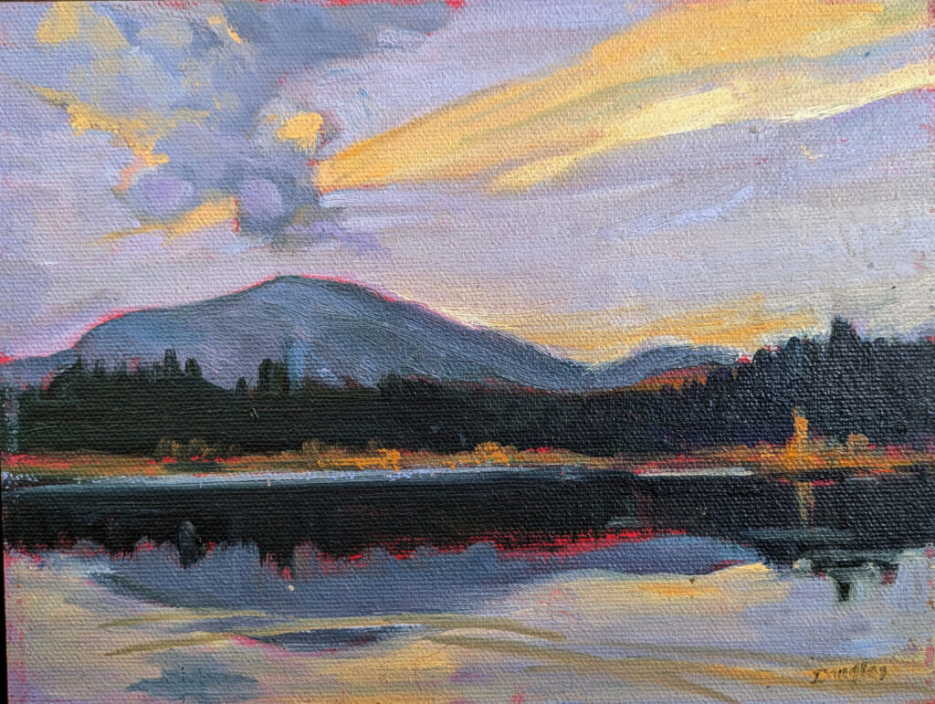
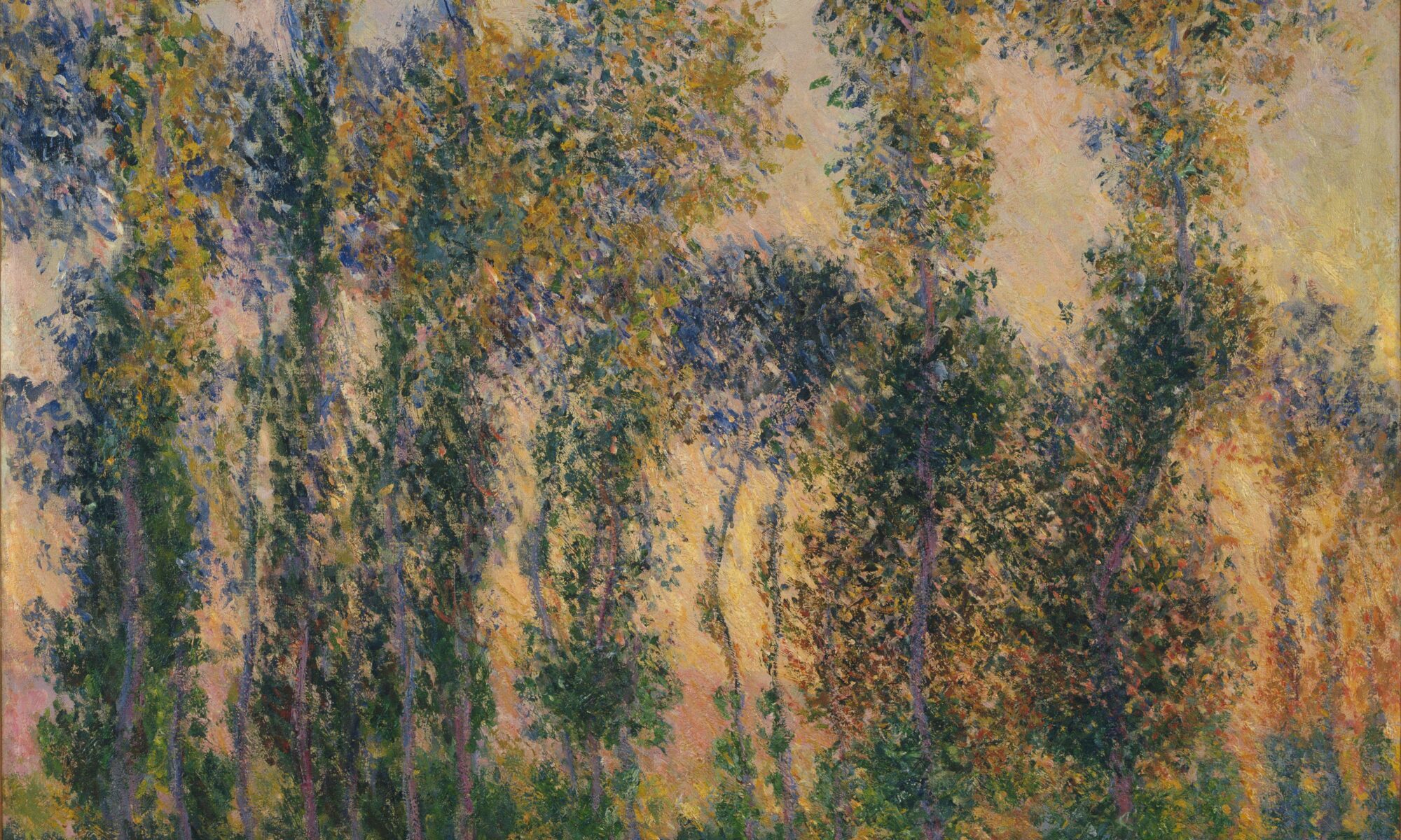
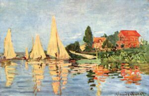
Yes, keen observation equals better painting. That doesn’t mean we should transcribe every tree, window or ripple. Without compositional hierarchy in painting, you’re left with a muddle where everything has equal importance and therefore nothing is important.
Every strong painting has a clear compositional hierarchy: something that matters most, things that support it, and what I sometimes call ‘border work’—things that whisper from the sidelines. If you don’t decide what’s important, who will?
What is this painting about?
When I teach critique, I start by asking the artist: “What is this painting about? What were you trying to say?” We could also ask, “What struck you the most about the subject?”
In most cases, that’s not a literal question, but a visual one. Is it light hitting a tree line? The sweep of a cloud bank? The gesture of a figure? The answer is the main determinant of what is important in the painting.
Anything that competes with that is a liability.
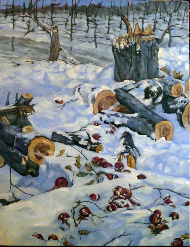
Let’s say your subject is the light raking across the roof of a house. That charming little mailbox on the edge of your scene may be delightful in real life, but if it pulls the eye away from your focal points, it belongs in its own, separate painting. That busy pattern of branches behind the roof might be absolutely accurate. However, accuracy isn’t your goal; clarity is. Simplify, soften or axe whatever doesn’t support your goals.
I don’t know why painters feel guilty when they do this, but people are always asking me if it’s okay to leave things out. Even hyperrealism relies on skillful editing.
Every element you keep must direct the eye around the painting through a series of focal points. It should also support the mood and message of the painting. If it doesn’t do those things, it’s not an addition to the painting; it’s a negative.
How do you control compositional hierarchy in painting?
You really have only a few tools to create focal points:
- Contrast in value;
- Contrast in hue;
- Contrast in chroma;
- Line (which can be literal or the boundaries between two shapes).
No amount of detail can make up for deficiencies in these elements.
Restraint is power
Preliminary studies are valuable in many ways. They tell whether the value structure is strong enough to carry an idea, but they also tell you what happens when you remove detail. Squint at the subject. Mass it into big shapes. Decide early what belongs and what doesn’t, and then stick to your guns.
I often tell my students, “If you can paint it once, you can paint it 1000 times.” That’s only necessary because they’ve managed to paint a clever detail in the wrong spot or the wrong value, which they could have avoided with a preliminary value sketch. Good painting requires ruthlessness. If you don’t cut in the sketch phase, you’ll end up doing it in paint. That’s far more painful.
Registration is now open for workshops in 2026! Reserve your spot:
- Advanced Plein Air Painting | Rockport, ME, July 13-17, 2026
- Sea & Sky | Acadia National Park, ME, August 2–7, 2026
- Find your Authentic Voice in Plein Air | Berkshires, MA, August 10-14, 2026
- New! Color Clinic 2026 | Rockport, ME, October 3-4, 2026
- New! Composition Week 2026 | Rockport, ME, October 5-9, 2026
Can’t commit to a full workshop? Work online at your own pace:
