
“It’s the lack of good composition and values that make a painting look like student work,” Bobbi Heath wrote in response to last week’s post on simplifying shapes. That’s where most early artists fail, and why good teachers stress value studies.
“Brushwork, color choices, and level of detail are all questions of style,” she added. “Each of these has a spectrum. A proficient artist can work anywhere in those spectra but they can’t ignore composition.”
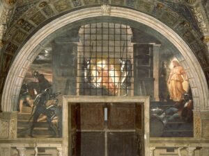
Wolf Kahn and Raphael are poles apart in terms of style. One might be more to your taste, but objectively, neither is better than the other-or more representational, for that matter. As stylized as Kahn’s trees are, Raphael’s Vatican Stanze are just as distanced from ‘reality’.
What unites them, and unites all good works of art, is composition. That’s true in painting, sculpture, writing, architecture and music-in fact, throughout the creative sphere. There must be structure there, or “the centre cannot hold,” to trivialize a great W.B. Yeats poem.
In painting and drawing our ideas about composition have remained remarkably static over time. Analyze the space in one of Wayne Thiebaud’s desserts and a Renaissance portrait like Bronzino’s self-possessed young man, and you’ll find they’re using the picture plane in much the same way. There are only so many ways to divide a rectangle.
What to think about
Composition rests on the following principles:
- The human eye responds first to shifts in value, but contrast in chroma and hue also attract our gaze;
- We follow hard edges and lines;
- We filter out passages of soft edges and low contrast, and indeed we need them as interludes of rest;
- We like divisions of space that aren’t easily solved or regular.
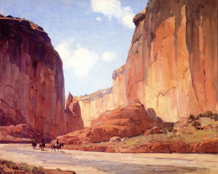
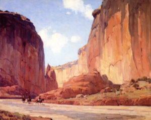
I ask my critique students to analyze their compositions based on Edgar Payne‘s exhaustive list of possible compositions in Composition of Outdoor Painting. (This used book is now so expensive that I can no longer recommend buying it. Check it out of the library.) The idea isn’t to slavishly follow one of his designs; it’s to understand whether you have an underlying design in the first place, and how you might strengthen it.
I also ask my students to tell me where the focal points are in their composition, and how they want the viewer to walk through them. If focal points aren’t intelligently designed, and you’re not drawn through them with contrast, line and detail, then it’s back to the (literal) drawing board.
John Carlson’s Guide to Landscape Painting is available in reprint. He’s the guy who gave us the idea of numbering our value levels, which I explained in this post from last year.
“Every good picture is fundamentally an arrangement of three or four large masses,” Carlson wrote. That’s as good an organizing principle as any in art. Value is what makes form visible, so we should see, translate, simplify and organize form into value masses.
These masses must be linked, whether obviously, subtly, or by implication. Think of a windbreak of separate trees on a hill. They might be disconnected dark shapes, but they’re held together by their rhythm.
What to avoid
You’ll note that I’ve said nothing about what’s in front of you, either in your photo or in the real world. Your reference might give you an idea for composition, such as a winding river, a break in the forest, or the strong diagonal of a hillside. But that is your starting point, not your destination.
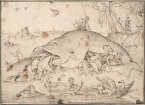
“Above all, don’t be boring,” I tell my students. This is a lesson from Pieter Bruegel the Elder, who often hid the text of his narrative in odd corners, far from the visual focal points. That makes every painting a puzzle to be worked out.
This page contains affiliate links for some but not all products. If you choose to make a purchase after clicking a link, I may receive a commission at no additional cost to you. Thank you for your support!
Reading today’s blog awoke the memory of a particular painting that I saw 30 years ago.
I had the opportunity to visit the Hermitage in St. Petersburg in the ’90s. I was walking through the rooms packed with hundreds of great works, but one small painting the the corner of one of the rooms took my breath away. It was Alphonse Marie de Neuville’s “Street in an Old Town.” Here is a link to the Hermitage’s web page (a search will turn up other websites, but the photos in those are more muted than what I recall seeing, and what the Hermitage posted).
https://www.hermitagemuseum.org/wps/portal/hermitage/digital-collection/01.+paintings/37430
What struck me was the use of light to divide the scene and draw my eye to the old woman. Only then did I notice the man leaning on the wall in the shade, and then the buildings in the background. At the time I thought only of his “use of light,” but now I think about the composition, value, line, color, and contrast.