
Today is my 66th birthday. By choice I’ve lived every one of those long years in the far north. I like winter; I hate heat. I was born in Buffalo, NY, which means my blood is an amalgam of snow and beer. So, when I tell you this winter has been a unique pain in the arthritic joints, I speak from deep personal experience.
Can you paint in the winter? Heck, yeah.
About 25 years ago, I set out to paint every day of the year. I was living in Rochester, NY, which is every bit as tempestuous weatherwise as Buffalo. There were blizzards, there was sleet, there was hail, there were torrential rainstorms, there were line squalls, there were those awful, sticky, still, humid summer days that resolve into thunderstorms. Do you know what my take-away lesson was? I never need to do that again.
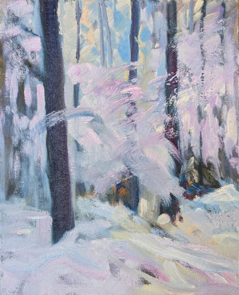
That doesn’t mean I won’t paint in the snow if the spirit moves me. Can you paint in the winter? Of course, if you dress right. It’s not quite true that there’s no such thing as bad weather, just bad clothing. However, my friend Poppy Balser paints outside in winter a lot. To be fair, though, Nova Scotia is milder than Maine. (If you want to try snow painting, my friend Catharine swears by these rechargeable pocket warmers.)
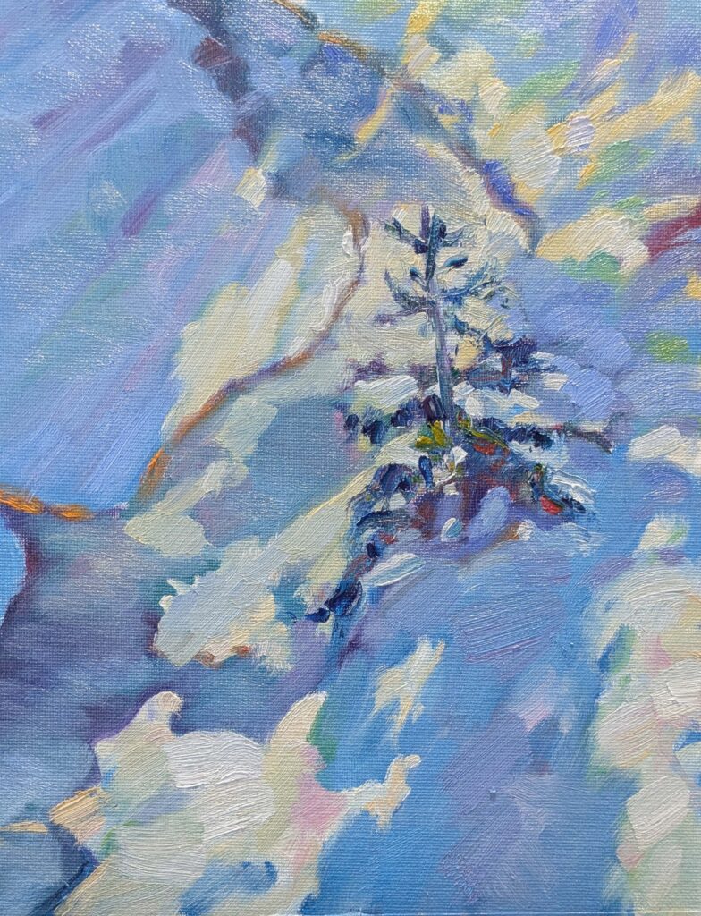
We’ve had a steady snow cover since December and many sunny days, so why haven’t I gotten out to paint? It’s been too frigid, the snow is deep and covers a slick layer of ice, and the wind seems to howl incessantly. While it looks lovely from my living room window, it’s been miserable out there.
We had an awful storm at the beginning of this week, with snow layering on sleet layering on snow. I got a glum text from Ken DeWaard. “I am officially sick of the snow,” he said. “I can’t even push it off the deck.” I felt badly for him until I went outside and realized that the portable garage-tent over my Ford 9N tractor had collapsed. And that was before the 50 MPH gusts hit later in the day.
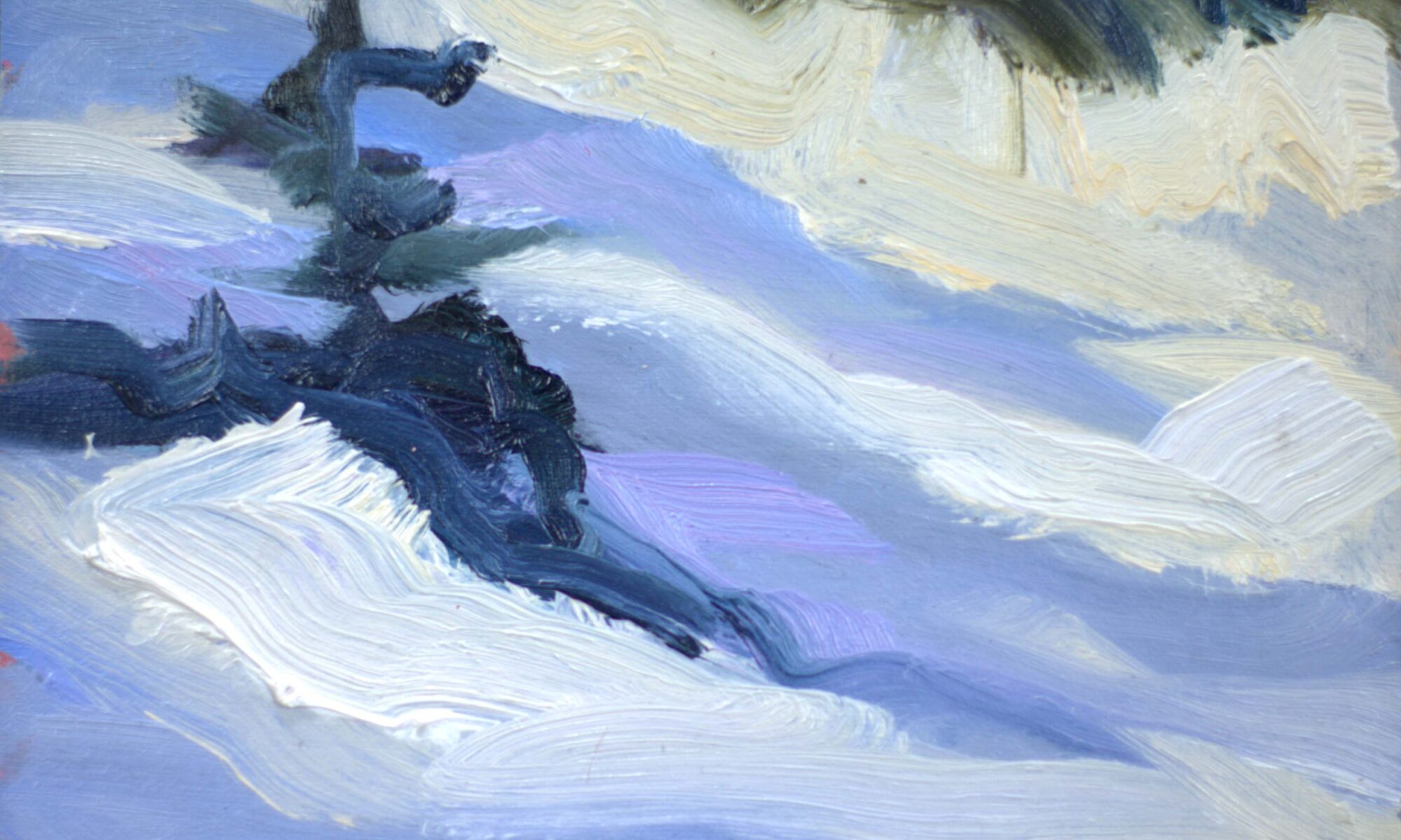
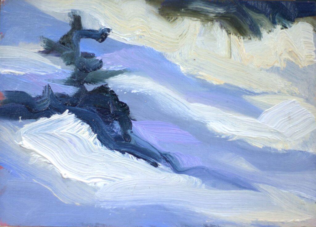
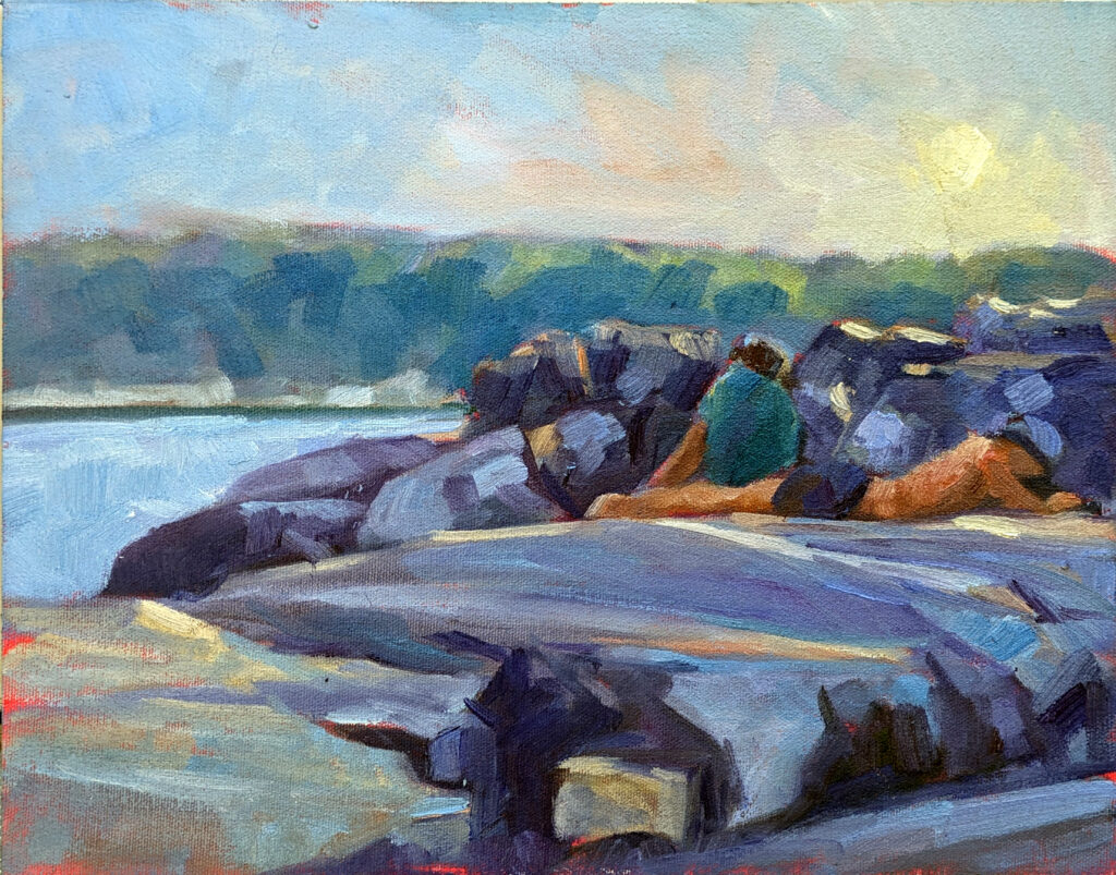
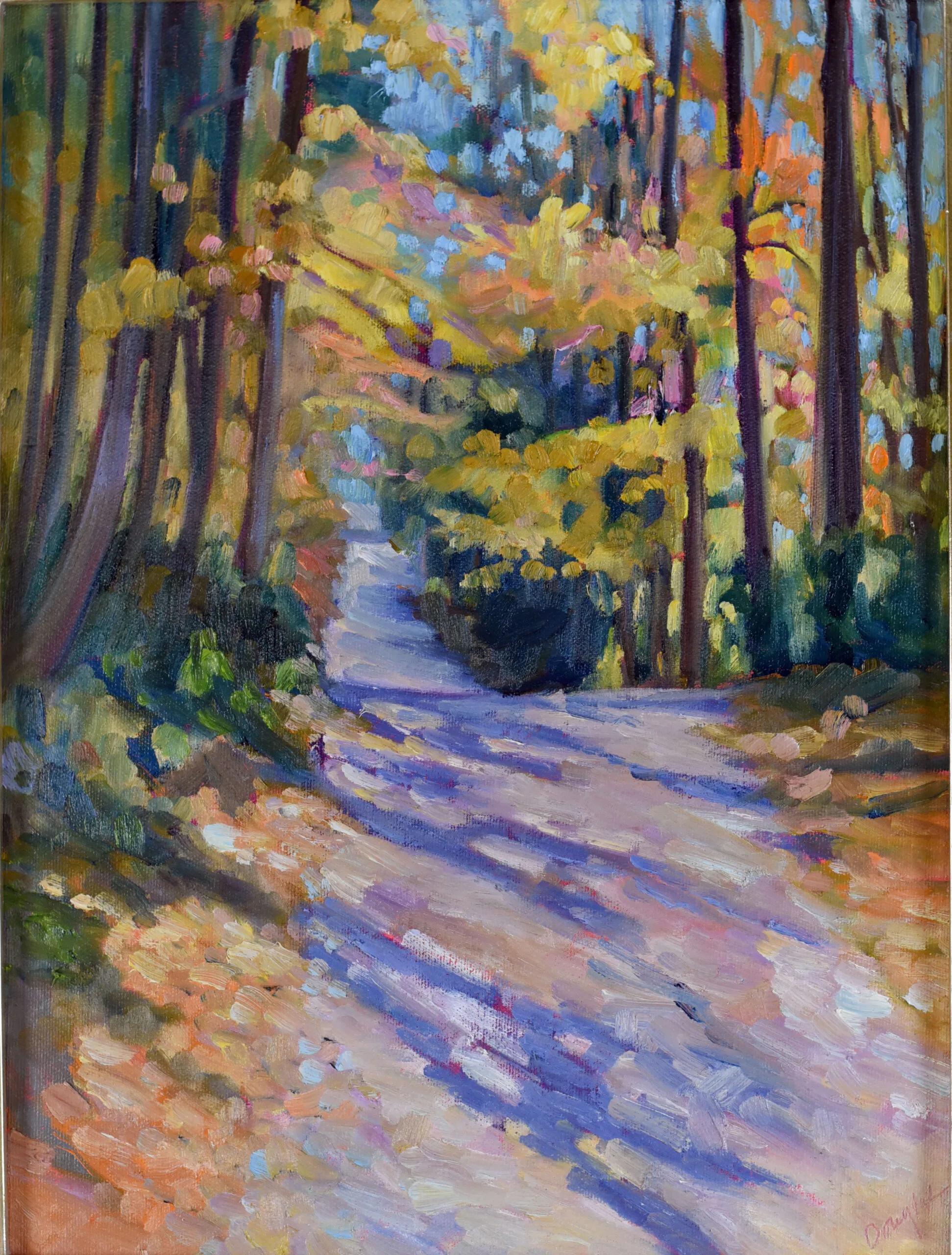
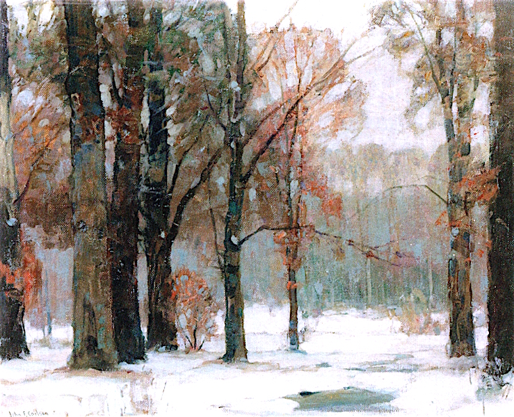
Bob’s trail
I’m 66 and in rude good health, despite having had three different cancers. I blame this on my lifelong exercise habits. I ran until my first cancer at age 40; I’ve been walking and hiking long distances since then.
I’m supposed to be training to hike around Malta and Gozo in early April. My training regimen meant I should be doing five miles a day now. (All three of my hiking partners are younger, fitter, and possibly better-looking.) But the trails here are deeply buried; over the past week, I’ve struggled to do 2.5 miles. On Monday it took me an hour to push through just one mile. By Monday afternoon, even the dogs wouldn’t go out into that wind.
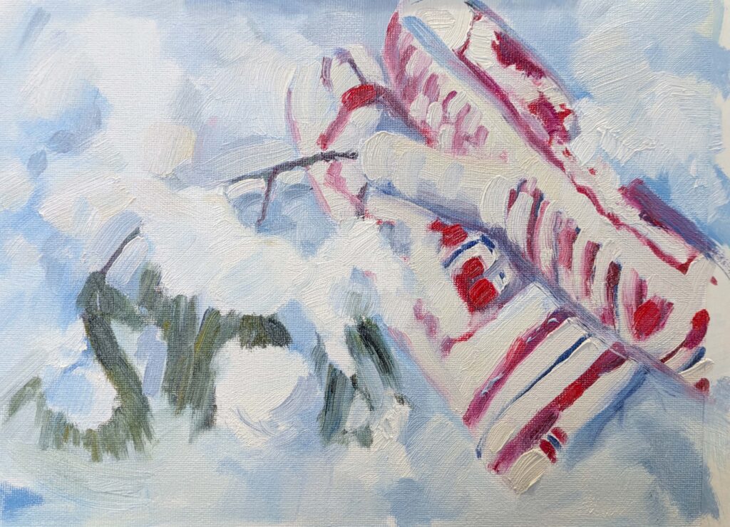
‘Bob’s trail’ is what I call an informal extra loop on my regular ascent, because my trail-buddy Bob first stomped it out. For the past several days, I’ve been pushing uphill on it and then realizing I’m too spent to make the rest of my loop.
Bob and his wife are regulars on these trails. Sometimes they do them on snowshoes. That’s a real blessing, because snowshoes pack the snow down evenly and make it possible to walk in their tracks. “Oh, where the heck are you,” I breathed, as I pushed through yet more snow. And then I realized that they’re in Vietnam, where the temperature is hovering around 70° F.
I guess I’d better go out to the shed and fetch my own dang snowshoes.
Registration is now open for workshops in 2026! Reserve your spot:
- Advanced Plein Air Painting | Rockport, ME, July 13-17, 2026
- Sea & Sky | Acadia National Park, ME, August 2–7, 2026
- Find your Authentic Voice in Plein Air | Berkshires, MA, August 10-14, 2026
- New! Color Clinic 2026 | Rockport, ME, October 3-4, 2026
- New! Composition Week 2026 | Rockport, ME, October 5-9, 2026
Can’t commit to a full workshop? Work online at your own pace:
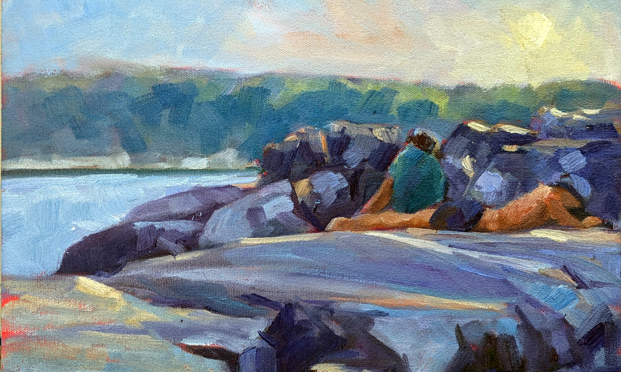
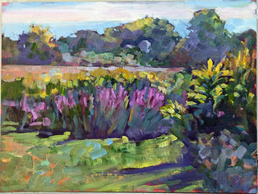


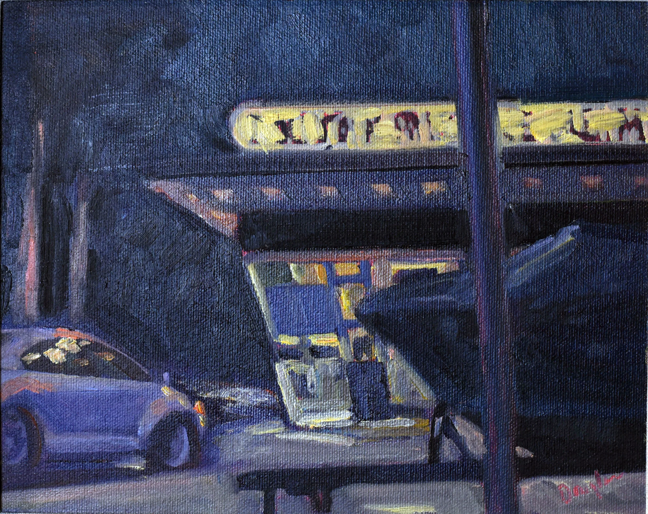
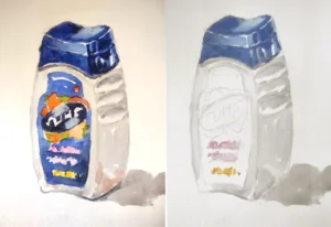
 However, Ken is a disciple of a method he calls Park-N-Paint, which means that we never stray from our cars. I appreciate that, since my painting pack weighs about 40 lbs.
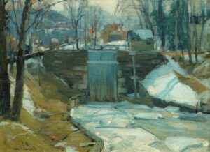


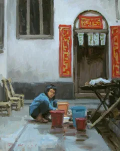
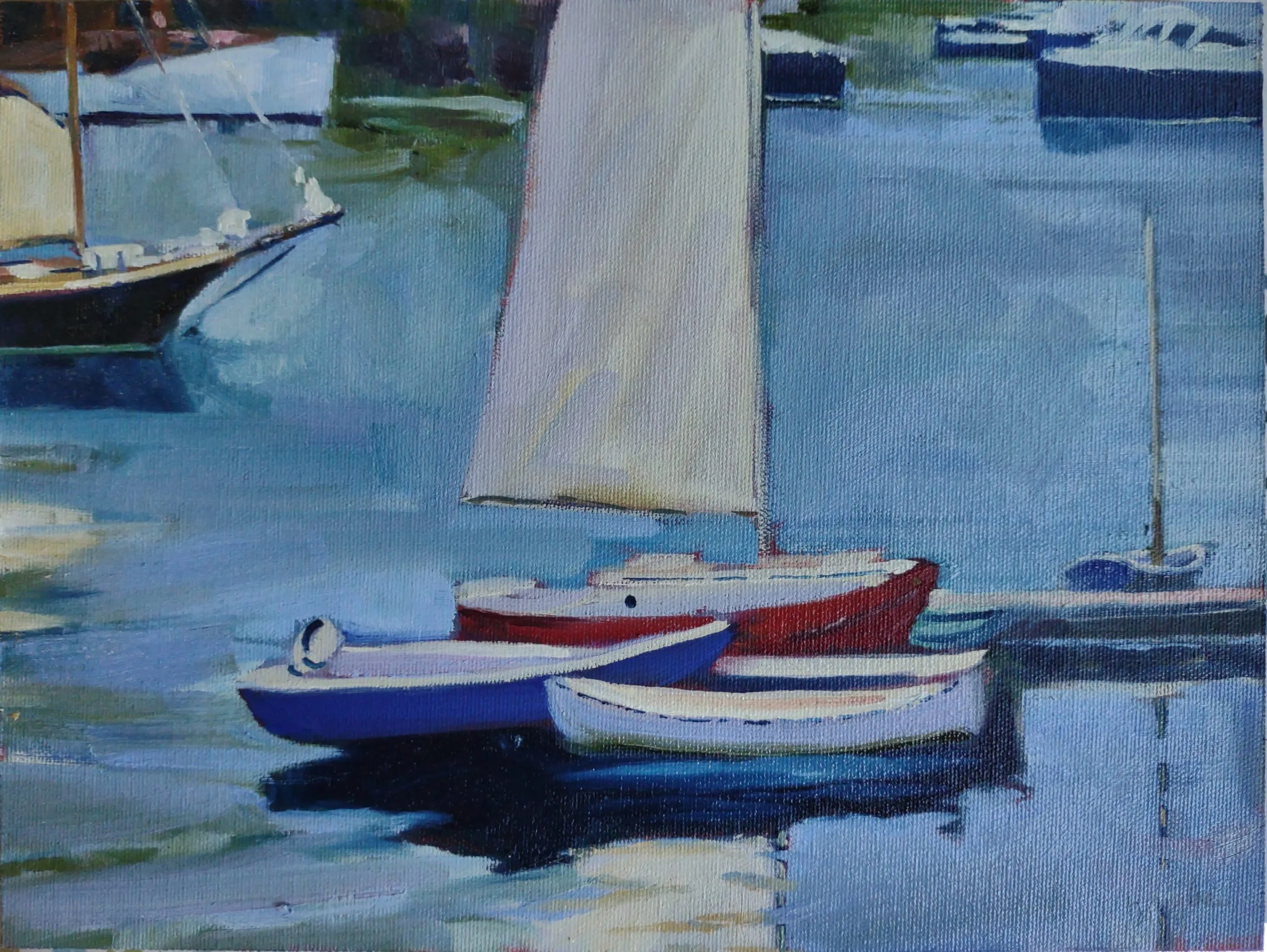
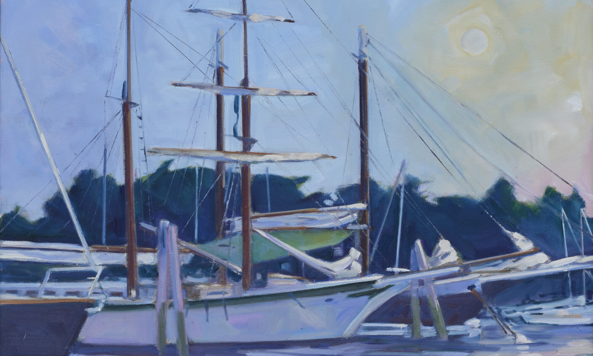
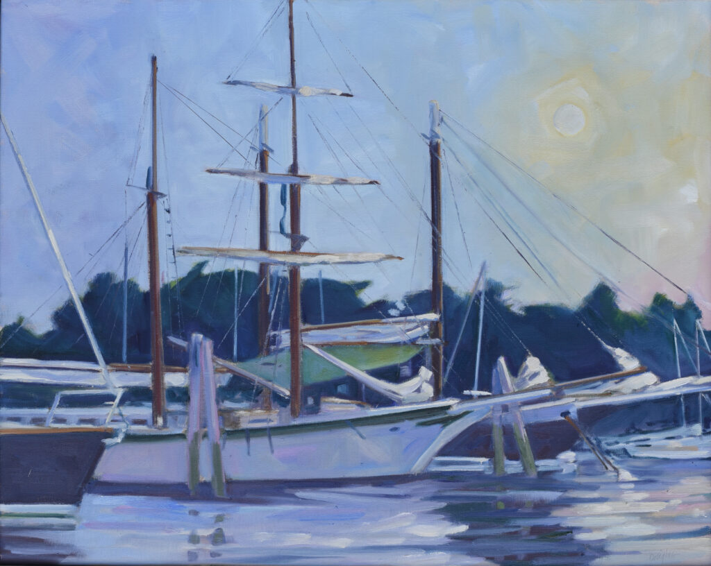
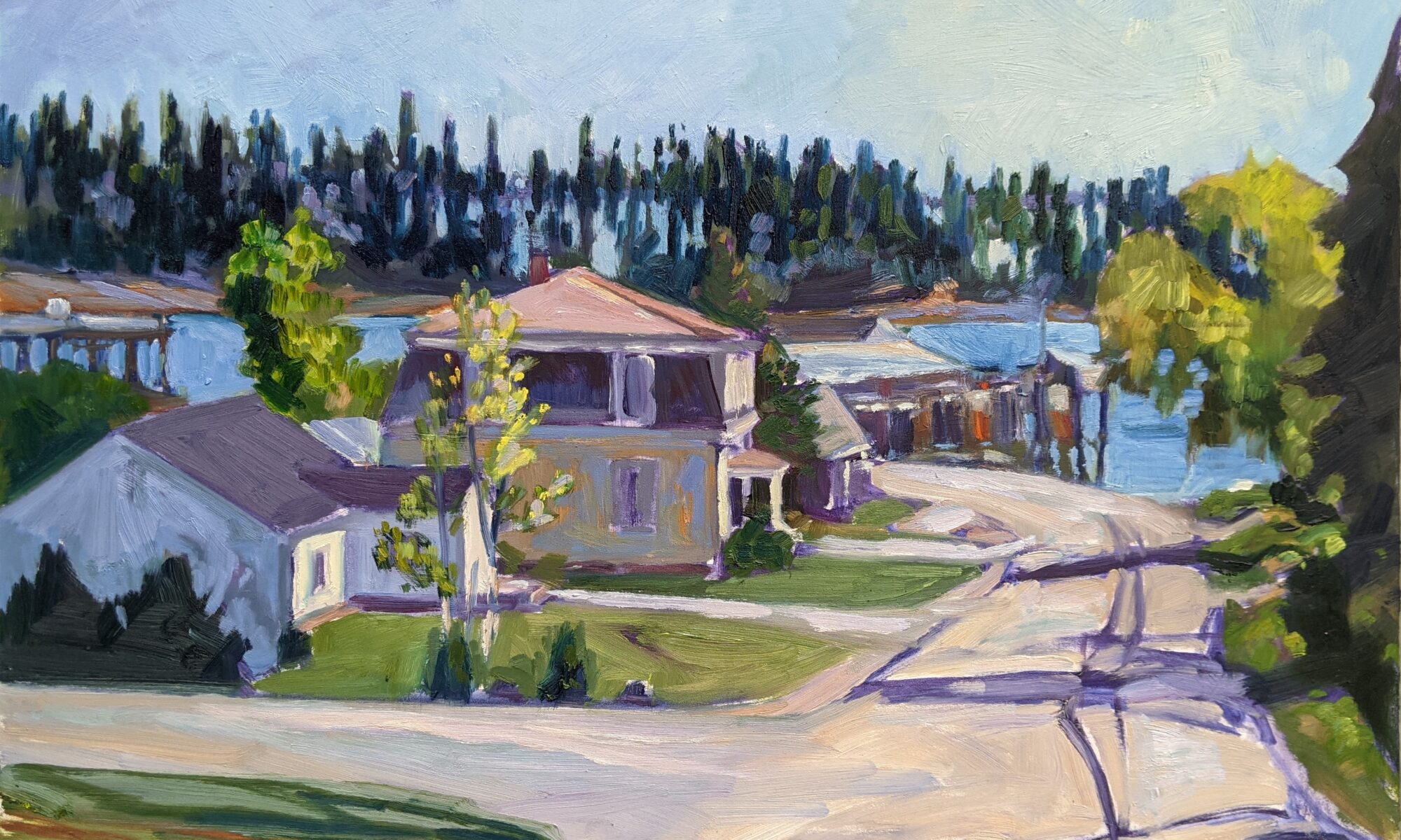
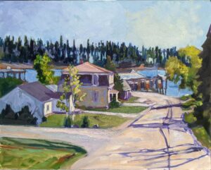
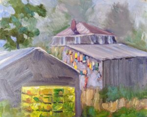
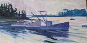
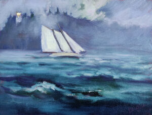
 Drying Sails, oil on canvas, 9×12, available on my website later this morning.