According to the USDA, “a warm wet spring, favorable summer weather, and warm sunny fall days with cool nights should produce the most brilliant autumn colors.” We’re well on our way, having had plenty of moisture (and therefore new growth), along with balmy temperatures.
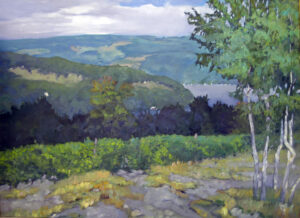
In the northeast, we’ve been seeing the first intimations of autumn for a few weeks: staghorn sumac sporting red velvety fruit, soft maples turning along the edges of ponds, and goldenrod and asters in unmowed fields.
As I look out my window, I see that the young maple across the road is turning gold on its top. It’s the perfect ombre coloring job, and Mother Nature’s been doing it for eons.
This is my favorite season for painting and for sailing. The days are warm, the nights are cool, and the colors are glorious. It’s no surprise that my October immersive workshop has only two seats left.
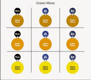
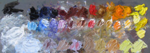
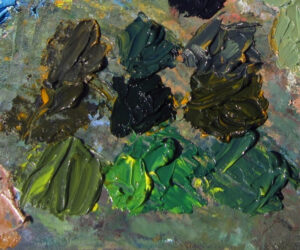
My students are familiar with the exercises I give them to mix greens, because the green matrix helps them avoid the ‘wall of green’ that’s the death of so much landscape painting. I tell them to leave out the top left mixes (yellow ochre/black and Indian yellow/black) in midsummer because they’re only appropriate for autumn. Now’s the time to add those back in, because autumn is as much about bronzes as it is about reds and yellows.
There are three pigments involved in autumn color:
Carotenoids: They give us the yellow, orange, and brown colors in things like corn, carrots, and daffodils.
Anthocyanin: That’s the pigment in apples, grapes, blueberries, strawberries and plums. It’s pH sensitive, which is why it appears to be red in some places, blue in others, and even violet or black.
Chlorophyll: That’s our basic green pigment in leaves. It’s responsible for photosynthesis, so it’s a fundamental building block for life.
Chlorophyll and carotenoids are in leaves all through the growing season but anthocyanins are produced in autumn. As chlorophyll production slows down, the reds and golds and violets in leaves are unmasked.
It’s a slow roll out
None of this happens instantaneously. It starts about the second week in August and continues until just the beech and oak leaves are rattling in the wind in November.
I like high chroma as much as the next painter, but what sets the florid coloring of the maples off are the browns and russets of the beeches and oaks, the violets of dogwoods, and the yellows of birches. Furthermore, about half the trees in the Maine forest are conifers. They’re not the same green as they were in spring; they’ll get deeper and duller as they too slip into dormancy. Convincing autumn color requires all of these.
A little exercise for you
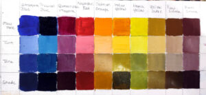
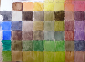
Remember the green matrix I mentioned above? It’s still the basis of autumn color. If you’ve made one up (or in watercolor, made up a mixing chart of the same), try modifying each green with tints of the following colors:
- Quinacridone violet
- Ultramarine blue
- Raw sienna
(A tint is a pigment plus white. In watercolor, you’re not going to add white, of course, but just a dash of the modifying color.)
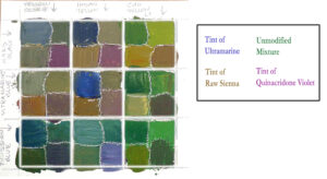
The chart above, made by Jennifer Johnson, shows how it’s done. And when you’re finished, you’ll have a solid blueprint to paint your way through every subtle shade Mother Nature throws at you this fall. Furthermore, you have another hint as to why I paint with premixed tints on my oil palette.
Another little exercise
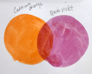
Try mixing cadmium orange and quinacridone violet. Have you ever seen a natural red that’s more vibrant than this? I doubt it. Red can easily be too strong in a landscape painting, so in most field work, I just mix it.
Registration is now open for workshops in 2026! Reserve your spot:
- Advanced Plein Air Painting | Rockport, ME, July 13-17, 2026
- Sea & Sky | Acadia National Park, ME, August 2–7, 2026
- Find your Authentic Voice in Plein Air | Berkshires, MA, August 10-14, 2026
- New! Color Clinic 2026 | Rockport, ME, October 3-4, 2026
- New! Composition Week 2026 | Rockport, ME, October 5-9, 2026
Can’t commit to a full workshop? Work online at your own pace: