The rookie error for summer is to paint all foliage using the same basic color. You lose more points if it’s sap green.
 |
|
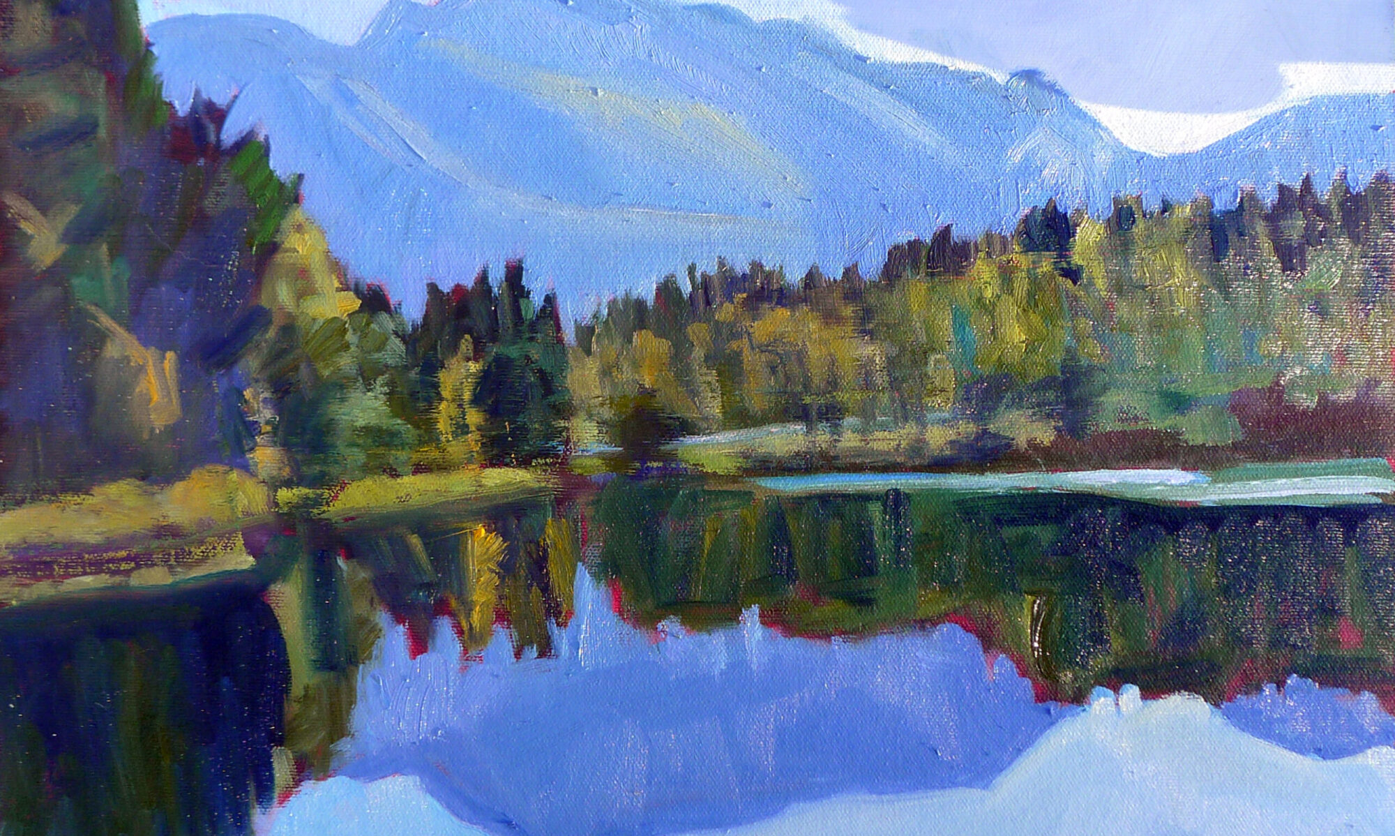
Hazy mountain afternoon: Keuka Lake, by Carol L. Douglas. Available.
|
I have a student who reacts to my pulling out black paint by making the sounds of a rattlesnake at me. She’s been fully inculcated into the idea that black should be banned.
Michael Wilcox published a famous watercolor pigment guide called Blue and Yellow Don’t Make Green. Most of what it tells you can now be found on the internet, but it’s where I first got the idea to add back the banned black.
His point was that there are many routes to the same destination, and that to really mix colors, you need to understand what pigments you’re using, not work from trade names for colors. Consider sap green, for example—a staple of many plein air painters’ toolkit. It’s really a convenience mix made of a phthalo blue and some kind of yellow. The same is true of Hooker’s Green.
 |
|
Chart courtesy of Victoria Brzustowicz
|
The single-pigment (‘true’) greens available are chromium oxide green, viridian, and cobalt green. Chromium oxide green is a lovely, heavy, natural green. Unfortunately, it outweighs everything it’s mixed with. Viridian and cobalt green are lovely, but expensive. Beware viridian hue—it’s just another phthalo in disguise.
By now, foliage has settled into a deeper, more uniform tone. The rookie error of August is to paint all your greens using the same basic color, modulating lighter or darker for highlights and shadows. You’ll have much more life in your trees if you know all the different ways you can get to leafy green. One of the most useful greens is black plus cadmium yellow lemon (or Hansa yellow).
|
Mixed greens, in oils.
|
The best way to navigate the colors of foliage is to avoid greens out of a tube altogether. A system of paired primaries gives you more options, avoiding the acidity of phthalo, the weight of chromium oxide green, or the soul-sucking darkness of sap green.
In my experience, bad paint mixing causes paintings to go wrong faster than anything else. Constantly over-daubing to modulate the paint color distorts the original drawing and makes a grey mush. If you’re confident of the color, you can apply it fast and accurately.
I make my greens on a matrix, which I’ve shown you both mixed (at top) and on a chart (below). I’m leaving for Castine Plein Air, but if I were teaching, I’d be drilling my students on green this week.
 |
| Swatches by Jennifer Johnson |
First mix greens according to the chart, and then modulate your resulting greens with tints (meaning a mix of white and a color). The specific tints are unimportant, but the most useful one for landscape is a mix of white, ultramarine and quinacridone violet, making a pale lavender. It is great for atmospheric perspective.
Note that blue/black pigments are much stronger than the yellows. You need about half the amount of blue or black as you do yellow.
 |
|
Your assignment is to hit paint swatches as closely as you can.
|
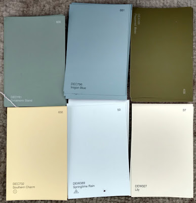
The second exercise involves stopping at your local hardware store for a few paint swatches. These are Benjamin Moore brand, but you should be able to find similar ones elsewhere. There are two off-whites: one cool and one warm. There’s yellow, green, and two soft blues. Your assignment is to mix until you think you’ve hit the exact color. Then put a dot of it on the card to see how close you got. (If you’re working in watercolor, the dot goes on paper instead.)
 |
| Jennifer’s neutral swatches, up close. |
I also have my students make neutrals using combinations of ultramarine blue with burnt sienna and raw sienna. I use ultramarine blue and burnt sienna as my standard dark-neutral, because it can go to the warm or cool side depending on how it is mixed. Raw sienna plus ultramarine is my go-to starting point for granite and the sands of our northern beaches.

Ok, shoooot me, I use lots of sap green. But I also mix my own with my yellows and blues. Shoot me again, I don't own black. If I WERE to buy a tube, would you suggest mars, ivory, or something else? And for that screaming green of spring, bright safety-vest green, any suggestions? I'm heading back away from the coast now, and I'm pretending I'll have time to do some painting exercises, once the landscape doesn't call to me so loud. I need to remember your atmospheric violet mix, though I feel pretty good with how I get it, too.
Rebecca, put down the sap green slowly and nobody gets hurt!
The cool thing about my matrix is that it goes from highest chroma–bottom right–to lowest chroma–top left. So to get safety-vest green, use cad/hansa yellow and a little bit of Prussian (or phthalo) blue.
Ivory black is ducky. My complete supply list is here:
https://docs.google.com/document/d/1iZnRcbzz6iMMcK81d_W0dq9bZKFk5MQ7mY4ciKnJJa0/edit?usp=sharing