
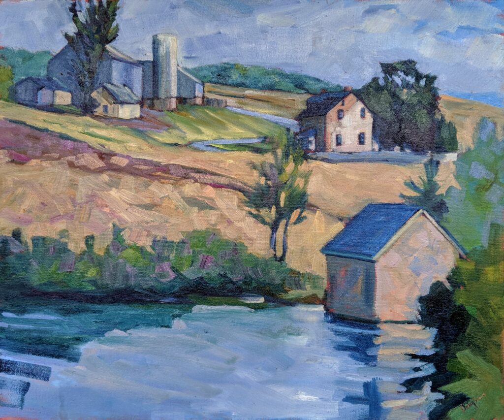
Taking shortcuts
Students understand the importance of a painting protocol (which I’ve shared here for oil painting and here for watercolors). These include sketching, a grisaille or greyscale study and layering paint in a specific order, all of which they’ll dutifully practice in class. Then, in the excitement of the chase, they throw that out the window and go right to color.
Following a painting protocol helps you work efficiently and avoid costly mistakes. It’s just an order of operations, and it’s nothing I invented. Painters have been putting down paint in the same general order for centuries.
A painting protocol also gives you a framework to diagnose problems. For example, if a painting feels flat, you might revisit your value sketch to see how accurately you’ve maintained the original structure. This gives you a systematic way to troubleshoot.
I like to have students lay out their paints in the same order every time they work; after all, it would be hard to play the piano if I kept moving the keys. Throughout the process of painting, repetition helps build consistency. It makes it easier to track what works and refine technique over time.
Each medium has its own requirements, limitations and strengths. A painting protocol ensures you capitalize on them and not make the same errors repeatedly. It prevents technical failures.
Paradoxically, having a painting protocol frees you up creatively. You’re not constantly second-guessing your logistics, so you can focus on expression, composition, and meaning. Protocol is not about rigidity; it’s about making good habits second nature so that your technique supports, rather than hinders, your vision.
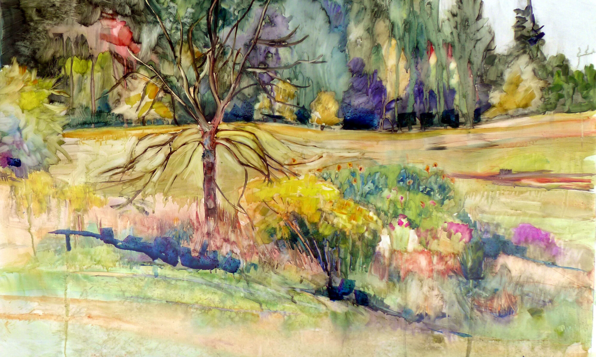
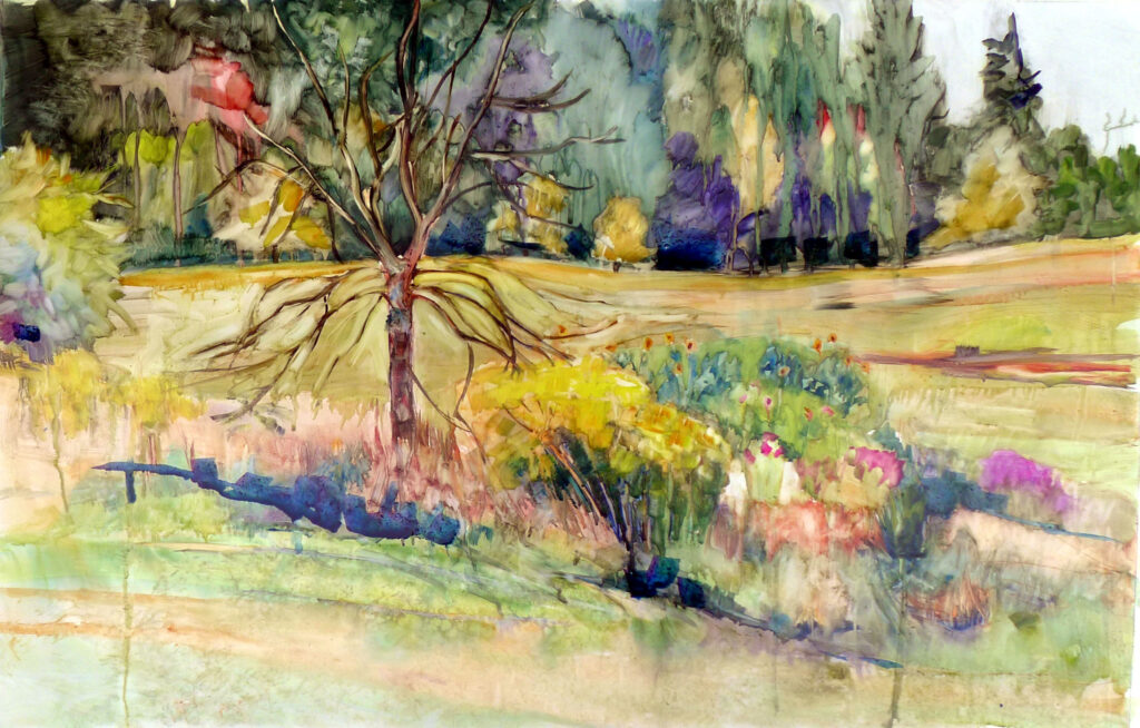
Ignoring value and composition
Beginners are often seduced by color and detail, neglecting value pattern and overall design. But values and composition are foundational to painting. They’re what make a picture work before color or detail ever come into play.
Value creates form and depth. Without a good value structure, paintings look flat and uninteresting. And value controls focus, since the eye naturally goes to areas of highest contrast. By controlling values, you control where the viewer looks.
If the value structure is naff, no amount of beautiful color will save it.
Composition is closely related to value, but is the more general arrangement of elements in your painting: shapes, lines, values and colors. Composition is how you guide the viewer’s eye and communicate your intent.
Good composition leads the eye on a purposeful path through the painting. Bad composition leaves the viewer wandering or worse, invites him or her to move on to something else.
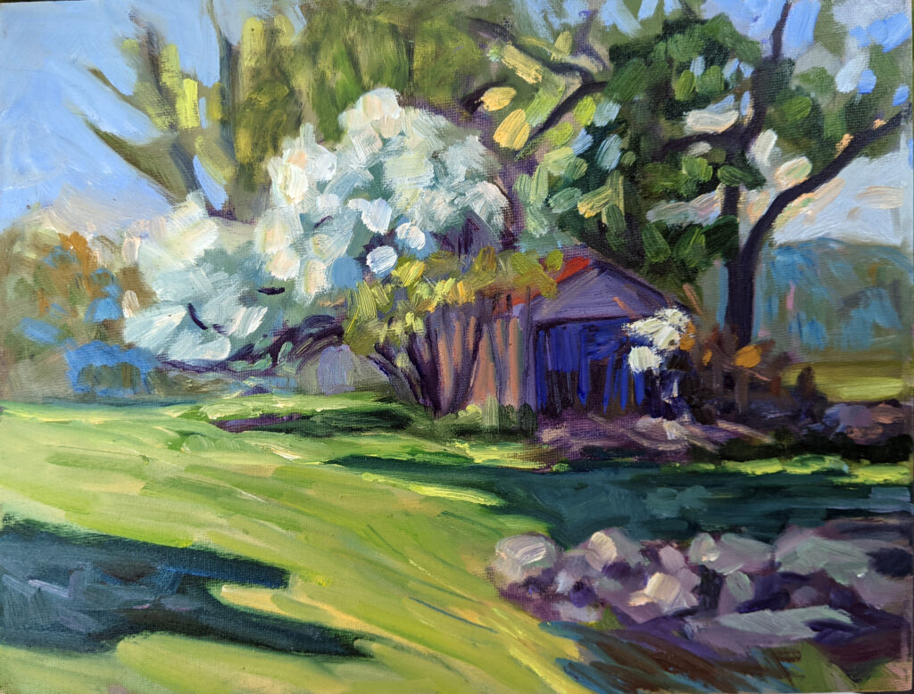
Coloring inside the lines
I can’t tell you how many times I’ve had students do brilliant drawings, but when it comes time to move those drawing to their canvases, they revert right back to copying their reference photos. (That’s one good reason to paint from life whenever possible.)
I used to have a painting teacher who said, “You are all terrified.” Well, I popped her in the nose—just kidding, but it took more than a blank canvas to terrify me. However, there was something in what she said. Students tend to play it safe, coloring inside the lines, using timid brushstrokes, and slavishly copying their reference. That leads to stiff, lifeless work and, worse, prevents real growth.
Reserve your spot now for a workshop in 2025:
- Advanced Plein Air Painting, Rockport, ME, July 7-11, 2025.
- Sea and Sky at Acadia National Park, August 3-8, 2025.
- Find Your Authentic Voice in Plein Air, Berkshires, MA, August 11-15, 2025.
- Immersive In-Person Fall Workshop, Rockport, ME, October 6-10, 2025.