
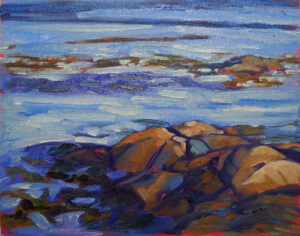
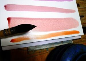
“I think when we ‘paint for ourselves,’ that’s when growth can happen. Our work just might push to a different level,” Barb Walker commented recently on Facebook.
“The whole burden of making a living selling artwork can have a devastating effect on one’s work,” Eric Jacobsen responded. “It keeps us in repetition mode and causes us to play it safe. Charlie Movalli posed a great question once. He asked, ‘Do you paint to be understood…or do you paint to understand?'”
I’ve had times where I stopped selling entirely to concentrate on improving my skills, and times when I produced very personal work that will never sell in my lifetime. But I’m more cynical than Eric and Barb. I need to eat, and I’m not much good at anything else. I either sell paintings or take a job as a greeter at Walmart.
Somehow our culture has created the myth that artists are above thinking about the business of art. “I’ve never been in it for the money,” said one friend (who nonetheless has a family to support). Nobody expects their doctors or lawyers to be motivated by altruism, and most of my painting buddies have spent at least as much time learning their craft as a professional-school graduate. (The BFA is just the beginning, friends.)
It’s counterproductive for artists to buy into this myth. If we don’t set a high value on our artwork, who will?
Above it or afraid?
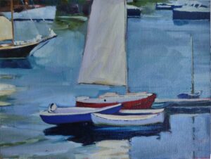
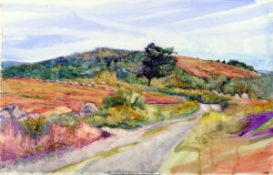
Sometimes, people refuse to engage in the marketplace because they’re afraid of failure. Painting for public consumption can make us better painters, however, as we strive to connect with an audience.
It doesn’t help that there’s some stupendously awful work out there masquerading as ‘art.’
This week a reader sent me a photo of an object painted by an ‘artist’ as a fundraiser. It was incompetent by every measure of design and execution. “It seems almost like satire. It highlights the unfortunate reality that anyone can call themselves an artist, and far too many do,” my reader commented.
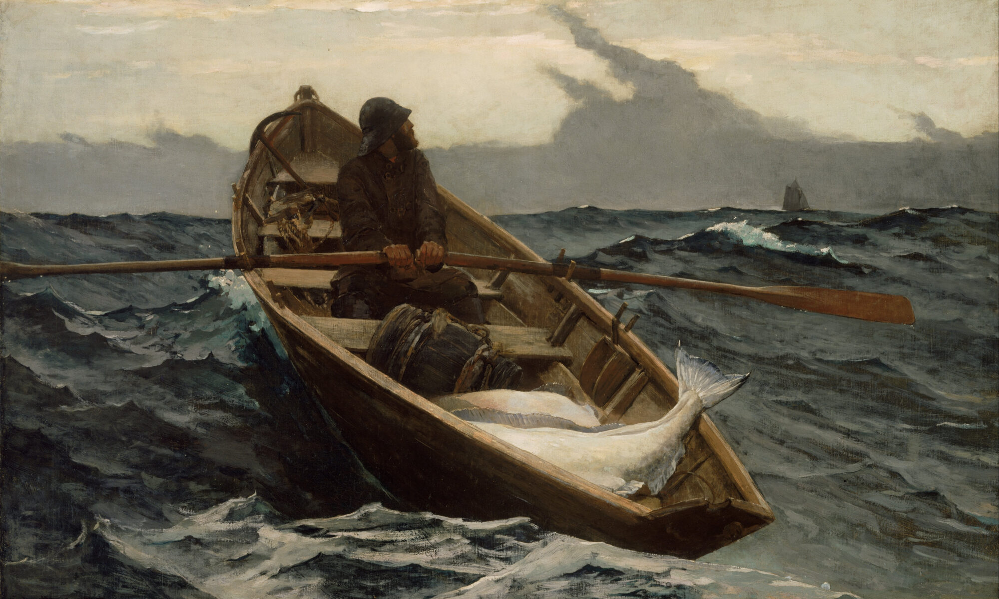
I spend a great deal of time teaching painters the objective criteria for critique. I wish someone would do the same for art fans. “I don’t know art but I know what I like,” is a great starting point. However, it’s not enough. If you want a painting that will continue to speak to you for years to come, it helps to understand what makes a good painting. And that’s not opinion; it rests on a thousand years of tradition and critical thinking.
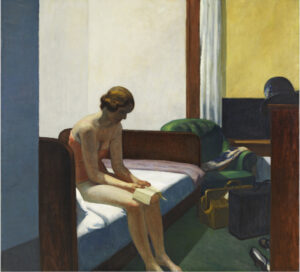
As with every philosophical endeavor, understanding starts with a common language. When artists carry on about things like lost-and-found line or pictorial depth, they’re not just trying to sound smart and smarmy. These are real factors that affect the staying power of a painting. And they’re as relevant in abstraction as in figurative art.
Two events this week
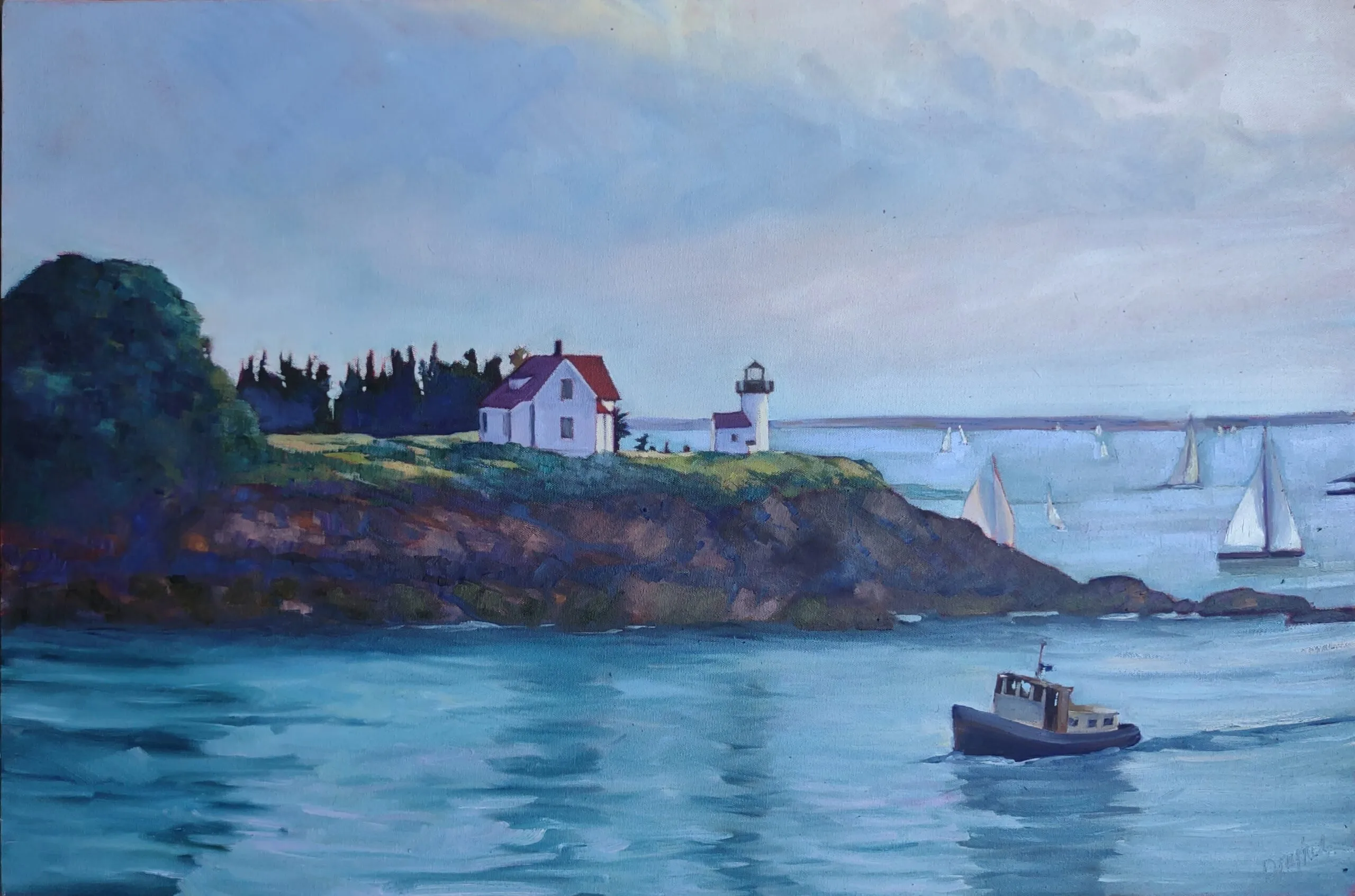
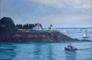
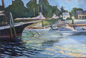
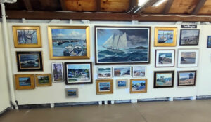
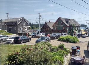
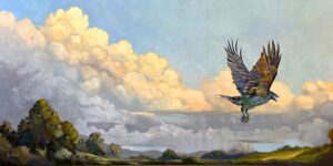
Kay Sullivan, Eric Jacobsen, Jill Valliere and Jim Vandernoot will be featured at the Red Barn Gallery‘s Strictly Invitational show this evening from 5-7 PM. That’s located in the heart of scenic Port Clyde village, across the street from the General Store. They’re a powerful lineup that’s worth driving out to see.
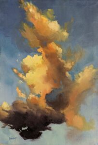
Camden on Canvas is next weekend, July 21-23, in the equally picturesque village of Camden, ME. There are too many great artists to list them by name here, but Colin Page, in particular, deserves a shout-out. Each year, he wears two hats, as organizer and participant. He and the library staff have put together a fantastic event in just a few short years. I strongly encourage you to come out and see the art.
My 2024 workshops:
- Painting in Paradise: Rockport, ME, July 8-12, 2024.
- Sea & Sky at Schoodic, August 4-9, 2024.
- Find your authentic voice in plein air: Berkshires, August 12-16, 2024.
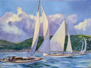
- Art and Adventure at Sea: Paint Aboard Schooner American Eagle, September 15-19, 2024.
- Immersive In-Person Workshop: Rockport, ME, October 7-11, 2024.


_-_WGA02983.jpg)