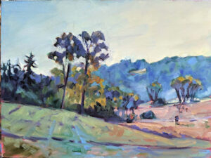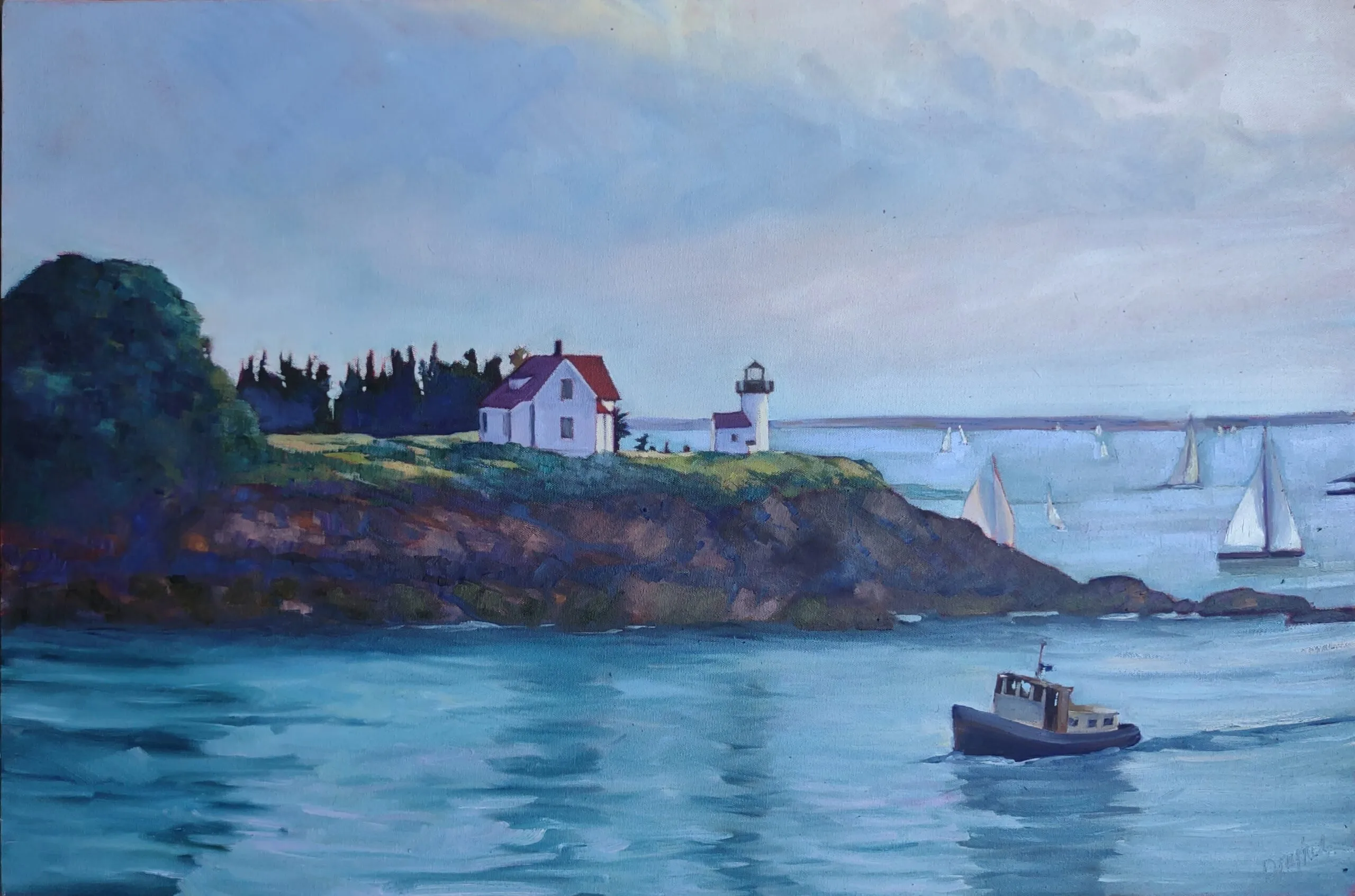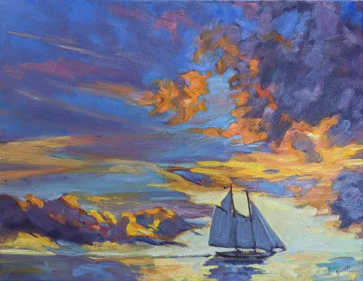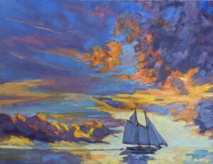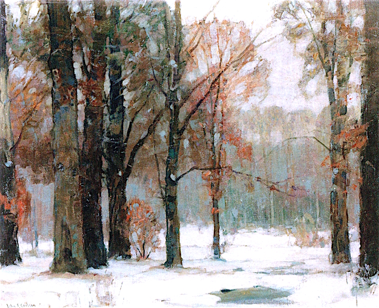
Thinking about the landscape as a series of planes will help you create depth in your painting.
When Eric Jacobsen told us that he was teaching the theory of angles and consequent values in his recent workshop, I was baffled by the big words. “What’s that when it’s at home?” I asked him. Ken DeWaard was equally confused, responding in a torrent of emojis.
“C’mon, guys, it’s John F. Carlson 101!” Eric exclaimed. Björn Runquist immediately checked, and announced that there was nothing about any angles on page 101. (Actually, it’s in chapter 3; I checked.)
It’s no wonder that Eric’s no longer returning our calls.
All kidding aside, Carlson’s Guide to Landscape Painting is a classic. His theory, although it has a high-flown title, is actually quite intelligible to even the meanest intellects (and you know who you are, guys).
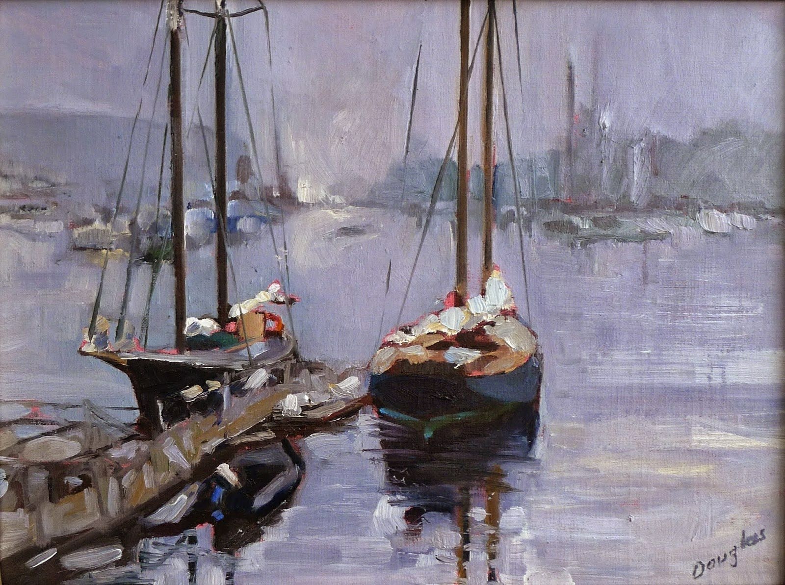
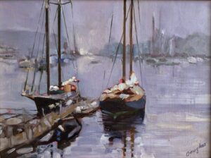
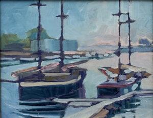
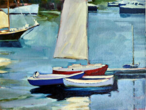
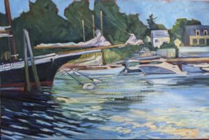
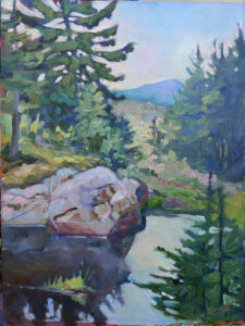
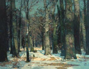
“Every good picture is fundamentally an arrangement of three or four large masses,” Carlson began. That’s as good an organizing principle as any in art. Value is what makes form visible, so we should see, translate, simplify and organize form into value masses.
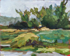
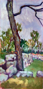
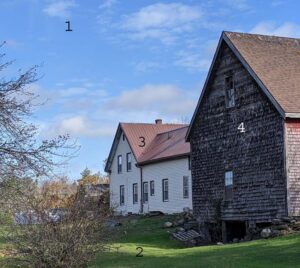
Carlson wrote that any landscape would contain four groups of values bouncing off three major planes:
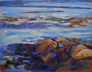
- The horizontal ground plane;
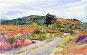
- The angle plane represented by mountain slopes or rooftops;
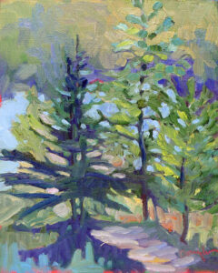
- The upright plane, which is perpendicular to the ground plane, such as trees.
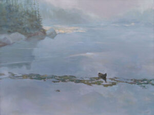
In the middle of the day-our most common circumstance for painting-the value structure would be as follows:
- The sky is our light source. It should be the highest value in our painting.
- The ground plane gets the most light bouncing off it, so it should be the next-lightest plane.
- The angle planes such as rooftops or mountain slopes, are the next lightest planes.
- The upright objects in our painting, such as trees, walls or people, should be the darkest value element.

That doesn’t mean that the shapes are crudely simplified, as a glance at Carlson’s own paintings confirms. The shapes can be beautiful, elegant, complex, and lyrical without too much value overlap.
Thinking about the landscape as a series of planes will help you create depth in your painting. However, it can be tricky to see the landscape as a series of planes rather than objects. It can be helpful to keep each value group completely separate, with no overlap of values, but, in reality, there will always be overlap.
As you try to integrate this idea into your painting, exaggerate the separation of planes.
Of course, there are many circumstances where this doesn’t hold true-where the sky is leaden and darker than a snow plane, or when the fading evening light is hitting the vertical plane rather than the ground. But understanding it will help you paint the exceptions in a more arresting way.
This post originally appeared in 2021, but the information bears repeating.
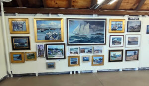
My 2024 workshops:
- Painting in Paradise: Rockport, ME, July 8-12, 2024.
- Sea & Sky at Schoodic, August 4-9, 2024.
- Find your authentic voice in plein air: Berkshires, August 12-16, 2024.
- Art and Adventure at Sea: Paint Aboard Schooner American Eagle, September 15-19, 2024.
- Immersive In-Person Workshop: Rockport, ME, October 7-11, 2024.