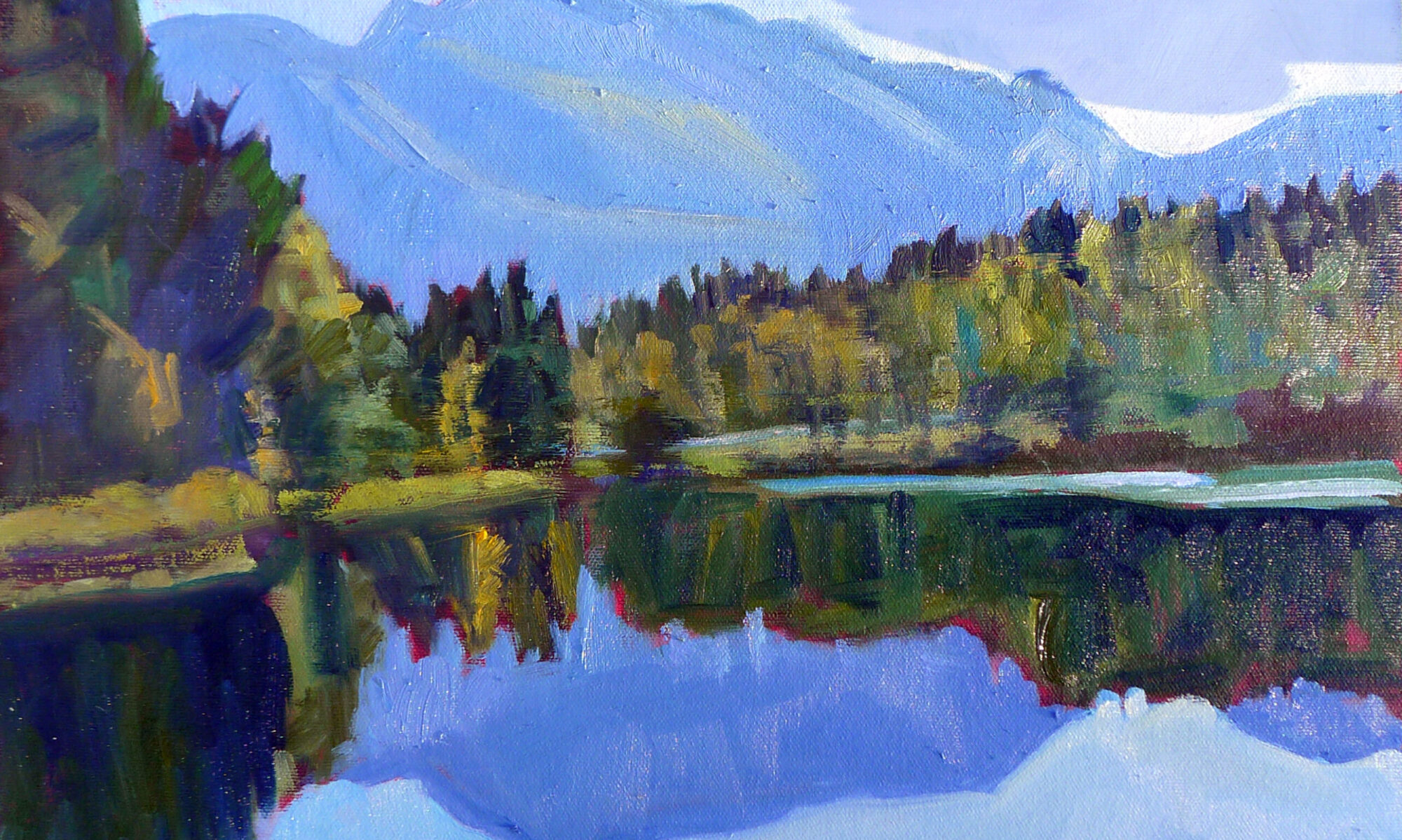
The last thing I want is to create a school of mini-me painters with a slavish fidelity to my style. But there are ways to make painting easier, and people wouldn’t take my classes and workshops if they didn’t want to learn that.
| Victoria Brzustowicz made this color chart based on my workshop palette. Here is a printable PDF.I crossed out the red on the chart because in most cases, it’s unnecessary.
|
On the other hand, I’m emphatic about how the beginner’s palette is set up. One of my students made the nifty little paint chart above and gave me permission to share it.
Why do I ask my painters to set up like this?
- It’s efficient;
- It allows you to mix without thinking;
- It prevents the beginner’s error of modulating with white or black;
- It teaches how to mix greens.
The color tints are there as a substitute for straight-up white. If the light is cool use a cool tint; if the light is warm, use a warm tint. (I make an added puddle of lavender to modulate my greens; often that is the most appropriate cool modulator for our northern forest of mixed greens.)
I crossed out the red on the chart because in most cases, it’s unnecessary.
| Admittedly, it’s a bit scruffy, but I’ve got all my landscape greens and all my figure skin hues built on the same system. |
Is this the only palette organization that works? Of course not! I recently had a funny conversation with a fellow teacher who swears by phthalo green, a paint that I think should be banned by international convention. We each have our rationale, but the pigments we each use are part of our own coherent systems, not purchased higgledy–piggledy. In time, you will branch out in your paint buying, but it makes sense to start with a proven system.
Let me know if you’re interested in painting with me on the Schoodic Peninsula in beautiful Acadia National Park in August 2015. Click here for more information on my Maine workshops! Download a brochure here.

Interesting palette, Carol! And I like the idea of having a row of tints of the colors instead of a puddle of (often dirty) white on the palette. Gamblin makes a cool and a warm white that I'm finding useful, and these help in a similar way. I do use phthalo green, but in the hands of a civilian, it can be quite dangerous. Proper training and certification is important for using it safely. 🙂
This comment has been removed by the author.
Yeah, I didn't know if I wanted to identify "Mad Michael" Chesley Johnson by name as the user of that TNT of pigments.
My criteria is essentially to have a warm and cool of each primary–quin and orange serving that purpose for red–and a few earths. You could doubtlessly do this with NO earths, but I like their opacity in the place of white.
I kind of touched on the principle here:
http://watchmepaint.blogspot.com/2015/01/oldies-but-goodies.html
I agree; the earth colors are great modulators. They grey color down nicely. I've been playing with a palette of burnt sienna, yellow ochre and Prussian blue, which makes for some very harmonious color mixtures. If I need to punch up the chroma, I'll sneak in a touch from my split-primary palette.
Yellow ochre and Prussian blue is actually one of my happiest greens.