

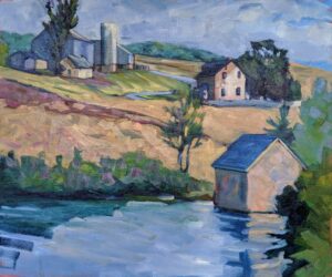
Volume is the three-dimensional space occupied by an object. For example, in Home Farm, above, each of the buildings has a height, width, and depth, and the product of those three things is its volume. Form is the artist’s representation of volume, and shape is the space enclosed by a line or lines.
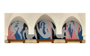
Usually, we start with a line drawing (shape) and then use modeling to create form. However, there are many instances in which form is implied with no modeling at all; see Henri Matisse’s The Dance, above, for just one (superb) example.
Before you can progress to modeling, you need to create accurate shapes. This starts with measurement, which is most often done with the pencil-and-thumb method and with angles. A theoretical understanding of perspective helps as well. (I am convinced that anyone of normal intelligence can learn to draw, given patience and perseverance.)
When we think about modeling, we think of shading, which is the technique we use to represent light and shadow on an object’s surface. Start by observing how light interacts with the objects’ surfaces. If they’re shiny, the value range (light to dark) will be much greater than if the surfaces are matte. Likewise, if the light is close by, shadows and highlights will be harsher than if the light source is far away or filtered.
Our first task is to identify where the light is coming from. The direction and intensity of the light will affect how shadows are cast, and where highlights appear on the object. But to confuse the issue, light can bounce around and shadows can overlay other shadows. A good understanding of light is important, but it can never replace observation. By that I mean observation from life, for just as cameras compress color, they also compress greyscale.
We use gradation to model changes in light levels. That can take the form of carefully blended charcoal, graphite or, indeed, paint. Sandy Quang and I demonstrated drawing globes in pencil here, so you can follow our steps to practice drawing shiny round objects.
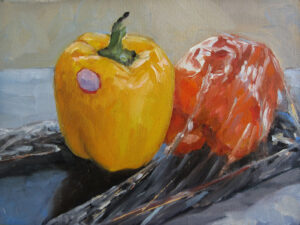
Gradation can also be implied with the use of hatching, cross-hatching, stippling, or rough paint or lines. In the two peppers above there is no blending at all; the mind fills in the gaps.
Your specific technique for gradation isn’t as important as your observation of how the light levels and patterns tie together. This can be complicated.
Every painting has highlights and core shadows. The highlights are the brightest areas in the picture, usually facing the light. Core shadows are the darkest part of the picture, usually opposite the light source. Highlights may be absolute white and core shadows absolute black. Although we could draw them like that, modern painting tends to shy from either true white or black. (Even watercolor paper is not harshly white.) That, however, like so many other things, is a trope of our times. The Baroque masters of chiaroscuro relied on absolute black to set the dramatic mood.
Highlights and core shadows are easy enough to spot. What is more difficult is fitting the mid-tones in, in a consistent series of steps from dark to light, hitting all or most of the levels. If you don’t start with the highs and lows, it’s very easy to err on the side of being too dark or too light. This is where a greyscale is very handy, for light levels are infinitely complicated. I’ve tacked one at the end of this post; go ahead and print and use it.
Remember that brushwork and drawn lines themselves can imply volume by curving with the object’s surface. This is an effective technique in both drawing and painting.

Registration is now open for workshops in 2026! Reserve your spot:
- Advanced Plein Air Painting | Rockport, ME, July 13-17, 2026
- Sea & Sky | Acadia National Park, ME, August 2–7, 2026
- Find your Authentic Voice in Plein Air | Berkshires, MA, August 10-14, 2026
- New! Color Clinic 2026 | Rockport, ME, October 3-4, 2026
- New! Composition Week 2026 | Rockport, ME, October 5-9, 2026
Can’t commit to a full workshop? Work online at your own pace:
Carol, thank you for your weekly blog posts. This week’s post has given me much to think about. Over the last couple of months, I’ve experienced a renewed interest in color and its use when quilting. My current project uses low volume prints instead of stark solid white for the background. I had seen a rendition of this quilt online and even with the myriad of quilts in my daily feed, I kept returning to this particular one. It had depth instead of being simply a collection of geometric shapes laying on a monochromatic background. The quilter who had made it used her camera’s mono filter when photographing fabrics she was auditioning for the project, allowing her to see where on the greyscale they fell. She said this process helped her to see the volume of the fabric. For me it is a whole new way of laying down the foundation of the design and I’m excited knowing the finished piece will be more interesting to look at.
The use of color is fascinating and has opened my eyes to seeing the world around us differently. Snow is no longer simply white. Color brings joy to my day, every day. Who knows, perhaps there’s a hidden artist in me just waiting to take a class with you. I just need to find a way to double the hours in my day.
Thanks for taking the time to share your knowledge.