Monday Morning Art School: the danger of safe color

Towpath on the Erie Canal
“Pulteney vineyard,” private collection. For another treatment of the same vineyard, see here.

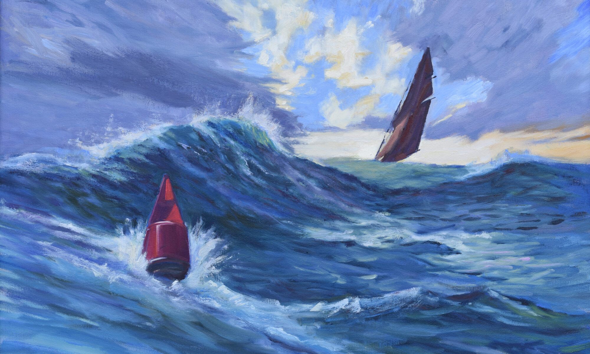
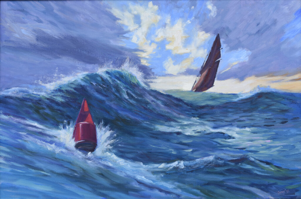
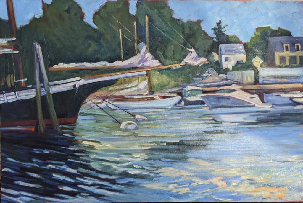
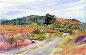
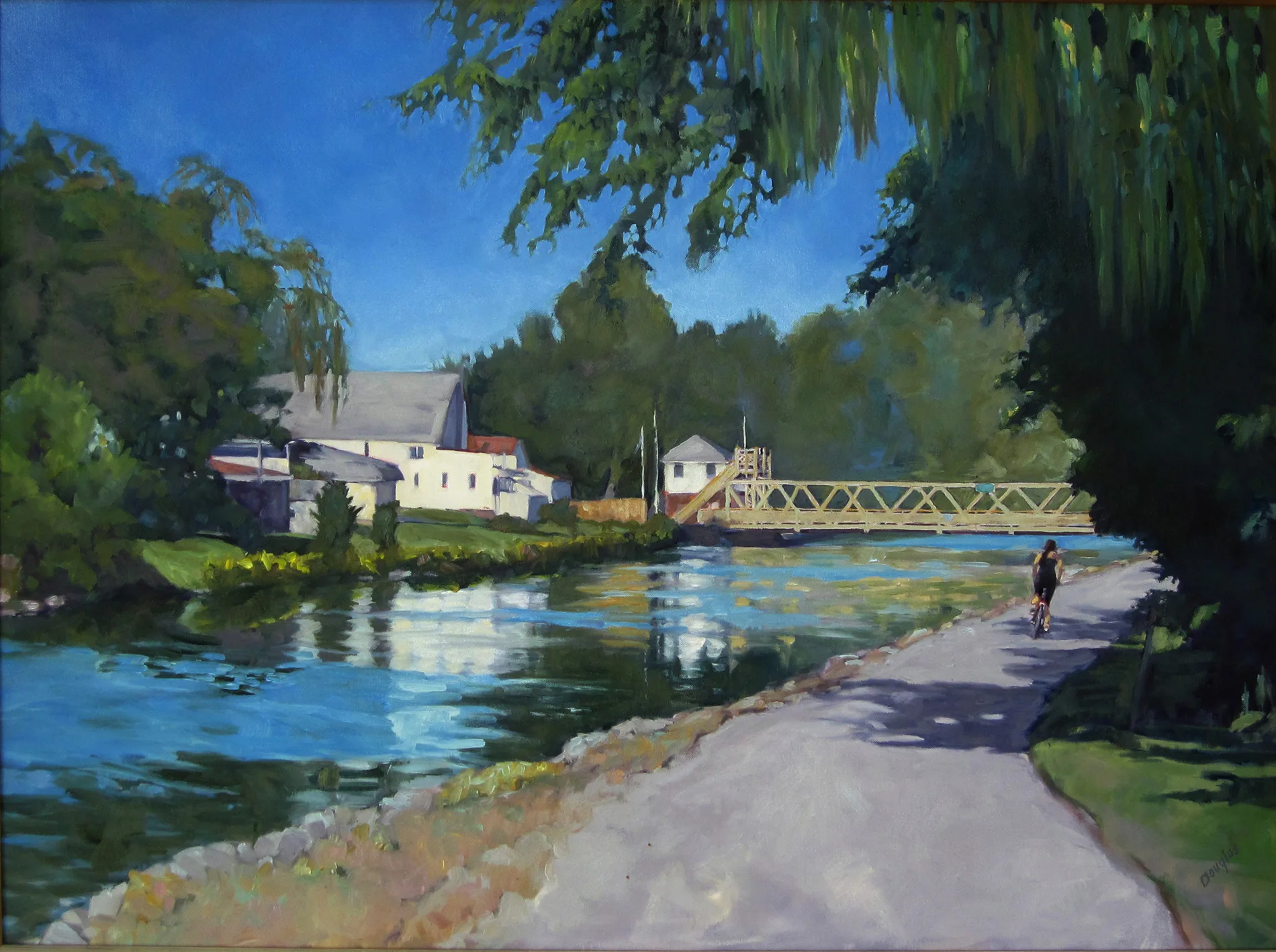
There’s nothing inherently wrong with a delicate painting, but safe color can make an otherwise accomplished painting boring. That’s true even when the drawing is solid, the values are controlled and the technique is assured. There are certainly days when the light is dull and the color is duller. But you need to translate that into something that will compel the viewer to walk across the room.

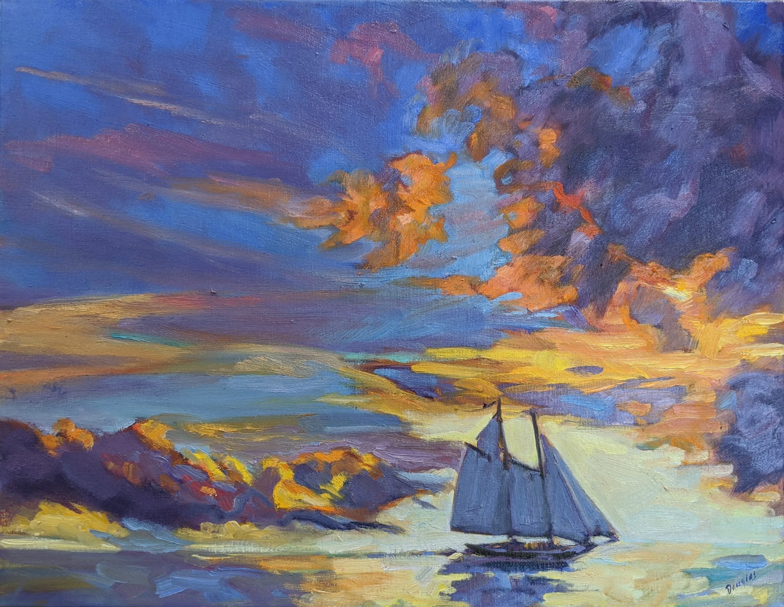
The modern world loves color saturation. My phone edits my photos to be hyperintense; social media is full of high-chroma color. In this world, paintings that whisper can disappear entirely.

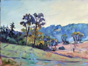
High chroma, however, must be balanced with lower-chroma passages. Otherwise, it overwhelms. The goal isn’t maximum saturation everywhere; it’s contrast of saturation.

Towpath on the Erie Canal
“Towpath on the Erie Canal,” 30X40, oil on canvas, private collection.

How to mix mud… or not

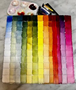
Clean color mixing starts with understanding warmth and coolness within individual pigments. Overtones matter. You can’t randomly mix any blue and any red and expect a high-octane purple. If either pigment carries yellow overtones, you’ll get mud. It’s easy to subdue a wild color; it’s impossible to enliven a dead one. Paint can never be mixed more intensely than it comes out of the tube.

The three historical palettes (and that’s a vast oversimplification) are classical, impressionist, and 20th-century. The 20th century palette has the highest chroma, widest temperature spread and hits the most points on the color wheel. Starting there saves you aggravation, because buying more paint than you need is a waste of money and a fast track to confusion.

Paired primaries can get you to anywhere you need to go in paint-mixing. For more information, see here.

Some specific color concerns

I recommend against heavy-metal pigments for environmental and safety reasons. They also tend to make muddy colors. For example, cadmium pigments mix true only to the warm side.

Viridian is a very cool green and almost always needs warming for foliage. If you mix lemon yellows with any blues, you’ll get cool spring greens. Most natural greens are warmer. Yellow ochre and Indian yellow temper greens because you’re actually adding a lot of red.

For the same reason, darkening with red kills chroma. Instead, use quinacridone magenta or violet.

It’s easy to drop the chroma of high-chroma 20th century pigments.

How to hit the perfect color every time

Start with the pigment closest to your goal. Ask: in which direction on the color wheel do I need to go? Does chroma need lowering? Does it need to go darker? Lighter? Once you’ve answered those questions, you can stop fiddling.

And remember, you can lie about hue if you tell the truth about value.

If you mix the color right but you still make mud, the culprits may be:

  • Too much solvent or medium;
  • Too many layers;
  • Overworking and fussing;
  • Digging in with a vertical brush.

As the old Ronco ads used to say, “set it and forget it.”

By the way, one reason we tend to use too much solvent or medium is that we’ve let our paint half harden on the palette and are trying to open it back up. Suck it up and put out fresh paint.

Want to try painting? I’d love to have you join me for Trust the Process (making technique tell the story you want to tell), my live Zoom class designed to help you build a dependable, joyful, repeatable painting practice. We’ll dig into technique, creative decision-making and the mindset that frees you to paint with confidence. We meet Monday nights, 6-9 PM EST, starting on January 5, 2026. It’s suitable for all levels and all media. You can learn more here.

Registration is now open for workshops in 2026! Reserve your spot:

Can’t commit to a full workshop? Work online at your own pace:

Seven Protocols for Successful Oil Painters

Monday Morning Art School: five ways to create focal points

By the time you read this, I’ll be embarking on my first day of two weeks of teaching—first at Schoodic Institute in Acadia National Park, and then in the Berkshires. (Schoodic is now closed, but there’s still room in the Berkshires.) This morning I’m starting with composition and focal points.

Focal points are crucial in painting. They guide the viewer’s eye and create visual interest and impact. Not everything in a painting should compete for attention. Focal points help establish a clear visual order, telling the viewer where to look first. This hierarchy makes the painting more readable and engaging.

Understanding focal points is fundamental to intentionally designing your paintings. Focal points influence and interact with rhythm, value structure, color, edges, and detail—in short, the most critical elements of design.

For a more in-depth description of focal point, see here.

How to Create a Focal Point:

Here are five ways to create focal points in your paintings

Line—the human eye naturally follows lines.

Line is the boundary between two shapes. There are two fundamental kinds of line: actual lines, which are visible marks, and implied lines, which are suggested by a sequence of objects—like a row of trees or the gaze of the subject.

Line directs the eye, so you can use it to guide the viewer through the painting.

Value contrast—the eye sees shifts in value first.

This makes it the most important design element in visual art. Value contrast defines form and structure and creates the illusion of depth and volume. But most importantly, it controls the viewer’s eye.

Because of the physical construction of our eyes, we are drawn to areas of strong contrast. You can use value contrast to highlight focal points, draw the viewer through your composition and emphasize what’s important (and downplay what isn’t). That’s the theatrical power of chiaroscuro right there.

Chroma contrast—use high-chroma focal points in contrast to a neutral background.

Lobster pound, 14X18, oil on canvas, $1594 framed includes shipping and handling within the continental US.

First, some definitions. High chroma means intense, pure, vivid color. Low chroma means dull, neutral, or grayed-out color.

Passages of high chroma against low chroma draw attention and create focal points. Our eyes are drawn to areas of strong chroma contrast. For example, a splash of bright yellow in a painting full of muted tones instantly commands attention.

Varying chromatic intensity also adds emotional power, creates depth and space, and supports color harmony.

Warm vs. cool contrast—use warm tones against cool tones to create focal points.

Heavy Weather (Ketch Angelique), 24X36, oil on canvas, framed, $3985 includes shipping and handling in continental US.

Contrasting warm and cool colors draw the eye. The viewer instinctively notices where temperatures shift, especially if warm and cool are placed side by side.

Warm vs. cool contrast is one of the most useful tools in a painter’s toolbox. It helps create spatial depth, especially when describing light and shadow. It adds emotional tone. Used properly, it creates color harmony.

Place focal points at strategic compositional points

Placing focal points at visually strategic points in a painting is essential. You would be unwise to place focal points on the edge of the canvas, for example. That looks unbalanced and will encourage the viewer’s eye to just leave the picture entirely.

Careful placement of focal points guides the viewer’s eye naturally. These have to be considered in relation to each other, and their placement is as important as the patterns of darks in your painting.

Strategic placement always takes into account the shape and orientation of the canvas. It’s about using the visual geometry of the space to strengthen the painting’s design.

Registration is now open for workshops in 2026! Reserve your spot:

Can’t commit to a full workshop? Work online at your own pace:

Seven Protocols for Successful Oil Painters

Art and social media

Camden Harbor, Midsummer, oil on canvas, 24X36 $3188 includes shipping in continental US.

Yesterday, I did an interview for this autumn’s Artworks for Humanity. The conversation got me thinking about the relationship between art and social media.

How does social media shape creativity?

Social media is a two-edged sword for the creative. It can energize our thinking or chip away at our self-esteem.

I can now visit more museums in a day than I used to be able to visit in a year. The internet gives us instant access to others’ ideas. That’s great for cross-pollination, learning about trends, and feeling like part of the larger creative world. Social media can give you feedback and help you find your tribe, particularly when you’re a niche artist.

Beautiful Dream, oil on archival canvasboard, $1449 framed includes shipping and handling in continental US.

At the same time, social media is essentially isolating, since we post and consume it alone.

Constant comparison with others makes me feel less productive and less creative. The feedback one gets is seldom deep, thoughtful or intelligent. Rather, it’s distilled down to things like, “Love this,” or “Beautiful!” Worse, it can simply mean capturing as many likes as we can get.

Fear of negative feedback can steer us back toward safer subjects. That has been one of the bugbears interfering with my own work over the last few months. None of us like to admit that we seek validation, but we do.

When we’re always on display, it’s too easy to play it safe. I mentioned on Monday that I’m not sharing my sketchbook right now, because it’s full of half-baked ideas. When I’m playing to the crowd, I avoid risks.

Social media favors easily-digested content, like reels, stories, and time-lapses of work in the making. That encourages output over depth, which is why those acrylic paint-pouring videos are so popular.

Inlet, 9X12, oil on archival canvasboard, $869 includes shipping and handling in continental US

Small video screens favor images that are high-saturation. Yesterday, I was showing Inlet (above) to a gallery visitor. I love this painting for its accurate rendering of the boreal woods, but it doesn’t read wonderfully on social media. It’s dark, cool and low-chroma.

I like high-chroma painting as much as anyone, but it’s not the only kind of art that has value. Often, other art wears better over time.

How has the rise of social media changed how we make art?

Before the internet, artists created work with gallery visitors, clients and themselves in mind. Today we ask, “How will this look on Instagram?” This shifts the intention of the work, but it also affects how we make it. We’re living in the age of bold color and brushwork, because these are the things that look good on a small screen. Fewer people concentrate on the gemlike beauty of indirect light, despite its long history in painting.

Social media favors regular posting. That makes speed paramount. Painting to trending hashtags (like challenges) or good Search Engine Optimization (SEO) terms is a sadly common idea. Consciously or subconsciously, artists prioritize what’s shareable over what’s meaningful or complex.

You might say these things don’t matter to you, but you wouldn’t even be seeing this blog if I didn’t tailor the word order in my posts to SEO. Without it, the most beautiful content sinks like a rock.

Heavy Weather (Ketch Angelique), 24X36, oil on canvas, framed, $3985 includes shipping and handling in continental US. This is one of the paintings currently at Lone Pine (see below).

Painting is not performance art

I’ve made enough painting videos to know that the camera always affects my final product. Time-lapses, reels, and behind-the-scenes content have made the performance of art-making paramount in art and social media. Thoughtful painting is a slow, laborious, constantly shifting process. It’s full of mistakes, missteps, and bad ideas, none of which are telegenic.

Come see me tomorrow in Camden

I’ll be at Lone Pine Real Estate, 19 Elm St., Camden, ME, from 5-7 for this month’s Camden Art Walk. Stop by and I’ll buy you a glass of wine!

Registration is now open for workshops in 2026! Reserve your spot:

Can’t commit to a full workshop? Work online at your own pace:

Seven Protocols for Successful Oil Painters

Let’s talk limited palette

Sunset sail, 14X18, oil on linen, $1594 framed includes shipping and handling in the continental US.

Last week I mailed a small sample of paints to a student in South Carolina. She was frustrated with her paints and I was equally frustrated watching her try and fail to hit color notes. What I sent her was a simple, primary-color limited palette: QoR brand Ultramarine Blue, Nickel Azo Yellow, and Quinacridone Magenta. This is what she did with them:

A color chart done with just three pigments: ultramarine blue, nickel-azo yellow, and quinacridone magenta.

There are disadvantages to limited palette-for example D. couldn’t hit a brilliant green because the red tones in her blue and yellow partially cancel out green. (I’ve explained that in greater depth here.) But the range she did hit is amazing.

Quality, please

You’re far better off with a high-pigment-load, professional-quality limited palette than a dozen badly-chosen paints. Yes, I know the lure of the bargain bin at the art store, but those pigments are in there because they’re unnecessary or, worse, useless.

Sometimes you’ll read rapturous nonsense about pigments. For example, cobalt violet is sometimes described as “deep, richly glowing, and unmatchable by mixing.” I like the color but not enough to bypass my desire to avoid metal pigments wherever possible. Cobalt violet has a lovely weightiness in oils, but it’s hardly unmatchable. In fact, D. did it in the second column from the right, with just magenta and blue.

Clary Hill Blueberry Barrens, watercolor on Yupo, ~24X36, $3985 framed includes shipping and handling in continental US.

Tastes differ

I like my paint to be able to hit intensely saturated colors, because you can always kill chroma, but you can never intensify it. A more traditional palette, like my Winsor & Newton field kit, never seems brilliant enough. It has convenience mixes like Sap Green and Payne’s Grey, along with umbers and alizarin crimson. Those colors cannot compete with knockout 20th century pigments. When I weigh the convenience of sliding a palette in my pocket vs. having the colors I want, I invariably come down on the side of more color.

Autumn Farm, Evening Blues, oil on canvasboard, $1449 framed includes shipping and handling in continental US.

I’ve observed that the more experienced I get, the less stuff I buy. I know what I need, and I’m not tempted to deviate. Having said that, I recently updated my supply lists to replace Prussian blue with phthalo blue. Their color profiles are very similar, but phthalo is just a little clearer than Prussian. The downside is that phthalo is a more heavily-staining pigment. But after dithering for years, I’ve finally decided that clarity outweighs staining. Of course, both are excellent pigments, and can easily substitute for each other (except in acrylic, where Prussian blue is not available).

I make my supply lists for watercolors, oils, pastels, acrylic and gouache freely available to my readers (although this is copyrighted material; you don’t have permission to appropriate them and pass them off as your own). These are paired primary palettes with limited earths added, just because they’re cheap and useful. I have an entire cabinet of samples, gifts and bad purchases myself; I never touch any of them. These pigments are sufficient.

Registration is now open for workshops in 2026! Reserve your spot:

Can’t commit to a full workshop? Work online at your own pace:

Seven Protocols for Successful Oil Painters