
By the time you read this, I’ll be embarking on my first day of two weeks of teaching—first at Schoodic Institute in Acadia National Park, and then in the Berkshires. (Schoodic is now closed, but there’s still room in the Berkshires.) This morning I’m starting with composition and focal points.
Focal points are crucial in painting. They guide the viewer’s eye and create visual interest and impact. Not everything in a painting should compete for attention. Focal points help establish a clear visual order, telling the viewer where to look first. This hierarchy makes the painting more readable and engaging.
Understanding focal points is fundamental to intentionally designing your paintings. Focal points influence and interact with rhythm, value structure, color, edges, and detail—in short, the most critical elements of design.
For a more in-depth description of focal point, see here.
How to Create a Focal Point:
Here are five ways to create focal points in your paintings
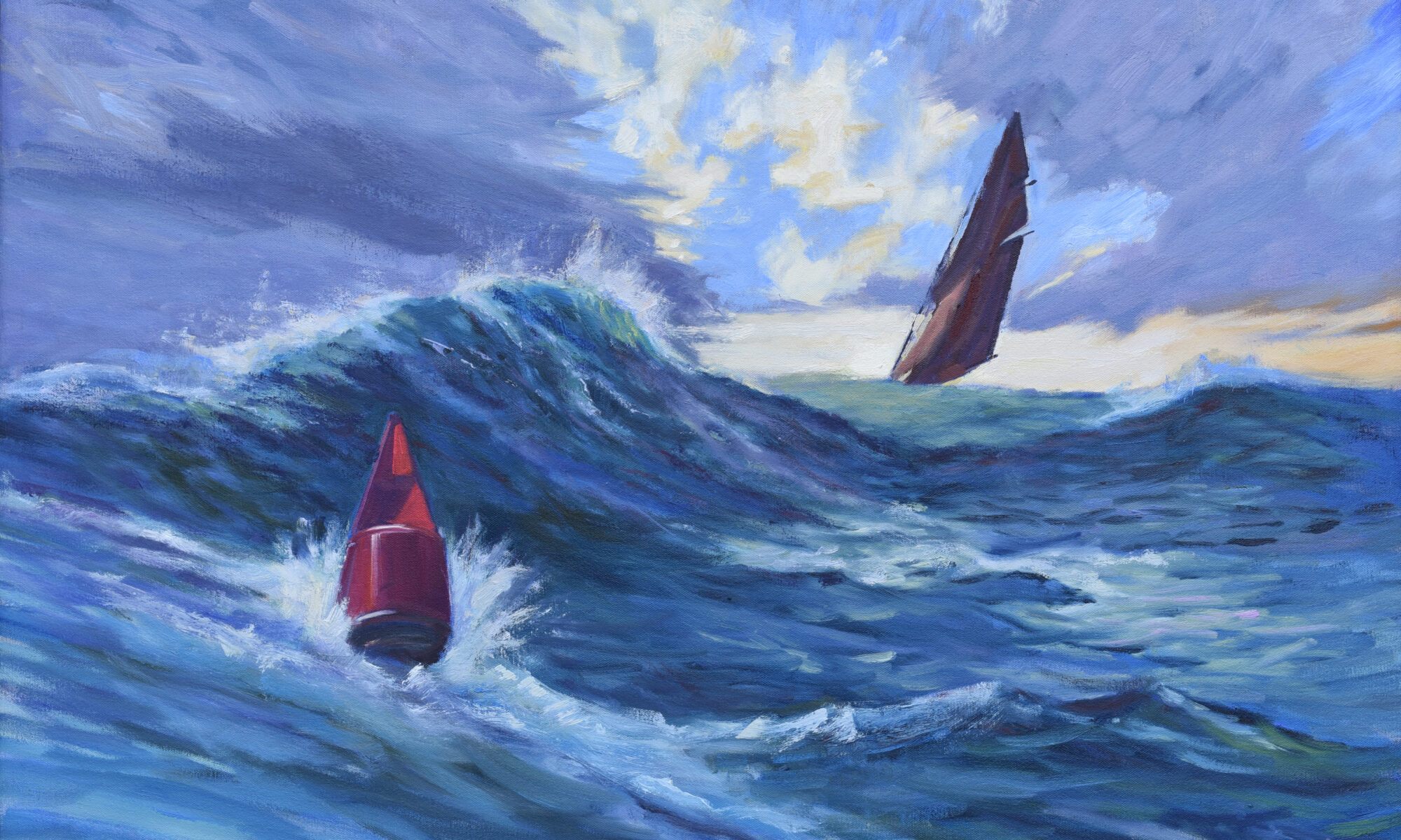
Line—the human eye naturally follows lines.

Line is the boundary between two shapes. There are two fundamental kinds of line: actual lines, which are visible marks, and implied lines, which are suggested by a sequence of objects—like a row of trees or the gaze of the subject.
Line directs the eye, so you can use it to guide the viewer through the painting.
Value contrast—the eye sees shifts in value first.

This makes it the most important design element in visual art. Value contrast defines form and structure and creates the illusion of depth and volume. But most importantly, it controls the viewer’s eye.
Because of the physical construction of our eyes, we are drawn to areas of strong contrast. You can use value contrast to highlight focal points, draw the viewer through your composition and emphasize what’s important (and downplay what isn’t). That’s the theatrical power of chiaroscuro right there.
Chroma contrast—use high-chroma focal points in contrast to a neutral background.
First, some definitions. High chroma means intense, pure, vivid color. Low chroma means dull, neutral, or grayed-out color.
Passages of high chroma against low chroma draw attention and create focal points. Our eyes are drawn to areas of strong chroma contrast. For example, a splash of bright yellow in a painting full of muted tones instantly commands attention.
Varying chromatic intensity also adds emotional power, creates depth and space, and supports color harmony.
Warm vs. cool contrast—use warm tones against cool tones to create focal points.
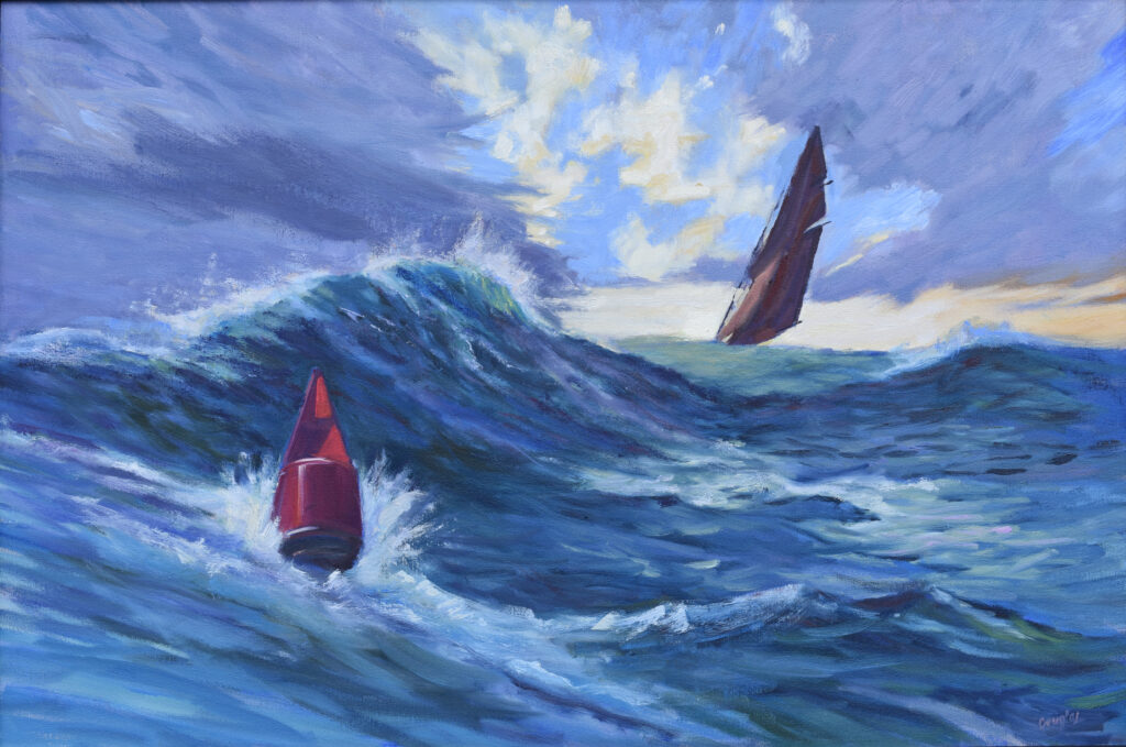
Contrasting warm and cool colors draw the eye. The viewer instinctively notices where temperatures shift, especially if warm and cool are placed side by side.
Warm vs. cool contrast is one of the most useful tools in a painter’s toolbox. It helps create spatial depth, especially when describing light and shadow. It adds emotional tone. Used properly, it creates color harmony.
Place focal points at strategic compositional points

Placing focal points at visually strategic points in a painting is essential. You would be unwise to place focal points on the edge of the canvas, for example. That looks unbalanced and will encourage the viewer’s eye to just leave the picture entirely.
Careful placement of focal points guides the viewer’s eye naturally. These have to be considered in relation to each other, and their placement is as important as the patterns of darks in your painting.
Strategic placement always takes into account the shape and orientation of the canvas. It’s about using the visual geometry of the space to strengthen the painting’s design.
Registration is now open for workshops in 2026! Reserve your spot:
- Advanced Plein Air Painting | Rockport, ME, July 13-17, 2026
- Sea & Sky | Acadia National Park, ME, August 2–7, 2026
- Find your Authentic Voice in Plein Air | Berkshires, MA, August 10-14, 2026
- New! Color Clinic 2026 | Rockport, ME, October 3-4, 2026
- New! Composition Week 2026 | Rockport, ME, October 5-9, 2026
Can’t commit to a full workshop? Work online at your own pace:
That’s a great synopsis. I would add (perhaps as subtext) “subject” – a figure, animal or human, can pull focus; so can man-made objects, and words (e.g. signage).
Hope you are having a blast.
Thank you,Casey!