“Is it okay to leave out the…?” is a question I hear often.
Many landscape painters approach scenes like journalists. They try to report what they see. Every tree is accounted for, every ripple on the water acknowledged, every color matched as faithfully as possible. It feels responsible. It feels honest. It also feels boring as hell.
I’ve worked as a journalist and I know that reporting is far from passive. It requires cultivation of sources, incisive questioning and a quick mind. But painters can’t assume the reportorial pose. There’s a difference between a news story and a narrative. One is factual and one is poetic.
A scene is raw material, not a conclusion. A painting is an allusion, and sometimes an illusion. It’s far closer to a novel than a news story.
I’ve written this blog three times a week for many years. When I was younger, I could write poetically, but I’ve trained that out of myself in favor of concise accuracy. I frequently regret that and hope I never do it in my painting.
From seeing everything to choosing something
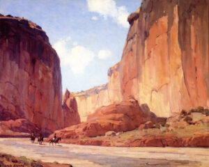
Good painting composers decide what matters and what doesn’t. They decide where the viewer looks first, and where their eye rests next. They decide how light is organized, how values are grouped and how color is bent to serve the structure. None of that is accidental, and none of it is guaranteed by the subject in front of you. That’s especially true in plein air, where the subject flickers and changes. If you’re merely trying to report what you see, you’re doomed to failure. The scene in front of you could change completely in the next fifteen minutes.
When you’re stuck in reporting mode, your paintings can end up with competing focal points, values that are true but not compelling and boring edges. All of that might be faithful to what you see but unconvincing as a painting.
A good painter can make a persuasive painting from any scene or subject. Sadly, the opposite is also true. It’s quite possible to make a terrible painting from the most wonderful scene or subject. I speak from experience here.
Authors edit, ruthlessly
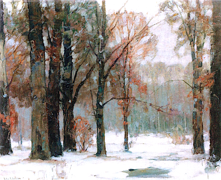
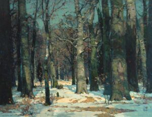
Painting teachers teach an exercise from John Carlson’s Theory of Angles and Consequent Values. It involves knocking the scene into four values. Inevitably, someone will assume that if four values are good, eight are better. Well, actually, three are better. Yes, value is a continuous band between dark and light, but the human mind craves patterns. That starts with simplification. When we drop meaningless, fine distinctions we oddly strengthen our painting.
Color is another area where factual reporting is counterproductive. Instead, think in terms of relationships. Warm plays against cool; saturated against neutral—all while being aware of color harmonies. Accuracy should be secondary to cohesion.
You’re not just making it up
This doesn’t mean you abandon observation. Quite the opposite. The first step in painting is to realize what compels you about the scene or idea. That requires a lot of seeing and thinking. Observe carefully but use information selectively. You’re not copying the scene; you’re interpreting it.
One practical way to break the reporting habit is to set constraints. Make a value sketch before you start. Identify clear focal points and commit to them. These decisions force you to prioritize.
In the end, a successful painting isn’t a record of what was there. It’s a record of what you thought and felt about it.
Registration is now open for the following Zoom classes:
Painting Water (almost full)
Monday evenings, 6-9 PM
June 1, 8, 15
Water is often the most mesmerizing part of a landscape—the way it holds the light, mirrors the sky, and breathes life into a static scene. Click to sign up.
Painting Clouds
Monday evenings, 6-9 PM
June 22, 29, July 6
If you’ve ever picked out shapes in the clouds as they drifted by, this class is for you. This short, 3-week session is a great opportunity to give weekly Zoom classes a try. Learn more.
From Field Sketch to Final Studio Work
Tuesday evenings, 6-9 PM
June 2, 9, 16, 23, 30, July 7
This 6-week course is designed to help you breathe life into those “unfinished” sketches littering your studio. Learn more.
Registration is now open for workshops in 2026! Reserve your spot:
- Advanced Plein Air Painting | Rockport, ME, July 13-17, 2026
- Sea & Sky | Acadia National Park, ME, August 2–7, 2026
- Find your Authentic Voice in Plein Air | Berkshires, MA, August 10-14, 2026
- New! Color Clinic 2026 | Rockport, ME, October 3-4, 2026
- New! Composition Week 2026 | Rockport, ME, October 5-9, 2026
Can’t commit to a full workshop? Work online at your own pace: