My students love to send me things they know will interest me, but sometimes they send me things to make my hair stand on end. As a courtesy, I’ve obliterated the OP’s name and photograph, but you really asked ChatGPT to tell you what paints to buy? And you put 32 paints on your palette? And now you want to know about color theory?

Assuming OP bought regular-size tubes of paints, they set her back $15-20 each. For 32 paints, that’s between $480 and $640. All those paints won’t make her a better painter. They’ll make her a worse painter, because she’ll never learn about color theory and color mixing.
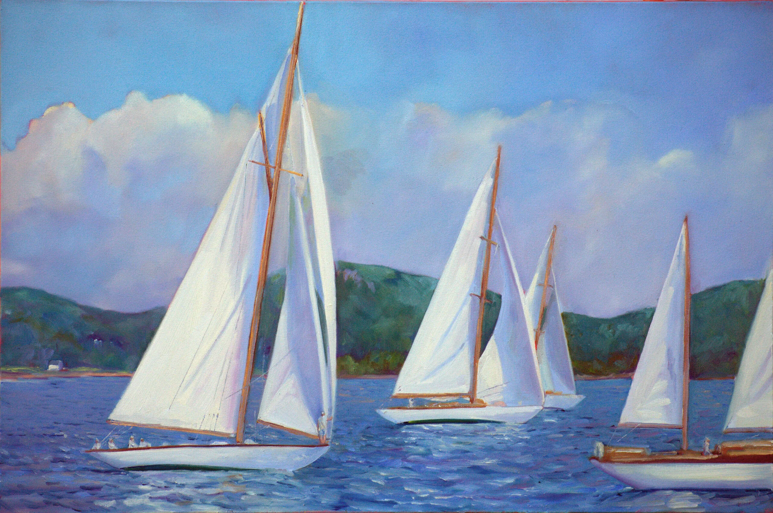
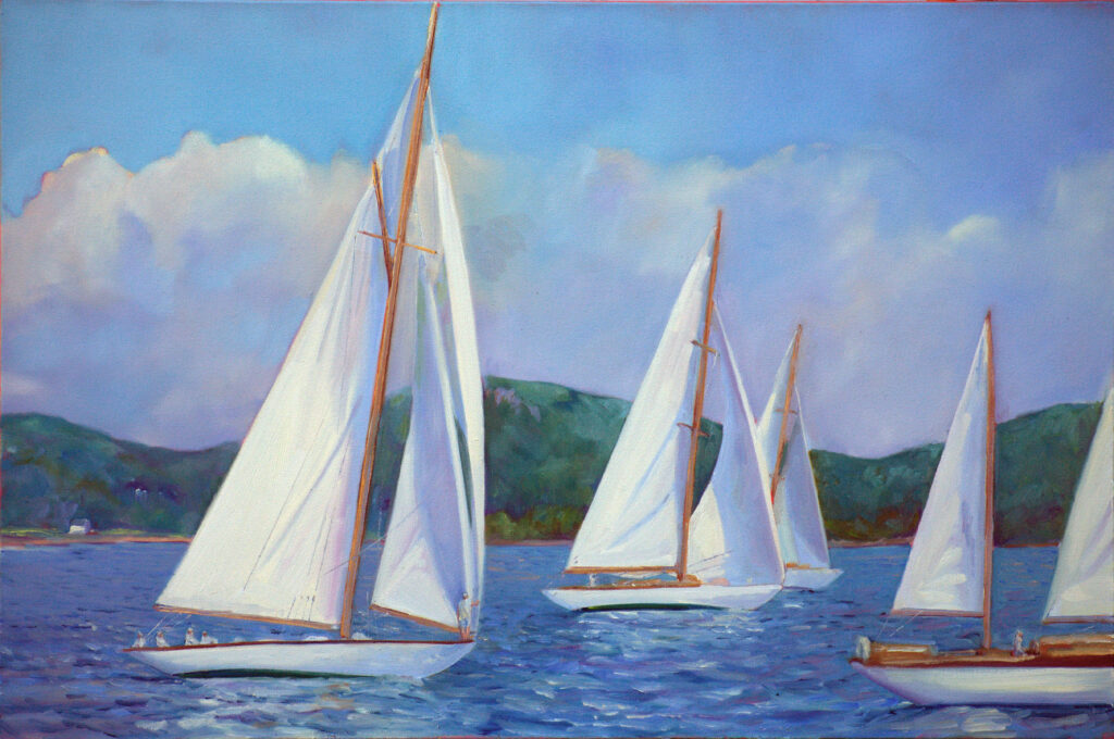
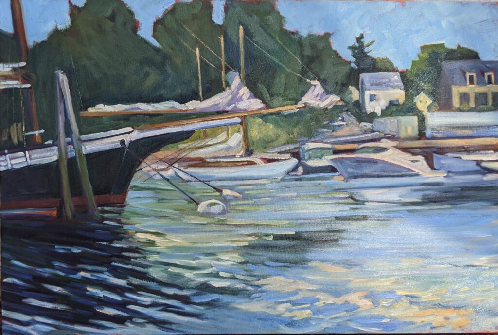
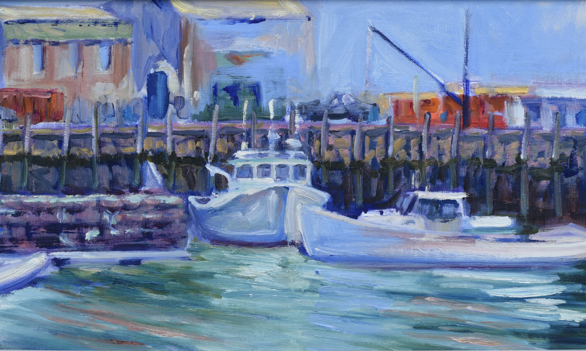
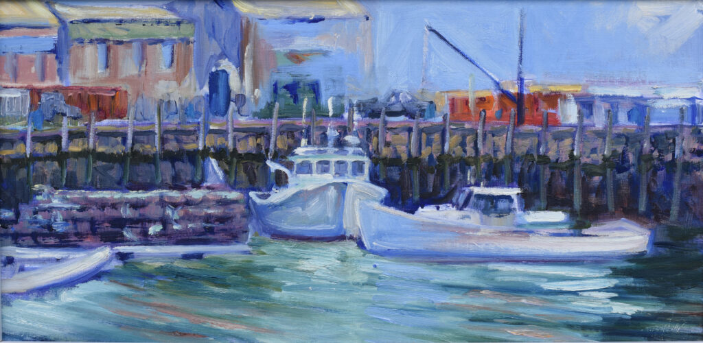
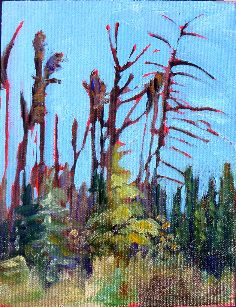
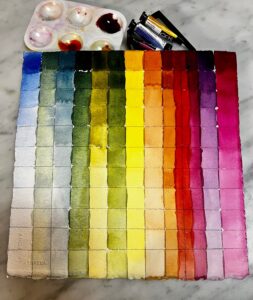
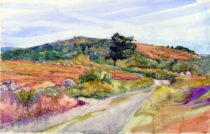
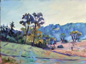
A few years ago, I mailed a small sample of paints to a student in South Carolina. She was frustrated with her paints and I was equally frustrated watching her try and fail to hit color notes. What I sent her was a simple, primary-color limited palette: QoR brand Ultramarine Blue, Nickel Azo Yellow, and Quinacridone Magenta. This is what she did with them:

Learn to love limited palette
A limited palette sounds like a restriction, but it’s a shortcut to clarity and cohesiveness. Instead of dabbing in all those paint pots, you learn to mix and marry color.
Learning to mix color teaches you more about color theory than any color wheel. You discover how complements neutralize each other, how color temperature works to create form, and how value does the heavy lifting in painting.
Color harmony and consistency
When all your colors are mixed from the same small family, they are innately related—that’s a shortcut to color harmony. There are no out-of-tune notes screaming for attention. For beginners, who often struggle with garish or muddy color, limited palette creates a more consistent color voice.
Painters need to learn the working characteristics of their paints, including hue, value, chroma, transparency, granulation (in watercolor) and dry time (in oils). That’s hard enough to master for just a few paints.

Decisiveness
With fewer choices, you spend less time dithering and more time painting. That’s invaluable in alla prima and plein air, but it matters any time you pick up a brush. You’re not hunting for the perfect color on your oversized palette; you’re learning to make what you need. This builds confidence and speed.
We can play fast and loose with hue if value is right, which is why pink or yellow skies can make perfect sense in paintings. When pigment options are reduced, we’re forced to shift our attention to value, which is more important than hue.
By stripping color back to basics, we also see form, edges and composition more clearly.
A limited palette is a tool, not a moral position
Once you understand what each pigment on your palette does, you can expand with intention. But I’ll note that I’m using the same number of paints I was thirty years ago, with very few modifications. They’re simply not necessary.
In the end, a limited palette isn’t about limitation at all. It’s about focus. By reducing choices, you sharpen your eye, strengthen your technique, and let painting be about seeing rather than collecting colors. That’s a lesson worth revisiting at every stage of an artist’s journey.
And, by the way, I’d have freely shared my palette recommendations with this artist. She’d have had hundred of bucks to spend more intelligently… and most of her paint wells would have remained empty.
Registration is now open for workshops in 2026! Reserve your spot:
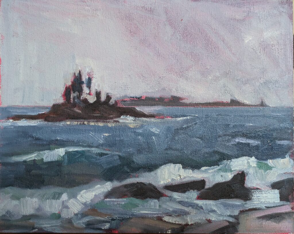
- Advanced Plein Air Painting | Rockport, ME, July 13-17, 2026
- Sea & Sky | Acadia National Park, ME, August 2–7, 2026
- Find your Authentic Voice in Plein Air | Berkshires, MA, August 10-14, 2026
- New! Color Clinic 2026 | Rockport, ME, October 3-4, 2026
- New! Composition Week 2026 | Rockport, ME, October 5-9, 2026
Can’t commit to a full workshop? Work online at your own pace: