
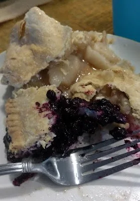
In the past, I threw in the pie crust recipe as a teaser to get people to learn how to draw ellipses. These days, pie crust is a dying art, so that might be the most important part.
Drawing the pie plate
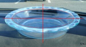
When drawing round objects, we have to look for the ellipses, which are just elongated circles. Ellipses have a horizontal and a vertical axis, and they’re always symmetrical (the same on each side) to these axes.
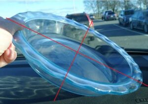
This is always true. Even when a dish is canted on its side, the rule doesn’t change; it’s just that the axes are no longer vertical or horizontal to the viewer.
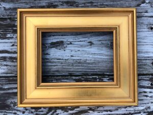
As always, I started by taking basic measurements, this time of the ellipse that forms the inside rim of the pie plate. (My measurements won’t match what you see because of lens distortion.)
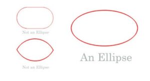
An ellipse isn’t pointed like a football and it isn’t a race-track oval, either.
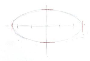
It’s possible to draw an ellipse mathematically, but for sketching purposes, just draw a short flat line at each axis intersection and sketch the curve freehand from there.
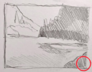
There are actually four different ellipses in this pie plate. For each one, I estimate where the horizontal axis and end points will be. The vertical axis is the same for all of them.
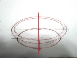
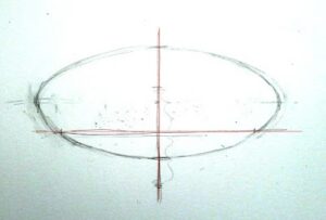
Next, I find the horizontal axis for the rim, and repeat with that. Most vessels are just a stack of ellipses; it’s the same idea over and over. Figure out what the height and width of each ellipse is, and draw a new horizontal axis for that ellipse. Then sketch in that ellipse.
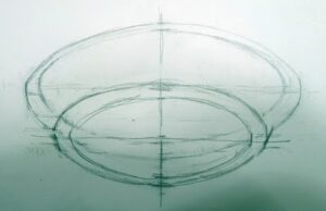
Because of perspective, the outer edge of the rim is never on the same exact horizontal axis as the inner edge, but every ellipse is on the same vertical axis. We must observe, experiment, erase and redraw at times. Here all four ellipses are in place. Doesn’t look much like a pie plate yet, but it will.
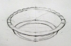
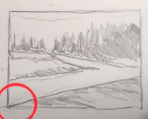
If I’d wanted, I could have divided the edge of the dish by quartering it with lines. I could have then drawn smaller and smaller units and gotten the fluted edges exactly proportional. But that isn’t important right now. Instead, I lightly sketched a few crossed lines to help me get the fluting about right. It’s starting to look a little more like a pie plate.
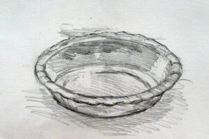
Now that you’ve tried this with a pie plate, you can practice with a bowl, a vase, a wine glass, or any other glass vessel.
Double Pie Crust
2.5 cups all-purpose white flour, plus extra to roll out the crusts
2 tablespoons sugar
1 ¼ teaspoon salt
12 tablespoons lard, slightly above refrigerator temperature, cut into ½” cubes.
8 tablespoons butter, slightly above refrigerator temperature, cut into ½” cubes.
7 teaspoons ice water
Thoroughly blend the dry ingredients. (I use a food processor, but the process is the same if you’re cutting the fat in by hand.) Cut in the shortening (lard and butter) with either a pastry blender or by pulsing your food processor with the metal blade. It’s ready when it is the consistency of coarse corn meal. (If it’s smooth, you’ve overblended.) Sprinkle ice water over the top, then mix by hand until you can form a ball of dough. If the dough seems excessively dry, you can add another teaspoon of ice water, but don’t go nuts.
Divide that ball in two and flatten into disks. Wrap each disk in wax paper, toss the wrapped disks into a sealed container and refrigerate until you’re ready to use them.
Don’t worry if the dough appears to be incompletely mixed or the ball isn’t completely smooth; mine comes out best when it looks like bad skin.
Let the dough warm just slightly before you start to roll it out. And while you don’t want to smother the dough with flour when rolling, you need enough on both the top and the bottom of the crust that it doesn’t stick. If you’re doing this right, you should be able to roll the crust right up onto your rolling pin and unroll it into your pie plate with a neat flourish.
(If you’ve never rolled out a pie crust, watch this.)
I use this crust for single- or double-crusted, fruit and savory pies. (If you make an extra double-batch you can make a turkey pot pie on Friday.)
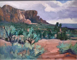
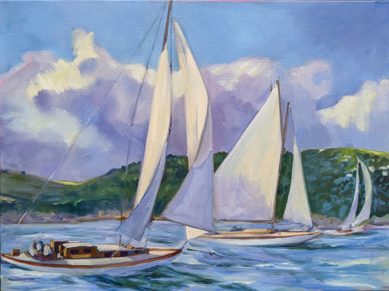
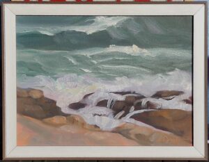
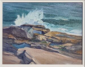
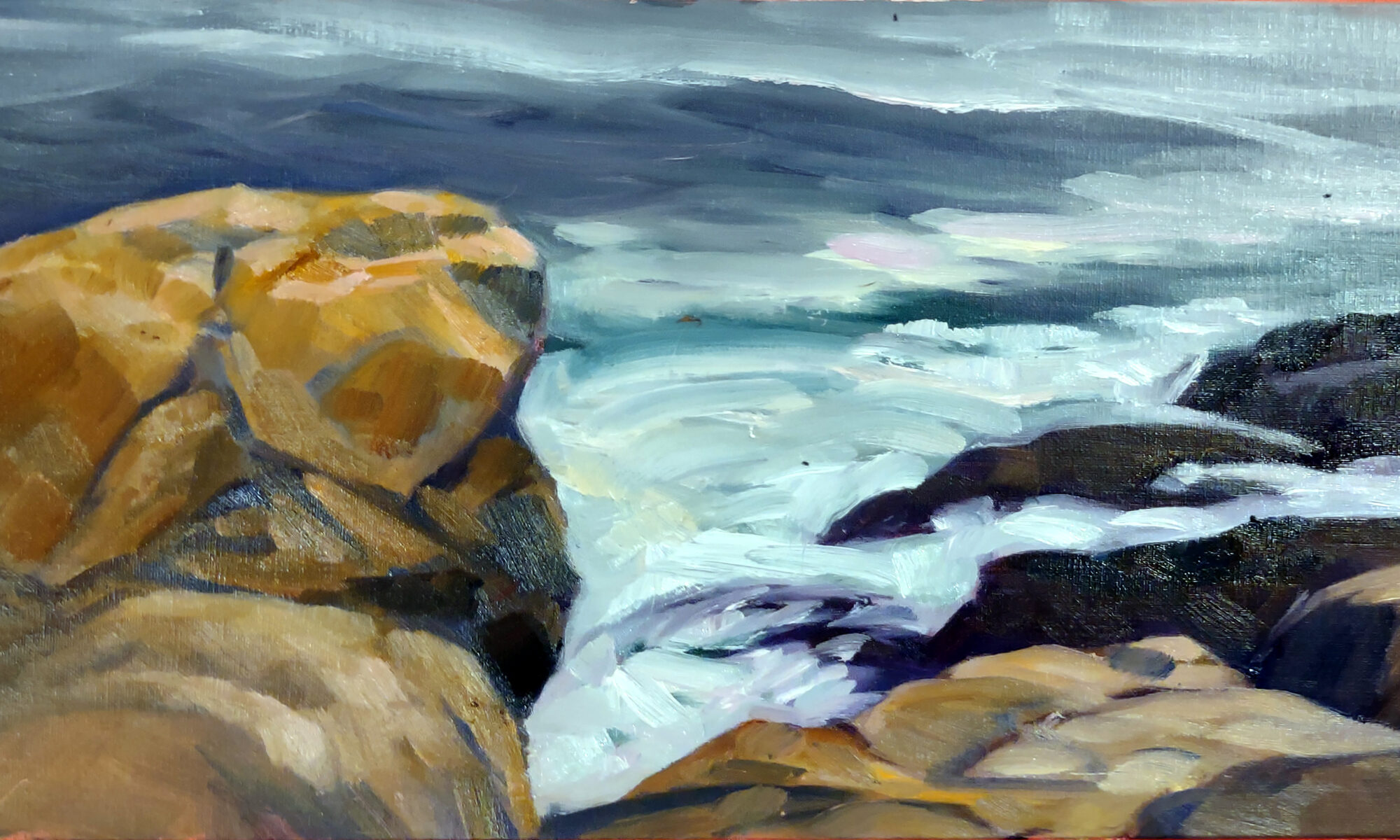
When I did Friday’s workshop post, I didn’t have the details on my new Austin workshop. I’m super-psyched about this new offering, which is the brainchild of my student Mark Gale. Austin offers a wealth of possibilities to the plein air painter, ranging from historic architecture, beautiful parks, and the urban energy of this cosmopolitan, quirky capitol city. But, honestly, I’m just as excited about seeing old friends, eating barbeque, and painting bluebonnets.
You can learn more here.


