Monday Morning Art School: composition is about light, not objects

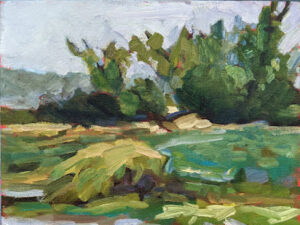
Fog over Whiteface Mountain, 11×14, $1087 includes shipping in continental US.

“From now on, I’m gonna stop thinking about composition being about things,” my correspondent wrote, “and start thinking about it as shadows.”

I feel like a deficient teacher, because composition is always about light and dark. Hue, chroma, line and objects may feed into that, but it’s value that makes a composition weak or strong.
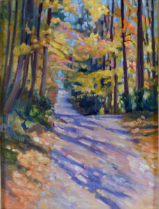
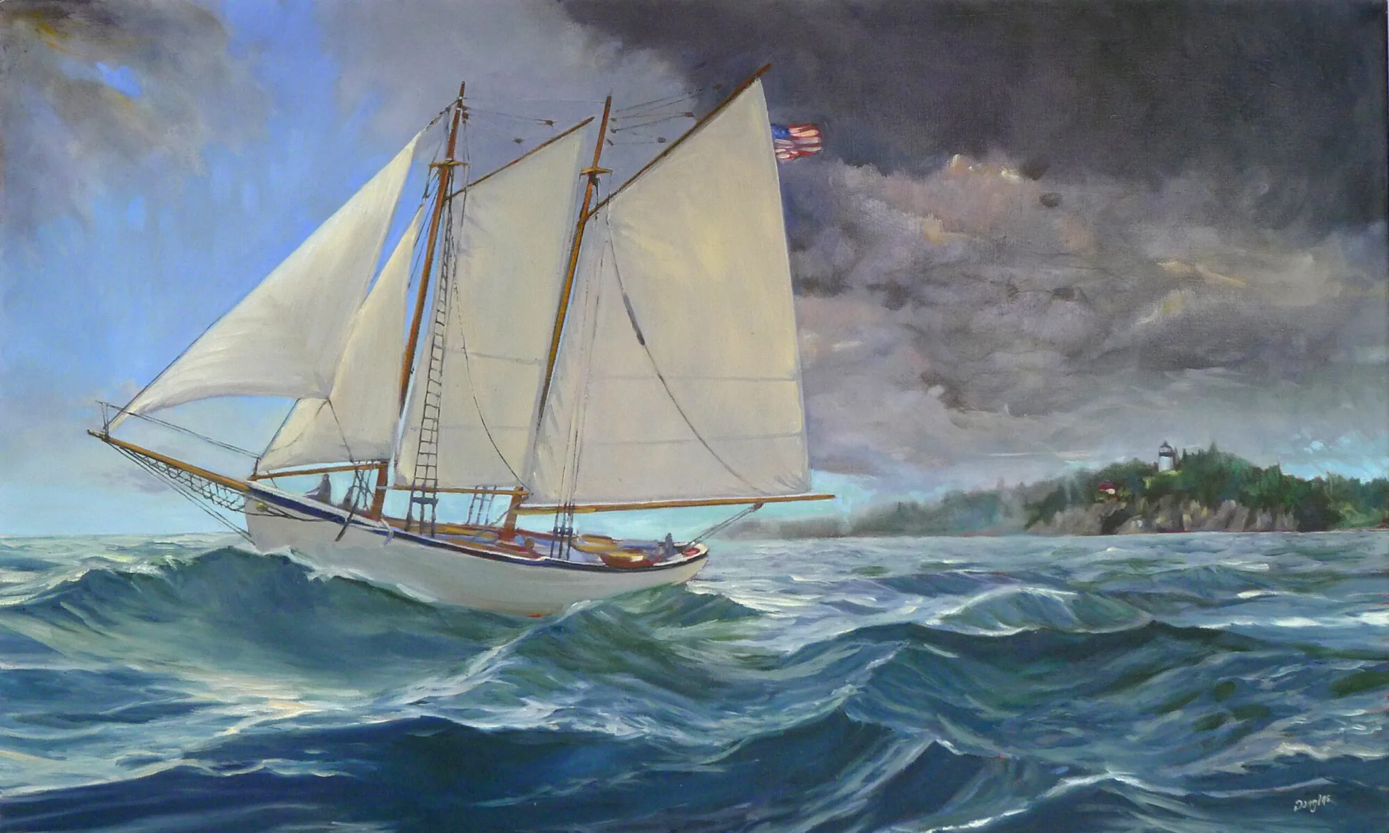
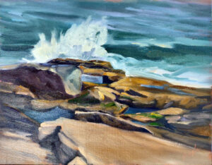
Beauchamp Point, Autumn Leaves, 12X16, oil on archival canvasboard, $1449 includes shipping in continental United States.

I ask my critique students to analyze their compositions based on Edgar Payne‘s exhaustive list of possible compositions in Composition of Outdoor Painting. (This used book is now so expensive that I can no longer recommend buying it. Check it out of the library.) The idea isn’t to slavishly follow one of his designs; it’s to understand whether you have an underlying design in the first place, and how you might strengthen it.

But these compositional armatures are always about value, even when that value takes the form of an object. There are many times when objects and shadows coincide; for example, a large piñon and some small creosote bushes can combine in a dark triangular mass, because they’re both dark objects usually set against light-colored grasses. On the other hand, sidewalk chalk isn’t going to create any kind of structure against a concrete sidewalk unless the artist thinks about the shadows rather than the chalk.

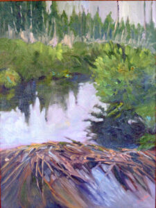
Quebec Brook, oil on canvasboard, 12X16, $1449 framed includes shipping in continental US.

By now, most of you have gotten the message that a painting needs to compel on a tiny screen (or from thirty feet) as well from three feet or three inches.

You do this with value. It’s not enough, for example, that an object is at a diagonal; you must make a persuasive shift between light and dark along that diagonal. This is the primary lesson a painter can take from Winslow Homer’s incredible seascapes.

This is also why plein air painters dislike murky grey skies; they make it harder to find compelling shadow patterns.

Composition rests on the following principles:

  • The human eye responds first to shifts in value, and following that, in shifts in chroma and hue;
  • We follow hard edges and lines;
  • We filter out passages of soft edges and low contrast, and indeed we need them as interludes of rest;
  • We like divisions of space that aren’t easily solved or regular.
Best Buds, 11X14, oil on canvasboard, $1097 framed includes shipping in continental US.

But I just want to paint what I feel!

Music, sculpture, poetry, painting, and every other fine art form relies on internal, formal structure to be intelligible. This is easiest to see in music, where the beginner starts by learning chords and patterns. These patterns are (in western music, anyway) universal, and they’re learned long before the student starts writing complex musical compositions. In other words, you start at the very beginning.

Music is an abstract art because it’s all about tonal relationships, with very little realism needed to make us understand the theme. A composer doesn’t need little bird sounds to tell us he’s writing about spring. Likewise, the painter doesn’t need to festoon little birdies on his canvas to tell us he’s painting about spring. That should already be apparent in the light, structure and tone of his work.

The strength of the painting is laid down before the artist first applies paint, in the form of a structural idea-a sketch or series of sketches that work out a plan for the painting.

All good painting rests on good abstract design. Take a good look at Christina’s World by Andrew Wyeth. Whatever meaning we’re supposed to take from it, it’s a strong triangular composition juxtaposed with a mid-century curving line.

Still, most realist painters don’t spend nearly enough time considering abstract design, even when they understand the critical importance of line and value. Christina’s World doesn’t rely much on hue for its impact. It’s a washed-out pink, a lot of dull greens and golds, and a significant amount of grey. And yet it was the most successful figurative painting of the 20th century. Wyeth was almost obsessive in his drawing habits; that translates into powerful finished paintings, driven by value.

My 2024 workshops:

The value of value

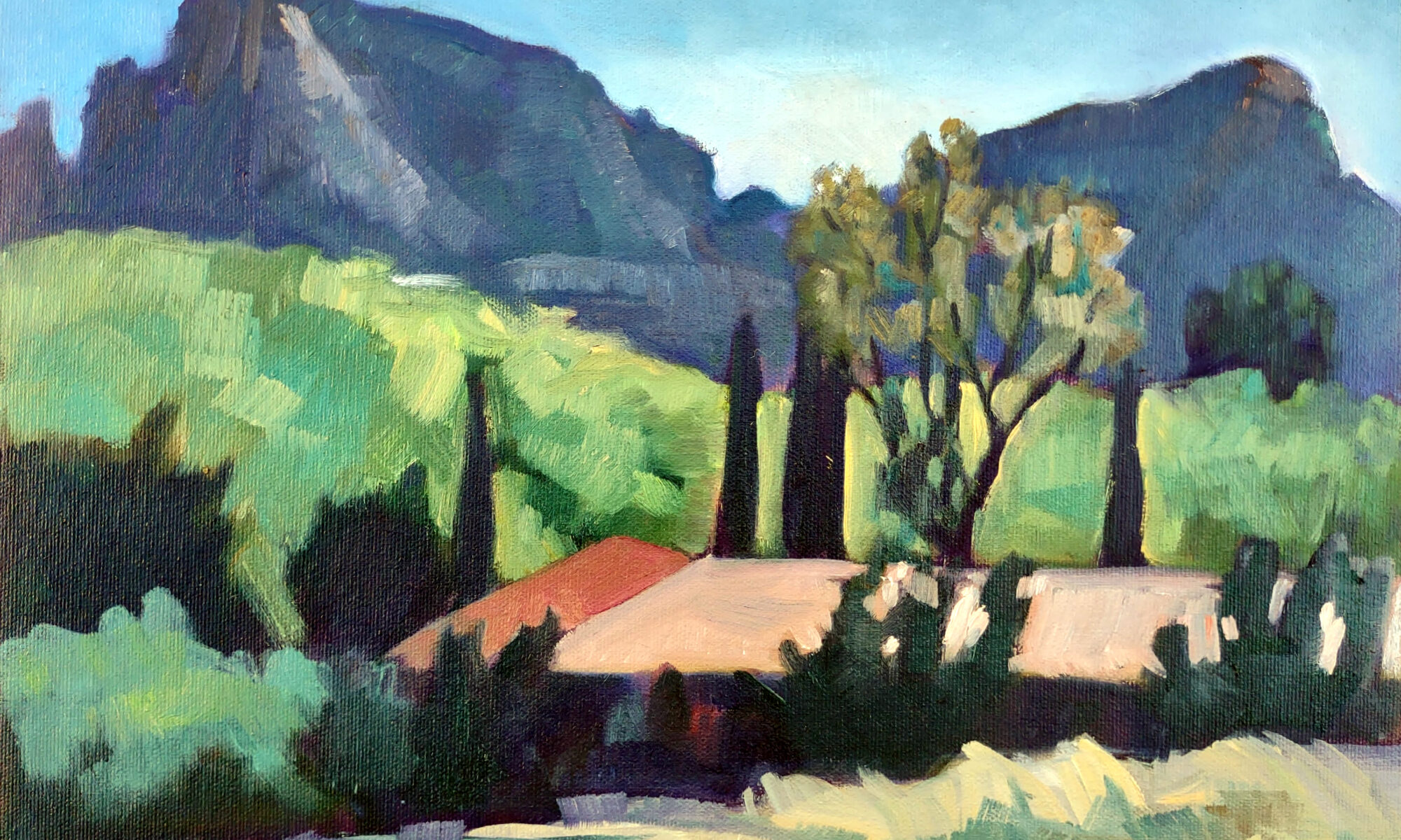
Cypresses and Sunlight, 11X14, Carol L. Douglas, $1087 includes shipping in continental US.

Early this year, I set out to create a seven-step online training class to teaching the fundamentals of oil painting. This morning I’m releasing Step 2: the Value Drawing. Making these interactive classes is a tremendous learning experience for me, and I hope the net result is helpful for you, too.

Value (lightness to darkness) is just one component of color, but it’s the most important. Establishing a hierarchy of values before you ever pick up a brush will save you hours of flailing around in the field. I know this from personal experience. Before I became disciplined about value, I wasted tons of time (and much paint) dithering, repainting, and generally making a mess of more paintings than I saved.

The value sketch is the oil painter’s secret weapon. It’s an opportunity to plan your painting before you ever pick up a brush. And it’s critical; if the value structure is compelling, your painting will be compelling. If not, your painting is doomed from the start. Nothing in painting is more important than value.

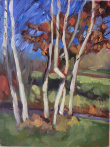
Birches, 6X8, oil on archival canvasboard, $435 includes shipping in continental US.

Value is the basis of good composition

“But why waste time on a sketch when I can just paint?” you ask. For the same reason that contractors need blueprints before they start building: great ideas require planning.

Investigating value in advance is the key to compositional fluency. In value sketches, we quickly experiment with different arrangements of lights and darks. This helps us make intelligent choices about focal points, line, and the weight of individual elements in the painting.

By breaking complex scenes down into restricted value planes, we create blueprints for our paintings. This not only helps us simplify ideas, it guides us through later decisions about color, texture, and detail.

Value sketching starts with just a few simple, inexpensive tools: a sketchbook and a mechanical pencil. Working in a sketchbook is a lot faster and easier than working out questions of light and dark in paint. In return for a small investment of time at the beginning of your painting, you’ll reap tremendous dividends as you go forward.

Dropping Tide, 11X14, oil on archival canvasboard, $1087 framed includes shipping in continental US.

Amplifying contrast

Value drawing helps us simplify and amplify (when necessary) the contrast between darks and lights in our composition. Contrast is the visual tool that creates interest and drama in a painting. Too many paintings fail because they’re stuck in the boring midtones.

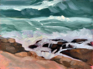
Seafoam, 9X12, oil on archival canvasboard, $869 framed includes shipping in continental US.

Understanding Form

Value drawing helps us understand how light interacts with different forms and objects in a composition. It’s what gives objects volume. You may never paint the nuances of three-dimensional modeling, but you should understand them.

Value is particularly important in realism. It’s how we create convincing illusions of light and shadow, depth and dimensionality.

Who is this course designed for?

It’s comprehensive, so it’s tailored to both a beginner’s understanding and an experienced artist’s continued development. You can go back to it repeatedly and take it at your own speed, so you’ll benefit from it no matter what your starting point.

Step 1: the Perfect Palette

Step 2: the Value Drawing

My 2024 workshops:

Monday Morning Art School: start with value

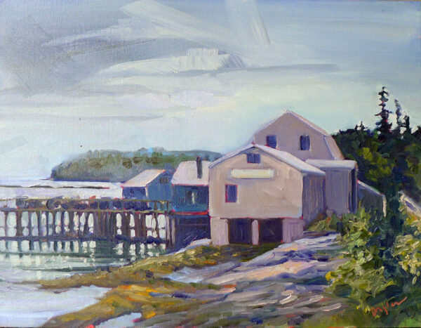
Lobster pound, 14X18, oil on canvas,  $1594 framed includes shipping and handling within the continental US.
Lobster pound, 14X18, oil on canvas, $1594 framed includes shipping and handling within the continental US.

There’s an old saw that goes, “value does all the work and color gets all the credit.” I tend to not repeat it because value is just one aspect of color. It’s like saying ‘my arm hit that ball and my body gets all the credit.’ Nevertheless, it points out an essential truth.

A review, for those of you who are new to color science:

Value – How light or dark is the pigment?

Hue – Where does the color sit on the color wheel? All colors fall into one of the following hue families: red, orange, yellow, green, blue and violet. Within those families, however, are many subdivisions.

Chroma – How much intensity, or “punch” does the color have?

Spring Greens, 9X12, available.

Value is the key player in our first reading of a painting. It drives our perception and guides us through the painting. When we understand this, we can substitute any hue in a painting—even unreal, high-intensity colors—as long as they’re the proper value.

The inverse is also sadly true. “I substitute off-value color and chroma for accurate value. Then, except for a couple spots of high-chroma yellow, I wonder why my paintings are flat,” a student told me. He took that observation and ran with it, painting only in greyscale for months.

That might be a little extreme, but preparatory work in value is important. If you've never tried value sketching before, start with this set of grey markers and a simple Strathmore Visual Journal (in Bristol finish). Practice simplifying complex scenes into simple value structures.

There are various ways to sharpen our focus on value: notans, value sketches, and grisaille underpaintings being the most popular. However we get there, the first step of a good painting is to see each composition in terms of its value structure.

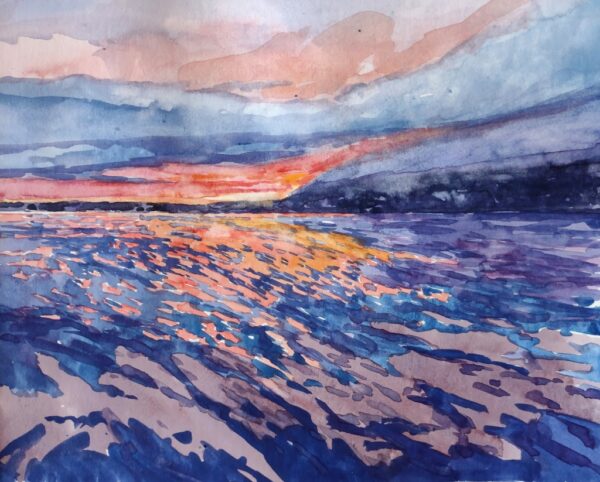
The same is true in watercolor, of course. Untitled class demo.

Alla prima painting requires great skill in color mixing, because the goal is to nail it on the first strike. That goes not just the for darks, but every color in the picture. Even a painting with wonderful shadows and lights will have many middle tones, often closely related in value. These are actually the most difficult colors to mix accurately. If you have a painting that isn’t working, ask yourself if it has a full tonal range, or is it simply hitting the highs and lows. For example, when people get in trouble painting texture, it’s usually because they’re overstating the contrast.

All color is relative, meaning it depends on its neighbors. That’s particularly true when it comes to value. Below see a plate from Joseph Albers’ groundbreaking Interaction of Color. The inner violets are the exact same value. But the framing color influences how we see those values, so one looks much lighter than the other.

Plate IV-4 from Joseph Albers' Interaction of Color, demonstrating how all color is relative. The inner violet colors are the same exact value, but what surrounds them influences how we perceive them

There are three things to remember:

Value judgments are subjective. There’s no reliable way to measure the value of a color. The camera is as subjective as the human eye.

You can’t get a color to go darker than its ‘natural’ value without distorting the hue or chroma. Thus, there is no natural dark version of cadmium yellow, so the shadows in a yellow object require a workaround.

All pigments can make about the same number of discrete steps. While the yellows have a shorter range, the steps are more noticeable. Blues can mix from almost-white to almost-black, but the middle points are very similar.

This page contains affiliate links for some but not all products. If you choose to make a purchase after clicking a link, I may receive a commission at no additional cost to you. Thank you for your support!