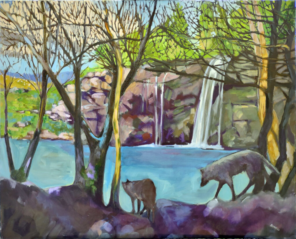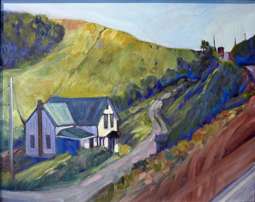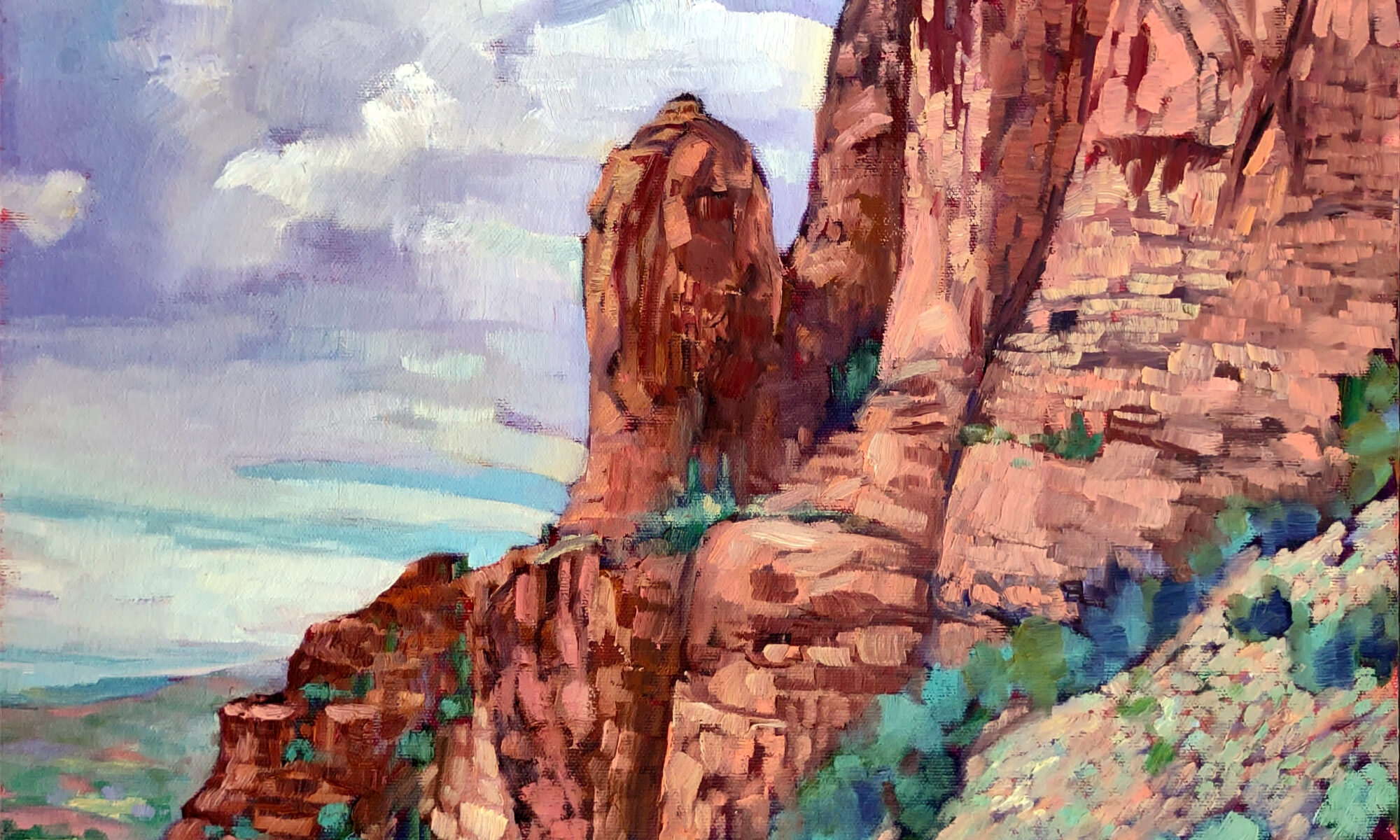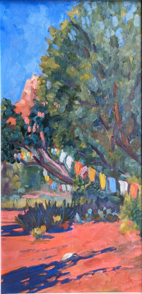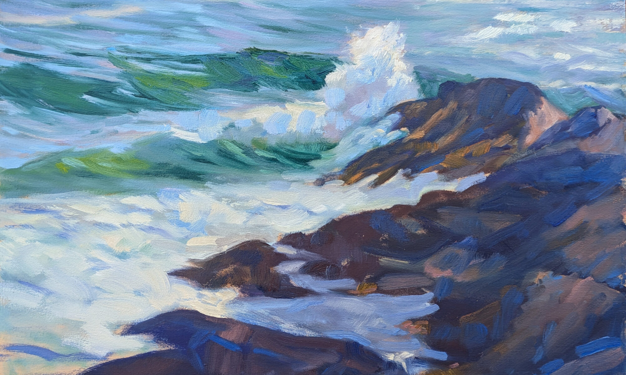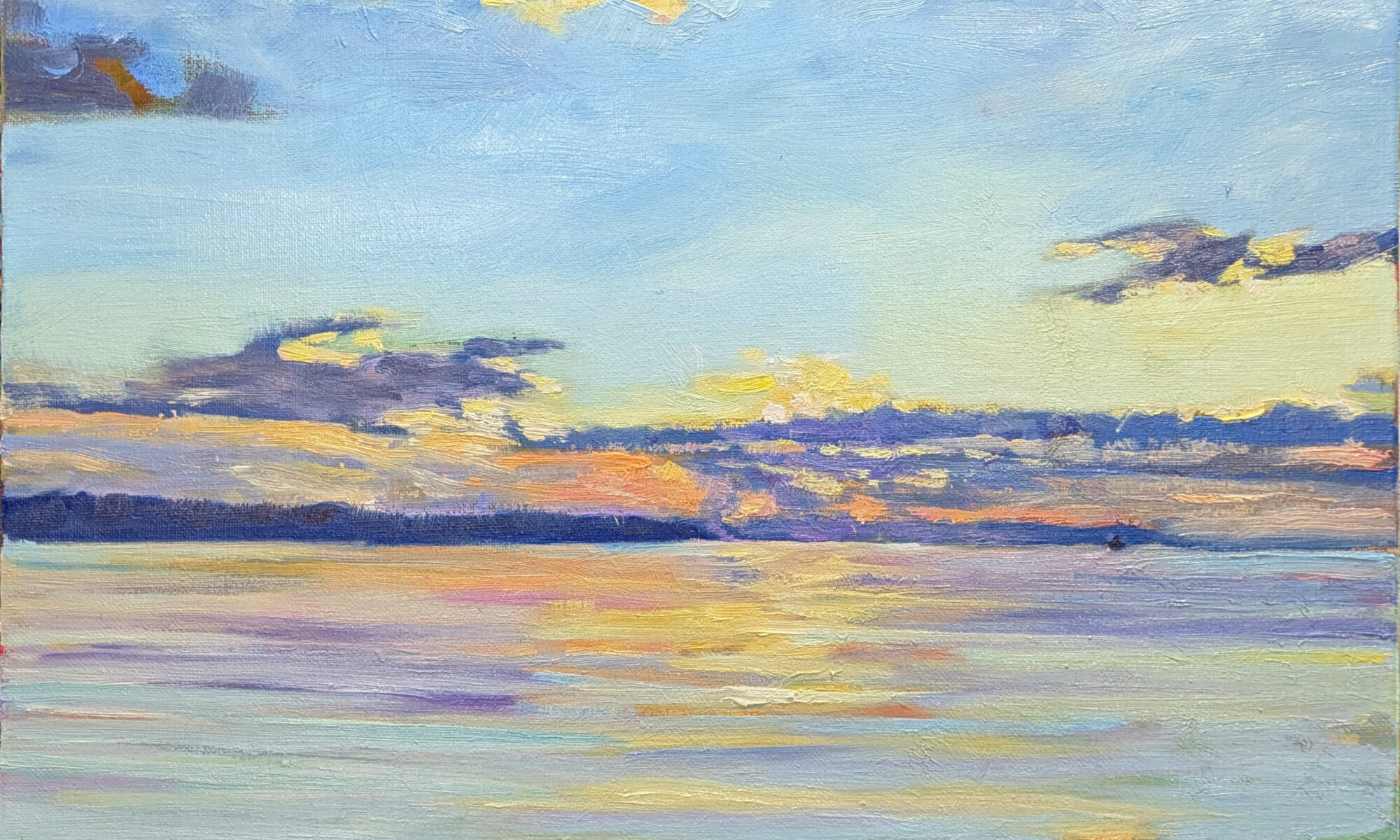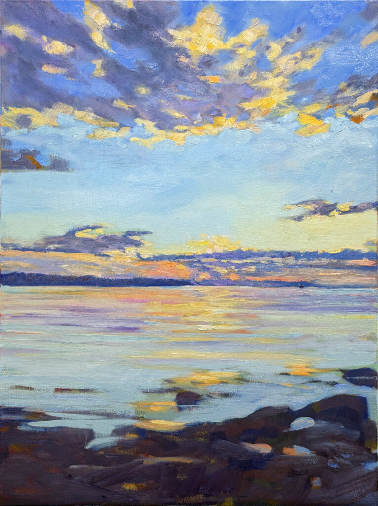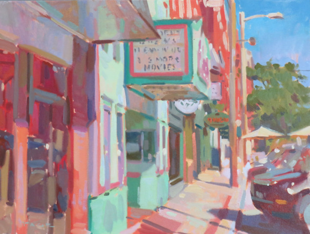
“Non-creatives underestimate how much time we spend on non-creative tasks to support our creative output,” artist Cheryl Shanahan recently told me. She was varnishing paintings at the time, but I’ve been thinking about her comment this week. I’m in the middle of a 41-hour drive from Rockport, ME to Sedona, AZ for the 20th annual Sedona Plein Air Festival.
“But that’s on you, Carol,” you may be thinking. Over the past three years, it’s taken 24 hours for me to travel by air from my house to my friends’ house in Phoenix. That includes getting up in the middle of the night to drive down to Portland, layovers, and time spent foozling around renting a car. Driving may add another 16 hours, but when I get there, I have my own car, my own dog, and even my own chair.
And, rather annoyingly, last year my entire painting kit (retail value, ~$600) disappeared somewhere between Sky Harbor’s car rental return and my gate.
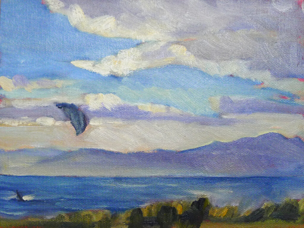
Two winters ago, my son and I contracted COVID in West Yellowstone, MT. Given a choice of feeling horrible in a hotel room for ten days or driving home and feeling horrible in the car, we elected to zip back to his apartment in New York, taking turns sleeping and driving. I learned a few things on that trip, including that COVID is slightly less horrible in a car than in my bed. Just as importantly, America is prettier on the ground than from the aisle seat of a plane.
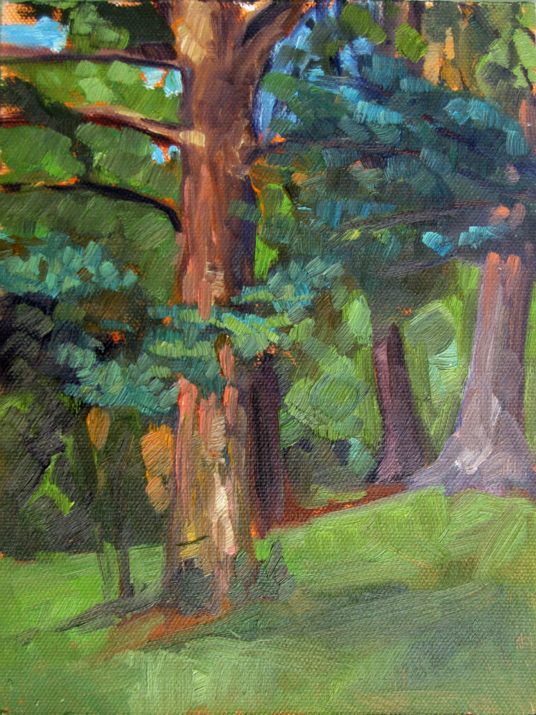
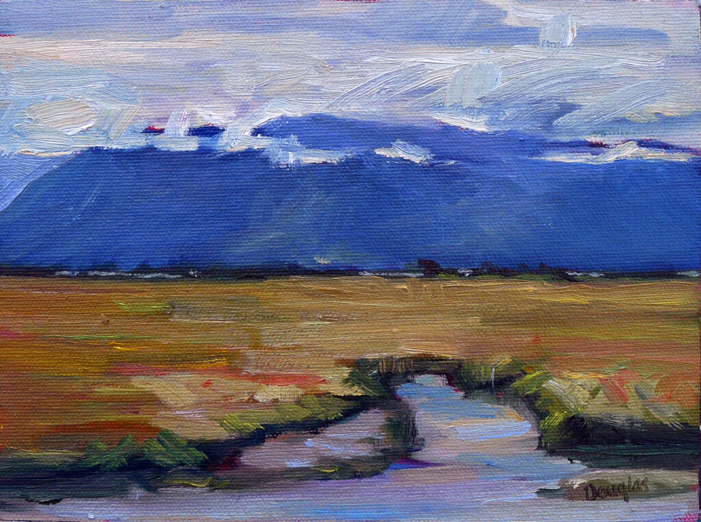
I’m not planning on getting sick on this trip, but I still had a lot of prep work to do before leaving. That included closing my gallery for the season and wrapping and storing paintings. I won’t be home until early November, after all. In addition, I prepared archival painting boards, matched them to frames, made sure I had enough paint, and sorted and packed my tools and clothes.
I’m luckier than most because I have a 3-day-a-week administrative assistant. But even with that, non-creative tasks often threaten to swamp me. In addition to the Cheryl’s varnishing and my travel, here are some of the things professional artists do that you never see:
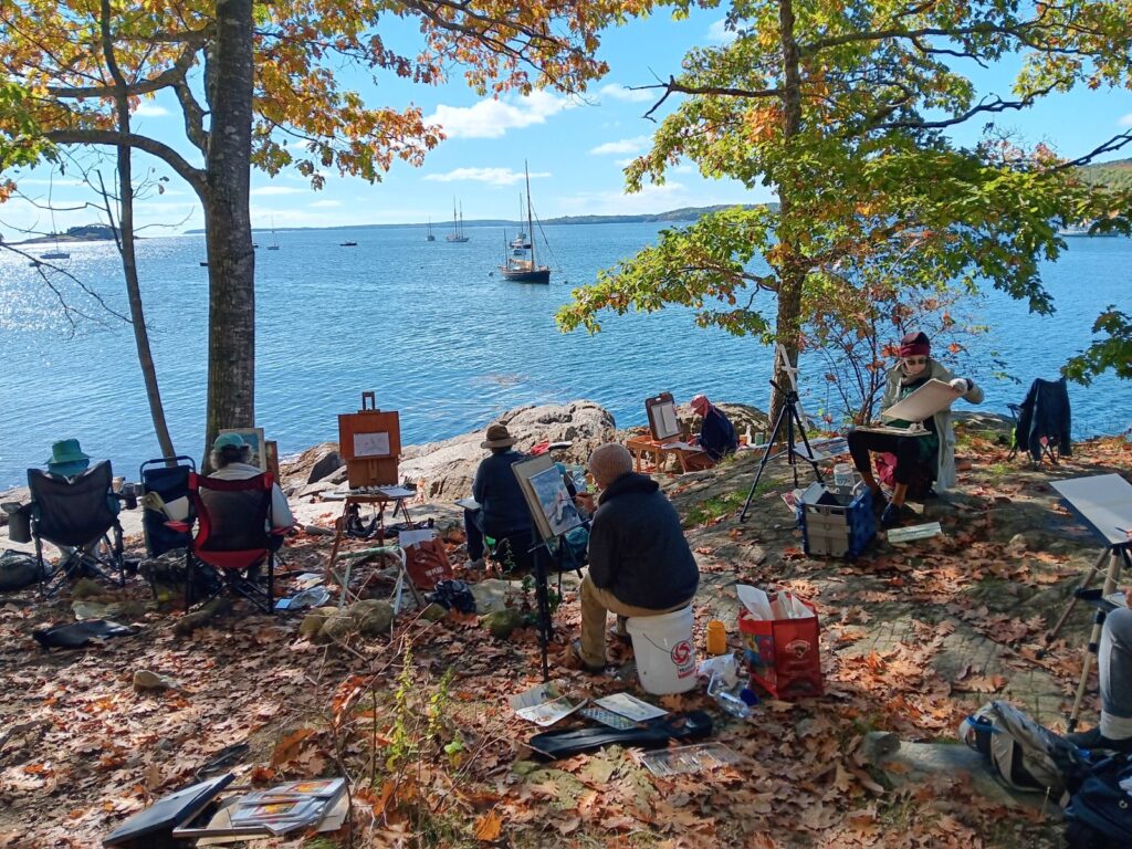
Preparing classes and workshops: I love teaching, both on Zoom and in person at workshops, but there’s a lot of lesson planning involved. Some of my students have been with me a long time, and I refuse to feed them warmed-over instruction.
Marketing and Promotion: I’ve had to learn things like SEO the hard way. While Laura manages my promotional materials, website and Google visibility, this blog is still 100% written by me, three days a week. The oldest posts on this platform are from 2007; I don’t know how much earlier I started it.
Boring old admin: Someone has to read contracts, invoices, and routine emails. Worse, someone has to file state and Federal tax forms.
That includes paying the bills and keeping accurate records, which I do twice a month.
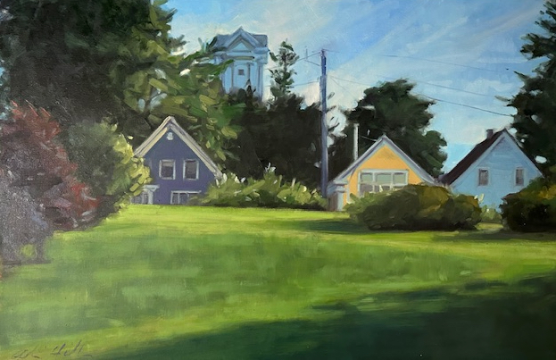
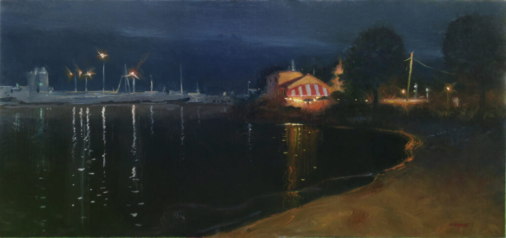
Art handling: Preparing artwork for exhibition includes framing, packaging, and transportation. And you don’t necessarily do it just once—frames get damaged in transit, or by people knocking into them. And they go in and out of style.
Documentation: We used to send work to professionals to be photographed and wait to get slides back. The modern artist photographs his or her own work and maintains records of sales and exhibitions.
“How long did it take you to do that painting?” is one of the most common questions we’re asked. We like to answer, “a few hours, plus the sixty years I’ve spent learning my craft.” A more accurate answer would include all that back-office work that you, the buyer, never see at all.
Reserve your spot now for a workshop in 2025:
- Advanced Plein Air Painting, Rockport, ME, July 7-11, 2025.
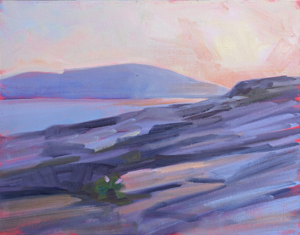
- Sea and Sky at Acadia National Park, August 3-8, 2025.
- Find Your Authentic Voice in Plein Air, Berkshires, MA, August 11-15, 2025.
- Immersive In-Person Fall Workshop, Rockport, ME, October 6-10, 2025.