Monday Morning Art School: why grisaille?

Sometimes you just need to push paint around in a dream state. A grisaille is the perfect place to do that.

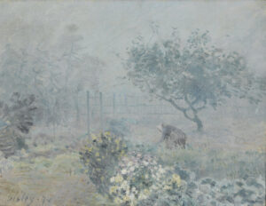
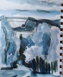
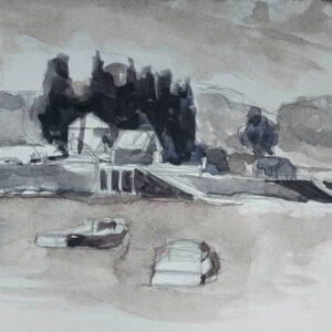
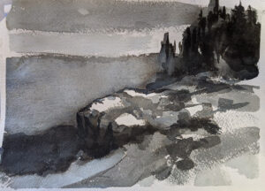
A grisaille is a monochromatic painting. In oil painting, it forms the first step of underpainting. In watercolor, it’s a separate reference to check values.

There are a few painters I know who skip the grisaille step entirely. (I’m not one of them.) The only ones who are successful at it are so experienced that they can integrate hue, value and chroma simultaneously. Even then, they’re still working dark to light and being careful not to misstep and put gobs of white or light paint where it doesn’t belong.

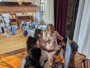
Eric Jacobsen is one of these outliers, and he graciously offered to demo his underpainting technique for my newest online class, The Essential Grisaille. (Appearances by his dog Sugar and his chickens were completely unscripted – but cute.)

As we filmed, I kept thinking, “Kids, don’t try this at home!” Eric isn’t skipping the grisaille step so much as integrating it with his initial color notes. That’s very difficult for all but the most experienced painters.

Early in the grisaille process for the Scottish portrait I wrote about on Friday.

Why grisaille?

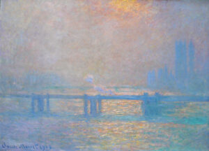
The human mind sees value before hue or chroma. The arrangement of rods and cones makes us more sensitive to value shifts when scanning a vista. We also have a wide dynamic range. Both were awfully convenient for our hunter-gatherer ancestors, and they influence how we see paintings.

In the brain, processing starts with low-level information like brightness and contrast. That’s processed more quickly and efficiently than higher-level color information, which requires additional signals from the eyes.

Sometimes my sketch for an oil painting will take the form of a watercolor grisaille.

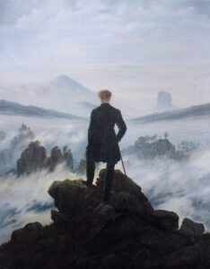
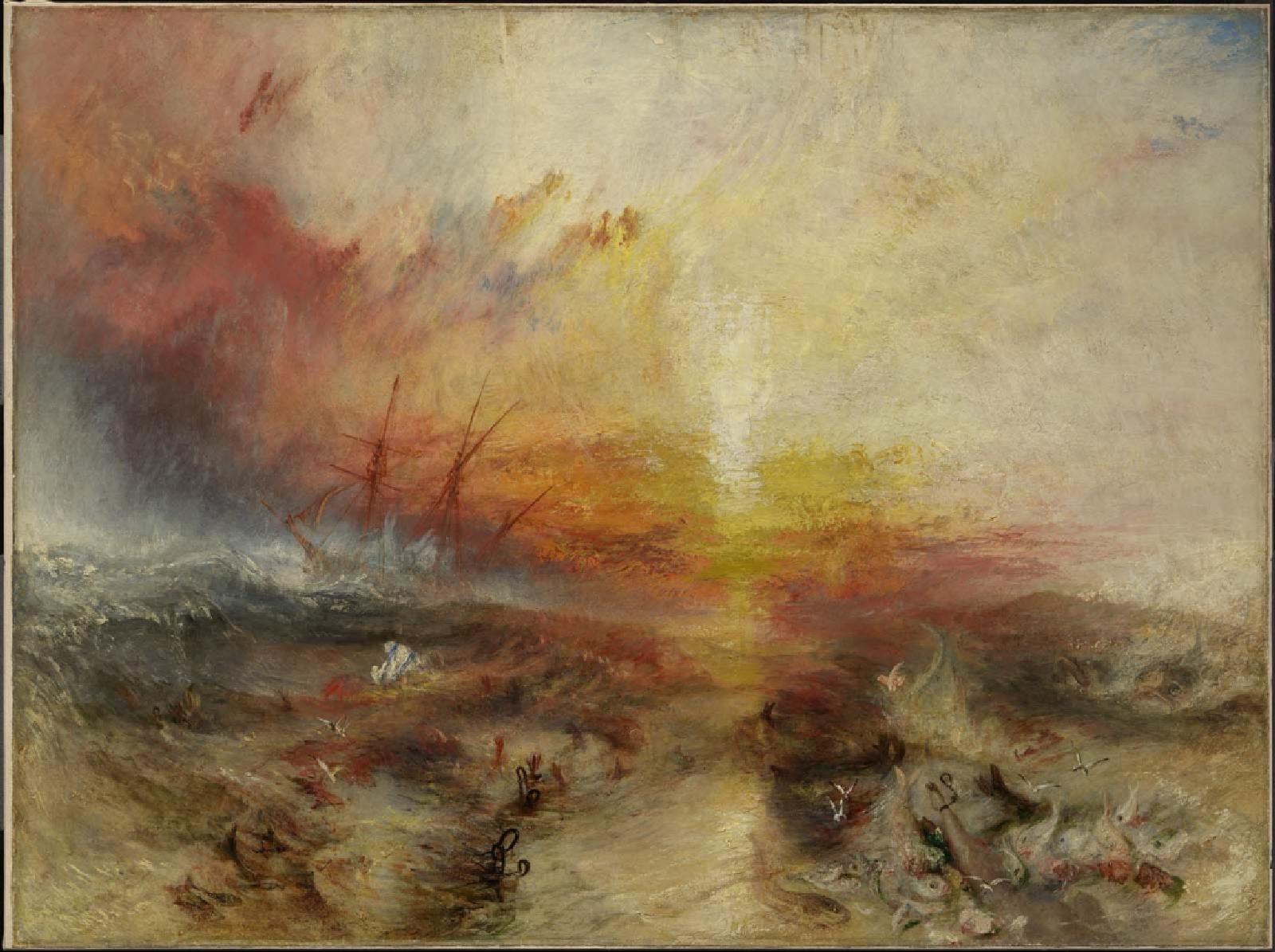
In a nutshell, that means the viewer will see your value structure before he or she sees anything else. A painting that fails on its value structure will just fail, period. Arthur Wesley Dow, who wrote the definitive 20th century composition book, is the guy who gave us the notion of notan. He taught students to restrict the infinite range of tonal values to specific values. He wanted students to realize that all compositions are, underneath, a structure of light and dark shapes. That’s a critical insight that influences all modern painting.

A watercolor grisaille done as preparation for a watercolor painting.

What is grisaille?

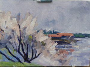
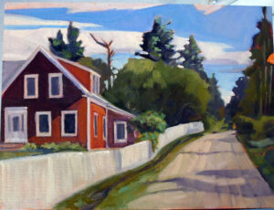
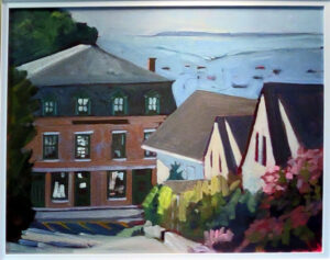
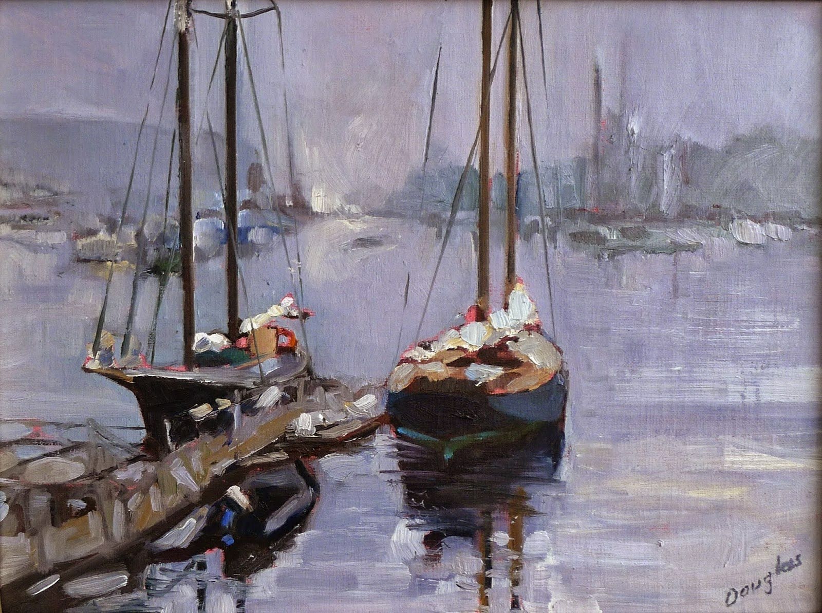
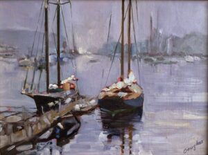
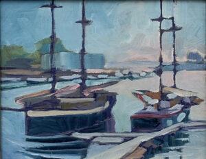
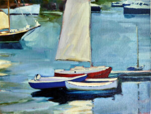
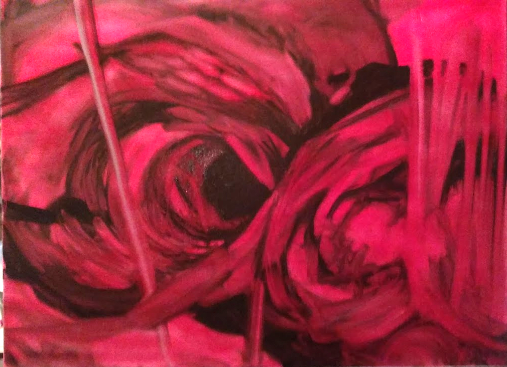
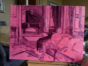
Grisaille just means a monochromatic painting. I teach both oil and watercolor students to do this preparatory step. In watercolor, it’s a monochrome study on a separate page that guides the color choices for the finished painting. For oil painting it’s the underpainting step before we start adding color.

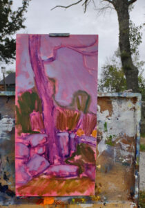
In oils, it’s done in a dark tone that relates to the overall color scheme of the planned painting-if the shadows are cool, the grisaille should be cool, and if the shadows are warm, the grisaille should be warm. That’s because the grisaille will be part of the finished painting, sometimes visible with no covering whatsoever.

The paint is thinned with odorless mineral spirits (OMS) and no white or light colors should be introduced. A brush and a rag are both used to get the full range of values.

Even for a QuickDraw, I do a grisaille. This is partly covered with color notes. The finished painting is here.

Simple, right?

Another watercolor grisaille. All examples are by me.

I’ve just spent about six weeks writing and filming The Essential Grisaille*, and thinking through all the ways it can go wrong. Julie Hunt, who is a very good student and painter, told me, “There were beginning things I fudged with little instruction that I remember.” She has now carefully worked through every step of The Essential Grisaille to really master the subject. I’m excited to see how her painting changes.

Julie has put her finger on the difficulty of all classes, online or in person. There’s so much to take in that nobody gets it all the first time they hear it. And we can fill in the gaps with inspired guesses or just wrong-headed mistakes. It all comes down to being ready to hear, grasshopper.

Which is why Seven Protocols for Successful Oil Painters is designed to be open-ended. You can go back and revisit them… as long as I pay my internet bill.😊

*I’m talking about both watercolor and oils in this post, but The Essential Grisaille is intended for oil painters.

My 2024 workshops:

The value of system

In Control (Grace and her Unicorn), 24X30, $3,478 framed, oil on canvas, includes shipping in continental United States.

Recently, someone called me ‘formulaic.’ I laughed because all experienced painters have systems; some just let beginners flail around because it cuts down on the competition. Systematic painting is no different from my carpenter friend Dave knowing how to get professional results with minimal struggle. Professionals know where it pays to bear down, and where bearing down is useless.

Systematic painting gets the mechanics out of the way and makes room for true creativity to emerge. It also helps when time and pressure threaten to derail you.

Fog over Whiteface Mountain, 11×14, $1087 includes shipping in continental US.

You can overcome your nerves

I was a mess at my very first plein air event. I started using opaque colors way too soon, with too much mineral spirits. Daisy de Puthod, bless her, lectured me. “Carol, what are you doing? You know better than that!” It snapped me out of my momentary insanity.

I have several decades of systematic painting under my belt since then. Although I still get nervy at times, I no longer panic. When I’m stressed, I just fall back on what I know, a simple system that always works.

Portrait of Dr. Martha Vail Barker, Edinburgh, Scotland (Private collection)

You can work in a tight time window

In 2018, I traveled to Edinburgh, Scotland, to do a portrait. This was no open-ended affair where I could putz around and deliver when I felt like it. I had exactly eight days from conception to completion, including a trip to Greyfriars Art Shop to get supplies.

That wouldn’t have worked had I not stuck to my protocol. I had it planned almost to the hour, and there were no snafus. In fact, I had enough time left to go see the delightfully weird Rosslyn Chapel.

“Ravening Wolves,” oil on canvas, 24X30, $3,478.00 framed includes shipping in continental US.

You can overcome your emotions

There are paintings with an emotional wallop that can threaten to derail you. I’m working on one right now (with a short hiatus to go teach a few workshops). It’s a picture of my grandmother and her cronies in her South Buffalo backyard, and includes me as a toddler on a swing. I have no good reference materials, and I’m frequently finding myself thwacked upside the head by memories, not all of them pleasant. But I can continue because I’m working to a system.

It helps when you have the attention span of a rabbit

This week the turnscrew on my pochade box decided to strip itself. Painting is no fun when your box keeps falling down, but I stand it back up and get on with it. I’m the poster child for ADHD, so it’s only system that keeps me on track in situations like these.

Why do I mention this?

I’ve spent the last seven months doing steps 1-4 of a systematic painting instruction system called Seven Protocols for Successful Oil Painters. This is what I’d intended to write as a ‘how to paint’ book but realized that an interactive instructional system comprised of lectures, exercises, and quizzes would teach far more thoroughly.

By the time you read this, my beta testers will be done and The Essential Grisaille will be live. That means four segments are finished:

The Perfect Palette-what paints should you buy and why?

The Value Drawing-where you work out the thorny questions of light and dark.

The Correct Composition-the ‘secret sauce’ that makes some paintings transcendent.

The Essential Grisaillemoving that composition onto the canvas without losing what makes it great.

As I told a reader recently, if you start at the beginning and faithfully do the exercises, you’ll probably be ready for the next section about the time I finish it. I intend to have this done by the end of the year, and I do believe it’s the most important work I’ve ever done.

My 2024 workshops:

What is art?

This 9X12 painting of spring blossoms in Thomaston is one of four paintings I delivered to the Red Barn Gallery in Thomaston. They’ll be there until August 6, 2023.

‘What is art?’ is a deceptively simple question. I come down hard on the argument that art is any creative impulse that is utterly useless in practical terms. Art is created primarily for aesthetic, intellectual or expressive purposes. It evokes emotions, conveys ideas and, hopefully, provokes thought.

Craft, on the other hand, is traditionally used to describe work that serves a practical purpose. Of course, the line between art and craft is hopelessly vague and jagged. There was no legitimate purpose served by the exquisite illumination of the Lindisfarne Gospels; the stories were read out to an audience who probably couldn’t read and never had a chance to look at the pictures. The illumination was just a celebration of the magnificence of the Good News. But we call those unknown artists ‘medieval craftsmen.’

Red House, Monhegan, 12X16, oil on canvas, is one of four paintings I delivered to Red Barn Gallery in Port Clyde. They’ll be there until August 6.

In late medieval Europe, tapestry was the central, most expensive figurative medium. Tapestries often showed complicated Biblical, allegorical or historical scenes. They were full of beautifully drawn figures in well-drafted settings.

These immense wall hangings were made in large workshops under the aegis of a master artist. Their production was not materially different from the painting workshops that would follow in the Renaissance. However, tapestry was based on two very practical crafts, weaving and needlework. We’ve further muddied the waters by assuming that the magnificent tapestries of our ancestors were primarily to keep drafts down. We call tapestry a craft, even though its technical demands are at least equal to those of painting.

Hans Holbein traipsed all over Europe to paint portraits of prospective brides for Henry VIII. (The king was terribly disappointed in Anne of Cleves when he saw her in the flesh, so much that the marriage was unconsummated. But he was the only person who thought her homely, so we’ll never know if Holbein flattered her or if Henry was unreasonable.)

Holbein’s paintings were made for a highly practical application, but they’re among the great paintings of the western canon. Nobody would call them craft.

Rockport Opera House, 14X18, is one of four paintings I delivered to Red Barn Gallery in Port Clyde. They’ll be there until August 6.

Consider three tiny figurines, exactly the same. The first was made as a doll for a child. It’s by our modern lights a craft object. The second was made to cast a spell upon an unlucky recipient. That’s also a craft object. The third was made for no reason other than that its maker thought it was a good idea. That’s an art object.

I may not like a Maurizio Cattelan‘s Comedian (the infamous banana taped to a wall) but it provoked a response and a lot of conversation. That’s one of the fundamental purposes of art. Could I have enraged as many people with a landscape painting? Hardly.

A large part of the game Warhammer 40,000 is painting miniatures. Is that a craft, because it’s for a game, or art, because it’s totally useless? Is building a model of Frederic Church‘s Olana in The Sims, as my daft daughter is doing, art or craft?

I’ve spent a few weeks at the Red Barn Gallery in Port Clyde contemplating a vivid and sublime Eric Jacobsen painting. It has been a true aesthetic pleasure. Beauty is something both traditional art and craft do magnificently. It’s something a banana taped to the wall (and much other modern art) fail at. To divorce aesthetics from art is as foolish as trying to draw a line between art and craft.

We’d love to have you enter this year’s 10X10 show. Details below.

Speaking of the Red Barn Gallery, intake for the annual 10X10 show starts this Thursday. It’s a juried show that runs from August 11-September 1. Artists can submit up to three works, and the fee is $15/per submission. The application form is here.

I’ll be there on Thursday, and I’d love to see you!

My 2024 workshops:

Monday Morning Art School: ten great fog paintings

I thought about giving you some rules for painting fog, and then thought again: why not let the masters show you themselves? The hard part was winnowing it down to ten.

Waterloo Bridge. Effect of Fog, 1903, Claude Monet, courtesy Hermitage Museum. Part of a series of 41 paintings capturing London’s Waterloo Bridge engulfed in fog, showcasing Monet’s fascination with atmospheric effects.
Nocturne in Black and Gold – The Falling Rocket, 1875, James McNeill Whistler, courtesy Detroit Institute of Arts. This nocturne painting features a distant fireworks display against a foggy night sky, showcasing Whistler’s mastery of tone and atmosphere.
Fog, Voisins, 1874, Alfred Sisley, courtesy Musée d’Orsay. An Impressionist landscape painting portraying a misty morning in the French countryside. It’s a more intimate view than most fog paintings.
Fog Warning, 1885, Winslow Homer, courtesy Museum of Fine Arts, Boston. This realistic painting depicts a fisherman rowing his boat through foggy waters, evoking the very real danger of being caught out in the fog in the Gulf of Maine.
Charing Cross Bridge, Claude Monet, 1903, courtesy Museum of Fine Arts of Lyon. One of a series of 37 paintings of this bridge in various fog conditions. Are you sensing a theme here about Monet’s capacity for hard work?
Snowstorm: Hannibal and His Army Crossing the Alps, 1810-12, J.M.W. Turner, courtesy the Tate. While primarily focused on a snowstorm, this painting also captures the foggy atmosphere surrounding the mountains.
Wanderer above the Sea of Fog, c. 1817, Caspar David Friedrich, courtesy Hamburger Kunsthalle. I’ve mentioned this painting so many times I was almost reluctant to use it again, but it is a definitive fog painting. He did so many of them that his entire oeuvre is worth studying.
Grand Canyon (Mist in the Canyon), 1915, Thomas Moran, courtesy Palm Springs Art Museum. Moran’s work is Romantic in that he idealizes nature as a spiritual and moral force. On this relatively small canvas, he still succeeds in capturing the monumental scale of the Grand Canyon.
Stetind in Fog, Peder Balke, 1864, courtesy National Museum of Art, Architecture and Design. This Romantic painting sets the austere peak against the turbulent waters of Tysfjord.
Impression, Sunrise, 1872, Claude Monet, courtesy Musée Marmottan Monet. The masterpiece that gave rise to the Impressionist movement, portraying a foggy morning at Le Havre’s port with stunning use of light and color.

My 2024 workshops:

Top ten myths about art

Spring Greens, 8X10, oil on canvasboard, $652 framed includes shipping in continental US.

Some people are “just born with talent”
One of the most pernicious lies about art is that people are either born with innate talent for art, or they’re not. While some people may show early aptitude, art is a skill that requires practice, dedication, and continuous learning. I’ve taught for a few decades now, and some of the people who’ve gone the farthest would surprise you.

The starving artist
The ‘starving artist’ is a fiction of popular culture. As in every entrepreneurial career path, there are people who will be successful and those who won’t. Some will work second jobs to support their families, but I know many people surviving and prospering as artists.

Autumn farm, oil on canvasboard, $1449 framed, includes shipping in continental US.

Artists are loners
Art is communication, and the people who do it have something to say. While some need solitude, many collaborate and work best in social settings. Online groups, workshops, cooperative studios, and classes provide social opportunities and support for solo artists.

Art is not a “real” job
At the end of 2021, the arts and cultural sectors made up 4.4% of the nation’s economy. That was more than a trillion dollars. Between 2020 and 2021 the economic value of the arts grew by 13.7%, a disproportionately large increase when compared to the wider economy.*

Oil paint is toxic
The binder for oil paint is linseed oil, which comes from flax seed. That’s the same stuff I put in my oatmeal every morning. The pigments in paints can be toxic, but it’s easy to choose a non-toxic palette these days.

Autumn Farm, evening blues, oil on canvasboard, $1449 framed includes shipping in continental US.

[Fill in the blank] is the easiest medium
Every medium has some maddeningly difficult technical issues and things that are easier than in other mediums. In the end, they balance each other out pretty evenly. And, anyway, once you get past the question of how to get the paint where it belongs, most of the difficulties of painting are true across all media.

Art is easy
Creating good art demands dedication, practice, and continuous improvement. It’s not merely about inspiration striking; good artists put in years of effort to develop our skills.

There’s an ‘arty personality’
Probably, but that person is probably a poseur. Most working artists are no different from their neighbors. You might actually be living next door to an artist and not even realize it.

Seafoam, 9X12, oil on archival canvasboard, $869 framed includes shipping in continental US.

Figure is the highest expression of painting
Artists used to believe in a hierarchy of genres, but that ship has sailed. Done well, all styles and genres have their value and their challenges. Often the simplest work is, paradoxically, the most difficult.

Art doesn’t require education
There are excellent self-taught artists, but they’ve spent a lot of time studying others’ technique. Artistic practice rests on two millennia of technical skill, carefully passed along from masters to students. You don’t learn that by just thinking about art.

My 2024 workshops:

An agonizing painting

Slavers Throwing overboard the Dead and Dying-Typhon coming on, Joseph Mallord William Turner, 1840, courtesy MFA Boston

In 1840, the great British romantic painter J. M. W. Turner painted Slavers Throwing overboard the Dead and Dying-Typhon coming on, now commonly called The Slave Ship. In true Turner form, the narrative is matched by the sublimity of the sea.

In aesthetics, the word ‘sublime’ means greatness beyond all possibility of human comprehension. There’s a large dollop of terror in there, as well, for what is mankind when facing the power of the sea or the infinity of space, or, indeed, God? The sublime is a force much greater than beauty. Our primary response ought to be awe.

The archetypal painting of the sublime is Caspar David Friedrich‘s Wanderer above the Sea of Fog. But sublimity was on every Romantic painter’s mind. The British gave it an added fillip of moral judgment; hence Turner used it in his powerful polemic against slavery.

Detail from The Slave Ship, by JMW Turner. Hands and chains on the surface of the sea.

Turner was inspired by the story of the overloaded slave ship Zong. She was carrying 442 enslaved people on a boat intended to carry fewer than half that; she was captained by a surgeon, not a mariner, and nobody was checking the water supplies as she bumbled around the Caribbean. When she ran low on drinking water, the crew threw more than 130 people overboard. They continued on this unspeakably evil task even after it started raining.

Evil is difficult to depict in a landscape painting, so Turner made Nature the visual culprit. The ship in the distance is a slave ship, as evidenced by its fast clipper lines. That’s the most realistic part of the painting. There are iron chains floating on a lurid sea, the leg of a woman being devoured by fishes and drowning hands grasping at the air.

Detail from The Slave Ship, by JMW Turner. Leg of a drowning woman being eaten by fishes.

When Turner exhibited this picture at the Royal Academy in 1840, he paired it with the following extract from his perhaps-apocryphal poem Fallacies of Hope. (When he died, no such manuscript was ever found, but he often paired his paintings with verses from this supposed work.)

For The Slave Ship, he wrote:

Aloft all hands, strike the top-masts and belay;
Yon angry setting sun and fierce-edged clouds
Declare the Typhon’s coming.
Before it sweeps your decks, throw overboard
The dead and dying – ne’er heed their chains
Hope, Hope, fallacious Hope!
Where is thy market now?

Although Turner was a staunch Abolitionist in his maturity, as a young man he’d invested in the West Indian sugar trade, like many of his peers. Perhaps The Slave Ship was his atonement.

The Deluge, Joseph Mallord William Turner, c. 1805, courtesy the Tate.

Long before Turner developed his unique style, he was captivated by the concept of the sublime. That can be seen clearly in The Deluge, painted when he was just 30. Nominally about the Biblical flood, it’s a powerful statement of hopelessness, prefiguring the same theme in The Slave Ship.

Reaction to The Slave Ship was mixed. John Ruskin, who received it as a gift from his father in 1844, thought it the greatest of Turner’s paintings. Mark Twain ridiculed it thus, “What a red rag is to a bull, Turner’s ‘Slave Ship’ was to me, before I studied art. Mr. Ruskin is educated in art up to a point where that picture throws him into as mad an ecstasy of pleasure as it used to throw me into one of rage, last year, when I was ignorant. His cultivation enables him-and me, now-to see water in that glaring yellow mud, and natural effects in those lurid explosions of mixed smoke and flame, and crimson sunset glories; it reconciles him-and me, now-to the floating of iron cable-chains and other unfloatable things; it reconciles us to fishes swimming around on top of the mud-I mean the water. The most of the picture is a manifest impossibility-that is to say, a lie; and only rigid cultivation can enable a man to find truth in a lie.”

My 2024 workshops:

Monday Morning Art School: simplifying shapes in the landscape

Thinking about the landscape as a series of planes will help you create depth in your painting. 

Ice Bound Locks, John F. Carlson, courtesy Vose Galleries

When Eric Jacobsen told us that he was teaching the theory of angles and consequent values in his recent workshop, I was baffled by the big words. “What’s that when it’s at home?” I asked him. Ken DeWaard was equally confused, responding in a torrent of emojis.

“C’mon, guys, it’s John F. Carlson 101!” Eric exclaimed. Björn Runquist immediately checked, and announced that there was nothing about any angles on page 101. (Actually, it’s in chapter 3; I checked.)

It’s no wonder that Eric’s no longer returning our calls.

Sylvan Labyrinth, John F. Carlson, courtesy of Virginia Museum of Fine Arts

All kidding aside, Carlson’s Guide to Landscape Painting is a classic. His theory, although it has a high-flown title, is actually quite intelligible to even the meanest intellects (and you know who you are, guys).

“Every good picture is fundamentally an arrangement of three or four large masses,” Carlson began. That’s as good an organizing principle as any in art. Value is what makes form visible, so we should see, translate, simplify and organize form into value masses.

Carlson wrote that any landscape would contain four groups of values bouncing off three major planes:

  • The horizontal ground plane;
  • The angle plane represented by mountain slopes or rooftops;
  • The upright plane, which is perpendicular to the ground plane, such as trees.

In the middle of the day-our most common circumstance for painting-the value structure would be as follows:

  • The sky is our light source. It should be the highest value in our painting.
  • The ground plane gets the most light bouncing off it, so it should be the next-lightest plane.
  • The angle planes such as rooftops or mountain slopes, are the next lightest planes.
  • The upright objects in our painting, such as trees, walls or people, should be the darkest value element.
Snow Lyric, John F. Carlson, courtesy of The Athenaeum

That doesn’t mean that the shapes are crudely simplified, as a glance at Carlson’s own paintings confirms. The shapes can be beautiful, elegant, complex, and lyrical without too much value overlap.

Thinking about the landscape as a series of planes will help you create depth in your painting. However, it can be tricky to see the landscape as a series of planes rather than objects. It can be helpful to keep each value group completely separate, with no overlap of values, but, in reality, there will always be overlap.

Your assignment is to find a photo among your own snapshots and reduce it to a series of four values. Then paint it.

As you try to integrate this idea into your painting, exaggerate the separation of planes.

Of course, there are many circumstances where this doesn’t hold true-where the sky is leaden and darker than a snow plane, or when the fading evening light is hitting the vertical plane rather than the ground. But understanding it will help you paint the exceptions in a more arresting way.

This post originally appeared in 2021, but the information bears repeating.

My 2024 workshops:

May you have more friends than you do chairs

Me, painting at Camden Public Library, 9X12, colored pencil, by Robin Miller.

Yesterday, I received the most amazing gift in the mail, from my sometimes-student, Robin Miller. She drew it from a photo she took last summer at the Camden Public Library Native Plant Sale, which was the brainchild of another of my students, Amy Thomsen. My library-supplied assistant at that sale was Becky Bowes, who’s also, coincidentally, another of my painting students.

It’s one of only two paintings (I know of) done of me. The other was by Ed Buonvecchio and is in a private collection in Ocean Park, ME. The owner recently got in touch with me and offered to leave it to me when she sheds this earthly coil. I enthusiastically accepted, although I suspect she’s younger than me.

My grandchildren skating, approximately 9X12, by Bruce McMillan.

I haven’t been this surprised by a gift since I received the painting, above, of my grandchildren from my buddy Bruce McMillan. In the oddly circular nature of this week, Bruce and his buddy Óskar Thorarensen stopped by my gallery for a brief visit.

On Sunday, I was in Rochester, NY, for Kamillah Ramos‘ wedding. I first had her as a student when she was a junior in high school; she’s now a full-grown architect and last took a workshop with me a year ago. I love the kid, and I cried a little into my lovely embroidered cambric handkerchief. (I’m just kidding; I cadged a tissue from someone.)

Supervising three of my painting students at Kamillah Ramos’ wedding. (Photo by Douglas Perot)

Being a serious artist, Kamillah set up an easel so people could paint during her reception. (I went up and adjusted the palette while she wasn’t looking.) Later, I was at the easel with three of my former students as they painted on this most auspicious of days. We all managed to keep the paint off our wedding finery, and that really made me weep with joy.

I am very serious about the business of art, but I also recognize that my work has created a wide circle of cherished friends. There’s Toby Gowing, who mentored me through some very dark times in my life. And Jane Chapin, who saved my nut when we were stranded in Patagonia, and who later captured a street dog for me in New Mexico. And Bobbi Heath, who mentored me into being businesslike. There are my pals from the Hudson Valley, the Adirondacks, Arizona, Texas, and especially Rochester, where I taught for many years. Jennifer Johnson, who pulls me away from the brink every year at my Schoodic workshop. And there are Ken DeWaard, Eric Jacobsen, and Björn Runquist, with whom I paint here in Rockport. I can’t possibly mention you all by name, but I can tell you how blessed I am by having you in my life.

My friend Rita once told me at the start of a party, “you have more friends than you do chairs.” It’s stuck with me all these years, because to me it’s really the greatest blessing life can throw at us. May we all have more friends than we do chairs.

My canoe is on the SUV, ready to roll. Swim out and say hi!

As I said, this week is circular, so it’s fitting that this morning I head back to Camden for the third annual Camden on Canvas, also a benefit for the Camden Public Library. I’ve got my canoe on my car, and providing there are no cock-ups, I plan to paddle out to Curtis Island to paint the lighthouse. I’m reminded of Cassie Sano bounding up Bald Mountain two years ago to watch me paint. If she appears on Curtis Island streaming wet, seaweed in her hair, I promise to give her a lift back to shore.

My 2024 workshops:

That show you want to get into, and can’t

Schooners in the fog at Camden, 9X12, private collection.

“How do you get into shows like Camden on Canvas?” a reader asked in response to Friday’s post. “It seems like I just keep getting rejected over and over.”

When I was young, I was very naive. I thought I could apply to prestigious shows and I’d automatically get in, because the jurors – of course! – would instantly recognize my genius. It didn’t help that I had some early successes, which were the equivalent of a new golfer hitting a hole-in-one. They didn’t signify anything about my skill, but they made the inevitable rejection that much harder.

Ketch and Schooner, 8X10 in a solid silver leaf frame, $652 includes shipping in the continental US. Lighter fog, 20 years after the above painting, my style has changed but the dock remains the same.

Today I’m no smarter, but I’m far more experienced. I’ve learned the hard way that the competition is fierce. We work our way up to big shows by putting in time and effort at smaller shows. Jurying is subjective, so you might win an award one year, and be rejected another year. (I’ve never had much luck trying to game the system by only applying to shows where I think the jurors will like my work.) Moreover, there are some factors you can’t know, such a gallery’s pressing need to have more of one medium, or artists of a particular demographic, in a show. You can’t take any of it personally.

It’s partly a game of numbers; the more events you apply to, the more you’ll get into. I’m a better painter than I was 25 years ago. I hope to be even better 25 years hence. My success rate is better than it was a quarter-century ago and I expect it will continue to improve.

Drying Sails, 9X12, oil on canvasboard, $869 framed includes shipping in continental US. This is one of my favorite things I’ve painted in Camden in recent years.

Painting in front of an audience

“I hate painting in front of crowds,” a friend kvetched as we scouted locations. In the case of nerves, as I wrote last week, desensitization helps. But for most experienced painters, the problem isn’t nervousness but distraction.

That’s a harder nut to crack. We are supposed to talk to passers-by, engage them in the painting process, and encourage them to attend the auction or sale. However much that helps business, it can have a toxic impact on your work.

Sometimes I do two paintings: one is a serious entry for the auction, and one is theater. But that’s not always possible.

I cope with frequent interruptions by digging deeper into my process. That way, when I’ve lost the thread, I can go back over my mental checklist. And when I’ve gone completely off the rails, I take a break and go bother some other artist.

There are artists who simply can’t deal with the endless chatter. There are solitary perches even in Camden, where they’ll squirrel themselves away to paint. The downside is that they haven’t established a relationship with their audience, and that’s not good for sales.

Camden Harbor, Midsummer, oil on canvas, 24X36 $3,985 framed includes shipping in continental US.

What about the weather?

This has been a very unusual year. Fog is a beautiful part of our climate, but even lifelong Mainers have told me they’ve never seen this much dense fog.

Obviously, I’m not a meteorologist but since we’ve been in a fog pattern for months now, it’s unlikely to change by Friday. What’s a poor artist to do? Shorten the pictorial distance, play up the atmospherics, and, above all, count my blessings. It could be snowing.

Camden on Canvas features “twenty-two notable New England landscape artists [who] will paint, en plein air, at multiple local sites” from this Friday morning to noon on Sunday. Start your tour at the information tent outside the Camden Library’s Atlantic Avenue entrance. There, you’ll find information about us and a map showing where we’re painting. The tent will be open from 9 to 5 Friday and Saturday, and 9 to noon on Sunday.

The reception and auction will be Sunday, July 23, 4 to 6 PM, and features Kaja Veilleux, who’s the most entertaining and professional art auctioneer I’ve ever worked with. Tickets are available here.

My 2024 workshops:

Monday Morning Art School: the color of light and shadow.

Spring Greens, 8X10, oil on canvasboard, $652 framed, includes shipping in continental US.

The ‘golden hour’ is that period after dawn and before sunset when the light is warm and the shadows are long and blue. The farther north you go, the longer the golden hour lasts. in midsummer in Maine, we have very little of that ‘dead light’ that so bedevils painters in more southerly climes.

Sunlight is composed of a spectrum of colors, which we observe when it passes through a prism, as when raindrops create a rainbow. This dispersion reveals the visible (to humans) spectrum of light. Combined equally, these colors make white light. But sunlight is seldom pure white. It is generally some tint of color – often a warm yellow, depending on the time of day and the weather.

There are instances when natural light can appear quite cool; for example, on an overcast day or at sea, when the reflected blue water and sky can tint everything blue. At midday in midsummer, when the sun is at the highest point in the sky, the light can be so blindingly white that it looks cool.

When light shines on an object, that object absorbs certain wavelengths of light and reflects others. The warmer the ambient light, the warmer the light bouncing back at us from that object.

Walnut tree, stone wall, 8X16, oil on linenboard, $903 framed includes shipping in continental US.

What color are shadows?

Shadows do not have an inherent color of their own. When an object casts a shadow, it blocks some of the light from reaching the area behind it. The shadow will be a different hue than the lighted part, because the shadow is not illuminated directly by the light source. Its hue is influenced by the absence of the reflected light and by the colors of the surrounding environment.

As a matter of mental shorthand, we say that the shadows are the complement of the light source, but this is not exactly true. We think the complement of yellow light should be violet, but that’s in subtractive color (the same system of color that gives us paints and inks). The primary subtractive colors are red, blue, and yellow, and their complements are green, orange, and violet.

However, light creates additive color, with different primaries and complements. The primary colors are red, green and blue, and their complements are cyan, magenta, and yellow.

Autumn farm, evening blues, oil on canvasboard, $1449 framed includes shipping in continental US.

That means the complement of our yellow light is blue, and the complement of peachy light would be more on the greenish-blue side. However, there’s another aspect of light at play. Just as distant objects can appear blue-violet because of the scattering of blue light, shadows can sometimes look blue-violet due to the scattering of shorter wavelengths of light.

Three photos of the golden hour, courtesy of Jennifer Johnson

Your eye-brain connection sees things interpretively. You may see the same blue shadows in the three photographs at top, but I’ve sampled them and they’re not the same at all. In fact, they’re not even blue, but rather three variations of a soft blueish-grey. Your mind perceives the lack of warmth in the shadows as coolness. In this case it’s better to trust your mind than the hard ‘facts’ of camera and laptop.

Generally, we warm up the shadows in figure to stop the model from looking cadavaresque. The Servant, oil on linen, 36X40, $4042.50 includes shipping in continental US.

You’ll outsmart your audience if you just remember that if the light is warm, the shadows will be cool, and vice-versa. Landscape painting tends to have warm light and cool shadows, while figure and portrait painting tend to use cool light and warm shadows. (There are of course many examples disproving this general rule.)

The exception to this is filtered light. Its shadows and lighter passages will be variations of the same color temperature. This is how we instinctively know that something we’re seeing is under an awning, for example.

Study the Spanish painter Joaquín Sorolla to understand the color of light. He was the master of warm and cool passages.

My 2024 workshops: