
My Zoom class was discussing ways to manage anxiety. “Is buying more and more art supplies a sign of painting anxiety?” Pam asked.
“Don’t judge me!” someone else laughed.
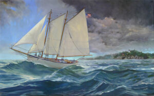
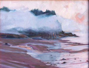
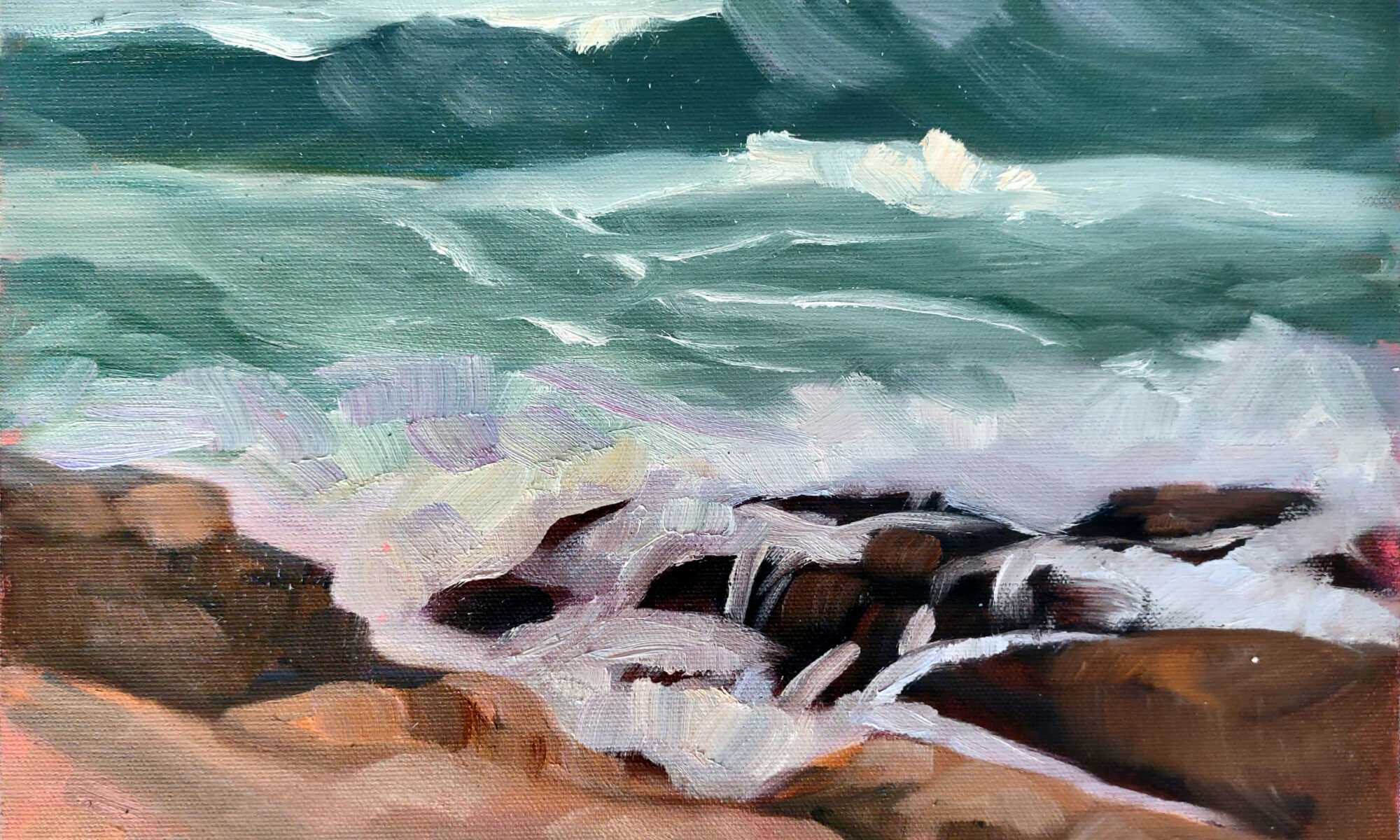
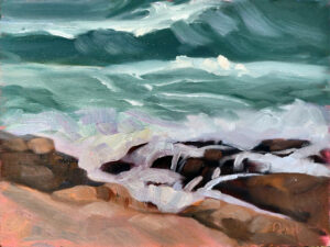
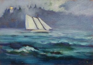
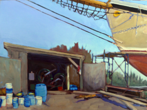
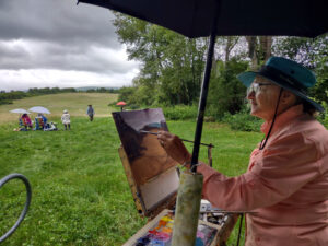
I’m cleaning my studio involuntarily. As of last night, Hurricane Lee was on track to nick Cape Cod and graze Maine on its way to the Bay of Fundy. Unless that hurricane does a 180, we’re due for, at a minimum, high seas. Normally I’d sit back with a glass of wine and watch the fun, but I’m supposed to be teaching watercolor aboard schooner American Eagle starting on Saturday.
“The time for taking all measures for a ship’s safety is while still able to do so,” wrote Admiral Chester W. Nimitz (in response to three ships of the Pacific Fleet being lost in a typhoon). “Nothing is more dangerous than for a seaman to be grudging in taking precautions lest they turn out to have been unnecessary.”
Captain Tyler King and reservationist Shary Cobb Fellows have roughed out a plan. We’ll stay in port another day, and the first day of the workshop will take place in my studio. Nobody needs to be bobbing around Penobscot Bay in high seas, including the boat herself, which is on the National Register of Historic Places.
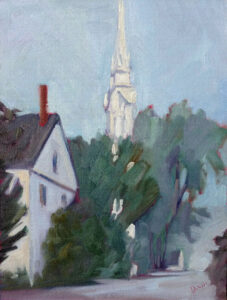
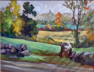
Every September, my studio is, frankly, a mess. I’ve been using it as a staging ground all season. It’s not just cluttered, it’s filthy, and there’s no way I’m hosting a workshop in it the way it looks right now.
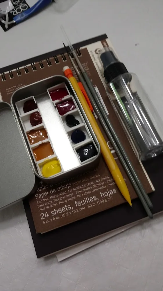
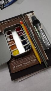
That led me to sorting art supplies. I’m a reformed shopper; I haven’t bought a tube of paint or a canvas that I haven’t needed for twenty years. But before that, oh, boy, did I have a problem.
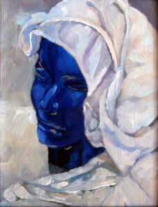
Added to that, people tend to leave things at my studio and they give me art supplies as gifts. Some are extremely useful, like the Rosemary brushes my students bought me a few years ago, or the charcoal Karen brought me from France. Others, not so much, but I’m very sentimental.
In my experience, people tend to buy unnecessary materials for three reasons:
- In lieu of actually buckling down to do the work. I’m not pointing fingers here, but a man I know always makes the first step of any job going to Home Depot. He may or may not get any farther.
- Because they’re frightened of actually painting. Shopping for art supplies is a lot easier than facing their fears.
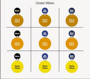
- To experiment. That’s why I have a tube of liquid graphite, oversized chalks and various colored pens in my studio-none of which I use very often. On the other hand, that’s also why I have watercolor pencils, which I find indispensable.
I freely distribute my supply lists for watercolors, oils, pastels and acrylics. If you stick with them, you can paint for the lowest cost possible. Still, I get many letters from experienced painters, like L, who wrote, “I’m always trying to decide if I am missing some beautiful mixes by limiting my colors too much.” That’s FOMO, or fear of missing out.
You can spend hundreds of dollars buying paint and supplies that are useless or redundant. My online class, The Perfect Palette, is meant to steer oil painters away from this. But perhaps even more important is to analyze why you’re going shopping in the first place.
My 2024 workshops:
- Painting in Paradise: Rockport, ME, July 8-12, 2024.
- Sea & Sky at Schoodic, August 4-9, 2024.
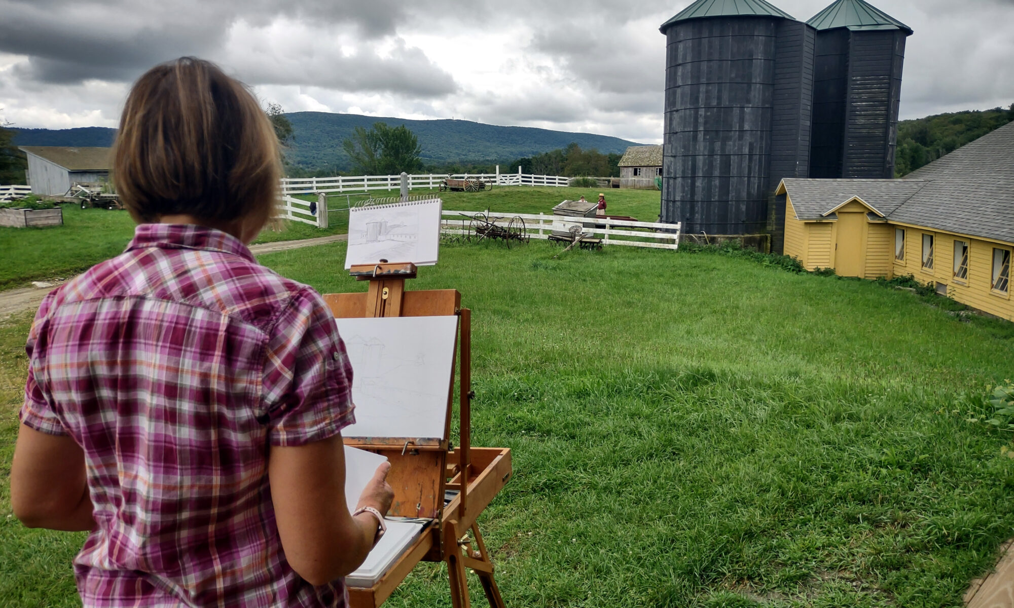
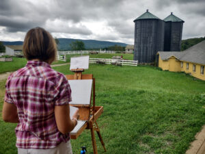
- Find your authentic voice in plein air: Berkshires, August 12-16, 2024.
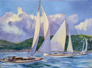
- Art and Adventure at Sea: Paint Aboard Schooner American Eagle, September 15-19, 2024.
- Immersive In-Person Workshop: Rockport, ME, October 7-11, 2024.


#/media/File%3AStaircase_perspective.jpg)