Monday Morning Art School: design elements

Santa Claus, 6X8, oil on archival canvasboard, $435 framed includes shipping and handling in continental US.

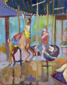
Design elements are in themselves neither good nor bad. They are ideals that can be used in many ways. That’s why two paintings with identical subject matter can land so differently.

You can understand the principles of design intuitively, without being able to name design elements, but it helps to have a common language.

The basic design elements

  • Line—that’s either a long mark or boundary between two shapes; 
  • Shape—an area defined by boundaries;
  • Form—that has different meaning in 2D and 3D design. In painting it means how we represent three-dimensional space;
  • Color, which is made up of:
    • Hue—the position on the color wheel,
    • Chroma—how intense the color is, and,
    • Value—the lightness or darkness of a color, creating contrast and dimension; 
  • Texture—the surface quality of the work, which in practice means brushwork;
  • Rhythm and movement—the organized repetition of objects, and the path through the painting;
  • Balance—how far the painting moves off from symmetry;
  • Focal points—the areas that draw the viewer’s eye first.
Toy Reindeer with double rainbow, oil on archival canvasboard, 6X8, $435 framed, includes shipping in continental US.

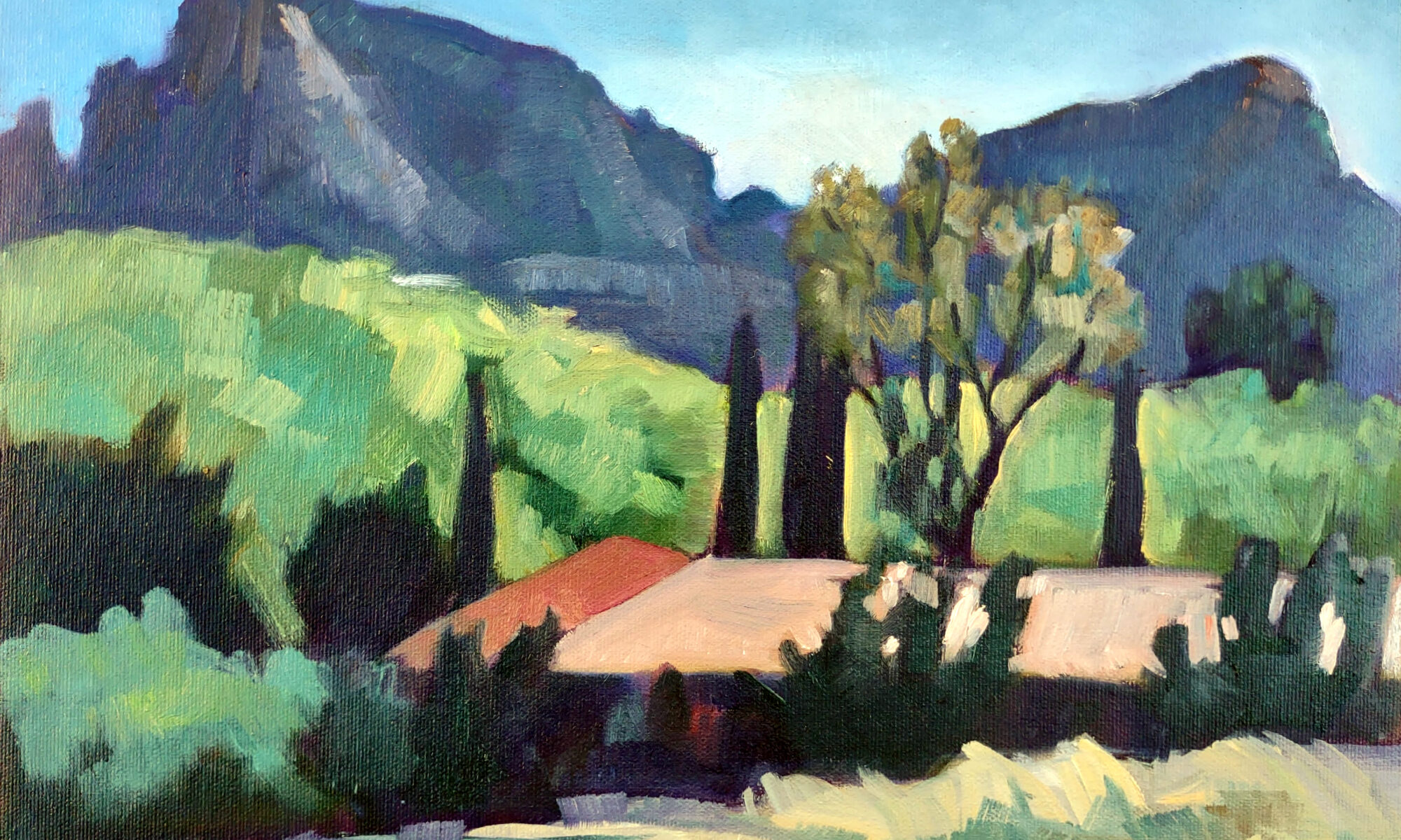
No artist can focus on all these at one time. Composition depends on which design elements we choose to stress and how they relate to each other. For example, almost all paintings have line in some form. But is that line restrained? Kinetic? Is it meant to support focal points or recede into the background?

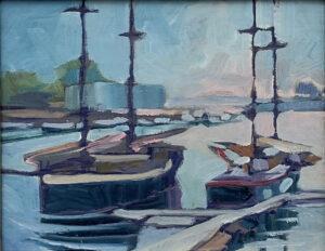
A masterpiece may have quiet, smooth brushwork or bravura brushwork. Neither is ‘better,’ no matter how many times you’ve been told to loosen up. Bravura brushwork may be associated with the brilliant palettes of modern painters, but there were many Old Masters, including Diego Velázquez, Frans Hals and Rembrandt, who painted loosely. Conversely, there are contemporary painters using polished surfaces. What matters is how design elements fit together.

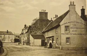
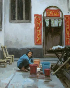
Subject matter has little to do with design.

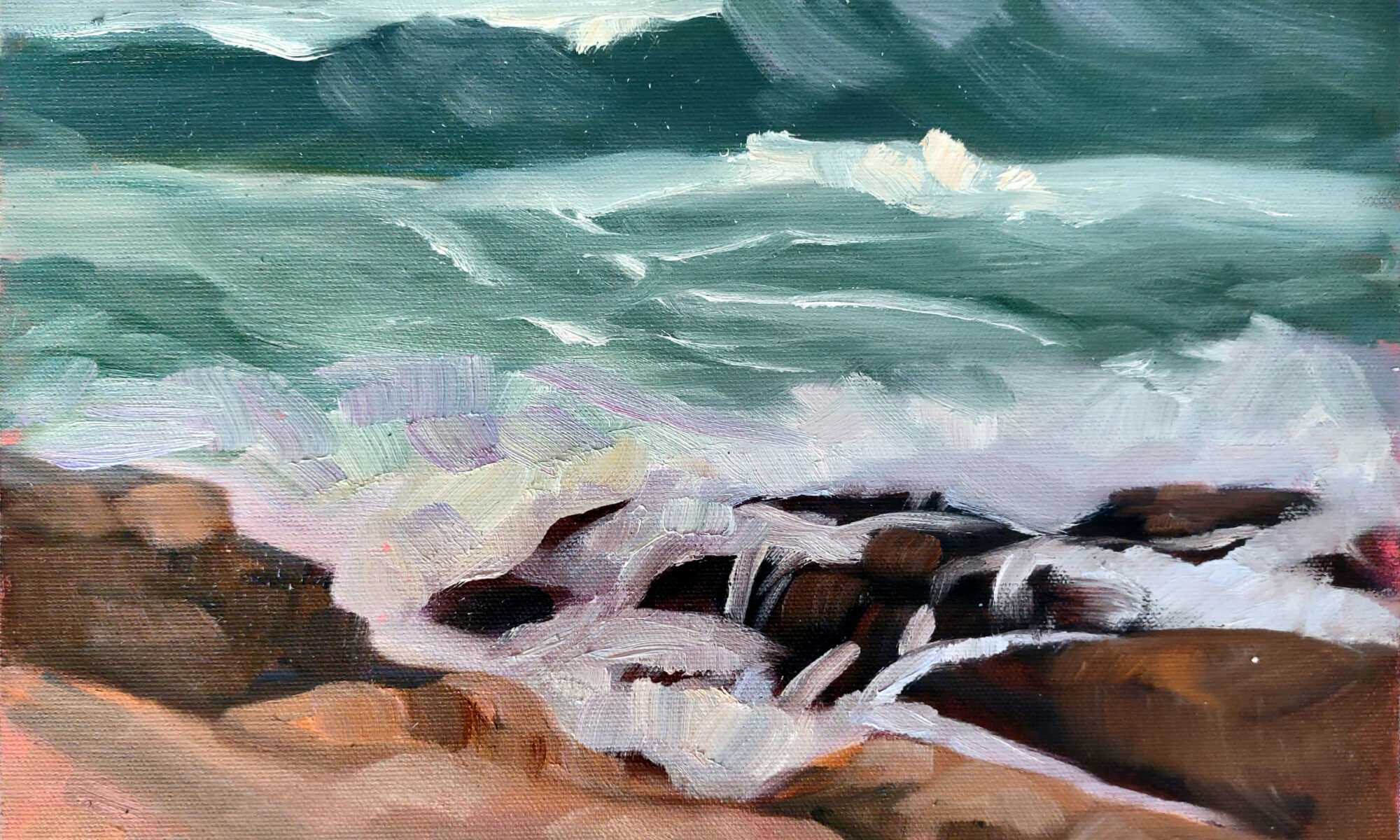
I have taken tens of thousands of photos I’ll never paint. A strong photo is not necessarily a strong painting. The camera records everything with glacial indifference; we, the artists, must emphasize what’s important.

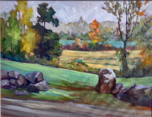
I find nature a very compelling subject, but nature itself doesn’t guarantee a strong painting. Paintings fail when the value structure is vague, focal points are accidental or don’t exist at all, and nothing is dominant.

Example of nōtan from Composition: Understanding Line, Notan and Color (1899) by Arthur Wesley Dow.

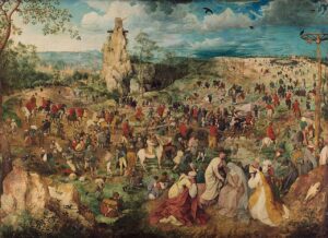
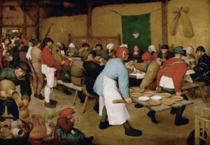
This has been a guiding principle of painting in all times and places. Compare Francisco Goya’s The Third of May, 1808, Jusepe de Ribera’s The Martyrdom of St. Andrew, Winslow Homer’s Weatherbeaten,  Wayne Thiebaud’s Around the Cake and Hasegawa Tōhaku’s The Pine Trees. They’re from different times and places and about radically different subjects. However, they all pare representation down to its essentials. Design is not a modern invention.

Arthur Wesley Dow was one of the great American painting teachers. He pioneered the ideas of space-cutting and nōtan. Both ideas emphasized the arrangement of beautiful shapes, and they’re skills worth practicing.

Example of space cutting from Composition: Understanding Line, Notan and Color (1899) by Arthur Wesley Dow.

Want to learn more about this? I’d love to have you join me for Trust the Process (making technique tell the story you want to tell), my live Zoom class designed to help you build a dependable, joyful, repeatable painting practice. We’ll dig into technique, creative decision-making and the mindset that frees you to paint with confidence. We meet Monday nights, 6-9 PM EST, starting on January 5, 2026. It’s suitable for all levels and all media. You can learn more here.

Registration is now open for workshops in 2026! Reserve your spot:

Can’t commit to a full workshop? Work online at your own pace:

Seven Protocols for Successful Oil Painters

Why care about composition?

Forgotten Man, 1937, Maynard Dixon, courtesy Brigham Young University Museum of Art

Composition is the quiet engine of a successful painting. It’s the part viewers feel before they start thinking rationally. It’s also the part painters often skip past too quickly. I’m busy writing my upcoming Zoom class, Trust the Process (making technique tell the story you want to tell), and of course composition is a big part of that.

Rouen Cathedral, Full Sunlight, 1894, Claude Monet, courtesy Musée d’Orsay

The first pillar of composition is harmony

Harmony in notan is about space cutting—the abstract division of the picture into dark and light shapes. This is not strict value modeling or chiaroscuro. It’s closer to pattern and rhythm. When Whistler painted Symphony in White, No. 2, he wasn’t describing light so much as arranging shapes.

Harmony in line is about the boundaries between shapes and the relationships between those boundaries and the surrounding space. The Charioteer of Delphi is a masterclass in this. Even in stillness, the interlocking lines guide the eye with clarity and restraint. Strong line harmony keeps a painting readable from across the room.

Harmony in color depends on hue, saturation, and value working together. Monet’s Rouen Cathedral series shows how disciplined color harmony can create vastly different moods using the same motif. Color isn’t decoration; it’s structure.

Vitruvian Man, c. 1490, Leonardo da Vinci, courtesy Gallerie dell’Accademia

What’s my number one rule?

If you’ve taken any of my classes, you’ve probably already answered, “Don’t be boring!” All rules can be broken, but only once you know what they are. Jacques Henri Lartigue’s Cousin Bichonnade works precisely because it bends expectations with confidence. Predictability is the real enemy, and that means being unpredictable even to yourself.

Dividing the frame in interesting ways helps avoid that trap. The rule of thirds is just the very beginning. There’s no law that says you can’t put the subject smack dab in the center of your composition. Look no farther than Leonardo da Vinci’s Vitruvian Man to see the power of symmetry and geometry in design.

Maynard Dixon’s Forgotten Man and Abandoned Ranch demonstrate how restraint, scale, and placement create emotional gravity. Both tell the story of the Great Depression indirectly, yet powerfully. Which brings us to focal points, which are different from the subject of a painting. Know what and where they are before you paint. Use contrast and line to support them—and never park them on the edge of the canvas.

Before the Race, 1882–1884, Edgar Degas, courtesy The Walters Art Museum

Finally, consider the motive line, or kinetic line. It’s tied to the major area of focus, divides contrasting values, and must be complex and intentional. Edgar Degas and Winslow Homer both used motive line to energize still scenes, guiding the viewer through the painting with quiet authority.

Want to learn more about this? I’d love to have you join me for Trust the Process (making technique tell the story you want to tell), my live Zoom class designed to help you build a dependable, joyful, repeatable painting practice. We’ll dig into technique, creative decision-making and the mindset that frees you to paint with confidence. We meet Monday nights, 6-9 PM EST, starting on January 5, 2026. It’s suitable for all levels and all media. You can learn more here.

Registration is now open for workshops in 2026! Reserve your spot:

Can’t commit to a full workshop? Work online at your own pace:

Seven Protocols for Successful Oil Painters

Monday Morning Art School: the #1 mistake painters make

Skylarking, 24X36, oil on canvas, $3985 framed includes shipping and handling in continental US.

Even when we work with a very competent instructor or institution, painters are largely self-taught. That’s true of most creative disciplines, since every hour of instruction is followed by hours of practice and self-discovery.

Eventually, we all run into a frustrating truth: effort doesn’t always equal results. We work for hours, even days, and still end up with a painting that feels fussy, flat, or somehow not quite right. Mostly that comes down to one simple mistake: prioritizing detail over the big picture.

Breaking Storm, oil on linen, 30X48, $5579 framed includes shipping and handling in continental US.

“It looks just like a photograph” is not usually a compliment

“It looks just like a photograph” is something casual passers-by will sometimes say to painters, and it always makes me wince. It generally means the details are all there, but the big sweep of movement and energy is lacking. As artists, most of us are drawn to detail; it’s almost instinctive to notice the sparkle on the water or the delicate branching pattern of new leaves in the spring. (In real life, we’re attracted to those sparkles and branches because they’re gently moving, which doesn’t translate to canvas.)

Frankly, detail is fun to burrow into, and I’m not saying don’t do it—that is a question of your own personal style and vision. But diving into detail before establishing the big shapes and values is the fastest way to derail an otherwise promising piece.

Brigantine Swift in Camden Harbor, 24X30, oil on canvas, framed, $3478 includes shipping and handling in continental US.

Structure vs. detail

Painting isn’t built from details outward; it’s built from structure inward. When your underlying shapes, values, and composition are strong, the painting sings before you ever add a highlight. But when the structure is weak, no amount of careful rendering can save it. If you doubt that, go back and look at the work of Baroque painters like Caravaggio or Peter Paul Rubens. As crazily detailed as their canvases are (by our modern standards) they rest first and foremost on solid value structure.

Avoiding this trap is simple

I’ve mentioned that I paint without my glasses; it prevents me from focusing on detail. But even clear-sighted individuals can remember to start with the largest shapes and the biggest value relationships. Ask yourself: Where is the light? Where is the shadow? What are the major masses of the scene? Block those in with confidence and clarity. Only after the bones of the painting are solid should you refine, adjust, and bring in the detail.

American Eagle in Drydock, 12X16, $1159 unframed includes shipping and handling in continental US.

Helping you learn

Watching someone move from frustration to epiphany is absolutely the most rewarding part of teaching. It’s also why plein air workshops are transformative. “I’m just asking you to trust me for one week,” I tell my students. I’m there to stop you when you fall back into the habit of fussing or adding tchotchkes to try to fix a not-fully-thought-out composition. We all do it at times, from exhaustion, nerves or sheer obstinacy. But one of my jobs is to intercept that and put you on the road to good design.

Over the course of my workshops and classes, we revisit this idea again and again: simplify first, refine later. You’ll learn to organize values swiftly, make decisive compositional choices and build paintings that hold their structure from the first brushstroke. Once you truly internalize this approach, painting becomes easier, faster and far more joyful. You stop fighting the canvas and start working with it.

I have two types of offerings to help you with this process. The first is a class starting in January called Trust the Process: making technique tell the story you want to tell. It’s on Monday evenings, 6-9, and is open to painters of all levels. The second is my workshop schedule for 2026, below.

If you’ve been feeling stuck, unsure, or just ready for a real leap forward, this is your invitation.

Registration is now open for workshops in 2026! Reserve your spot:

Can’t commit to a full workshop? Work online at your own pace:

Seven Protocols for Successful Oil Painters

Monday Morning Art School: simplifying shape and proportion

Heavy Weather (Ketch Angelique), 24X36, oil on canvas, framed, $3985 includes shipping and handling in continental US.

When you begin a painting, the natural instinct is to replicate every little wrinkle, cast shadow, and subtle nuance. But strong painting starts with drawing and structure. You must distill a composition down to its essential shapes and accurate proportions. That includes clear focal points and a compelling value structure. Once you have that you can worry about expressive brushwork.

A sketch of Trundy Point. It doesn’t need to be complicated; it’s a map, not a masterpiece.

Start with the underlying basic shapes

I’ve mentioned that I have the advantage of being slightly nearsighted, and I don’t paint with my glasses on. The rest of you can squint. What are the big masses? Forget identifying whether that’s a tree or a house; it’s a mass topped with another mass.

Every complex form or scene can be broken down into simplified geometric shapes. In addition to making better compositions, shape simplification helps you map proportion. Of course, you’ll occasionally need to check how tall vs. how wide the objects are and where they intersect.

Do this work in a sketchbook, where an ounce of prevention (drawing) is worth a pound of cure (overworking the painting).

How to block in a compelling composition

Once you understand the basic shapes, place them on your drawing. I never work inside a box; instead, I draw and then crop my drawing to match my canvas size. In fact, sometimes I do this several times, searching for the strongest composition.

My sketch for Heavy Weather. 5X8, graphite on Bristol-finish paper. This is a drawing that I spent a long time on, moving elements around until I was satisfied with the composition.

This allows me to explore all aspects of the idea before I commit to a composition. Sometimes I do a carefully-realized drawing. More typically, my drawing is not even identifiable as the subject; it’s merely a series of shapes.

How much of the canvas will the largest shape occupy? Is it part of a repeating motif or a one-off? Is it dark or light? Is it centered or offset? What quiet passages or negative space balance it? How does it support focal points?

This exploration is the most important part of painting (and to me, the most fun, since it’s fast and free). If line and value in a sketch are working, we know before we start whether the painting will end up feeling energetic, balanced, or completely static.

Refine edges before details

Working in big shapes does not mean those shapes remain unrefined; in fact, the best loose painters are the ones working from beautifully-drawn outlines. Drawing is the scaffolding of painting. Get the edges and proportions right while the shapes are still bold and simple.

Simplify and emphasize for impact

The beauty of this approach is that it can be pursued to whatever level of finish you like—either left wide open or with a high level of detail. With structure locked in, you can choose to paint the smaller elements as you wish, as long as you don’t overwrite your initial bold composition.

Napoleon I on his Imperial Throne, 1806, Jean-Auguste-Dominique Ingres, courtesy Musée de l’Armée

However, even the most meticulous realists edit some things out. For example, look at the above painting by Jean-Auguste-Dominique Ingres. At first glance, it’s highly detailed, but that’s selective. The robes are simplified, the carpet is simplified, and the background is simplified. (It’s huge, by the way.) Ingres knew what he wanted us to look at, and everything else is subservient to that. With a strong composition, his viewers instantly felt the power of Napoleon’s imperial pretensions, even before they noticed the details that Ingres did include.

Once the bones are in place, you can worry about style

Once shapes, proportion, value and placement are set, you can worry about brushwork. That includes lost-and-found edges, which can lead the eye through lesser forms and amplify major passages. You’ll find you’re a lot closer to looser brushwork if you lay a strong foundation first.

There are openings in my January-February Zoom classes

Trust the Process: making technique tell the story you want to tell
Monday evenings, 6-9, Jan. 5-Feb. 9, 2026

Where Do I Fit In?
Tuesday evenings, 6-9, Jan. 6-Feb. 10, 2026

Registration is now open for workshops in 2026! Reserve your spot:

Can’t commit to a full workshop? Work online at your own pace:

Seven Protocols for Successful Oil Painters

Monday Morning Art School: what is a focal point in art?

All Flesh is as Grass, oil on linen, 30X40, $5072 framed, includes shipping and handling in continental US.

A focal point in art is the area of a composition that draws the viewer’s eye and holds his or her attention. It’s the visual center of interest.

Artists create focal points primarily with contrast in value, hue and chroma, but other elements of design also support focal points. These include lines that guide the viewer’s eye, textural changes, and placement. Detail and complexity will naturally draw the viewer, as will isolation (which is usually also an exercise in contrast). And everything else being equal, a large object will dominate.

Why do focal points matter?

A good visual composer, just like a good musician, guides his or her viewer through the composition. Focal points engage the viewer, and lead them through the space in a calculated way.

Saskatchewan Grain Elevators, oil on archival canvasboard, 8X10, $522 includes shipping and handling in continental US.

Should a work of art have just one focal point?

Generally, most paintings have more than one focal point, although occasionally an artist will let just one section of the canvas dominate. Good examples are Rembrandt van Rijn’s self-portraits, where humanity, as expressed through his face, is everything.

A single focal point creates a clear, strong emphasis, but the downside is that there’s no path forward into the painting. Multiple focal points create movement and tension, leading the viewer’s eye through the composition. The longer a person looks at an artwork, the more they engage with it.

Early Morning at Moon Lake, 6X8, oil on archival canvasboard, $348 includes shipping and handling in continental US.

How to prioritize focal points

You, the artist, are the boss here. You should ponder the hierarchy of focal points before you ever pick up a brush. (That’s one reason for a good value sketch.) What is the strongest focal point? What is its spatial relationship to the others? One focal point should lead the band, the others should follow merrily along.

Make sure none of your focal points are at the edge of your canvas or leading off the page. Think of your focal points as elements that are connected compositionally, connected by color harmonies, lines, and value.

Are focal point and subject the same?

While focal point and subject often overlap, they are not always the same thing.

The subject is what the artwork is about—the main idea or theme. The focal point is where the viewer’s eye is drawn first.

In many situations, they might be identical; for example, a black dog running in the snow would be both the focal point and the subject. But in Johannes Vermeer’s Girl with a Red Hat, the subject is the girl and her stupendous hat, but the focal points are the side of her face, her lace fichu, and the flash of red at the far right of her hat. The focal points are masterfully drawn down the canvas by a single line of light. Rembrandt’s The Night Watch is a portrait of the militia of Frans Banning Cocq and Willem van Ruytenburch but none of the supporting militiamen are focal points at all.

Athabasca River Confluence, 9X12, $696 includes shipping and handling in continental US.

How do you apply this?

In your next painting or drawing, make a conscious effort to set out and emphasize focal points, using value, hue, chroma and line. Can you articulate where they are and how you want the viewer to read them?

This spring’s painting classes

Zoom Class: Advance your painting skills (whoops, the link was wrong in last week’s posts)

Mondays, 6 PM – 9 PM EST
April 28 to June 9

Advance your skills in oils, watercolor, gouache, acrylics and pastels with guided exercises in design, composition and execution.

This Zoom class not only has tailored instruction, it provides a supportive community where students share work and get positive feedback in an encouraging and collaborative space. 

Zoom class: Signature series

Tuesdays, 6 PM – 9 PM EST
April 29-June 10

This is a combination painting/critique class where students will take deep dives into finding their unique voices as artists, in an encouraging and collaborative space. The goal is to develop a nucleus of work as a springboard for further development.

Registration is now open for workshops in 2026! Reserve your spot:

Can’t commit to a full workshop? Work online at your own pace:

Seven Protocols for Successful Oil Painters

Monday Morning Art School: composition is about light, not objects

Fog over Whiteface Mountain, 11×14, $1087 includes shipping in continental US.

“From now on, I’m gonna stop thinking about composition being about things,” my correspondent wrote, “and start thinking about it as shadows.”

I feel like a deficient teacher, because composition is always about light and dark. Hue, chroma, line and objects may feed into that, but it’s value that makes a composition weak or strong.

Beauchamp Point, Autumn Leaves, 12X16, oil on archival canvasboard, $1449 includes shipping in continental United States.

I ask my critique students to analyze their compositions based on Edgar Payne‘s exhaustive list of possible compositions in Composition of Outdoor Painting. (This used book is now so expensive that I can no longer recommend buying it. Check it out of the library.) The idea isn’t to slavishly follow one of his designs; it’s to understand whether you have an underlying design in the first place, and how you might strengthen it.

But these compositional armatures are always about value, even when that value takes the form of an object. There are many times when objects and shadows coincide; for example, a large piñon and some small creosote bushes can combine in a dark triangular mass, because they’re both dark objects usually set against light-colored grasses. On the other hand, sidewalk chalk isn’t going to create any kind of structure against a concrete sidewalk unless the artist thinks about the shadows rather than the chalk.

Quebec Brook, oil on canvasboard, 12X16, $1449 framed includes shipping in continental US.

By now, most of you have gotten the message that a painting needs to compel on a tiny screen (or from thirty feet) as well from three feet or three inches.

You do this with value. It’s not enough, for example, that an object is at a diagonal; you must make a persuasive shift between light and dark along that diagonal. This is the primary lesson a painter can take from Winslow Homer’s incredible seascapes.

This is also why plein air painters dislike murky grey skies; they make it harder to find compelling shadow patterns.

Composition rests on the following principles:

  • The human eye responds first to shifts in value, and following that, in shifts in chroma and hue;
  • We follow hard edges and lines;
  • We filter out passages of soft edges and low contrast, and indeed we need them as interludes of rest;
  • We like divisions of space that aren’t easily solved or regular.
Best Buds, 11X14, oil on canvasboard, $1097 framed includes shipping in continental US.

But I just want to paint what I feel!

Music, sculpture, poetry, painting, and every other fine art form relies on internal, formal structure to be intelligible. This is easiest to see in music, where the beginner starts by learning chords and patterns. These patterns are (in western music, anyway) universal, and they’re learned long before the student starts writing complex musical compositions. In other words, you start at the very beginning.

Music is an abstract art because it’s all about tonal relationships, with very little realism needed to make us understand the theme. A composer doesn’t need little bird sounds to tell us he’s writing about spring. Likewise, the painter doesn’t need to festoon little birdies on his canvas to tell us he’s painting about spring. That should already be apparent in the light, structure and tone of his work.

The strength of the painting is laid down before the artist first applies paint, in the form of a structural idea-a sketch or series of sketches that work out a plan for the painting.

All good painting rests on good abstract design. Take a good look at Christina’s World by Andrew Wyeth. Whatever meaning we’re supposed to take from it, it’s a strong triangular composition juxtaposed with a mid-century curving line.

Still, most realist painters don’t spend nearly enough time considering abstract design, even when they understand the critical importance of line and value. Christina’s World doesn’t rely much on hue for its impact. It’s a washed-out pink, a lot of dull greens and golds, and a significant amount of grey. And yet it was the most successful figurative painting of the 20th century. Wyeth was almost obsessive in his drawing habits; that translates into powerful finished paintings, driven by value.

Registration is now open for workshops in 2026! Reserve your spot:

Can’t commit to a full workshop? Work online at your own pace:

Seven Protocols for Successful Oil Painters

Monday Morning Art School: the number one problem with your painting

Seafoam, 9X12, oil on archival canvasboard, $869 framed includes shipping in continental US

On Monday, I posted Let’s Paint Some Duds! After about the hundredth person told me they have no trouble whatsoever painting duds, I realized my hook was lousy. It tapped into fear of failure instead of challenging people to be more questing and adventuresome.

I’ve had many emerging artists tell me that half or more of their paintings are duds. That’s shocking; it’s way too high a failure rate, especially when it comes in the learning phase. For that matter, there are other painters who fail just as often but don’t even realize it. (And far be it from me to wreck their happy illusions.)

Duds are a particular problem in plein air painting, so much so that my pal Brad Marshall coined a term for the process of making them: flailing around.

Cypresses and Sunlight, 11X14, Carol L. Douglas, $1087 includes shipping in continental US

Why so many?

I also get frequent emails and texts that read, “I’m stuck! What’s going wrong here?” That’s why I periodically teach an online critique class; you’ll advance more quickly when you can answer that question for yourself.

But the answer almost always comes down to bad composition. Either the darks are not organized, or the focal points are not clear, or there’s not a clear and compelling armature. Figuring that out in advance, with a value drawing or notan, saves tons of time and effort.

Composition organizes the design elements of a painting. It provides structure and balance, guides the viewer’s eye, and determines where a painting falls on the all-important scale of harmony-to-tension. Composition controls the visual appeal of a painting, but it also controls its emotional power.

Stone Wall, Salt Marshes, 14×18, $1594 framed includes shipping in continental US

A weak composition is still a composition.

The same student who kvetches about flailing and failing often resists the idea of studying formal composition. “I want to be spontaneous and natural,” he will say. Well, composition, like puberty, is going to happen whether you take a hand in guiding it or not.

Weak compositions impede the very message that the supposedly-spontaneous artist wants to convey. Conversely, strong compositions guide viewers through the content. By strategically placing focal points, controlling movement, and using visual cues, you influence not just what your viewers see, but what they think and feel. And isn’t that the point of communication?

Then there’s the question of balance and emphasis. Just as the cannonades in Tchaikovsky‘s 1812 Overture are carefully placed to emphasize the point of Russia’s victory over the French, your focal points must fall in sweet spots. They must be reinforced with contrast and line. When it works flawlessly, we see a painting that is beautiful individual, and stylish-without overburdening our minds too much about how it happened.

Ketch and Schooner, 8X10 in a solid silver leaf frame, includes shipping in the continental US

How do I learn to be a better composer?

I’ve written extensively on this blog on the subject of composition, which of course you can access for free. Above all, there’s my cardinal rule of painting: don’t be boring. I can’t restate that often enough.

If you really want to give up flailing and failing, I invite you to also take my online course, The Correct Composition, which I just released on Friday. Give yourself a lot of time to do the exercises and take the quizzes; you’ll get far more out of it than you will by just skimming the videos.

Registration is now open for workshops in 2026! Reserve your spot:

Can’t commit to a full workshop? Work online at your own pace:

Seven Protocols for Successful Oil Painters

Monday Morning Art School: Subject vs. focal point

The People’s Census at Bethlehem, 1566, Pieter Brueghel the Elder, courtesy Royal Museums of Fine Arts of Belgium

The number one question you must ask about your painting is: is it boring? If your painting is boring, nobody is going to engage with it.

One way to do keep things interesting is to manipulate where you put the subject of your painting. You don’t need to plop the subject in the center of your canvas and the subject does not necessarily have to be the focal point.

Consider Pieter Brueghel the Elder‘s masterpiece, The Census of Bethlehem, above. It’s unlikely that Brueghel consulted a text about composition, because those things didn’t exist back in the 16th century. He came up with this visual trick on his own and used it over and over.

The Procession to Calvary, 1564, Pieter Brueghel the Elder, courtesy Kunsthistorisches Museum. This is a veritable “Where’s Waldo” of a painting.

The subject is not in the middle of the canvas. Nor is it the focal point. In fact, the subject will only be clear to you if you know the Bible story about Mary and Joseph traveling to be counted in Bethlehem. Because of the overall energy of the canvas, you’re engaged enough to hunt for them, and to realize that Mary and Joseph are at the very bottom of the canvas, heading towards the census-taker at the bottom left.

That’s different from the focal points, which are within the swirl of activity that made up the daily life of a medieval village.

Landscape with the Fall of Icarus, c. 1558, either Pieter Brueghel the Elder or a close copy thereafter, courtesy Royal Museums of Fine Arts

Brueghel often made the subjects of his painting seem like almost an afterthought to the big scene. Another great example of this is Landscape with the Fall of Icarus, about which William Carlos Williams wrote:

According to Brueghel
when Icarus fell
it was spring

a farmer was ploughing
his field
the whole pageantry

of the year was
awake tingling
near

the edge of the sea
concerned
with itself

sweating in the sun
that melted
the wings’ wax

unsignificantly
off the coast
there was

a splash quite unnoticed
this was
Icarus drowning.

In that short poem, Williams says everything about Brueghel’s compositional technique.

The Peasant Wedding, 1566-69, Pieter Brueghel the Elder, courtesy Kunsthistorisches Museum. Brueghel also painted many genre paintings, meant to illustrate a known story or moral argument.

So, what’s the difference?

The focal point is a visual engagement, whereas the subject is what the painting is about. The subject of a painting can be a story or fable, as were Brueghel’s paintings. It can be an object or person. Or, in the case of abstraction, it can be nothing at all.

Focal points are something quite different. They are the points that your eye rests on at it moves through a painting.

What draws the human eye to a specific passage in a painting?

  • Contrast in value, hue and chroma, with value being the biggest driver of the three. If you have a dark shape next to a light shape, the eye tends to look at that place.
  • Detail. Assuming the whole painting is not overloaded with detail, if there’s a lot of detail in a passage, that is where the eye will go first.
  • Line. Lines within the composition act like arrows, drawing your eye to the focal points.

Is there just one focal point in the painting?

I sure hope not, because your job as the composer is to get the human eye to dance its way through the composition, to engage the viewer for as long as you can keep them interested. The longer they spend looking at your picture, the more involved they become with it.

Registration is now open for workshops in 2026! Reserve your spot:

Can’t commit to a full workshop? Work online at your own pace:

Seven Protocols for Successful Oil Painters

The value of value

Cypresses and Sunlight, 11X14, Carol L. Douglas, $1087 includes shipping in continental US.

Early this year, I set out to create a seven-step online training class to teaching the fundamentals of oil painting. One of these was Step 2: the Value Drawing. Making these interactive classes was a tremendous learning experience for me, and I hope the net result is helpful for you, too.

Value (lightness to darkness) is just one component of color, but it’s the most important. Establishing a hierarchy of values before you ever pick up a brush will save you hours of flailing around in the field. I know this from personal experience. Before I became disciplined about value, I wasted tons of time (and much paint) dithering, repainting, and generally making a mess of more paintings than I saved.

The value sketch is the oil painter’s secret weapon. It’s an opportunity to plan your painting before you ever pick up a brush. And it’s critical; if the value structure is compelling, your painting will be compelling. If not, your painting is doomed from the start. Nothing in painting is more important than value.

Birches, 6X8, oil on archival canvasboard, $435 includes shipping in continental US.

Value is the basis of good composition

“But why waste time on a sketch when I can just paint?” you ask. For the same reason that contractors need blueprints before they start building: great ideas require planning.

Investigating value in advance is the key to compositional fluency. In value sketches, we quickly experiment with different arrangements of lights and darks. This helps us make intelligent choices about focal points, line, and the weight of individual elements in the painting.

By breaking complex scenes down into restricted value planes, we create blueprints for our paintings. This not only helps us simplify ideas, it guides us through later decisions about color, texture, and detail.

Value sketching starts with just a few simple, inexpensive tools: a sketchbook and a mechanical pencil. Working in a sketchbook is a lot faster and easier than working out questions of light and dark in paint. In return for a small investment of time at the beginning of your painting, you’ll reap tremendous dividends as you go forward.

Dropping Tide, 11X14, oil on archival canvasboard, $1087 framed includes shipping in continental US.

Amplifying contrast

Value drawing helps us simplify and amplify (when necessary) the contrast between darks and lights in our composition. Contrast is the visual tool that creates interest and drama in a painting. Too many paintings fail because they’re stuck in the boring midtones.

Seafoam, 9X12, oil on archival canvasboard, $869 framed includes shipping in continental US.

Understanding Form

Value drawing helps us understand how light interacts with different forms and objects in a composition. It’s what gives objects volume. You may never paint the nuances of three-dimensional modeling, but you should understand them.

Value is particularly important in realism. It’s how we create convincing illusions of light and shadow, depth and dimensionality.

Who is this course designed for?

It’s comprehensive, so it’s tailored to both a beginner’s understanding and an experienced artist’s continued development. You can go back to it repeatedly and take it at your own speed, so you’ll benefit from it no matter what your starting point.

Here is a link to the whole series.

Registration is now open for workshops in 2026! Reserve your spot:

Can’t commit to a full workshop? Work online at your own pace:

Seven Protocols for Successful Oil Painters

Monday Morning Art School—Greeking

Ice Cream Stand, 8×10, Carol L. Douglas, $652 framed includes shipping.

Artists use the term ‘greeking’ to describe writing that isn’t writing, text that isn’t text, in a painting. The term comes from typography. There’s a famous passage that starts, Lorem ipsum dolor sit amet… It gets subbed in anywhere where the words aren’t already available to the designer.

This text comes from an essay by Cicero, and has been used by typesetters for this purpose almost since the start of moveable type. I don’t know which surprises me more-that typesetters in the 15th century knew Latin, or that so many of us today can recite a fragment of Cicero without having a clue about its meaning.

Medieval scribes were schooled in Latin, but not Greek. When they encountered Greek in a passage, they would note, graecum est; non potest legi (It’s Greek, so it can’t be read). Today we say, “it’s all Greek to me,” meaning it’s in a foreign language. Thus, a Latin placeholder ends up being called greeking. Makes perfect sense.

Poosie Nansie’s Inn, from Picturesque Ayrshire, 1900, by William Harvey. This was a popular subject for photographs due to its association with Robert Burns.

When is greeking appropriate?

Actual words are powerfully potent in visual imagery, as advertising attests. For a more high-brow example, think of Robert Indiana‘s famous LOVE icon and how it immediately changes the landscape when in sculptural form.

There are times when words can stand alone. For example, you might paint nocturne of a bar and put the single word ‘bar’ over the transom, to convey something about the destination to your viewers. That would read differently than if you carefully scribed Poosie Nansies, etc. on the wall of a painting of that Scottish inn. In the photo above, we’re instantly drawn to the text at the expense of the people, road, and fabulous chimney pots. The photographer couldn’t help it, but we painters have the option to deemphasize the writing in favor of the longer view.

We greek words to avoid overemphasizing their meaning at the expense of your overall design.

The Washing Buckets, 20X16, Ken DeWaard, courtesy of the artist.

How do I do it?

In oils, greeking is very simple. You simply scribe in some approximation of text and then push the background colors against it. You can do that neatly, as in Ken DeWaard‘s example above, or mushily, as in mine, at top.

Tums Bottle, watercolor, approximately 4X5, Carol L. Douglas.

In watercolor it is a little more difficult, since you can’t push the paint around in quite the same way. If the text you’re greeking is darker than the background, just scribble it in. If you have to reverse it, I find it’s easiest to write it in with your light color, let it dry, and then push the background in around it.

Try it; it’s fun!

My 30 Watercolors in 45 Days Challenge is an excellent opportunity to try greeking. Anything packaged in your home is bound to have words on it. Or, paint a sign in a landscape and experiment with how muddled or clear you want it to be. How does the painting read differently with different levels of clarity in the text?

Registration is now open for workshops in 2026! Reserve your spot:

Can’t commit to a full workshop? Work online at your own pace:

Seven Protocols for Successful Oil Painters