Monday Morning Art School: don’t be boring

Linda Smiley used the big shapes of shadows to draw us across a very familiar lake scene.

Don’t be boring, I wrote last week. This is the first and greatest rule of composition. “What do you mean by that?” a reader asked in response. This, like obscenity, is one of those things that’s hard to define, but we know it when we see it.

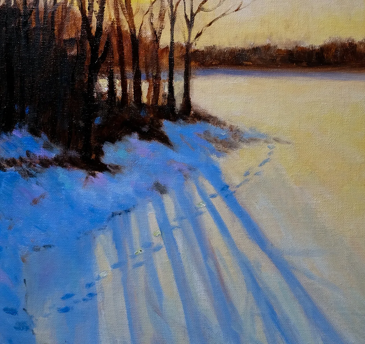
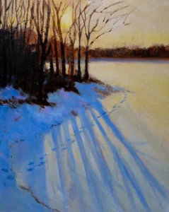
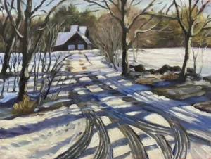
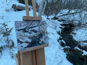
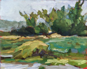
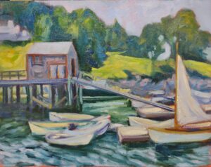
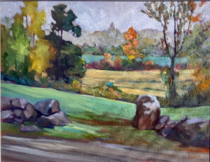
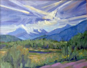
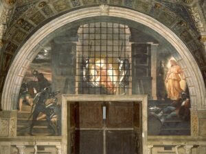
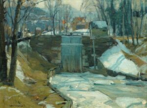
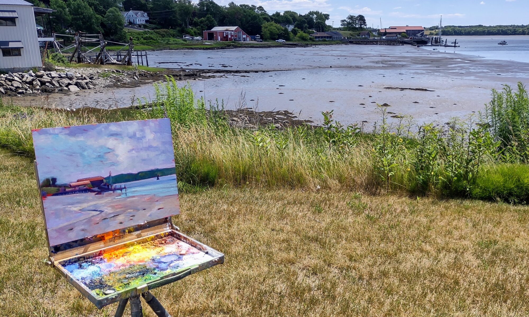
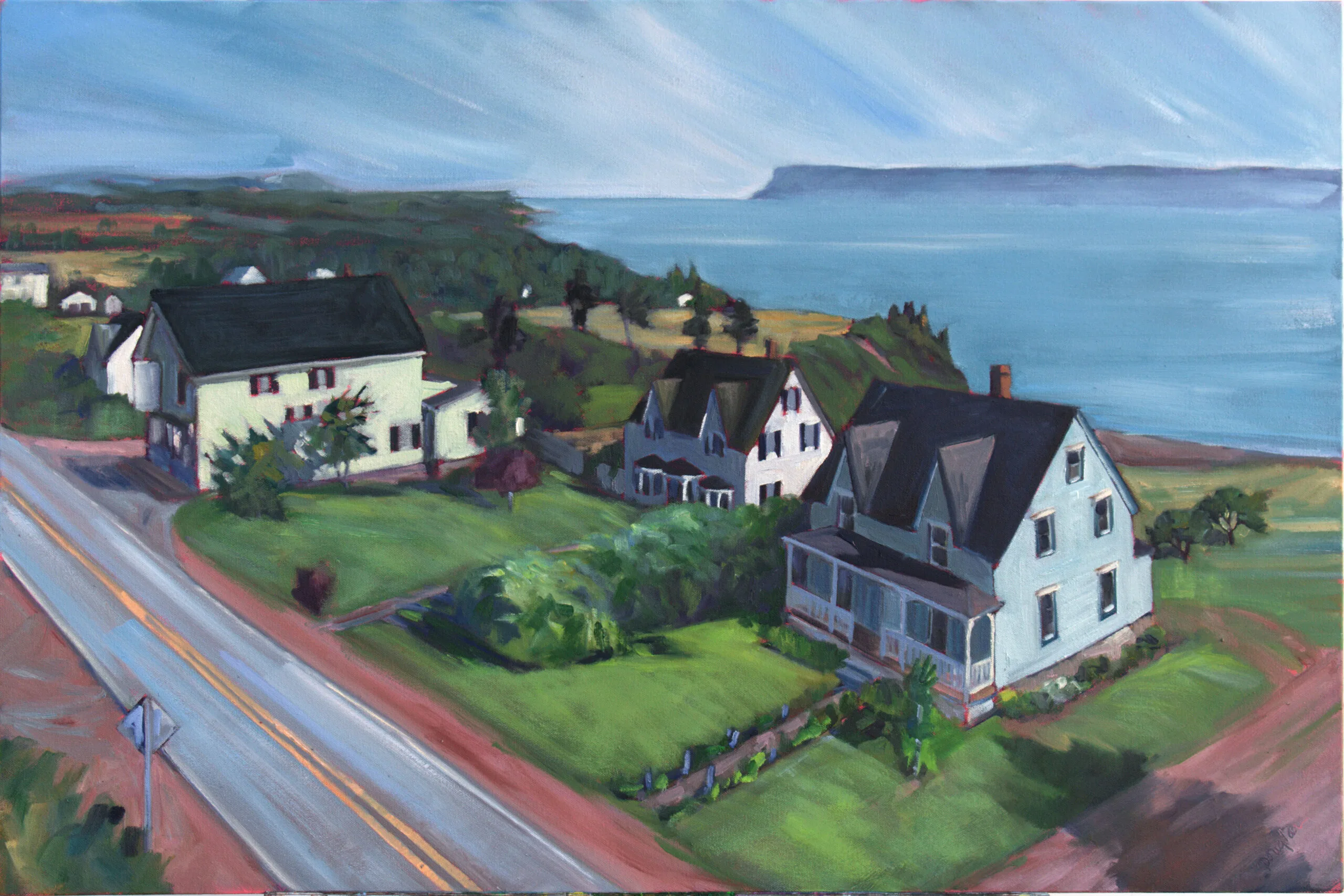
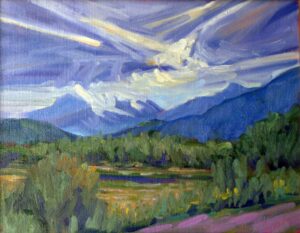
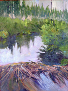
The subject is never the issue. We’ve all seen a thousand boring paintings of barns, but when Edward Hopper painted them, they were brilliant studies of light and shape. Very familiar subjects can be seen in new and arresting ways. I took the liberty of illustrating this post with paintings by my students; they all took common scenes in the northeast and finished them beautifully.

Most people would paint the fence from the side, but Rebecca Bense drove us right into the picture plane with that shadow.

The easy out

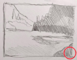
We tend to draw what’s right in front of us without thinking too much of how changing the viewpoint might make for a better painting. Commit to an idea, and squeeze out every ounce of design you can by drawing it repeatedly in different arrangements. That’s as important in landscape as it is in still life. The time you spend trying out new compositions is the most important part of the painting process.

That is not just a question of large shapes, but of values. Even a typical arrangement of trees, point, and water can be made arresting through dark shapes running through them. Contrast draws the eye.

Beth Carr used the chop of snow shadows to create great texture.

What everyone says is not necessarily true

You’ve heard of the rule of thirds, or that you should never center the subject directly on your canvas. What makes you believe these things? Someone told them to you.

Ideas of division of space are culturally-derived and quite complex. Tutankhamun’s golden mask is beautiful and perfectly symmetrical.

You will have an easier time creating a composition if you abide by these shibboleths, but that doesn’t mean you’ll make a better painting. A deep dive into space division is never wasted time. I think about the abstract paintings of Clyfford Still when I start to feel my compositions falling into dullness.

Cassie Sano crossed the tire tracks and the tree shadows to create a weave of interest.

There are some verities

Defining your composition with long unbroken horizontal and vertical lines will make it start out rigid. Look to Frances Cadell for ways to break out of that. Likewise, you don’t want to lead the eye out the corners of your canvas, or put a focal point to close to an edge. ‘Respect the picture plane’ is a good general rule.

The human brain loves the insolvable. That’s why the Golden Ratio and Dynamic Symmetry work better than the rule of thirds in design. That doesn’t mean you need to spend a lifetime studying design arcana; just understand it and better placement will come naturally to you.

Stephen Florimbi didn’t beat the details to death in this lovely creek painting, instead, concentrating on the patterns of light and dark.

Things to avoid

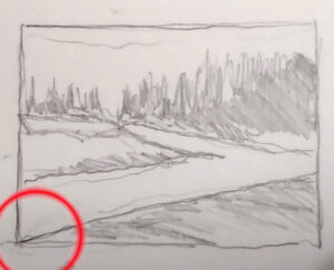
No painting without a series of focal points can succeed. This is where the marsh painting usually fails. The eye needs to be able to walk through, into, and beyond the work. I’m not talking about anything as hackneyed as the winding path or river, but a series of points that draw your eye around the picture in a planned way. These details reward careful study and keep the viewer engaged for long periods of time.

Registration is now open for workshops in 2026! Reserve your spot:

Can’t commit to a full workshop? Work online at your own pace:

Seven Protocols for Successful Oil Painters

Monday Morning Art School: composition starts at the beginning

Spring Greens, 8X10, oil on canvasboard, $522 unframed.

It’s been said that a painting needs to be compelling at three inches, three feet and thirty feet. That’s simple enough, but how does the artist make that happen?

Looking at a painting from a distance (or on the tiny screen of your phone), you’re not compelled by brushwork or even-mainly-by subject matter. You’re drawn by the internal structure and abstract masses of value and hue on the canvas.

Music, sculpture, poetry, painting, and every other fine art form relies on formal structure to be intelligible. This is easiest to see in music, where even the rank beginner starts by learning chords and patterns. These patterns are (in western music, anyway) pretty universal, and they’re learned long before the student transforms into another Bach or Ray Davies. In other words, you start at the very beginning.

This structure has nothing to do with the subject matter and everything to do with inherent beauty. It starts before the artist first applies paint, in the form of a structural idea-a sketch, or a series of sketches in monochrome, that work out a plan for the painting.

Larky Morning at Rockport Harbor, 11X14, on birch board, $869 unframed.

It starts at the beginning

What composition isn’t is the sudden realization, when you’re halfway finished, that you have a lot of boring canvas with nothing going on. Slapping a sailboat in there isn’t going to fix an essentially deficient construction.

Music is an abstract art because it’s all about tonal relationships, with very little realism needed to make us understand the theme. (Think of the cannonade in the 1812 Overture, which comes at the very end, but we’ve all gotten the point long before that.) A composer doesn’t need little bird sounds to tell us he’s writing about spring, although they can be cute. Done right, the painter doesn’t need to festoon little birdies on his canvas to tell us he’s painting about spring, either. That should already be apparent in the light, structure and tone of his work.

Stone Wall, Salt Marshes, 14×18, $1594 framed.

Abstraction is harder for the representational artist to grasp, even when we understand the critical importance of line and abstract shapes. We still must stuff a huge three-dimensional reality into a two-dimensional picture plane. That’s a big job and it must be handled with deliberation.

Just as with everything else, some of us are naturally better composers than others, but that only takes us so far. We all fail when we don’t put composition at the beginning of our painting process.

Mountain Fog, 12X9, oil on archival canvasboard, $696 unframed.

Building better paintings

All of us have closets full of bad paintings we can’t resolve. (“How long did that take you?” “Just the ten bad ones I did before I did this one good one.”) In almost every case, the problem is far deeper than modeling or paint application-it comes from ignoring the fundamentals of composition.

How can you avoid this and reduce the number of bad starts in your painting collection?

Respect the picture plane: the four ‘walls’ of your canvas are the most important lines of your painting. All composition must ultimately relate to them.

Armature: the fundamental lines of movement that connect the main elements of the painting must be dynamic and clearly articulated;

Abstract shapes: these are the building blocks of painting; they must relate as values and colors before they ever become real objects.

Don’t be boring: If you’ve seen that combination of tree, hill and sky a thousand times, do something to make it your own.

Then, and only then, can you move on to specific subjects and painterly detail.

“Remember, that a picture, before it is a picture of a battle horse, a nude woman, or some story, is essentially a flat surface covered in colors arranged in a certain order,” wrote one of the fathers of modern painting, Maurice Denis. As the direct heirs of Modernism ourselves, we would do well to listen.

Registration is now open for workshops in 2026! Reserve your spot:

Can’t commit to a full workshop? Work online at your own pace:

Seven Protocols for Successful Oil Painters

This post originally appeared in March, 2021, and has been lightly edited.

Monday Morning Art School: paint like a pro

Canyon de Chelly, before 1947, Edgar Payne, courtesy of the Atheneum Art List.
Canyon de Chelly, before 1947, Edgar Payne, courtesy the Atheneum Art List.

“It’s the lack of good composition and values that make a painting look like student work,” Bobbi Heath wrote in response to last week’s post on simplifying shapes. That’s where most early artists fail, and why good teachers stress value studies.

“Brushwork, color choices, and level of detail are all questions of style,” she added. “Each of these has a spectrum. A proficient artist can work anywhere in those spectra but they can’t ignore composition.”

Wolf Kahn and Raphael are poles apart in terms of style. One might be more to your taste, but objectively, neither is better than the other-or more representational, for that matter. As stylized as Kahn’s trees are, Raphael’s Vatican Stanze are just as distanced from ‘reality’.

Deliverance of Saint Peter, 1514, Raphael, courtesy of the Vatican

What unites them, and unites all good works of art, is composition. That’s true in painting, sculpture, writing, architecture and music-in fact, throughout the creative sphere. There must be structure there, or “the centre cannot hold,” to trivialize a great W.B. Yeats poem.

In painting and drawing our ideas about composition have remained remarkably static over time. Analyze the space in one of Wayne Thiebaud’s desserts and a Renaissance portrait like Bronzino’s self-possessed young man, and you’ll find they’re using the picture plane in much the same way. There are only so many ways to divide a rectangle.

Ice-Bound Locks by John Fabian Carlson, oil on canvas board, 12 x 16 inches, courtesy Vose Gallery

What to think about

Composition rests on the following principles:

  • The human eye responds first to shifts in value, but contrast in chroma and hue also attract our gaze;
  • We follow hard edges and lines;
  • We filter out passages of soft edges and low contrast, and indeed we need them as interludes of rest;
  • We like divisions of space that aren’t easily solved or regular.

I ask my critique students to analyze their compositions based on Edgar Payne‘s exhaustive list of possible compositions in Composition of Outdoor Painting. (This used book is now so expensive that I can no longer recommend buying it. Check it out of the library.) The idea isn’t to slavishly follow one of his designs; it’s to understand whether you have an underlying design in the first place, and how you might strengthen it.

I also ask my students to tell me where the focal points are in their composition, and how they want the viewer to walk through them. If focal points aren’t intelligently designed, and you’re not drawn through them with contrast, line and detail, then it’s back to the (literal) drawing board.

John Carlson’s Guide to Landscape Painting is available in reprint. He’s the guy who gave us the idea of numbering our value levels, which I explained in this post from last year.

“Every good picture is fundamentally an arrangement of three or four large masses,” Carlson wrote. That’s as good an organizing principle as any in art. Value is what makes form visible, so we should see, translate, simplify and organize form into value masses.

These masses must be linked, whether obviously, subtly, or by implication. Think of a windbreak of separate trees on a hill. They might be disconnected dark shapes, but they’re held together by their rhythm.

The Big Fish Eat the Little Fish, drawing for a print, 1556, Pieter Bruegel the Elder, courtesy the Albertina

What to avoid

You’ll note that I’ve said nothing about what’s in front of you, either in your photo or in the real world. Your reference might give you an idea for composition, such as a winding river, a break in the forest, or the strong diagonal of a hillside. But that is your starting point, not your destination.

“Above all, don’t be boring,” I tell my students. This is a lesson from Pieter Bruegel the Elder, who often hid the text of his narrative in odd corners, far from the visual focal points. That makes every painting a puzzle to be worked out.

This page contains affiliate links for some but not all products. If you choose to make a purchase after clicking a link, I may receive a commission at no additional cost to you. Thank you for your support!

Monday Morning Art School: five compositional no-nos

There’s more to composition than just avoiding these no-nos, but respecting the bounding box is a good place to start. Treat the edges as if they’re an important part of your composition.

Don’t cut off the corners

This can sometimes be difficult when running an S-curve to the corner of the page, but will make a painting feel boxed in. If you absolutely can’t avoid it, bring the contrast in that corner way down.

Don’t let a line exit through a corner

That’s a variation on the same problem-the energy in the line slams against the corner and is trapped. The viewer’s eye follows with the same effect. Again, if you absolutely can’t avoid it, bring the contrast way down.

Don’t run an unbroken parallel line with the sides of your painting

Nobody told Renaissance painters this, but even Caravaggio gave it up as he matured. An edge at the bottom, an unbroken horizon line, etc., just creates a box-within-a-box. Unless you have a op-art reason for doing it, it results in dead space within your canvas. And it’s a wasted opportunity to use angles beautifully, as Francis Cadell did with his still lives.

Don’t put a focal point on the edge of your painting

Focal points are an invitation for the viewer’s eye to linger, to be drawn in. A focal point at an edge is an invitation for them to just leave.

Avoid shapes just skimming the edge of your canvas

Either bring it in comfortably inside the picture frame, or let the object extend past it. And don’t scrunch trees trying to avoid hitting the edge; that robs them of their majesty. It’s better to start over.

Memory and judgment

Midsummer along the Bay of Fundy, 24×36, $3188 unframed, available.

“Sometimes I just have such a wonderful, fulfilling time painting a certain place, I conclude it must be my best painting ever, because I had such a good time,” a reader wrote. “Then when nobody seems interested in it, I realize I was just getting all those good vibes from the painting but other people didn’t, because it actually wasn’t such a good painting. I have been trying to still keep my focus on making a painting a ‘good’ painting, and not just a record of my fun. Just because I had a good time doesn’t mean I produced a good painting; that still requires work.”

I have a related problem: the more a painting or situation challenges me, the better I believe the painting to be. Thus, a painting that I had to hike for, or one where the subject refused to compose itself are the ones that continue to fascinate me.

Viewers seldom agree, because I haven’t necessarily defeated the challenge; often it has defeated me.

My own experience painting with Sandra Hildreth and Nancy Brossard at Madawaska Pond bears out the idea that memory colors our critical judgment: my painting skips right over its putative focal point so the composition is awkward. The treeline is disjointed. However, it’s a recording of a lovely day, far from the madding crowd. There’s a wee little figure (Nancy) in it, so I like it. I won’t pitch it or sand it out just yet.

Fog over Whiteface Mountain, 11×14, $1087, available.

Meanwhile, Sandy’s painting of the same subject (which you can see here), was right on the money: it accurately depicted the open sky, the enormity of the watershed, and the mood of the place. The public agreed; she sold it before the evening was out.

By and large, painting is not performance art. We hope to bring a whiff of mountain air into our work, or the raking light of evening, but these are illusions and memory.

Yet I still can’t bring myself to believe that the ancillary experiences that went into a painting’s making do not somehow inform the final result. Nor do I think that we or the immediate public are always the best judges of whether a painting is good or not. Had Vincent van Gogh relied on contemporary public opinion to judge his work, he’d have been dead wrong.

Quebec Brook, 12×16, oil on canvasboard, $1449 available.

I did another painting with Sandra Hildreth years ago. This one was of Quebec Brook, on the same watershed as Madawaska Pond but many miles away by road or canoe. It was a sunny summer day and I again had a lovely time. I was relaxed enough that I didn’t worry that my focal point-the beaver dam-was at the very bottom. Being chill allowed me to take a compositional risk.

The painting at the top of this post, Midsummer, was done from the edge of a cliff in Port Greville, Nova Scotia, over two days. The soil being soft, I managed to slide over the edge with my easel, landing in a patch of alders about ten feet from the rim. Had nature not put that ledge near the top of the ridge, I’d have splatted on the road below me. Yes, that experience has changed my view of the painting, but for good or ill, I cannot say.