When I told my Composition and Brushwork students they were going to complete a finished work in twenty brushstrokes, they were skeptical. “You’re going to demo,” they insisted. Once they realized it was easier than it sounds, they—not to put too fine a point on it—nailed it.
What will you learn?
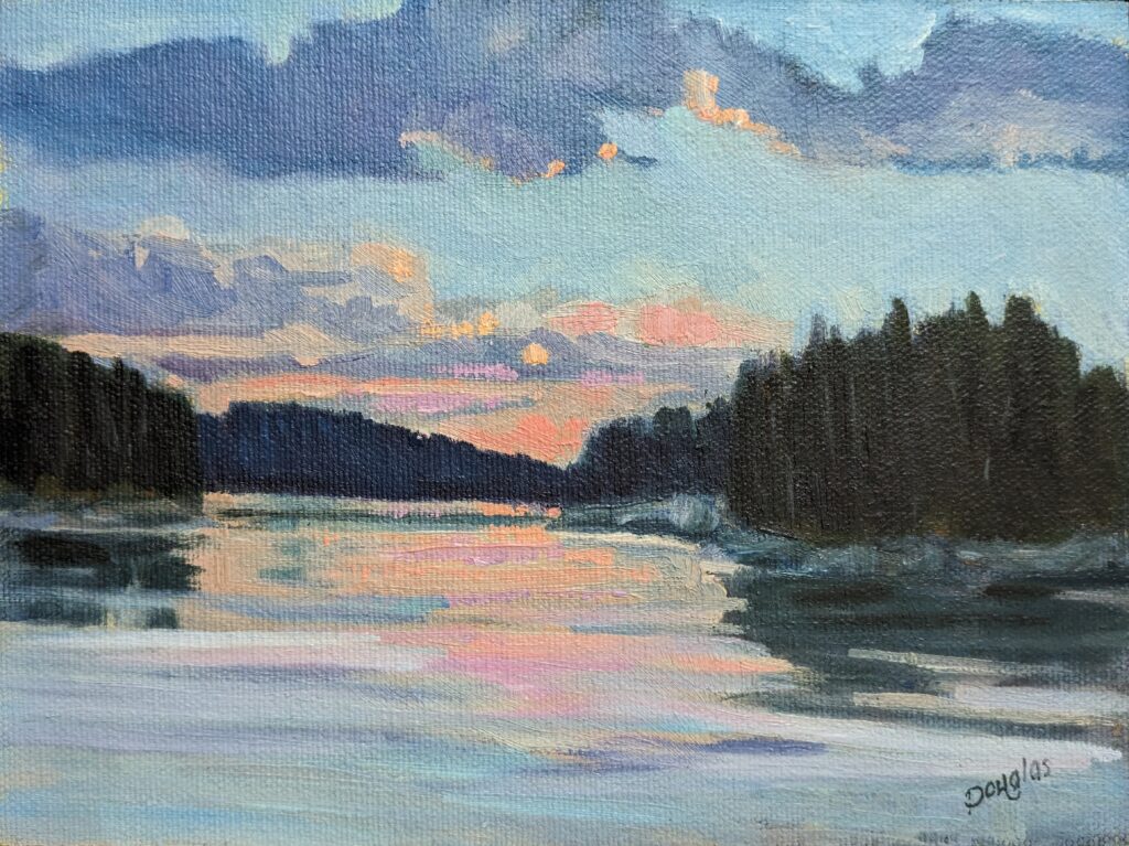
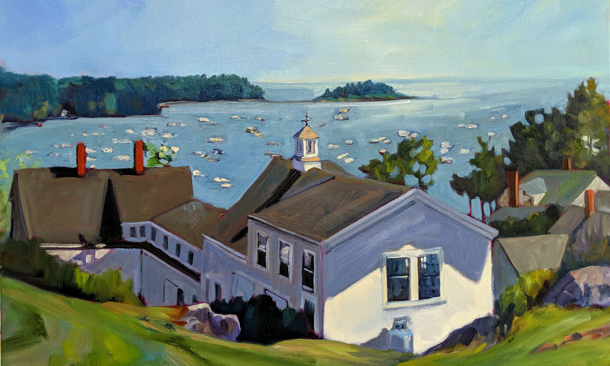
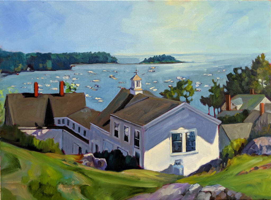
The twenty-brushstroke painting is an exercise to loosen up our painting. It emphasizes simplicity, efficiency and intention. It means prioritizing the essential elements of composition. That teaches us to focus on what matters most.
Painting is always about strategy. Limiting the number of brushstrokes forces you to plan carefully before you start. You must think ahead about where each stroke will go, what color it will be, and how it contributes to the overall painting. This sharpens your ability to observe and distill a subject into its most important elements.
That is the basis of making bold, deliberate marks rather than overworking, hesitating or flailing around. Simplifying helps you see larger shapes and forms instead of getting mired in details. Since you can’t rely on detailed rendering, you are forced t focus on strong contrasts, values and color harmony to convey thoughts and feelings.
The twenty-brushstroke painting frees us from perfectionism and encourages economy of movement and painterly efficiency.
I do the twenty-brushstroke painting when I’m tapped out. It encourages me to experiment and take risks. It’s almost impossible to do a twenty-brushstroke painting that isn’t energetic.
How do you start?
The twenty-brushstroke painting isn’t necessarily easier and faster to do than a conventional painting. It’s more thoughtful, less frenetic.
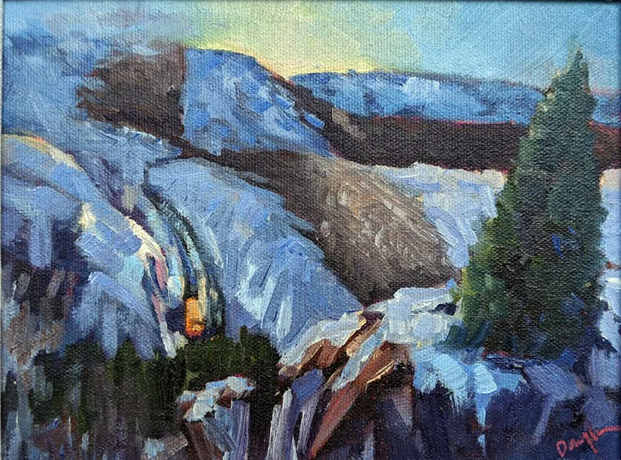
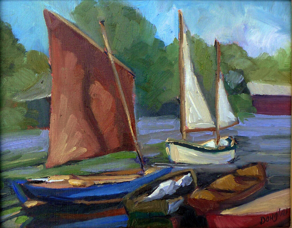
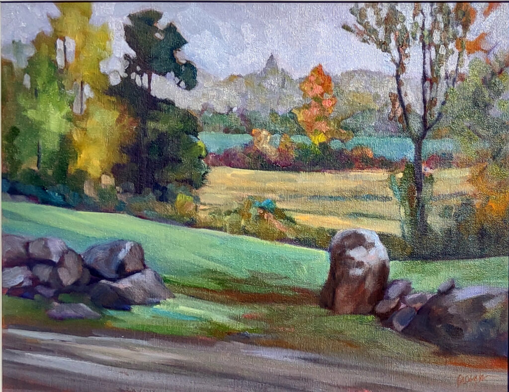
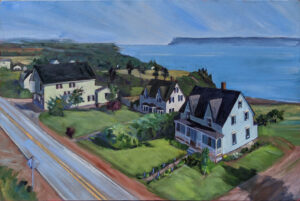
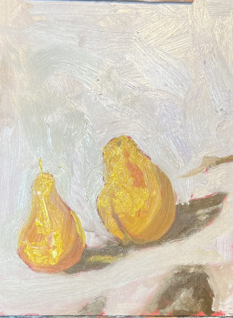
Start with a simple subject with clear shapes. A subject with defined forms is easiest, but with practice you can pare down most complex subjects into striking, recognizable shapes. Strong contrast helps.
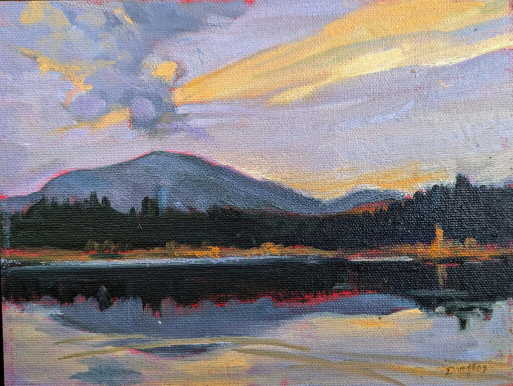
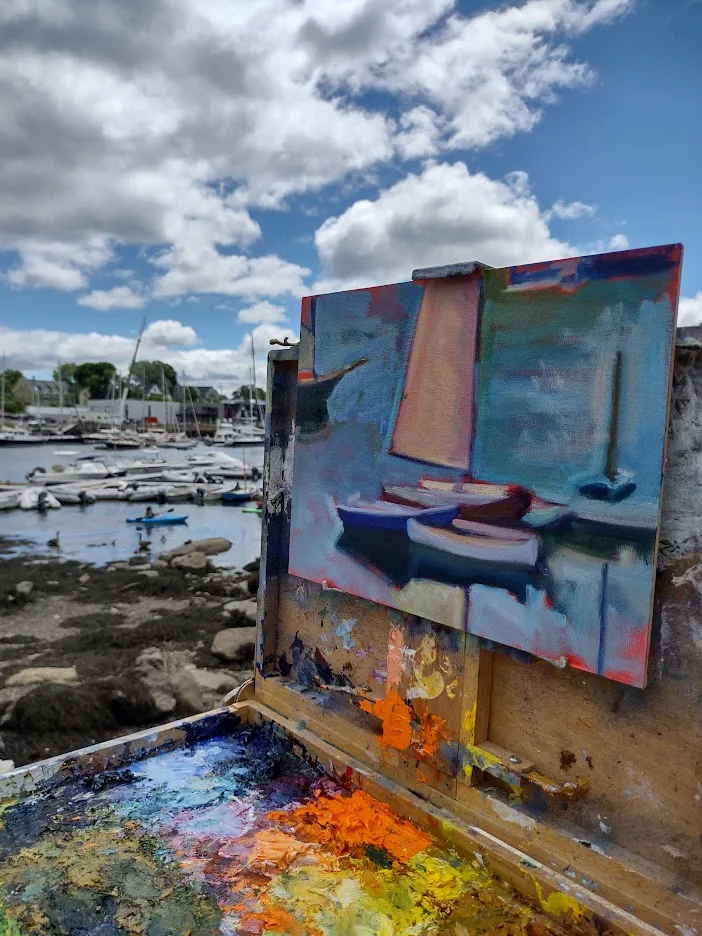
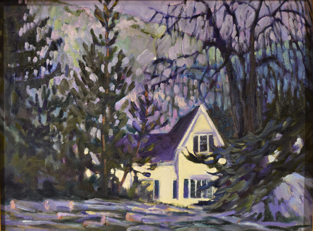
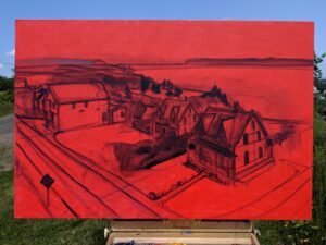
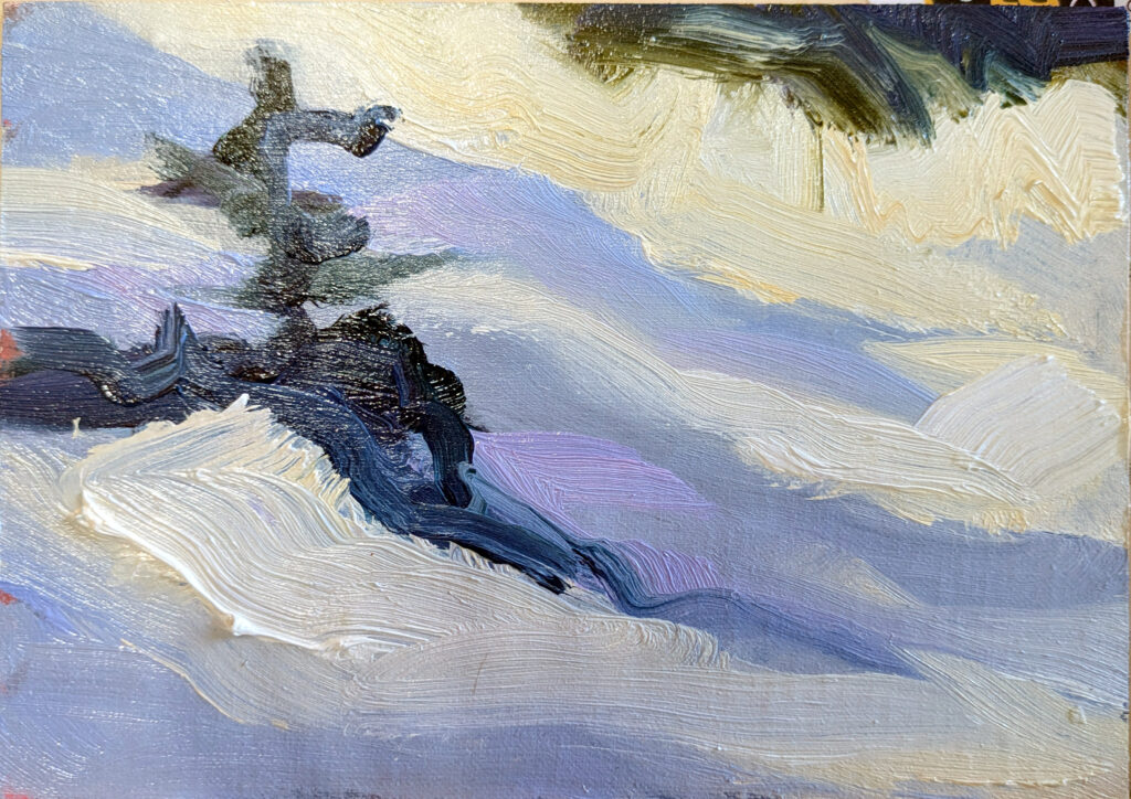
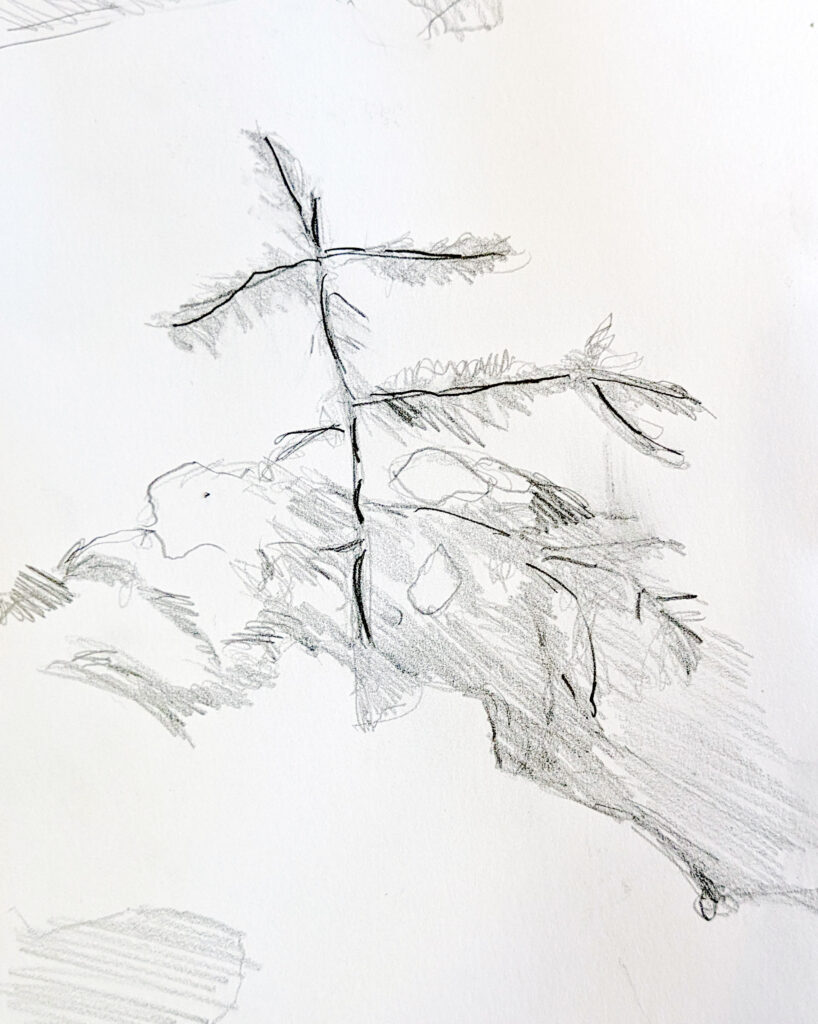
For my class demos, I snapped a photo of a baby spruce. I drew a careful rendering of the wee tree in order to study how the limbs and needles branched out into space. After that, I drew a composition drawing, because if a picture doesn’t work in greyscale, it’s never going to work in color.
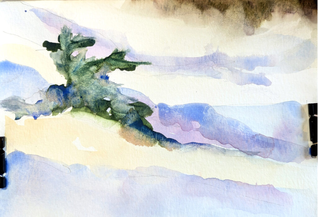
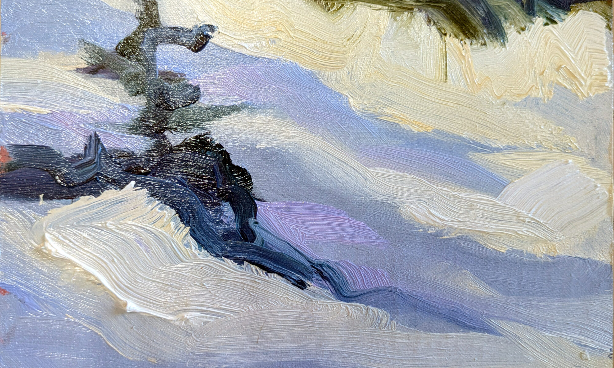
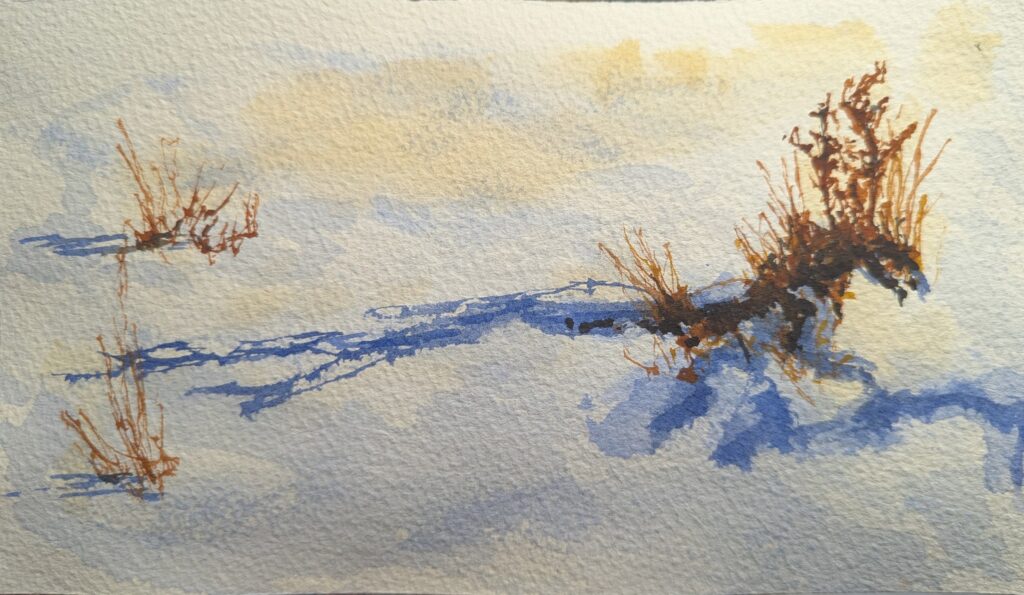
Since I was painting a baby spruce in snow, a complementary scheme of blue and palest peach was an obvious starting point. I mixed sufficient paint so that I didn’t run out in mid-brushstroke. This is almost counterintuitive in watercolor, where people tend to mix smaller amounts with a brush, but it’s a great skill to develop. You can modulate and mingle the basic colors as you go.
I always test my watercolor strokes on a sheet of scrap paper to make sure the value, hue and chroma are exactly what I want. In oils, I can generally see the chromatic relationships on my palette. Knowing that value is the most important element of color, I get that straight first.
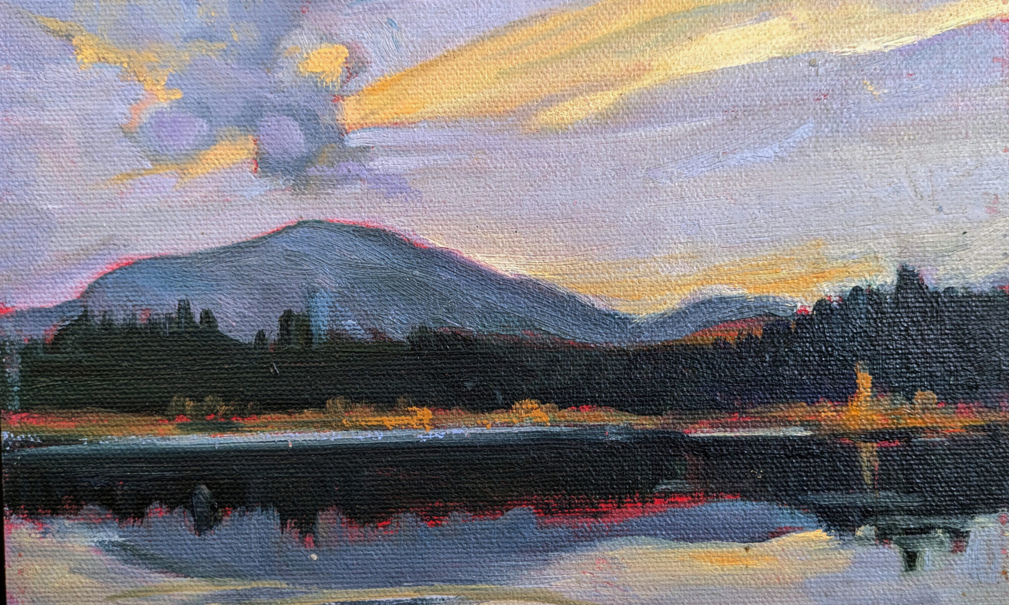
Each stroke is deliberate, with no dithering, correcting or overpainting. Brushstrokes should vary in length, texture, pressure and direction, but every one should have a purpose.
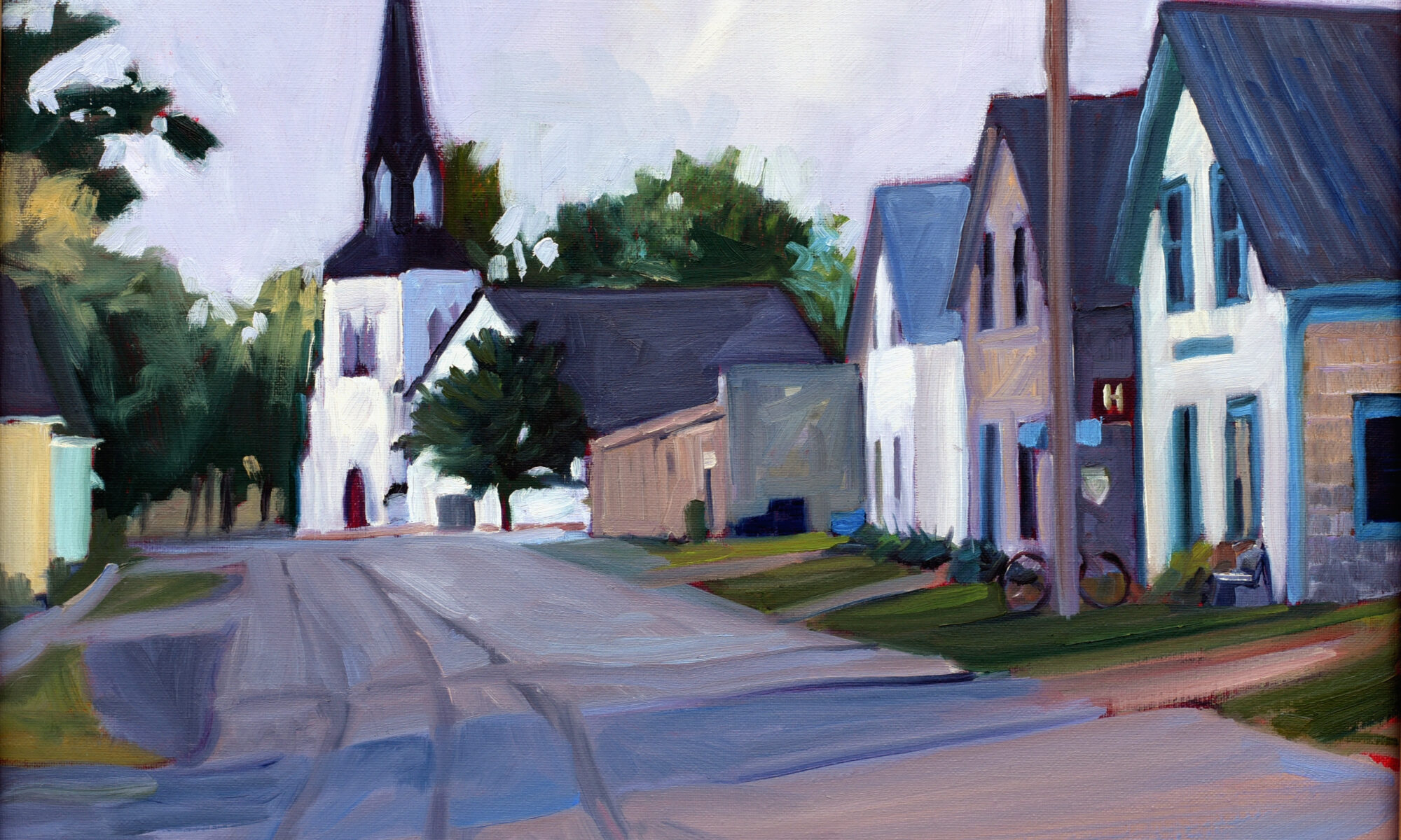
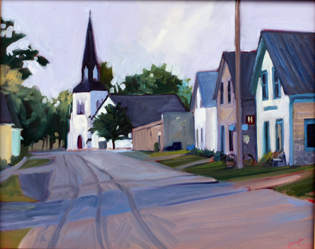
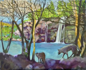
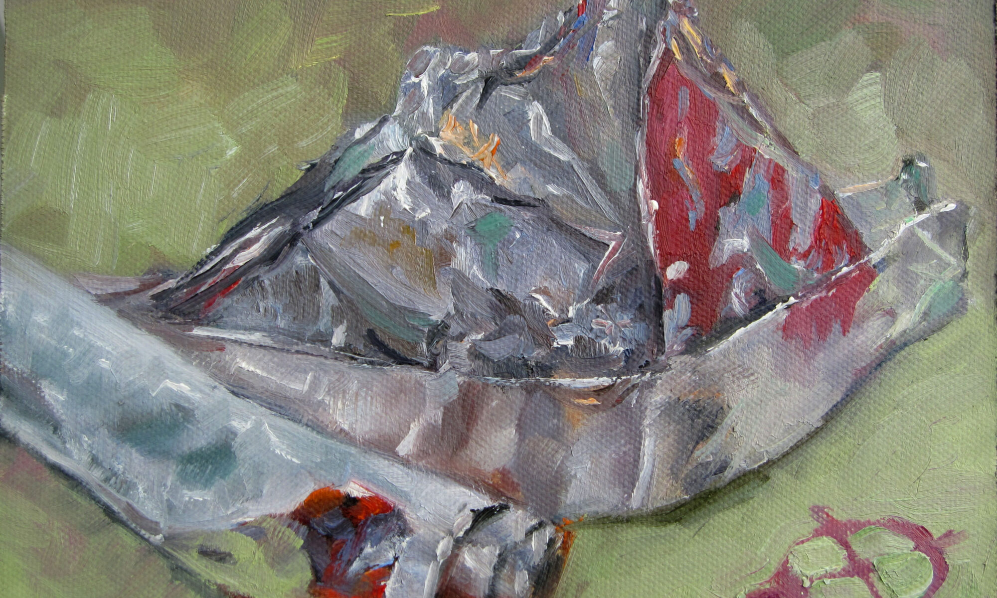
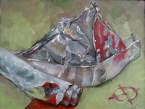
Work from the general to the specific. If you save details for the end, you may find you don’t want or need detail at all. In the watercolor painting above, I used one brush, a squirrel mop. In my oil painting, I used a #10 flat, a #6 bright, and a wee thing that was probably unnecessary. Mike Prairie used this dagger brush for his whole watercolor painting; I was so impressed I now want one myself.
Stop after each stroke to assess the overall balance and composition. Above all, resist the urge to overcomplicate matters.
Registration is now open for workshops in 2026! Reserve your spot:
- Advanced Plein Air Painting | Rockport, ME, July 13-17, 2026
- Sea & Sky | Acadia National Park, ME, August 2–7, 2026
- Find your Authentic Voice in Plein Air | Berkshires, MA, August 10-14, 2026
- New! Color Clinic 2026 | Rockport, ME, October 3-4, 2026
- New! Composition Week 2026 | Rockport, ME, October 5-9, 2026
Can’t commit to a full workshop? Work online at your own pace: