
“From now on, I’m gonna stop thinking about composition being about things,” my correspondent wrote, “and start thinking about it as shadows.”
I feel like a deficient teacher, because composition is always about light and dark. Hue, chroma, line and objects may feed into that, but it’s value that makes a composition weak or strong.
I ask my critique students to analyze their compositions based on Edgar Payne‘s exhaustive list of possible compositions in Composition of Outdoor Painting. (This used book is now so expensive that I can no longer recommend buying it. Check it out of the library.) The idea isn’t to slavishly follow one of his designs; it’s to understand whether you have an underlying design in the first place, and how you might strengthen it.
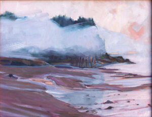
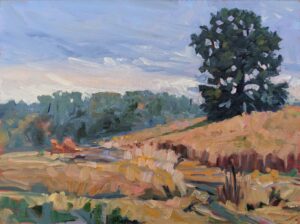
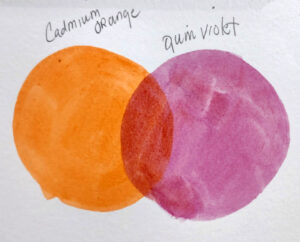
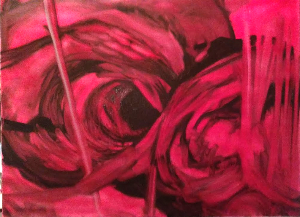
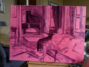
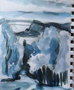
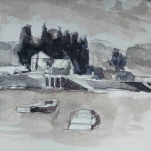
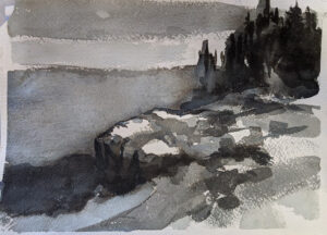
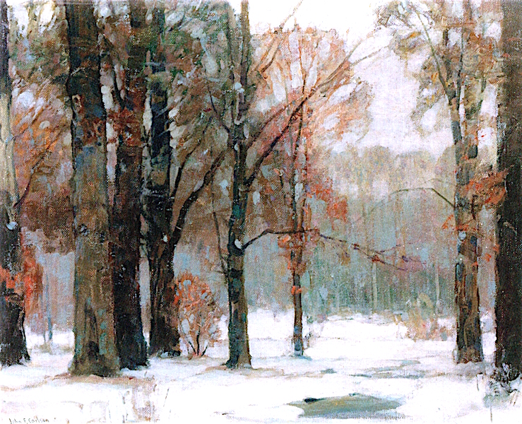
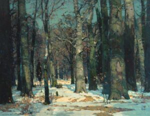
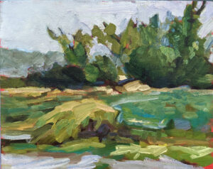
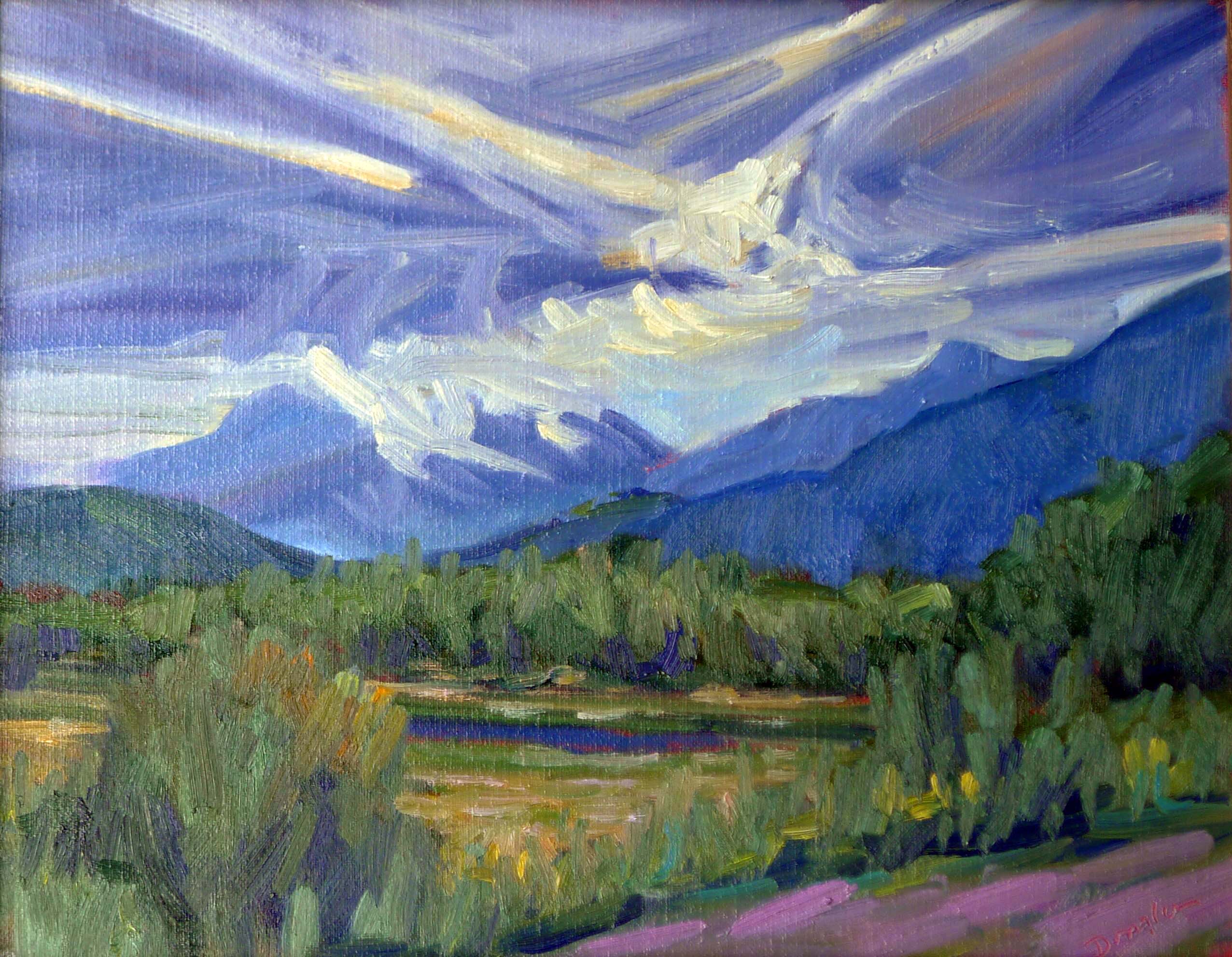
But these compositional armatures are always about value, even when that value takes the form of an object. There are many times when objects and shadows coincide; for example, a large piñon and some small creosote bushes can combine in a dark triangular mass, because they’re both dark objects usually set against light-colored grasses. On the other hand, sidewalk chalk isn’t going to create any kind of structure against a concrete sidewalk unless the artist thinks about the shadows rather than the chalk.
By now, most of you have gotten the message that a painting needs to compel on a tiny screen (or from thirty feet) as well from three feet or three inches.
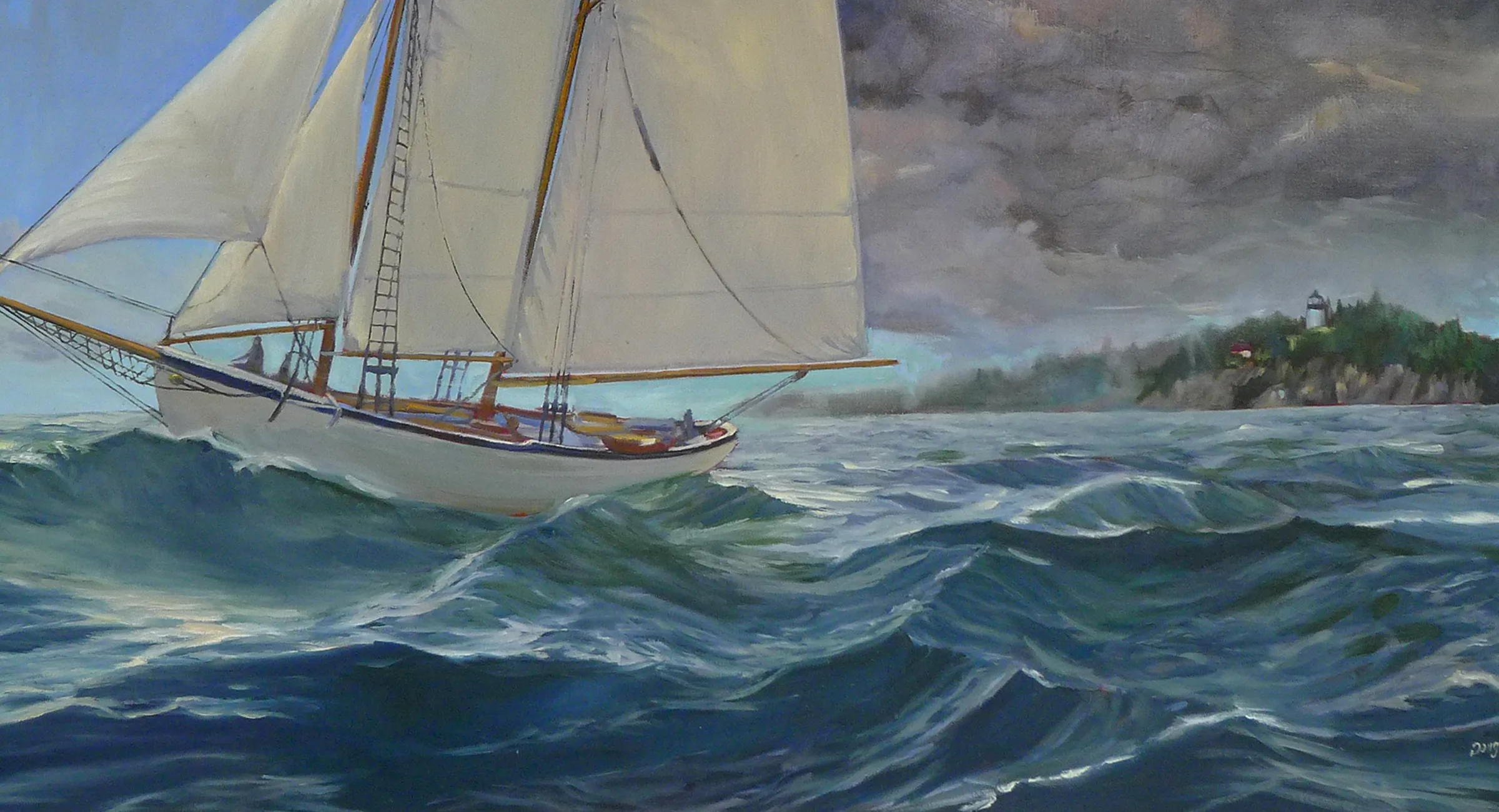
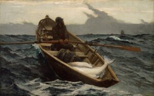
You do this with value. It’s not enough, for example, that an object is at a diagonal; you must make a persuasive shift between light and dark along that diagonal. This is the primary lesson a painter can take from Winslow Homer’s incredible seascapes.
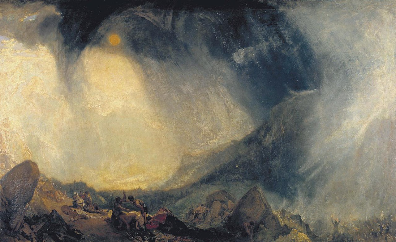
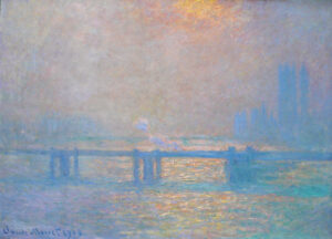
This is also why plein air painters dislike murky grey skies; they make it harder to find compelling shadow patterns.
Composition rests on the following principles:
- The human eye responds first to shifts in value, and following that, in shifts in chroma and hue;
- We follow hard edges and lines;
- We filter out passages of soft edges and low contrast, and indeed we need them as interludes of rest;
- We like divisions of space that aren’t easily solved or regular.
But I just want to paint what I feel!
Music, sculpture, poetry, painting, and every other fine art form relies on internal, formal structure to be intelligible. This is easiest to see in music, where the beginner starts by learning chords and patterns. These patterns are (in western music, anyway) universal, and they’re learned long before the student starts writing complex musical compositions. In other words, you start at the very beginning.
Music is an abstract art because it’s all about tonal relationships, with very little realism needed to make us understand the theme. A composer doesn’t need little bird sounds to tell us he’s writing about spring. Likewise, the painter doesn’t need to festoon little birdies on his canvas to tell us he’s painting about spring. That should already be apparent in the light, structure and tone of his work.
The strength of the painting is laid down before the artist first applies paint, in the form of a structural idea-a sketch or series of sketches that work out a plan for the painting.
All good painting rests on good abstract design. Take a good look at Christina’s World by Andrew Wyeth. Whatever meaning we’re supposed to take from it, it’s a strong triangular composition juxtaposed with a mid-century curving line.
Still, most realist painters don’t spend nearly enough time considering abstract design, even when they understand the critical importance of line and value. Christina’s World doesn’t rely much on hue for its impact. It’s a washed-out pink, a lot of dull greens and golds, and a significant amount of grey. And yet it was the most successful figurative painting of the 20th century. Wyeth was almost obsessive in his drawing habits; that translates into powerful finished paintings, driven by value.
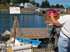
My 2024 workshops:
- Painting in Paradise: Rockport, ME, July 8-12, 2024.
- Sea & Sky at Schoodic, August 4-9, 2024.
- Find your authentic voice in plein air: Berkshires, August 12-16, 2024.
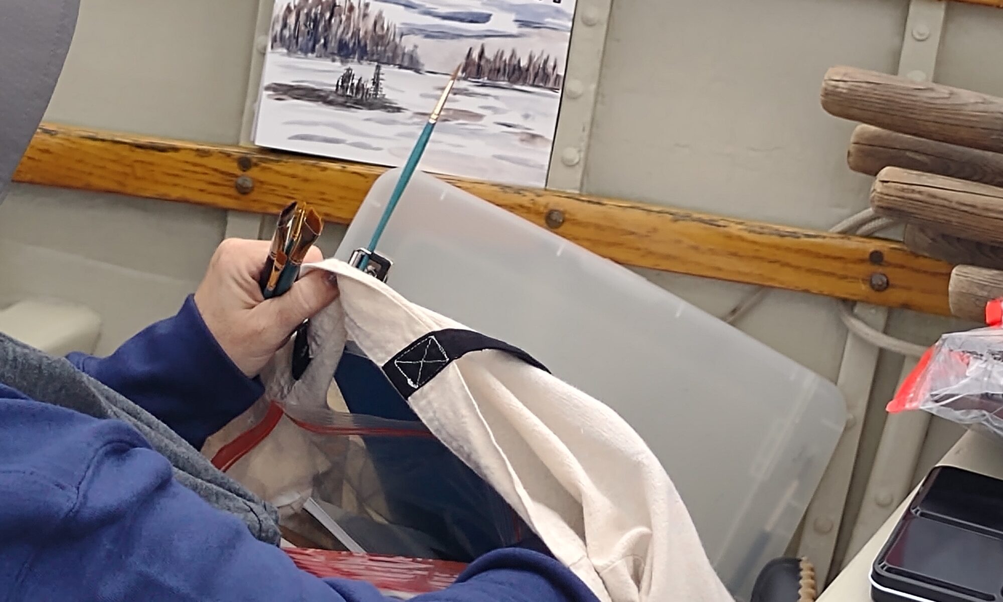
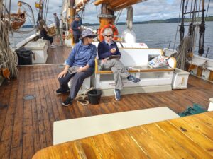
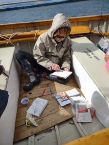
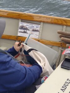
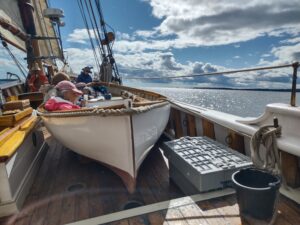
- Art and Adventure at Sea: Paint Aboard Schooner American Eagle, September 15-19, 2024.
- Immersive In-Person Workshop: Rockport, ME, October 7-11, 2024.