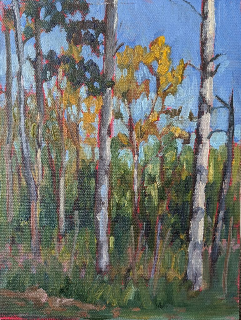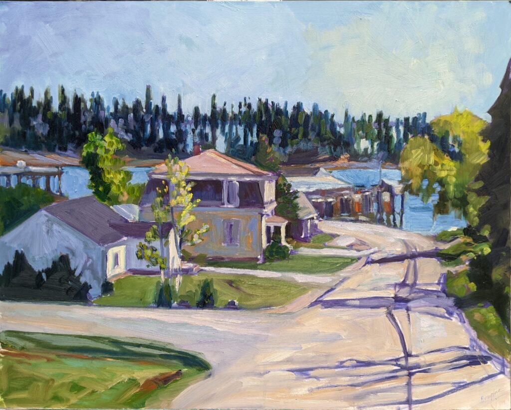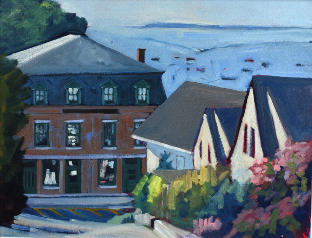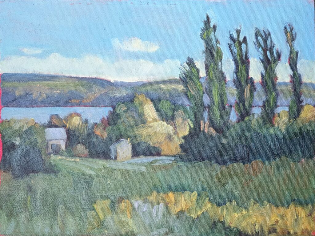
One of my students in Sea & Sky at Acadia National Park last week is a PhD researcher in the health sciences. I was thrilled to hear her disparage cobalt blue, not for its rather muddy color, but for the health risks associated with metal pigments.
Many traditional artist pigments contain toxic metals. These include cadmium (cadmium red, cadmium yellow), cobalt (cobalt blue, cobalt green), lead (lead white, flake white), and chromium (chromium oxide, viridian). In powdered form, heated as encaustics, or when sanded, they can be inhaled or ingested. Their health effects can be very serious, including organ damage, neurological problems and cancer risk. (As a three-time cancer survivor, I take this seriously.) The problem is most serious with loose pigments (as in pastels) or when heated in encaustics. But even when bound in oil or acrylic binders, small chips, dust or contaminated hands still pose hazards.

As real as these health hazards are, they pale in comparison to the risks to the people making these pigments. We’ve shipped our most egregious safety hazards to the developing world, where health and safety regulations are severely limited, and child labor isn’t unknown. Sadly, pigment manufacture is done almost entirely in those places. When you buy a tube of paint including heavy metal pigments, you’re contributing to that problem.
How do you know what pigments are in your paint?
All good manufacturers tell you what’s in their paints, either online or on the tube. The marketing name can be confusing, so I wrote this blog post to explain how to determine what’s in your paint.

Environmental toxicity
When you wash brushes in a sink or dispose of leftover paint, these same metals enter the wastewater stream. From there, they can accumulate in soil and waterways. Heavy metals don’t break down—they persist in the environment, harming wildlife and contaminating the food chain.
Safer alternatives now exist
Modern synthetic pigments generally surpass the brightness, permanence, and opacity of these ‘legacy’ heavy metal pigments, without the same toxicity profile. Painters should switch to these options for safety and ethical reasons.
However, heavy metal paints are still legal and still widely used. If you feel you must (and I hope you don’t), take the following safety precautions:
- Work in a well-ventilated room (open windows, use fans to exhaust air outside). Keep children and pets out of your painting area.
- Have a separate sink bucket for brush water—never dump pigment water into household drains. When the brush water has completely evaporated, dispose of solids as toxic solid-waste.
- Dispose of painting rags as solid hazardous waste.
- Wear nitrile gloves while handling paints.
- Wear a particulate mask while sanding and do so in a well-ventilated area.
- Use a palette knife to mix colors (you should be doing that anyway).
- Wear dedicated painting clothes, and don’t track pigment dust into your home.
- Wash your hands before leaving the studio or handling food or drink.
- Work in a well-ventilated space.
- Keep food and drinks out of the studio.

Doesn’t that sound like a complete pain?
Instead, why not use non-toxic pigments? They’re generally higher-chroma and less prone to fading anyway.
Here is a chart of toxic pigments and modern, non-toxic pigments:

Registration is now open for workshops in 2026! Reserve your spot:
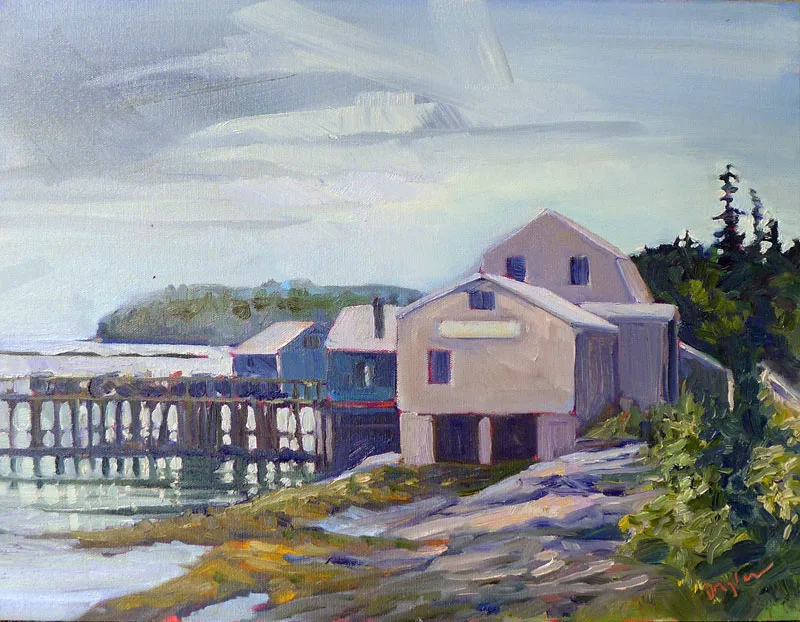
- Advanced Plein Air Painting | Rockport, ME, July 13-17, 2026
- Sea & Sky | Acadia National Park, ME, August 2–7, 2026
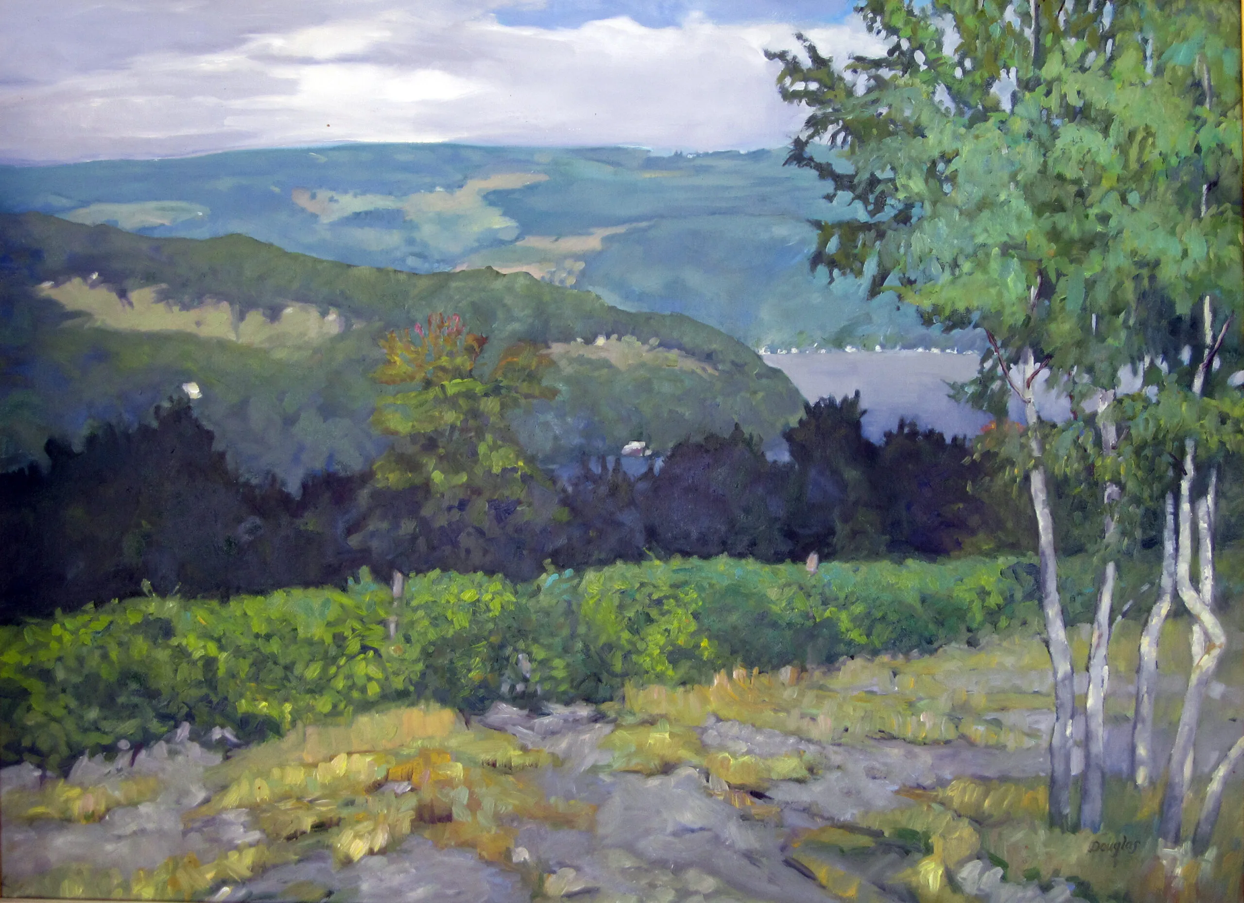
- Find your Authentic Voice in Plein Air | Berkshires, MA, August 10-14, 2026
- New! Color Clinic 2026 | Rockport, ME, October 3-4, 2026
- New! Composition Week 2026 | Rockport, ME, October 5-9, 2026
Can’t commit to a full workshop? Work online at your own pace: