
“If you hear a voice within you say ‘you cannot paint,’ then by all means paint, and that voice will be silenced.” (Vincent van Gogh)
If Van Gogh occasionally felt like that, what hope is there for the rest of us? But don’t give up quite yet; not only is artist self-doubt universal, it’s also a helpful part of our growth process.
Artist self-doubt is a sign that we care deeply about our work and are pushing ourselves creatively. Most serious artists, from students to professionals, wrestle with questions like:
“Is this any good?”
“Am I really an artist?”
“Who really cares about this, anyway?”
In fact, when you aren’t asking those questions, you’re in danger of becoming a stale parody of yourself.
Why we suffer from artist self-doubt
Almost everyone, in any line of work, has moments of imposter syndrome. That’s the feeling that you’re a fraud despite clear evidence of your skills, accomplishments or success. People with impostor syndrome often believe they don’t deserve their achievements. They fear being ‘found out’—even when they’re actually doing superlative work.
Artists carry an additional burden. Our work is inextricably bound to our innermost identities. Any judgment (real or imagined) of our work feels like a judgment of our selves. We can’t help that; we just have to recognize that the arrows of criticism are going to lodge deep. That goes for criticism from ourselves as well as from others.
In art, there’s no perfection. We reach points where we think, ‘wow, I’m really painting well,’ only to immediately start seeing other, previously-unnoticed flaws. That’s because the more we know, the more aware we are of where we can improve. (And people think art is easy.)

Comparison traps
Social media has a lot to answer for, but its comparison traps are purgatory for artists. Just as young women are barraged with bleached, buffed, airbrushed, filled, enhanced images masquerading as women, social media throws up images of ‘perfect’ art to confuse and depress painters. It’s easy to feel inadequate by comparison, especially when you can’t even tell if the art is made by human hands.
Progress comes in fits and starts
For all artists, progress isn’t linear. Some months, the paint will flow off your brushes; you may spend the next two months wondering why you thought you could ever paint at all. It helps to know that this is perfectly normal.
But here’s the good news
Self-doubt helps sharpen your vision. It makes you think. That pushes you to reflect, revise, and improve. Furthermore, the more you paint, the less you’ll be in the grip of artist self-doubt. Like all other forms of anxiety, self-doubt fades with action. Regular practice builds confidence more reliably than any amount of inspiration.
What I find helpful
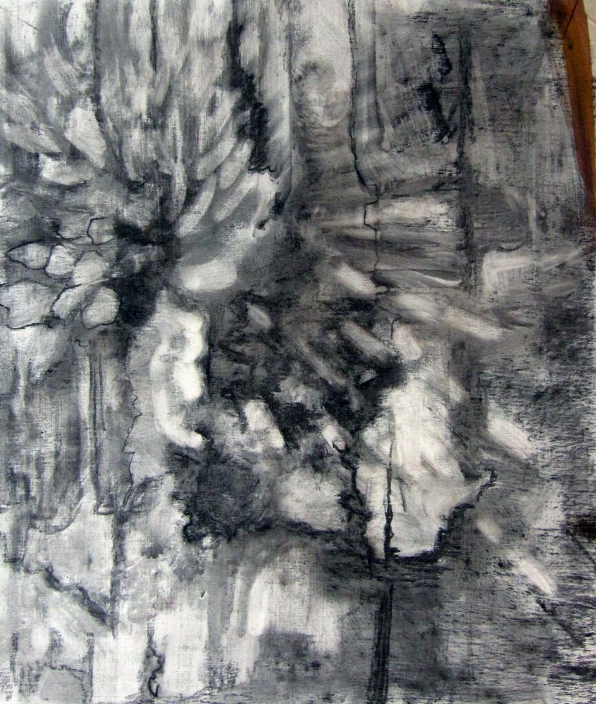
I keep a sketchbook and do private work that I don’t share with others. And I have a community of artists (my students and my peers) who keep me from feeling isolated.
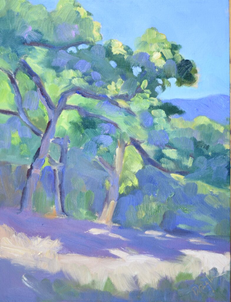
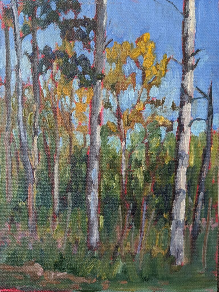
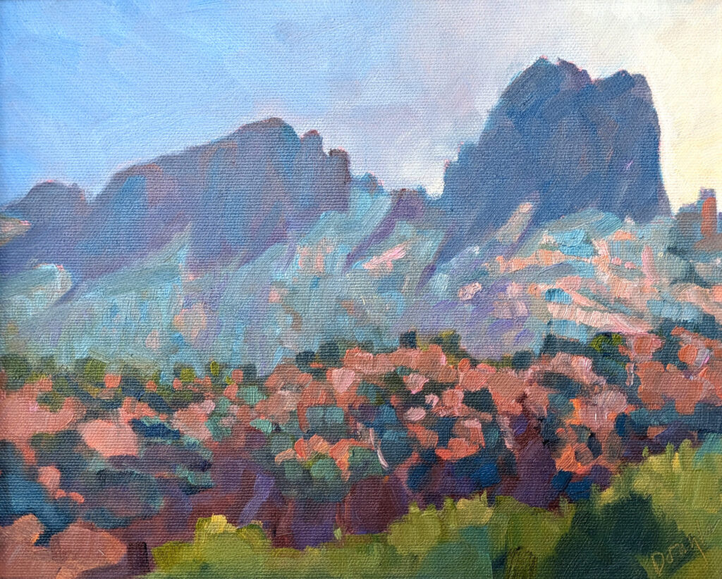
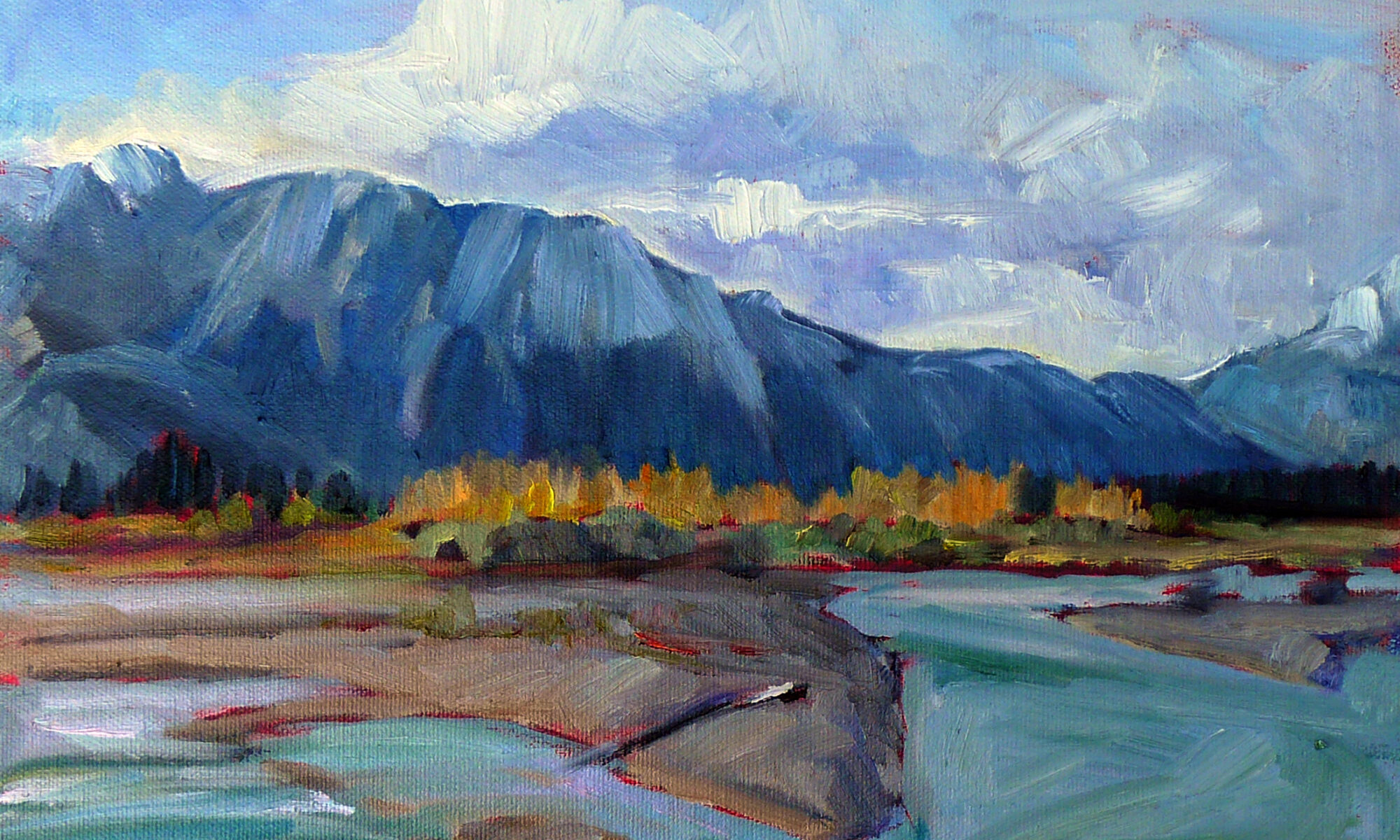
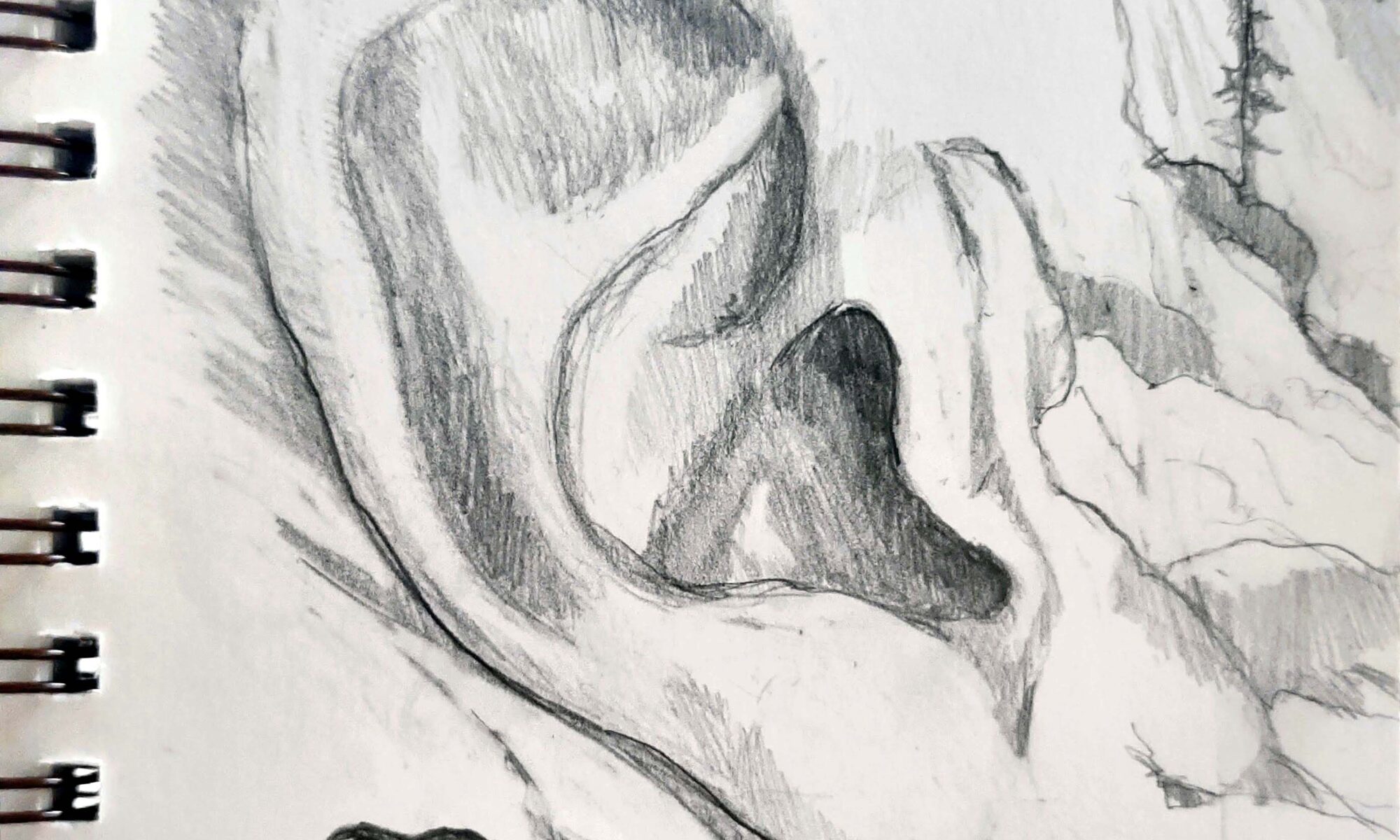
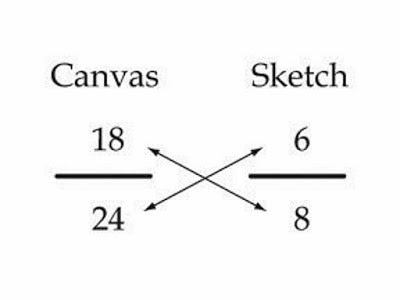
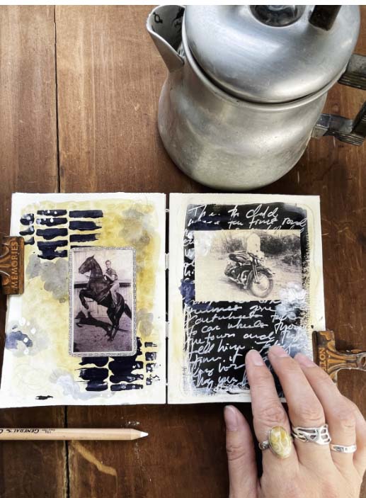
I recently went through about twenty years of sketchbooks. It was fun to see the places I’ve been. More importantly, I could track development over time. It’s helpful to reflect on how far you’ve come, not on how far you still have to go.
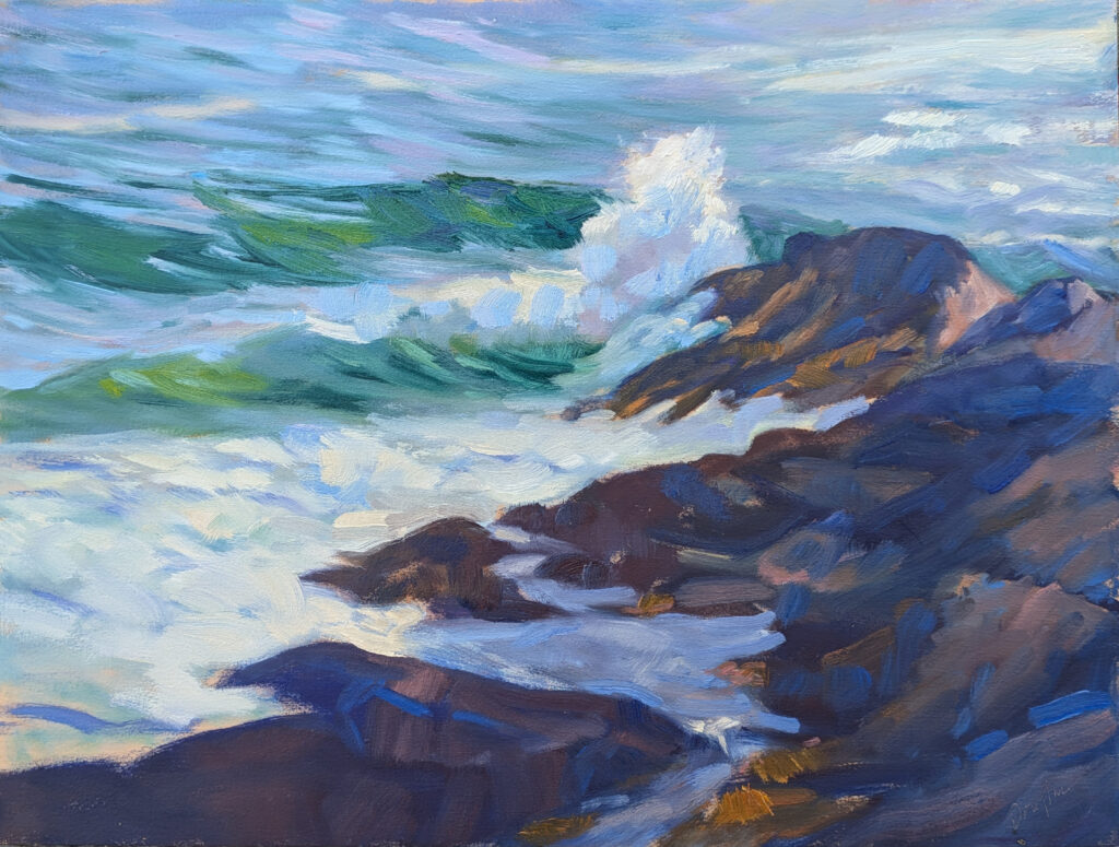
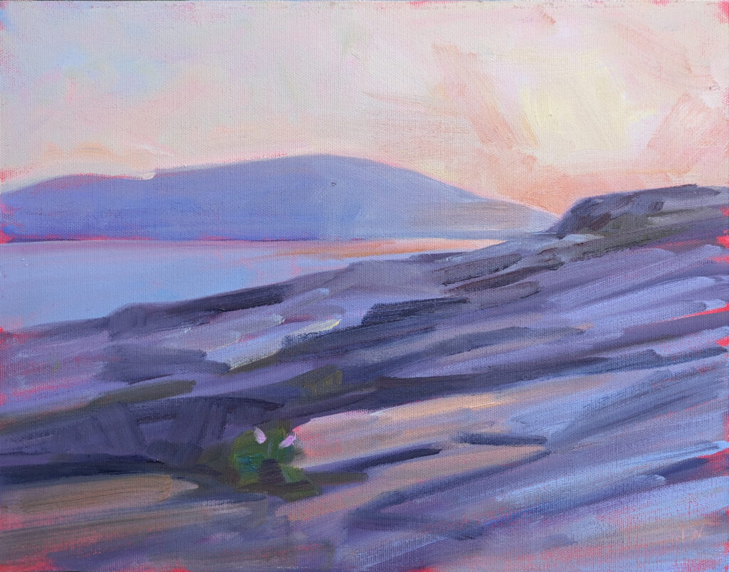
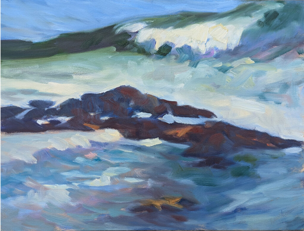
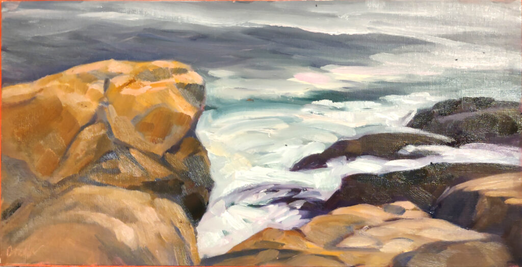
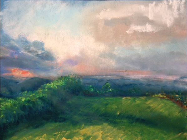
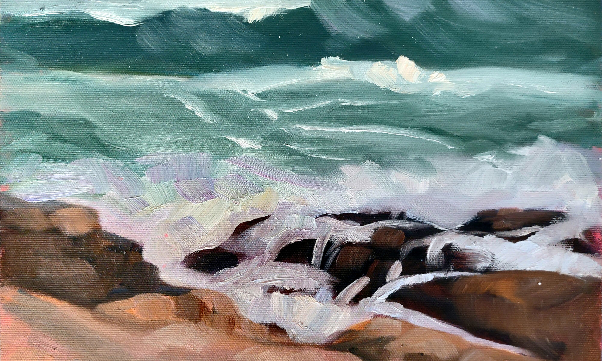
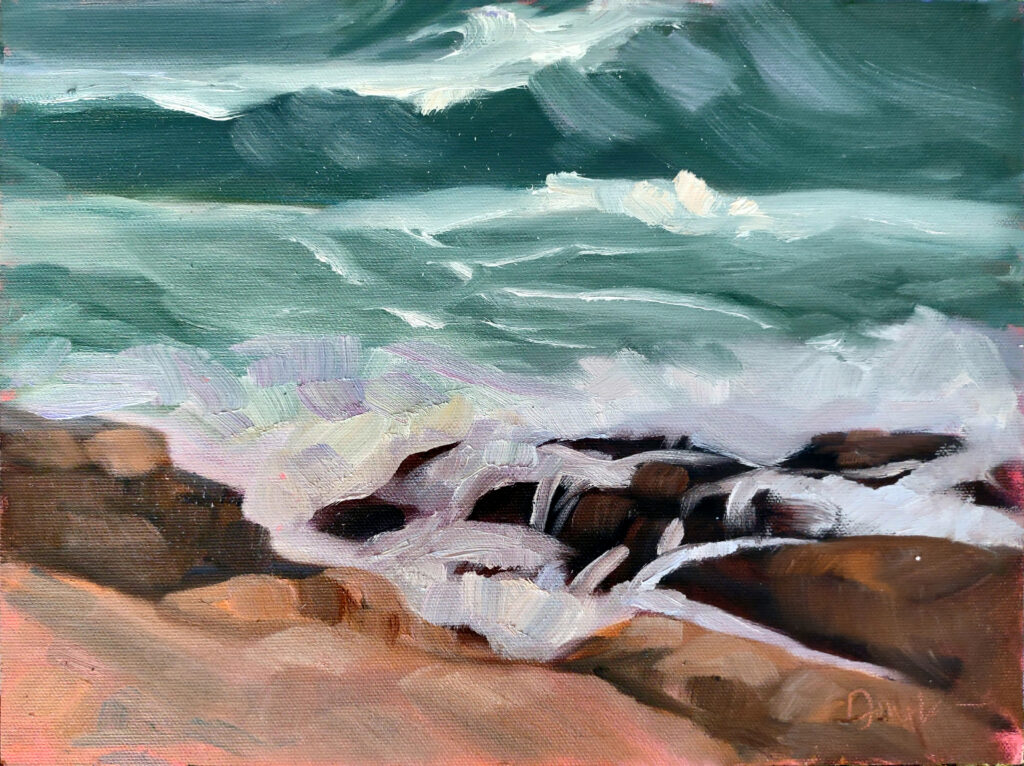
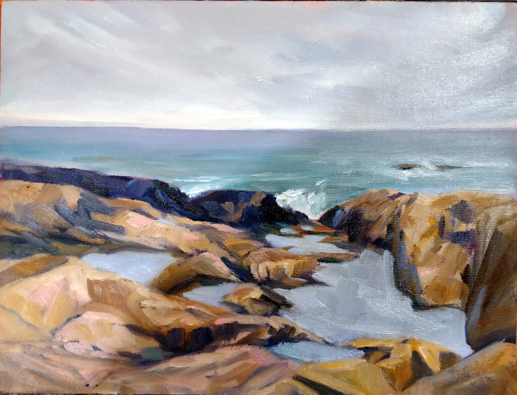
Registration is now open for workshops in 2026! Reserve your spot:
- Advanced Plein Air Painting | Rockport, ME, July 13-17, 2026
- Sea & Sky | Acadia National Park, ME, August 2–7, 2026
- Find your Authentic Voice in Plein Air | Berkshires, MA, August 10-14, 2026
- New! Color Clinic 2026 | Rockport, ME, October 3-4, 2026
- New! Composition Week 2026 | Rockport, ME, October 5-9, 2026
Can’t commit to a full workshop? Work online at your own pace:

