The difference between illustration and narrative painting

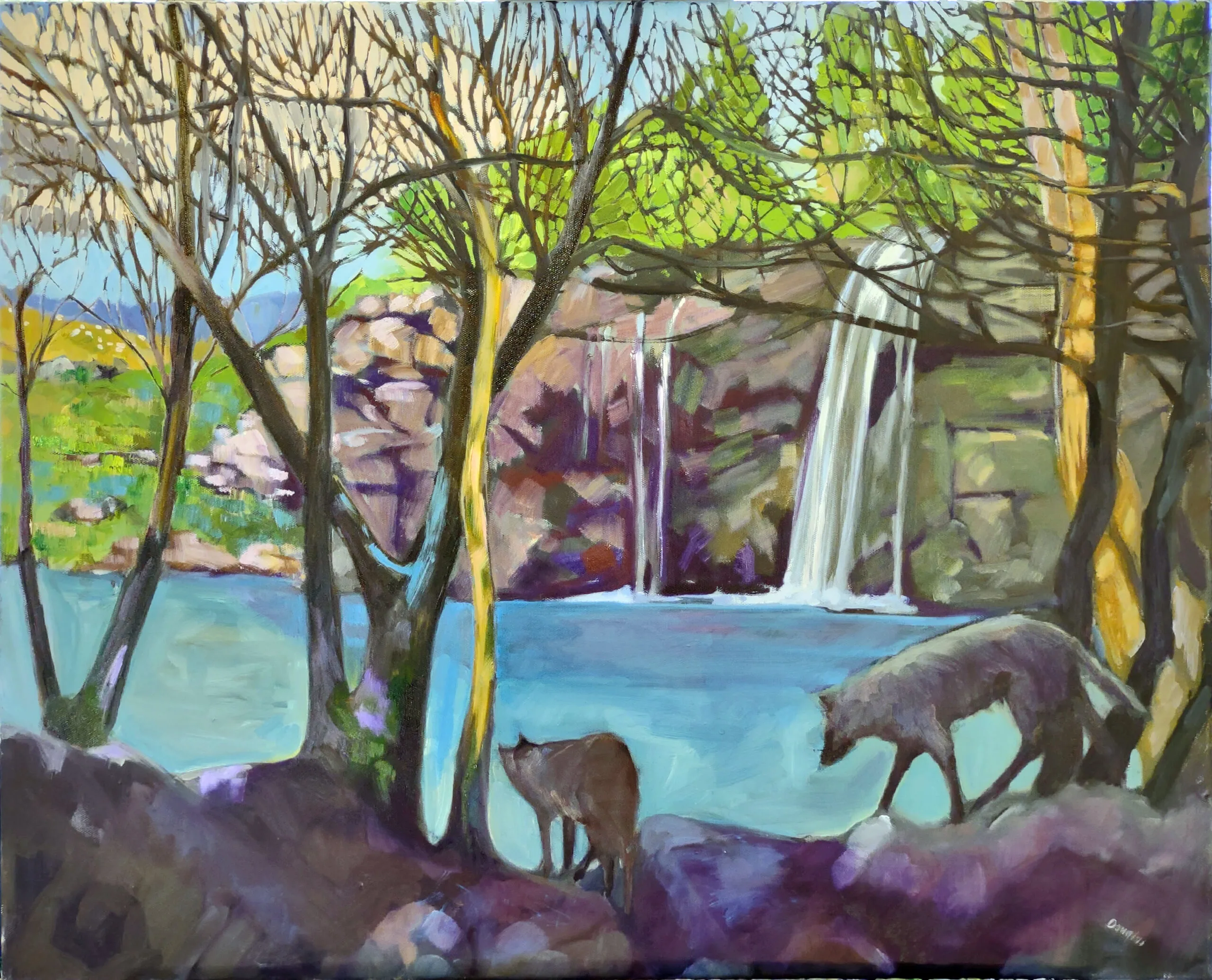
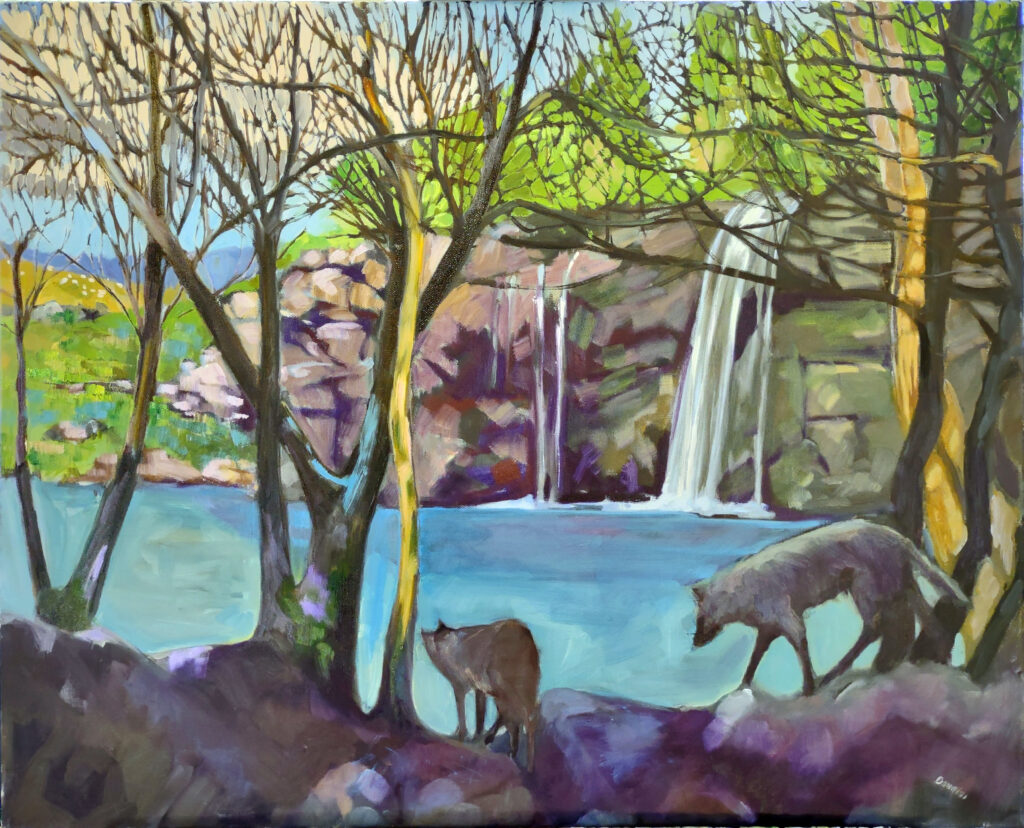
Ravenous Wolves, oil on canvas, 24X30. For more information, click on the image.

A painting can be competent and still feel contrived. It can be imaginative but feel trite. It can tell a literal story or be allegorical. These are questions we’ve been kicking around in both my classes recently.

I believe illustration is as valid an art form as fine painting. Ludwig Bemelmans, Robert McCloskey, Virginia Lee Burton, Frederick Remington, NC Wyeth and Winslow Homer all influenced American thought and culture with their illustration.

What is illustration?                                                                             

Illustration communicates a concrete message. Its success depends on how effectively, quickly and accurately it conveys the narrative. A painting, on the other hand, explores experience. It can tell a story, but that’s not mandatory. Its meaning is usually secondary to the principles of design and its emotional content.

There isn’t a clean line between the two. (Some abstractionists think all realism is illustration.)
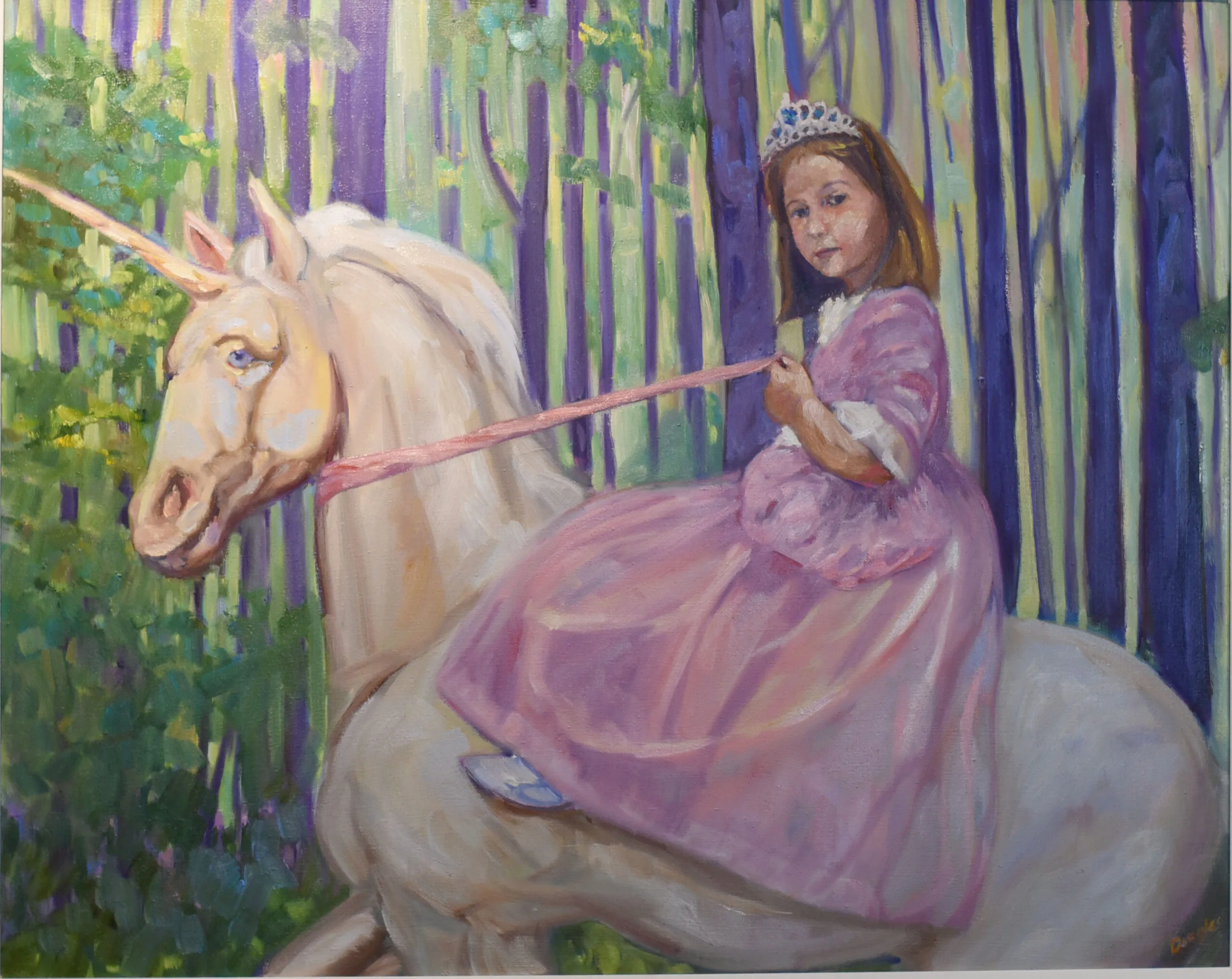
In Control (Grace and her Unicorn), 24X30. For more information, click on the image.

When is a painting contrived?

Contrivance is where the elements have been pushed around like chess pieces to support a preconceived idea. The artist’s hand is too obvious.

Every cloud points to a central point, every tree leans artfully, every figure strikes a perfect pose and every color harmonizes. No one thing is wrong, but as a whole everything is wrong.

Nature is not tidy. Rocks crumble and crash. Branches cross awkwardly. Light falls unevenly. Good painters respect this. Great painters deploy this in new and interesting compositions. The relationships between shapes, values, and subjects feel natural. The viewer may not know why the scene works, but they can suspend disbelief.
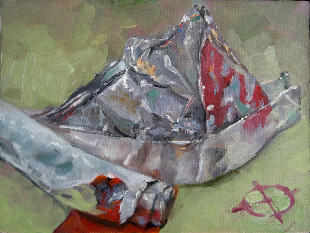
Tin Foil Hat, 6X8, oil on archival canvasboard. For more information, click on the image.

What makes a painting trite?

Artists are often told to paint from imagination. That’s good advice, but it only works when we’re insightful. Real imagination combines observation, memory and experience into something fresh.

Triteness just reiterates something someone else has already said. There are innumerable war paintings; many of them look unbelievable to modern eyes. However, Eric Kennington’s The Kensingtons at Laventie and Sir Alfred MunningsCharge of Flowerdew’s Squadron are both built on personal experience. That gives them grit and power.

AI art is trite because a computer can’t distinguish the emotional content and design sophistication of Edward Hopper’s The Light at Two Lights from a corny picture of a lighthouse. AI has no capacity to weed out clichés.

Fresh imagination doesn’t necessarily require fantastic subjects. It often emerges from ordinary observation. The great challenge is not inventing something nobody has ever seen before. It is seeing familiar things in a way that feels new.

Allegory vs. illustration

A painting of a fisherman hauling traps is descriptive. There is absolutely nothing wrong with that; many great artists have done and continue to do it. But that’s different from Andrew Wyeth’s Night Hauling, which transcends description.

The danger comes when we try to force this. There was a time when every object in a painting carried a coded meaning. Sadly, most of us have forgotten (if we ever knew) the symbolism of flowers, insects, skulls, goblets, etc. For this reason, modern allegory and metaphor is open-ended.
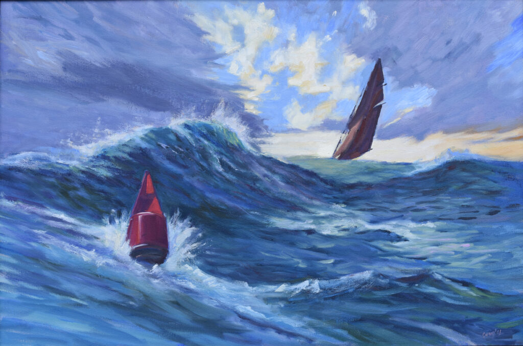
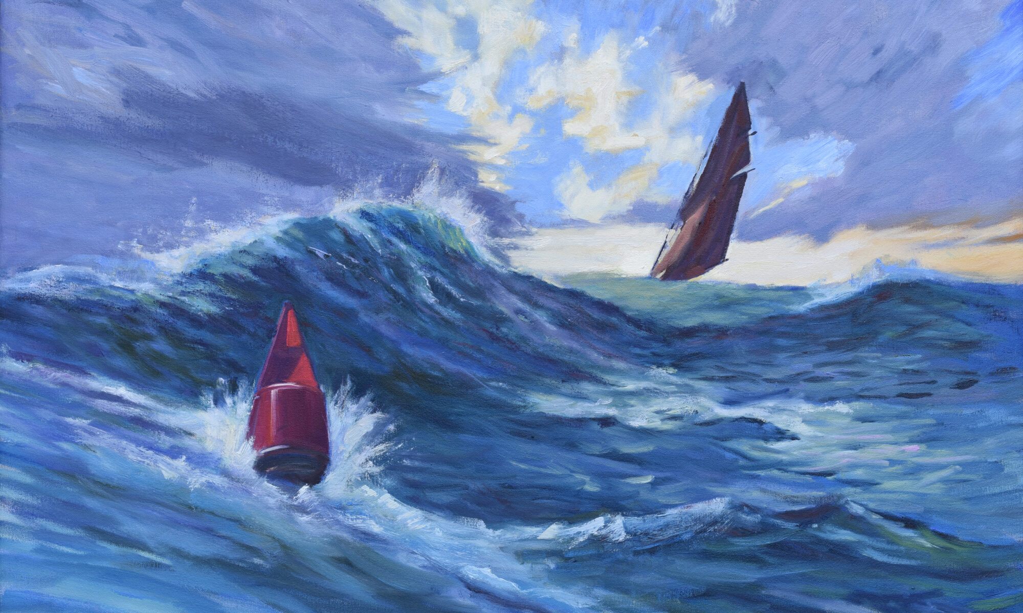
Heavy Weather (Ketch Angelique), 24X36, oil on canvas, for more details, click on image.

What’s your sweet spot?

Every realist painter defines his or her own place where narration, illustration and allegory wash into each other. That depends on your intellect and emotional life, but our goal should be to be organized but not contrived, imaginative but not gimmicky, meaningful but not preachy.

This is why working from life remains so valuable. Nature provides complexity and meaning that we could never invent on our own. Observation keeps us honest. Imagination helps us edit. Meaning emerges from the tension between the two.

I have just two workshops left in 2026! Reserve your spot:

Can’t commit to a full workshop? Work online at your own pace:

Seven Protocols for Successful Oil Painters

Mining your slush pile for better painting ideas

I think this was Camden harbor. Probably worth finishing.

Sometimes my aha moments don’t happen in the studio; they come as I’m writing a lesson. That happened to me yesterday as I was prepping for From Field Sketch to Final Studio Work. I included these discussion points:

  • How many images are on your phone/cloud right now? (20,308.)
  • How many images do you have stored on your laptop? (51,406, and there are more on our server.)

I can do two image searches on my phone using the same keywords and come up with different results. That is also true of file searches on my laptop. A terabyte here, a terabyte there… sooner or later it adds up to a real mess.

I painted this one early fall day with Björn Runquist. We discussed Proust.

A quick note on classes before we get into it

Claim your spot in Painting clouds, which starts in two weeks. There are just three seats open.

Too much reference material

I’m drowning in useless visual information that I can’t access in any consistent way.

If you’re like me, you’ve accumulated innumerable photographs, sketchbook pages, plein air studies, workshop demos and unfinished paintings. They’re tucked in hard drives, filing cabinets, cloud storage and bins. As with my attic, I keep shoving things in but never have a clear-out.

This week I cracked opened the door just a sliver. I photographed the top 42 unfinished oil sketches in my slush pile, hoping to see some pattern.

Strictly speaking, this is finished (I guess). I’d guess it was painted on the grounds of Frederic Church’s Olana, which means it’s at least ten years old.

Painting a series

Another question I asked my students last night was, “Have you ever painted a series?

I usually think of a series as like Richard Diebenkorn’s Ocean Park paintings, and no, that’s not my jam. But of course, I’ve painted lots of series, connected thematically and assembled for solo or group shows. I just didn’t call them that.

Assembling my sketches, I realized that they are also a series, keyed to a few simple themes.

But that was then, right?

We’re always tempted to chase something new. We imagine our next great painting is waiting in the national park we’ve never visited, overseas or the next workshop destination. Sometimes that’s true; for example, there was a time when I’d never painted in Arizona, and now the high desert is one of my favorite places.

Often, however, your real interests are visible in work you’ve already done. For me, that was clear in those 42 sketches—they were rocks, clouds, boats, water, buildings and trees, repeated in different combinations. Figure (which is where I was trained) doesn’t figure at all.

Time has already done the editing in your slush pile. You’re no longer standing in front of a spectacular scene where everything is monumental and the weather is doing backflips. What’s left is the germ of an idea and composition. If it still interests you a year or five later, there’s something there worth exploring.

Most of the paintings in my slush pile are flawed, which is how they ended up there to start with. But almost all of them have compelling fragments. There’s a workable idea in almost all of them.

I meant to paint this in a larger version, but lost the impulse.

Some paintings are really, truly terrible

Of course I have total fails. I’m not going to repaint them but they’re also instructive. Often, that’s because I just wasn’t engaged—I was tired, cold, hungry, or painting something that I didn’t care about. It’s amazing how clearly that lack of interest rings out, even after many years.

I have just two workshops left in 2026! Reserve your spot:

Can’t commit to a full workshop? Work online at your own pace:

Seven Protocols for Successful Oil Painters

Painters who invented the past

Isabella and the Pot of Basil, 1868, William Holman Hunt, courtesy Laing Art Gallery

When I’m dying for a laugh, I look at paintings by the Pre-Raphaelite Brotherhood. They were roughly the contemporaries of the Impressionists, but with little interest in the observed world. The Pre-Raphaelites were fantasists for the repressed Victorian age. They painted women as low-browed, passive, mysterious, tragic, seductive, doomed and sensuous. With some exceptions (including Ford Madox Brown’s The Last of England) the Pre-Raphaelites painted cloying sentimentality and rampant romanticism. And they invented how we see the historical England: knights in shining armor and noble ladies with flowing hair, living out rigid gender roles in castles bathed in golden light.

Almost none of that comes from actual medieval life.

The Pre-Raphaelites weren’t trying to teach history. They were reacting against the Industrial Revolution. To artists like John Everett Millais, Dante Gabriel Rossetti, and Edward Burne-Jones, medieval themes represented the beauty and romance sadly destroyed by Blake’s “dark satanic mills.” Then there’s Frederic Leighton, who conjured up classical themes as an excuse to paint scantily clad beauties.

The real medieval world was cold, dirty, violent and—by modern standards—desperately poor. Disease was common. Life expectancy was short.

Flaming June, 1895; Lord Frederic Leighton, courtesy Museo de Arte de Ponce. I hate everything about this painting.

On the other hand, Victorian gender roles were psychologically and socially more oppressive than in the Middle Ages. That’s where the Pre-Raphaelites did their most blatant lying. Medieval women lacked legal rights, but so did most men. Women’s labor was essential to the family unit. In contrast, the Victorians actively stripped middle-class women of economic agency.

Yet the images created by the Pre-Raphaelites became so powerful that they helped to permanently shape our view of medieval life.

The Knight Errant, 1870, John Everett Millais, courtesy Tate Britain

Artists don’t just record culture. They create it.

Ask someone to describe a dinosaur and they’ll likely talk about a giant reptile covered in scales. Much of that visual imagery can be traced back to Charles R. Knight. He worked closely with paleontologists in the early twentieth century. His colorful, lively murals and illustrations appeared in museums, books, magazines and classrooms throughout the world.

Unlike the Pre-Raphaelites, Knight was extraordinarily diligent in his research. His problem was that our scientific knowledge at the time was slim. Scientists thought dinosaurs were giant reptiles, so his dinosaurs looked like giant reptiles.

Leaping Laelaps, 1897, Charles R. Knight. This dinosaur is now called Dryptosaurus. However inaccurate Knight’s painting, they sure look like they’re having a good time.

Today, evidence suggests that many dinosaur species possessed feathers or feather-like structures. Current science says that birds are the last dinosaurs. Yet the image of the scaly dinosaur remains embedded in popular culture thanks to Knight’s skill and popularity as a painter.

There’s a lesson in this for us

We often talk about art as if it merely reflects reality. In fact, art determines what reality looks like in our collective imagination. For example, how much do movies and television shape what you think you know about the world?

Sometimes those visions are accurate. Sometimes they’re whimsical. Sometimes they’re harmful. Often, they’re a mixture of fact and fiction..

Once a compelling image takes hold, it can persist for decades or even centuries. That’s the extraordinary power of all art, including painting.

I have just two workshops left in 2026! Reserve your spot:

Can’t commit to a full workshop? Work online at your own pace:

Seven Protocols for Successful Oil Painters

Monday Morning Art School: what’s the best painting medium?

Clary Hill Blueberry Barrens, watercolor on Yupo, ~24X36. Click on image for more information.

I received this from a student who’s taking my Schoodic workshop in August: “I’m wondering how you decide which medium you want to use when you’re going to make a painting. That’s in addition to the more obvious practical considerations that might be involved in certain circumstances.”

And this (coincidentally, from another student enrolled in that same workshop): “Sometimes, I need a break from the complexity and mess of oil and take refuge in watercolor. It’s quick, clean, simple and cheap… Yes, it can be unforgiving, but that’s a good lesson to apply to oil: stop for a moment, think, proceed with a bit of caution. Watercolor forces one to let go of the ‘fix it later’ attitude that can belabor the process in oil.

“As an outgrowth of class with you, I do layout and content tests in little watercolors that then shift and scale up to oil. If done well, the watercolor can serve as my value study. I draw on the canvas and go right to paint in oil. If all goes well, I sell both the watercolor and the oil.”

Pink Carnation, 8X10, oil on Baltic birch, click on image for more information.

A quick note on classes before we get into it

Claim your spot in Painting clouds, which starts in two weeks. There are just a few slots open.

The medium changes the way we think

The medium isn’t just a delivery system. Because it affects how we work, it also affects how we think.

Watercolor insists that we stop dithering. Pastel encourages bold mark-making. Oils invite layering and contemplation. Acrylics demand decisiveness and speed. If you were to do the same painting in every medium, each work would be different. That’s because you are concentrating on different things.

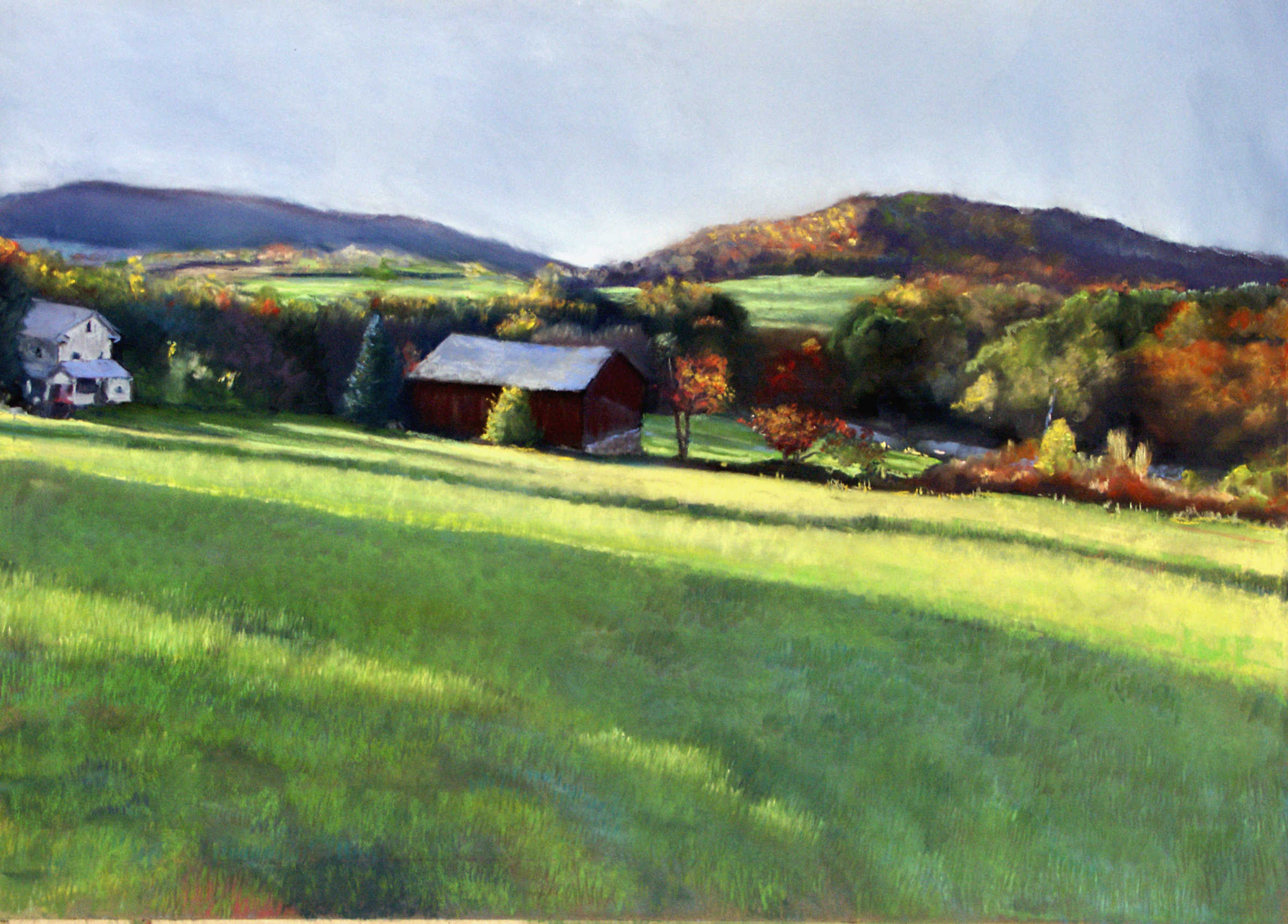
Genesee Valley farm in Autumn, 9X12, pastel, private collection.

I don’t dictate what media my students work in, with few exceptions:

  • Heavy-body acrylics don’t work well in extremely hot, dry settings. You need retarder or you can’t keep up.
  • I love pastels for the direct hand-to-paper connection but they’re harder to frame and ship.
  • Colored pencils are too time-consuming for plein air unless they’re combined with acrylics or watercolor.

Beyond that, the best medium is the one that gets you painting most often. For me, that means the thing I can grab most quickly, and that means oils and watercolors. For my student Kelly, it means gouache because it’s the easiest to use in her small apartment.

Toxicity

Sometimes, people tell me they’ve chosen acrylics or watercolors because they’re ‘less toxic.’ That’s untrue. The toxicity of paints lies in their pigments, and they’re the same in all media. The binder for oils is linseed (flax seed) oil; for acrylics, acrylic polymer emulsion; for watercolor and gouache, gum arabic (primarily), and for pastels, water-soluble gum. All but acrylics use mostly plant-based binders.

Some people are sensitive to odorless mineral spirits. There are solvent-free workarounds if they want to paint in oils.

Catskill farm, ~18X24, pastel, private collection

Which is best?

Oils have the longest history (except for encaustic) and the broadest range of technique. Watercolor is portable, bright and immediate. Acrylic and gouache dry quickly and are easy to transport. None of these make any one medium superior; they simply make them suited to different purposes and personalities.

Working across media strengthens your skills

As Mark pointed out above, many artists discover that working in more than one medium strengthens all of them. Their lessons cross pollinate.

Of course, that doesn’t really answer Vivi’s question, because there’s no right answer. This morning, I’ll paint with watercolor and the rest of the week it’s almost certainly going to be oils. Beyond that, we’ll just have to see, won’t we?

I have just two workshops left in 2026! Reserve your spot:

Can’t commit to a full workshop? Work online at your own pace:

Seven Protocols for Successful Oil Painters

If you’re ticked about AI stealing artwork, you should be ticked by this

Windsurfers at La Pocatière, 6X8, oil on archival canvasboard. For more information, click on image.

Artists argue against tech companies vacuuming up our paintings, illustrations, photographs, music and words without permission. The damage can take many forms, including:

  • Training AI models to mimic patterns, styles, subjects, composition, color relationships and visual conventions;
  • Generating images in a living artist’s style;
  • Reproducing copyrighted works, logos or characters, or close enough to make no difference;
  • Competing with the original artists whose material AI used in the first place;
  • Licensing products made from these materials.

These companies are monetizing results based on work for which the artists neither gave permission nor were compensated by the owners of these models.

Last light at Cobequid Bay, 6X8, oil on archival canvasboard, For more information, click on image.

A quick note on classes before we get into it

Claim your spot in Painting clouds, which starts in two weeks. There are just a few slots open.

Patagonia vs. Pattie Gonia

Patagonia, Inc. is an outdoor clothing company known for environmental activism, durable gear and sustainable manufacturing. Pattie Gonia is an environmental and LGBTQ+ activist and drag queen. They’re locked in a trademark battle right now.

You don’t have to dislike Pattie Gonia or Patagonia, Inc. to take a position on their lawsuit. If you’re outraged when AI steals creative work without permission, you should at least recognize that the principles are similar.

Patagonia has spent 53 years building a recognizable brand and trademark, one heavily invested in the environmental and social-justice causes that its founder held dear. Their gear is pricey in part because of their environmental standards, labor practices, and small-scale manufacturing.

The company says it’s tried for years to resolve concerns privately before filing suit, and that the dispute escalated when Pattie Gonia sought trademark protection and sold merchandise using a name and branding that Patagonia believes are too close to its own. The company is seeking only nominal damages but the legal costs that Pattie Gonia may be liable for could exceed $1 million.

Brooding Skies, 8X10, oil on archival canvasboard. Click on image for more information.

Intellectual property rights

What do artists say about AI?

  • We spent years developing our skills.
  • We built our reputation.
  • We created something distinctive.
  • We should have some control over how it’s used.

These are all intellectual-property arguments, and copyright and trademark law in the US are based on them. Both exist so that creators have some ability to control the use of what they’ve made.

Most artists are willing to defend intellectual property when it’s an individual’s work that’s being stolen. They’re less enthusiastic when the owner is a corporation, but they shouldn’t be. Intellectual-property rights don’t suddenly become meaningless when the owner is rich and successful. In fact, it helps all creators when corporations insist on robust intellectual-property protection.

If you believe AI is wrong to use your work without permission to train a commercial model, you believe that creative labor has value. You can’t then turn around and say that doesn’t matter when the owner of the intellectual property is a fat and famous corporation. Ownership matters regardless of who owns it. Even if Patagonia were an awful company (and it’s not), that would be true.

The Road to Seward, 6X8, oil on archival canvasboard. For more information, click on image.

Pattie Gonia argues that she’s just using a place-name from South America, but it’s hard to divorce the name from Patagonia, Inc.’s long-standing environmental advocacy. Of course, there is no guarantee that Patagonia will win. The legal outcome is for the courts, not me, to decide—and thank God for that.

However, artists should pay attention to the underlying principle. If we expect the world to respect our copyrights, we should respect the concept of intellectual property even when the owner isn’t a watercolor painter in a drafty studio. Consistency is the price of credibility.

I have just two workshops left in 2026! Reserve your spot:

Can’t commit to a full workshop? Work online at your own pace:

Seven Protocols for Successful Oil Painters

This is not your Dead Internet

The Wreck of the SS Ethie, oil on canvas, 18X24. For more information, click on image.

“Facebook doesn’t show me anyone familiar anymore,” artist Mary Sheehan Winn lamented. “I’ve noticed a lot of mistakes in AI when I’m looking at subjects I know about,” physician Brian told me (a caution for anyone who trusts Dr. Google). I recently asked ChatGPT for a precis of a scientific paper that interested me. It summarized another study entirely. I asked a second time and got the same result.

Tin Foil Hat, 6X8, oil on archival canvasboard. For more information, click on the image.

Dead Internet Theory

The Dead Internet Theory says that the internet is no longer a human-dominated space, that the web is now predominantly populated by AI bots and automated content. This artificial reality creates the illusion of genuine human interaction. The goal is ultimately profit, either directly or through control and manipulation.

I’ve been writing this blog for more than two decades. The internet has changed, but it’s also changed me. Social media and search engine algorithms have dumbed down my once-elegant language; what’s the point of writing something nobody sees because I use fancy words? While online teaching and commerce were things we only dreamed about at the turn of the millennium, we didn’t have to worry about bots. They’re drawn to my website and email client like blowflies to a corpse. So far, my systems have protected my turf, but one must be ever-vigilant.

A year ago it was estimated that half of all internet traffic was generated by bots; it’s probably worse today. That’s harmless until you remember that someone like me has to review and delete spam messages and comments, and pay for systems to protect my website from online attack.

Then there’s the business of not writing like AI. There are certain written tics I now avoid—chief among them the em-dash I love so much—because they’re common in AI-generated copy.

Hiking, 6X8, oil on archival canvasboard. For more information, click on the image.

False reality

I often write about focal points. This is very much in the plural, since every painting should contain a series of focal points that lead the eye through a painting. ChatGPT, however, discusses focal point in the singular. If you want to know where an art-writer is getting his or her information about focal points, this is a good test.

How important is that? Not very, but when that bleeds into imaginary relationships, it gets ugly. We all know the story of the lonely old lady bilked of her savings by online scammers, but what of the young people deluded into thinking they’re having relationships with sex-bots?

“Imagine,” my friend Michael posited on Saturday, “a romantic partner that never criticizes you, agrees with everything you said…”

“I don’t have to imagine that,” my husband (ever the smart-ass) said.

As Quinton Self said about our violence-surfeited culture, “‘Make a life, take a life’ and now even fake a life.”

Ravenous Wolves, oil on canvas, 24X30. For more information, click on the image.

We are fearfully and wonderfully made

As I mentioned Monday, I was surprised by the hand-brain connection in my writing. Perhaps with more experience I could learn to do voice-to-text, but right now I need a pencil or keyboard to organize my words. That reminds me that even our physical selves are more than just a brain attached to machinery; the sympathetic nervous system is very powerful.

We are, of course, wonderfully made beings. While AI is very good at some tasks (think data or routine programming) when man tries to create people he does a piss-poor job. My son once asked me why anyone would bother using AI to write. I can’t answer that, but you can rest assured that I’ll quit blogging before this space is another argument for Dead Internet Theory.

I have just two workshops left in 2026! Reserve your spot:

Can’t commit to a full workshop? Work online at your own pace:

Seven Protocols for Successful Oil Painters

Monday Morning Art School: understanding value

Autumn farm, oil on canvasboard, for more information, click on image.

I had surgery on my hand last week. I can paint a little bit, I can’t draw, but I especially can’t type. It makes me keenly aware of how our thinking isn’t just done in the brain; it’s also kinesthetic. I don’t write the same with voice-to-text.

A quick note on classes before we get into it

My upcoming session of evening Zoom classes starts next week. Painting water is already sold out. Claim your spot in Painting clouds or From field sketch to final studio work (which starts tomorrow) before they sell out too.

Value

Why do some paintings grab your attention from across the room while others seem muddled? The answer is always value. I spent a year experimenting with ways to disprove this, and the result were a lot of high-key paintings that didn’t read well.

Color is comprised of three aspects:

  • Value—lightness or darkness;
  • Hue—position on the color wheel;
  • Chroma—intensity or saturation.
Autumn Farm, Evening Blues, oil on canvasboard. For more information, click on image.

And the greatest of these is value.

The position on the color wheel (hue) is what non-artists call color. Ironically, it’s the least important aspect of color. That’s why nobody bats an eye at Vincent van Gogh’s yellow skies or Claude Monet’s pink and blue wheat field. Our brains take it in stride.

Before viewers notice anything else, they register a value pattern (and remember, they do that in as little as 50 milliseconds). Our eyes are hardwired for this. If your value structure is strong, your painting can be read almost instantly. If it’s weak, no amount of detail will rescue it.

Take off your glasses

I’m blessed with imperfect vision, so I paint with my glasses off. Others may have to squint, but blurry vision reduces visual information and compresses values into large, simple masses. The artist is immediately freed from the tyranny of fine detail and texture. (If, at the end you feel like adding those things, you can put your glasses back on.)

In the planning stages, ask yourself: do the major shapes separate clearly? Can you immediately identify a series of focal points that drive your eye through the composition?

Marshall Point, oil on archival canvasboard, 9X12. Click on image for more information.

Strong paintings

I advocate plein air to learn painting because the time constraints force us to simplify. This is one of the hardest skills for new painters to learn. They carefully record every detail, creating a wall of visual noise.

Strong paintings organize the world into a few dominant value masses and subordinate everything else.

That doesn’t mean a bunch of big, unbroken shapes. A meadow, for example may be all one close value family but contain dozens of different hues. It might be set against a darker tree line—again in a tight value family, with different hues. If there was value discontinuity in those larger shapes, you’d have visual chaos, but the tight value structure keeps them organized.

Note that I’m not suggesting these larger shapes be simple. They need compelling edges that are sometimes staccato, sometimes smooth, sometimes broken, but always interesting.

A Woodlot of her own, 9X12, oil on archival canvasboard. Click on image for more information.

Start with a sketch

A successful pencil sketch is a fast investment before you sink a lot of time into a painting. I encourage my students to use a sketchbook. If you draw on your canvas, your notes get buried under your painting.

Periodically step back and look at your work from a distance. If this is impossible (for example, if you’d fall off a cliff) take a picture and look at it on your phone. Compare it to your initial sketch. Are your large value masses intact, or are you chasing the light? Have you fussed the shapes apart with unnecessary detail? Are your focal points still reading?

Painting is all about editing reality into a clear visual statement. If you’re an experienced painter and want to learn more about value and composition, join my Advanced Plein Air Painting workshop and learn practical techniques to simplify complex scenes, strengthen value structure and create paintings that read instantly.

I have just two workshops left in 2026! Reserve your spot:

Can’t commit to a full workshop? Work online at your own pace:

Seven Protocols for Successful Oil Painters

How long do people take to judge a painting?

Drying Sails, 9X12, oil on canvasboard, click on image for more information.

We spend years learning to paint. What happens on the viewer’s side is a whole different story. People make snap decisions about what they like—as fast as 50 milliseconds to form a stable opinion. That our brains are capable of making judgments that fast, before we are consciously aware of the details, should awe us.

That means we’d better get it right straight off the bat, because if we don’t grab our audience instantly, we’re not going to get them at all.

Humans process paintings differently from other visual information. We don’t simply see a painting the way we see objects in real life. Instead, the brain rapidly organizes shape, color, composition, balance, contrast and emotional meaning into the gist of the image.

Apple Blossom Time, oil on archival canvasboard, click on image for more information.

A quick note on classes before we get into it

My upcoming session of evening Zoom classes starts next week. Painting water is already sold out. Claim your spot in Painting clouds or From field sketch to final studio work before they sell out too.

The physiology of meaning

We’ve all stepped back from a canvas and instantly felt that something was wrong, although it takes time (and sometimes outside help) to figure out what offends us. The inverse is when we know something clicks. That’s not subjective; it’s our visual system processing relationships, hierarchy and structure at astonishing speed.

The retina is actually a piece of the brain that migrated out into the eye during fetal development. Unlike our other sensory tools, the retina performs brain-level data-processing. It’s part of the central nervous system.

The only other sense that approaches this (incompletely) is our sense of smell. It’s interesting that both paintings and smells trigger not just the visual and olfactory pathways, but also emotion and memory. (That, by the way, is the whole point of the madeleine sequence in Marcel Proust’s Remembrance of Things Past. Now you don’t have to read it.)

Skylarking, 24X36, oil on canvas, click on image for more information.

There’s more to this than mere technique

This emotional/memory trigger is instantaneous. It means that viewers don’t just decode paintings, they experience them physically and emotionally.

Yes, you need drawing, value structure, color harmony, edges and composition. The painter is a magician, using these rational systems as sleight of hand to elicit that instantaneous response. At this level, painting is about controlling attention. The artist decides where the eye travels, where it rests, what it notices first and what remains implied. Great painters understand that the brain reads the whole painting before it reads the parts.

This is also why beginner painters often over-render everything. They’re painting objects instead of orchestrating perception.

Main Street, Owl’s Head, oil on archival canvasboard. For more information, click on image.

Science is fascinating, but painters figured this out centuries ago

Baroque painters played their audiences with dramatic chiaroscuro. Impressionists manipulated luminance and color relationships for shimmering light effects that the brain interprets as movement and atmosphere. Abstract painters learned that balance, rhythm, and spatial relationships alone produce strong emotional responses.

That’s why, in my advanced painting workshop, we spend less time fussing over trivia and more time asking the important questions:

  • What carries the emotional weight of the painting?
  • Where does the eye focus and how does it travel through the painting?
  • What can be simplified?
  • What deserves sharpness, and what should dissolve into atmosphere?
  • How much information does the viewer actually need?

The exciting thing is that this is learnable. The brain responds predictably to shape, contrast, hierarchy, rhythm and color relationships. The more you understand those principles, the more intentional your painting becomes.

If that sounds like the direction you want your work to grow, join me in my advanced painting workshop. We’ll dig into composition, simplification, edges, color structure, and the psychology of how viewers actually experience paintings—not just how to copy what’s in front of you, but how to make people feel something when they look at your work.

I have just two workshops left in 2026! Reserve your spot:

Can’t commit to a full workshop? Work online at your own pace:

Seven Protocols for Successful Oil Painters

Spring Greens

I just had a minor operation on my finger, and typing is tough. In light of that, I’m re-posting one of my all-time favorite topics for spring.

A quick note before we get into it

It’s time to claim your spot in Advanced Plein Air Painting, July 13-17 in Rockport, ME. If you have any questions about whether you fit into an advanced class, just ask!

How to avoid the wall of green

We take a snapshot of a dancing, glowing landscape and what we end up with is a wall of dull green. We need to insinuate that original energy back into our picture.

Cinnamon Fern, 9X12, oil on archival canvasboard, $955.90 framed includes shipping and handling in continental US.

Michael Wilcox published a watercolor pigment guide called Blue and Yellow Don’t Make Green. (Don’t buy it unless you can get it for a few dollars; its information is widely available on the internet, including here.)

Of course blue and yellow make green, but there are many routes to the same destination. I ask my students to avoid greens out of the tube, because they’re a sure-fired way of ending up with a monochromatic ‘wall of green’.

Apple Tree with Swing, 16X20, oil on archival canvasboard, $2231.90 framed includes shipping and handling in continental US.

Instead, I ask them to mix their greens using a matrix. I’ve written about this many times, so I’m not going to repeat the concept, except to say that it’s critically important to avoid the soul-sucking deadness of greens out of a tube.

Impressionism changed the way we look at and mix color. From the beginning of painting, artists understood that to warm a color up, you add a warmer tone, and to cool a color down, you add a cooler tone. If that neutralizes the color, so be it. That’s in fact what happens in real life with real light.

The Impressionists started to treat color as a wheel. If you wanted a warmer, lighter green, you mixed it not with Naples yellow* but with its cadmium yellow neighbor. If you wanted a cooler, darker green, you mixed it with it not with black but with its Prussian blue neighbor.

Better yet, you didn’t mix them at all, but laid gold next to green to warm it up, and laid blue next to green to cool it down. These tiny, discrete spots of color are averaged by the human eye into a coherent image. A blizzard of brushstrokes and color resolves into a discernable truth.

Spring Greens, 8X10, oil on archival canvasboard, $717.20 framed includes shipping and handling in continental US.

If you look carefully at human skin, you realize it’s not ‘skin-tone’ but is quite varied. There are areas tinged with blue, yellow, purple, and red. Without that, a person would look dead. The same is true of foliage. There are moments in which the color leans toward khaki, yellow, teal, violet and orange. They are what give life to greens.

Unfortunately, these color shifts are subtle and almost never caught in the snapshots we use as reference photos. We talk about ‘photographic proof’ as if it is an absolute, although by now we all know that photos are terrible liars.

For guiding a painting, photos have their limits. They distort distance and spatial relationships. Modern point-and-shoot cameras (especially cell phones) blow contrast and chroma up, because that’s what buyers like. In exchange, subtle value and hue shifts disappear.

We take a snapshot of a dancing, glowing landscape and what we end up with is a wall of dull green. Does that mean we can’t ever paint from photos? Of course not (although you’ll never really master the intricacies of natural color if you don’t go outside). It means we have to insinuate that energy back into the picture, and the tool we have to do that with is color.

The Impressionists taught us that we can do that by extending the range of color in an object. I can give you many examples of artists who did that, starting with Claude Monet and Vincent van Gogh. Spend a few hours analyzing their paintings in terms of color range.


I made a series of four photoshopped trees, above, to illustrate the concept. The first one is the normal way we might paint trees. With each step, I’ve added color range to the tree, until the final version has every position in the color wheel.

The guiding principle is the color of light. I’ve kept (for the most part) cool colors in the shadows and warm colors in the highlights. When you first try this, it will seem artificial and possibly absurd, but persevere. It’s the key to dynamic greens.

*Today’s Naples yellow is a mix and almost as deadening to a painting as sap green.

I have just two workshops left in 2026! Reserve your spot:

Can’t commit to a full workshop? Work online at your own pace:

Seven Protocols for Successful Oil Painters

When artists went to war

Gassed, 1919, John Singer Sargent, Imperial War Museum

Memorial Day began after the Civil War, when whole communities decorated the graves of fallen soldiers. Today, we see it more as the first holiday of summer. Partly, I think, this reflects the relative peacefulness of the past half-century.

The scale of American deaths in earlier wars beggars the imagination: Civil War, ~655,000 deaths. World War I, 116,516 deaths. World War II, 405,399 deaths. Korean War, ~36,500 deaths, Vietnam: 58,220 deaths

In contrast, the last fifty years of American military engagement has resulted in fewer than 10,000 combat deaths. That is not to diminish those losses; every one of those families has experienced personal holocaust. But perhaps it explains why we as a nation don’t see Memorial Day in the same way as our ancestors.

And they are wild beasts, from The Disasters of War, 1819, Francisco Goya, courtesy Clark Museum

Wartime artists

Before photography became fast, portable and cheap, the world relied on artists to explain war. The efficiency of modern killing developed in step with the development of modern publishing, and therefore the age of illustration.

War artists were never fringe observers. They were journalists, historians, propagandists, and eyewitnesses. Long before television correspondents crouched behind sandbags, illustrators (and writers like Ernie Pyle) crouched in mud, smoke, blood and cannon-fire, notebooks on their knees.

Their work required speed, courage and ruthless editing. Their ability to simplify complex scenes into strong patterns made their work readable in newspapers and magazines.

The American Civil War created enormous demand for battlefield illustration. Readers wanted immediacy, and illustrators delivered it. While some artists romanticized combat, most painted the mud, exhaustion and grief with brutal honesty.

Sunday Morning at Cunel, 1918, Harvey Dunn, courtesy National Archives

Today, we have endless photographs, and there are some with the emotional resonance of war drawings—Joe Rosenthal’s Iwo Jima picture of 1945, the Associated Press’ napalm picture of 1975 and the 2001 World Trade Center attack among them. But cameras only became fast enough to take action shots in the middle of the 20th century. With AI image manipulation we now don’t believe anything we see. 75 years of documentary photography seems very brief compared to the history of sketchbook journalism.

There have been hundreds and hundreds of war artists. Following is a partial list. Studying them is important not just for what they said, but for how the pressures of visual journalism refined their drawing and painting skills.

Francisco Goya became a bitter critic of war and its aftermath from the  Peninsular War of 1808–1814. His Disasters of War are a series of 82 prints chronicling the ways war harms the people living through it. It’s a good reminder to pray for Ukraine, Iran, and others living through war.

A Balloon Site, Coventry, 1943, Laura Knight

Winslow Homer worked as a battlefield illustrator for Harper’s Weekly, producing unsentimental scenes of soldiers’ daily lives, camps, marches and combat aftermath. Alfred Waud was more unsparing and immediate than Homer; he often drew while under fire. We’ve so romanticized the work of Frederic Remington, that we lose sight of his work as an artist-correspondent in Cuba and the American west. Harvey Dunn was one of the great artists of WW1’s American Expeditionary Force. His brutal, emotional battlefield scenes carry enormous force and psychological weight.

The Canadian Group of Seven painters are disproportionally represented in WW1 painting. AY Jackson enlisted in the Canadian Infantry in 1915. After being wounded in 1917, he documented the Western Front. Frederick Varley served as an official war artist for the Canadian War Records, focusing heavily on the raw emotional toll of war. Arthur Lismer primarily painted the home front, including his great portraits of dazzle-painted ships. And Lawren Harris, who was rich enough to buy his way out, enlisted in 1916 and served until he suffered a nervous breakdown.

There are too many British war artists to list. Paul Nash painted haunting, surrealist landscapes of the Western Front in WWI and aerial combat in WWII, emphasizing the clash of man versus machine. Ex-pat American John Singer Sargent was famous for his massive 1918 painting Gassed, which captures the devastating human cost of a mustard gas attack. CRW Nevinson used cubism and futurism to depict the raw, mechanized brutality of modern warfare. Sir Stanley Spencer produced deeply personal and spiritual interpretations of military life, particularly his murals at Sandham Memorial Chapel. Henry Moore did poignant, sculptural sketches of civilians sheltering in the London Underground during the Blitz. And Laura Knight captured the contributions of women, notably painting women working in munitions factories and military operations. 

And of course, there’s Käthe Kollwitz, who probably survived the Nazis because she was too famous to send to the gas chambers.

Wire, 1919, Paul Nash, Imperial War Museum

Then there were the American artists embedded with our troops during WW2. Mitchell Jamieson was in the first wave of assault boats that landed during the invasion of Sicily.Tom Lea produced Pacific Theater images including exhausted Marines and battlefield casualties rendered with stark humanity. Howard Brodie covered World War II, Korea, and Vietnam with fast, expressive drawings done near combat zones.

It’s a very incomplete list, but it’s a start. Take a few minutes and remember our troops this Memorial Day.

I have just two workshops left in 2026! Reserve your spot:

Can’t commit to a full workshop? Work online at your own pace:

Seven Protocols for Successful Oil Painters